Student Names:
Alara Kalfazade
Project Title:
Pocket Helvetica
Alara Kalfazade
Project Title:
Pocket Helvetica
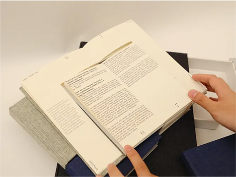
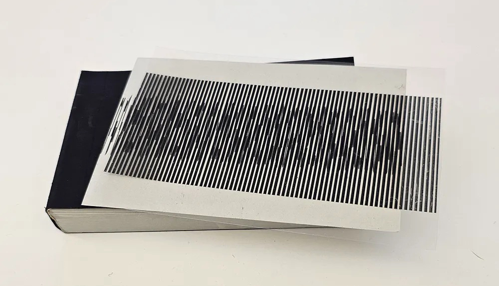
Project Description:
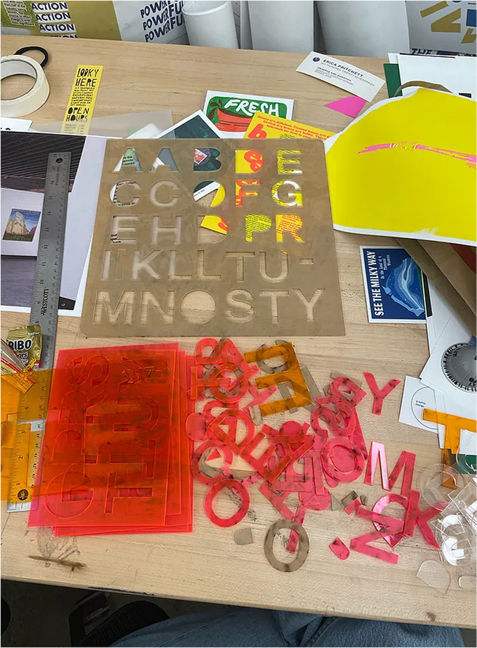
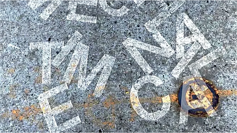
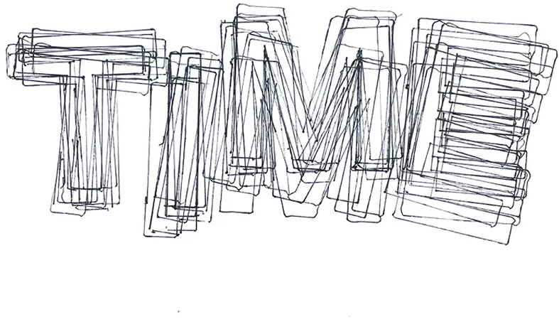
Pocket Helvetica transforms Helvetica from a familiar digital and printed typeface into a set of portable acrylic tools for drawing, measuring, and composing letterforms. Beginning as a laser-cut stencil, the project expanded into three clear acrylic rulers that include a full alphabet, a circular stencil, and typographic measurements such as picas, points, and inches. By turning type into a functional object, the project explores how tools mediate typographic knowledge and how authorship shifts between the designer, the system, the typeface, and the person using it.
READ ALARA’S FULL BLOG POST︎︎︎


Student Names:
Lisa Usanova
Project Title:
Layered
Lisa Usanova
Project Title:
Layered
Project Description:
Layered Card Deck transforms drawings and AI-generated imagery from the earlier AI&&You project into a full riso-printed deck of playing cards. Using each suit as a space for texture, color, halftone, and layered experimentation, the project explores the balance between control and unpredictability within the riso process. Finished with personalized card backs, rounded corners, and a transparent tinted case with vinyl detailing, the deck becomes both a functional object and a playful study of print, process, and material discovery.
READ LISA’S FULL BLOG POST︎︎︎


Student Names:
Sophie Beney
Project Title:
In Between Frames
Sophie Beney
Project Title:
In Between Frames
Project Description:
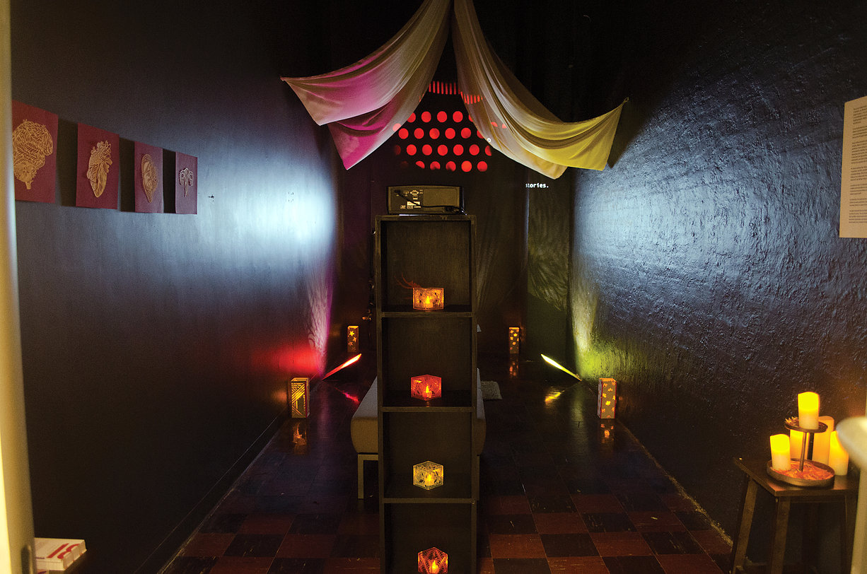
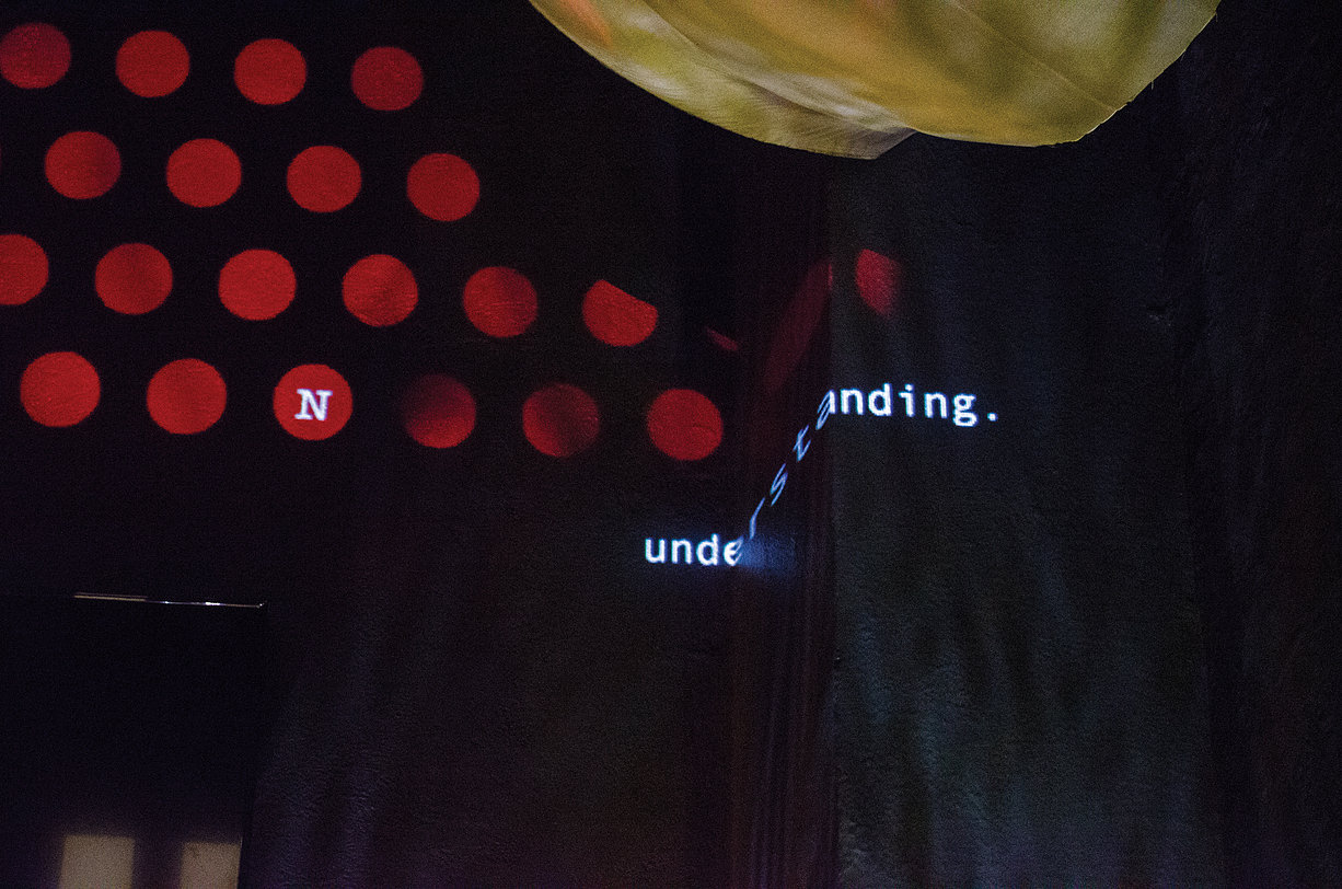
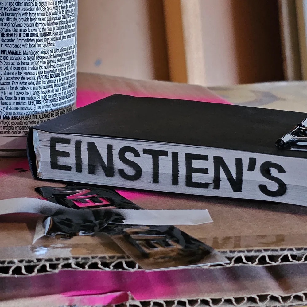
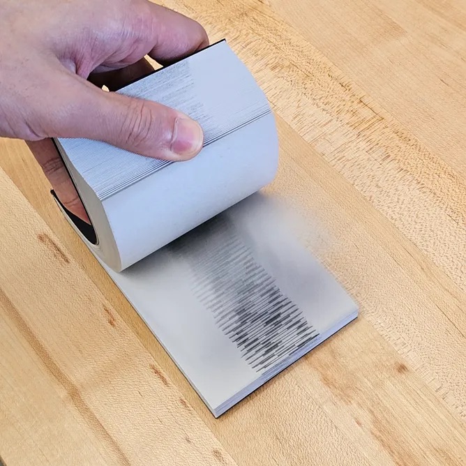
In Between Frames responds to Alan P. Lightman’s Einstein’s Dreams through a collage-based video exploring liminality, nostalgia, and time as a fragile chain of cause and effect. Using only scanned materials from vintage McCall’s magazines, the project assembles fragments of text and image into a layered visual narrative where each transition suggests an action leading to consequence. Paired with ticking clocks, a wind-up sound box, and record player sounds, the piece captures time as something constantly in motion, shaped by memory, perception, and human presence.
READ SOPHIE’S FULL BLOG POST︎︎︎


Student Names:
Sissi Lin & Nani Kim
Project Title:
Splitra
Sissi Lin & Nani Kim
Project Title:
Splitra
Project Description:
Splitra is a project that reinterprets the divided identity structure of the innie and outie from the TV series Severance through a contemporary language of interaction and graphic systems. The work begins with the idea that a single person does not exist as one unified self, but can be separated into different identities depending on situation and space. In this project, “I” am positioned as the innie — a figure who exists within limited information and remains unaware of the outside world.
READ SISSI’S FULL BLOG POST︎︎︎
READ NANI’S FULL BLOG POST︎︎︎


Student Names:
Lisa Usanova & Lara Herkenrath
Project Title:
Metropolis: An Interactive Experience
Lisa Usanova & Lara Herkenrath
Project Title:
Metropolis: An Interactive Experience
Project Description:
Metropolis: An Interactive Experience transforms Fritz Lang’s 1927 film into an immersive staircase installation that follows the movie’s narrative arc through space. Using the staircase to represent the upper city, threshold, and lower city, the project maps the film’s opposing worlds through black-and-white vinyl illustrations, directional quotes, and layered wall imagery. Built from close scene analysis and character progression, the installation turns the silent film into a physical journey where viewers move through its tensions, architecture, and story.
READ LISA’S FULL BLOG POST︎︎︎
READ LARA’S FULL BLOG POST︎︎︎


Student Names:
Icarus Guo & Margarita Gomez-Puche
Project Title:
Perfect Blue
Icarus Guo & Margarita Gomez-Puche
Project Title:
Perfect Blue
Project Description:
Perfect Blue translates Satoshi Kon’s psychological horror film into a material installation exploring identity, obsession, and the instability between reality and illusion. Centered on a dress constructed from printed film script, layered newsprint, pleating, pins, and red thread, the project turns language into something worn, fragmented, and spatial. Paired with a foldable idol-inspired poster, scattered script pages, projection, and suspended threads, the work externalizes Mima’s psychological unraveling and examines how narrative, memory, and selfhood can be constructed, performed, and pulled apart.
READ ICARUS’S FULL BLOG POST︎︎︎
READ MARGARITA’S FULL BLOG POST︎︎︎


Student Names:
Patrick Riley
Project Title:
Please Use Front Door
Patrick Riley
Project Title:
Please Use Front Door
Project Description:
Please Use Front Door turns an everyday walk to the studio into a visual study of door knobs and handles as overlooked objects of attention. After photographing each handle passed along the route, the project organizes the images into a large data-focused poster that follows the sequence of the walk. A companion set of nine riso prints pushes the subject in a more abstract and playful direction, using layered forms and a dark blue-and-gold palette inspired by the metal tones of the collected objects.
READ PATRICK’S FULL BLOG POST︎︎︎


Student Names:
Daisy Gaikwad
Project Title:
32oz
Daisy Gaikwad
Project Title:
32oz
Project Description:
32oz turns a personal collection of 127 Taco Bell hot sauce packets into a playful study of habit, obsession, and everyday accumulation. What began as a question about routines became a data-driven poster documenting each packet to scale, alongside details like sauce type, quantity, weight, and its relationship to Taco Bell bottled sauce. A companion set of riso prints uses scanned packets, sauce marks, bitmapped textures, and a purple-on-kraft-paper palette to transform the collection into something tactile, humorous, and strangely revealing.
READ DAISY’S FULL BLOG POST︎︎︎


Student Names:
Nadia Salomon
Project Title:
Road to London
Nadia Salomon
Project Title:
Road to London
Project Description:
Road to London transforms marathon training into a layered visual archive of data, routine, and personal experience. Centered on preparation for the London Marathon, the project tracks mileage, routes, pacing, weather, gear, emotional states, and social media engagement as interconnected forms of performance and documentation. Through nine riso-printed posters and one large data visualization, the work turns the invisible systems behind training into a tactile, rhythmic, and emotionally resonant story of discipline, repetition, and anticipation.
READ NADIA’S FULL BLOG POST︎︎︎

Student Names:
Margarita Gomez-Puche
Project Title:
Blink&Blink
Margarita Gomez-Puche
Project Title:
Blink&Blink
Project Description:
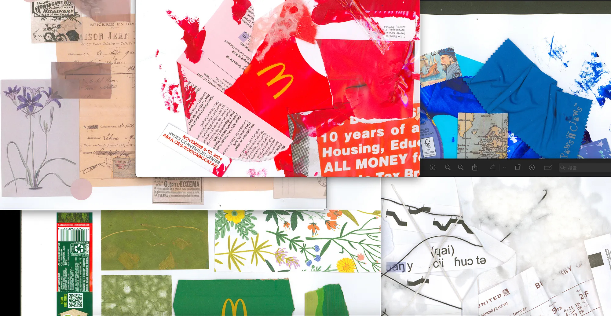
Blink&Blink is a self-reflective book that approaches AI through resistance, storytelling, and protest. Rather than using AI as a primary creative tool, the project positions it as an outsider, offering only selective prompts about family history, loneliness, separation, stress, and inherited repetition. Through a children’s-story format, ripped paper, folds, hidden text, and layered handmade imagery, the book uses concealment and revelation to explore how personal history can be protected, fragmented, and retold on the artist’s own terms.
READ MARGARITA’S FULL BLOG POST︎︎︎


Student Names:
Alara Kalfazade
Project Title:
Notes on Observation
Alara Kalfazade
Project Title:
Notes on Observation
Project Description:
Notes on Observation is a self-reflective publication that uses AI dialogue, personal data, and hand-crafted visualization to examine patterns within a creative practice. Inspired by conversations with ChatGPT and projects like Dear Data, the book translates one week of desires, locations, movement, routines, and project time into stitched data systems. Organized through sections on reflection, self-observation, and process, the publication uses French folds, purple as a conceptual baseline color, and hand embroidery to turn invisible habits into tactile records of attention.
READ ALARA’S FULL BLOG POST︎︎︎


Student Names:
Yue Zhou
Project Title:
The Folded Interview
Yue Zhou
Project Title:
The Folded Interview
Project Description:
The Folded Interview is a French-folded book that documents the creation and testing of an HR agent through vibe coding. The work operates on multiple information layers, challenging conventional accessibility while respecting reader agency. It exists simultaneously as a conversation log, an interview simulation, a portfolio presentation, and a code archive.
READ YUE’S FULL BLOG POST︎︎︎


Student Names:
Sophie Beney
Project Title:
A Little Called
Sophie Beney
Project Title:
A Little Called
Project Description:
This project translated Gertrude Stein’s poem A Little Called Pauline from Tender Buttons and embraces the poem’s confusion, absurdity, and resistance to clear meaning. The motion vignette uses retro-inspired collage, fragmented typography, disjointed visuals, and playful distortions to challenge the viewer’s expectations and disrupt coherence. Rather than trying to explain Stein’s language, the piece leans into its chaos, transforming the ordinary into something strange, humorous, and unexpectedly compelling.
READ SOPHIE’S FULL BLOG POST︎︎︎
Student Names:
Aerim Lee
Project Title:
Apple Plum
Aerim Lee
Project Title:
Apple Plum
Project Description:
Apple Plum translates Gertrude Stein’s poem from Tender Buttons into a playful, abstract motion graphic focused on texture, color, rhythm, and sound. Rather than illustrating a linear narrative, the piece builds a sequence of expressive compositions using bold typography, low-poly 3D objects, a consistent color palette, and grainy crayon-like textures. Timed with music and subtle sound effects, the animation captures the poem’s strange, sensory quality through movement, pacing, and layered visual experimentation.
READ AERIM’S FULL BLOG POST︎︎︎


Student Names:
Grace Kim
Project Title:
Beginners Mind Interview
Grace Kim
Project Title:
Beginners Mind Interview
Project Description:
Beginners Mind Interview is a series of three one-minute motion interviews exploring the distinct personalities of friends Andrew, Calvin, and Jared through their relationships with soccer, cello, and gym culture. Inspired by the scrapbook-like energy of My Life in 60 Seconds, each video combines animated type, textured imagery, shifting color palettes, and visual metaphors to create a shared style with individualized details. Using tools like Spectrolite to transform photos into cohesive textured visuals, the project celebrates how different personalities can still feel connected as part of one friend group.
READ GRACE’S FULL BLOG POST︎︎︎
Student Names:
Vibhasa Kanthamraj
Project Title:
Glazed Glitter
Vibhasa Kanthamraj
Project Title:
Glazed Glitter
Project Description:
Based on a passage from Gertrude Stein’s Tender Buttons, this project turns language into a rhythmic motion vignette driven by jazz music and animated typography. The piece experiments with type as image, using each phrase as a cue for shifting compositions, transitions, and visual effects. Inspired by lyric-focused music videos, the animation pairs expressive text movement with musical pacing and instrument-inspired visuals, creating a playful interpretation of Stein’s fragmented language.
READ VIBHASA’S FULL BLOG POST︎︎︎


Student Names:
Christin Kim
Project Title:
1 Gesture = 2 Screens
Christin Kim
Project Title:
1 Gesture = 2 Screens
Project Description:
1 Gesture = 2 Screens is a video-based exploration of balance through repetition, ritual, and subtle bodily gestures. Beginning with a single randomly chosen word, the project stages symbolic actions — lighting incense, stacking cups, setting an affirmation, moving through ballet steps, and tying shoes — while using split-screen compositions to hold internal and external states in tension. By cutting before each expected resolution, the video emphasizes anticipation, process, and the quiet struggle between movement and stillness.
READ CHRISTIN’S FULL BLOG POST︎︎︎


Student Names:
Rye Liu & TK Visuthiwat
Project Title:
Odd Apples
Rye Liu & TK Visuthiwat
Project Title:
Odd Apples
Project Description:
Odd Apples uses fruit as an abstract metaphor for the body to explore a more grounded form of body positivity — one focused on function, strength, and care rather than appearance alone. Through photography, small “peeling back” fruit books, and a poster series, the project highlights the layers, textures, and inner structures of fruit as reflections of what bodies do beneath the surface. Playful and thoughtful, the work reframes body diversity through form, function, and the quiet power of looking inward.
READ RYE AND TK’S FULL BLOG POST︎︎︎


Student Names:
Aria Meng & Yingxuan Zhuang
Project Title:
Cha Cha
Aria Meng & Yingxuan Zhuang
Project Title:
Cha Cha
Project Description:
Cha Cha reimagines the Cha Cha Festival as a playful bridge between tea culture, Asian traditions, and Gen Z pop culture. Centered on the Chinese character “茶” and inspired by calligraphy, tea leaf textures, and hands-on material research, the project expands into an experimental zine made with tracing paper, tea bags, and tactile layouts, along with a riso-printed tarot card set created from scanned tea leaf patterns. The work also extends online through an interactive 3D world, inviting audiences to explore tea culture through both physical artifacts and immersive digital storytelling.
READ ARIA AND YINGXUAN’S FULL BLOG POST︎︎︎
VIEW THEIR 3D SPACE︎︎︎


Student Names:
Sawyer Yoh & Sofia Innamorato
Project Title:
Semicolon;
Sawyer Yoh & Sofia Innamorato
Project Title:
Semicolon;
Project Description:
Semicolon; is a mental health awareness project that reframes conversations around mental illness in a friendly, approachable, and non-clinical way. Built around an anonymous survey for college-aged students, the project uses the semicolon as a symbol of hope, resilience, and continuation. Through a calming visual identity, mascot, website, motion graphics, posters, stickers, and zines filled with supportive messages and community doodles, the work encourages young people to care for themselves. It helps reduce the stigma around seeking support.
READ SAWYER AND SOFIA’S FULL BLOG POST︎︎︎


Student Names:
Steph Lu & Jacque Henderson
Project Title:
Seasalt
Steph Lu & Jacque Henderson
Project Title:
Seasalt
Project Description:
Steph and Jacque’s Sight of Sound transforms a 16-second excerpt of Santo & Johnny’s “And I Love Her” into a dreamy visual animation built around softness, nostalgia, and slow-moving light. After creating the digital animation, all 256 frames were riso-printed, scanned, and reassembled to give the piece a tactile, hand-touched quality. The project expanded into postcards, posters, and a collaborative zine titled seasalt, which brought the animation’s quiet glow together with Steph Lu’s playful Weird Fish illustrations through seafood recipes and comics.
READ STEPH AND JACQUE’S FULL BLOG POST︎︎︎


Student Names:
Lia Pires & Liz Reichman
Project Title:
Afro Blue
Lia Pires & Liz Reichman
Project Title:
Afro Blue
Project Description:
Lia and Liz’s Sight of Sound translates a 16-second excerpt of “Afro Blue” by Erykah Badu and Robert Glasper into a collaborative riso-printed animation and exhibition system. Drawing from jazz, surrealism, anime, dramatic lighting, and dense textures, the project follows a fluid visual narrative unified by black ink with blue and pink accent colors. The work expanded into posters, postcards, and a three-color riso zine inspired by graphic novels, telling the story of Stella, a jazz club worker who enters a fantastical world where sound, color, and atmosphere merge.
READ LIA AND LIZ’S FULL BLOG POST︎︎︎


Student Names:
Rye Liu & TK Visuthiwat
Project Title:
Heirloom
Rye Liu & TK Visuthiwat
Project Title:
Heirloom
Project Description:
Sight of Sound transforms Björk’s “Heirloom” into a riso-printed animation that explores memory, inheritance, and the dreamlike transmission of culture across generations. Inspired by the song’s layered soundscape and themes of ancestral connection, the project draws on both Thai and Chinese perspectives to visualize how dreams, spirits, and emotions can carry meaning from the past into the present. The tactile imperfections of risograph printing — including slight misregistration and unpredictable texture — become part of the work itself, reinforcing the feeling of a recurring dream being passed down and reinterpreted over time.
READ RYE AND TK’S FULL BLOG POST︎︎︎


Student Names:
Liz Reichman
Project Title:
Speculative Systems
Liz Reichman
Project Title:
Speculative Systems
Project Description:
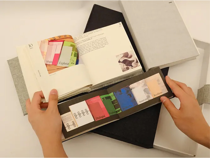
Speculative Systems is a publication that organizes a semester’s worth of thesis thinking into an alphabetized, dictionary-like catalog of references, instincts, and design interests. Built around the idea of looking ahead to thesis through systems of taste, habit, and inspiration, the book uses a spreadsheet-inspired structure to give shape to an intuitive research process. Printed on newsprint with French-folded pages, the publication embraces texture, tactility, and constraint, becoming both a record of creative reflection and a framework for trusting process.
READ LIZ’S FULL BLOG POST︎︎︎


Student Names:
Tyler Best
Project Title:
On My Own Terms
Tyler Best
Project Title:
On My Own Terms
Project Description:
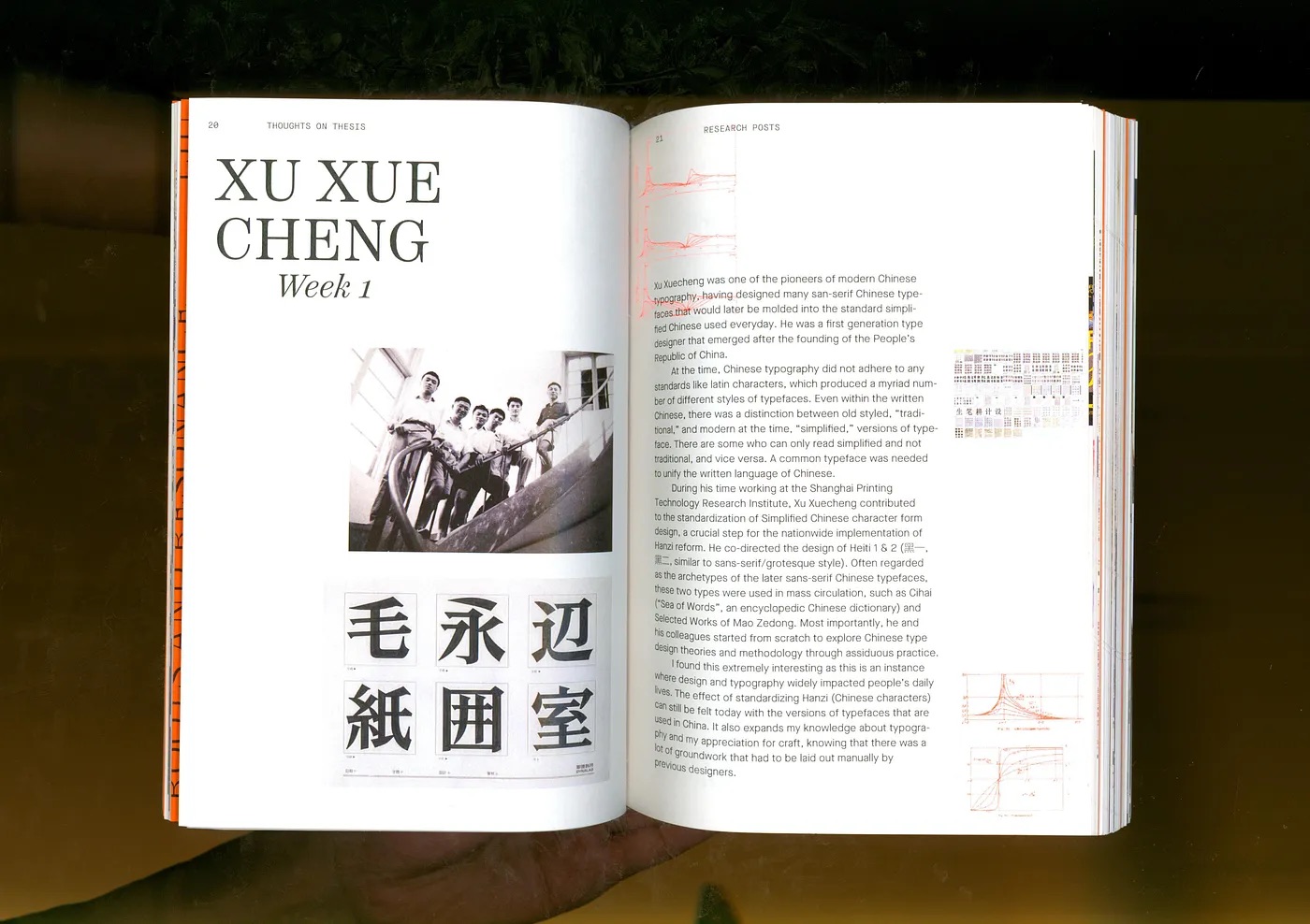
On My Own Terms brings together a semester of research, making, and reflection through a two-book system centered on building a Black design lexicon. The project separates an A-Z lexicon from Thoughts on Thesis, allowing the main book to function as an editorial archive of projects, process, and visual exploration while giving the language its own dedicated space. Through experimental layouts, vellum pages, Emory Douglas-inspired letterforms, material studies, branding, binding, and a supporting website, the work becomes a flexible foundation for a growing design practice rooted in voice, culture, and personal inquiry.
READ TYLER’S FULL BLOG POST︎︎︎


Student Names:
Yuting Lin
Project Title:
Between Pixel and Paper
Yuting Lin
Project Title:
Between Pixel and Paper
Project Description:
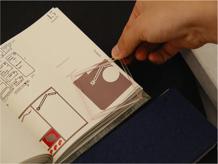
Thoughts on Thesis: Between Pixel and Paper is a hybrid book and website exploring how digital and physical design can intersect through motion, pattern, material, and interaction. Centered on the thesis idea Between Pixel and Paper, the book uses vellum, acetate, layered imagery, custom grid typography, coded glyphs, ASCII patterns, and hands-on page elements to translate screen-based behaviors into tactile form. Organized through a thesis statement, lexicon, research, previous work, and future directions, the project becomes both a research archive and an experimental object for testing how viewers move between digital logic and material experience.
READ YUTING’S FULL BLOG POST︎︎︎


Student Name:
Zhiyu Huang
Project Title:
(ME?)
Zhiyu Huang
Project Title:
(ME?)
Project Description:
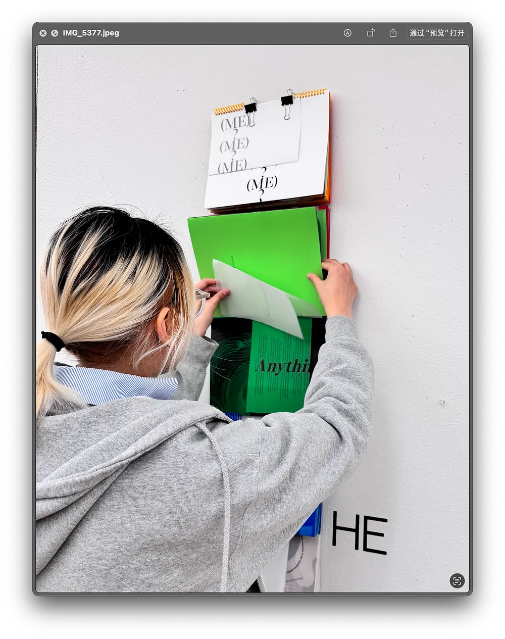
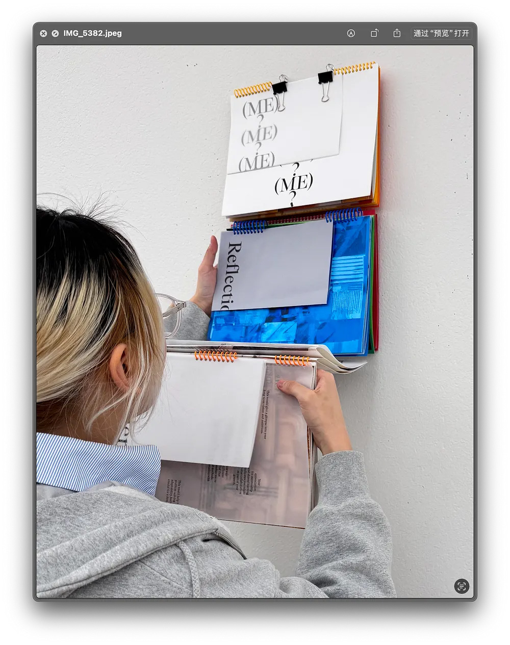
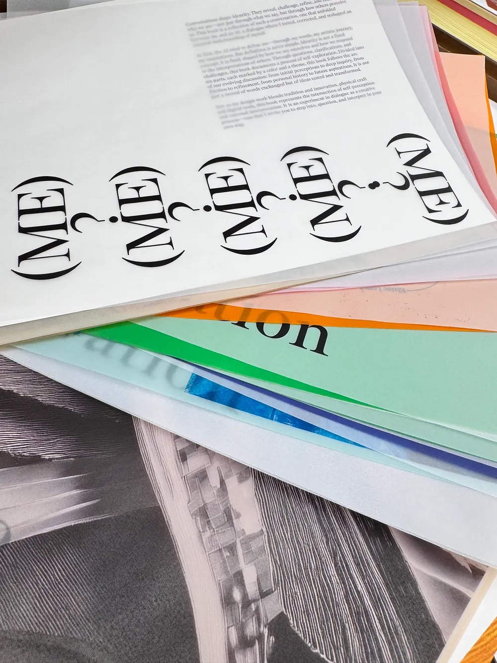
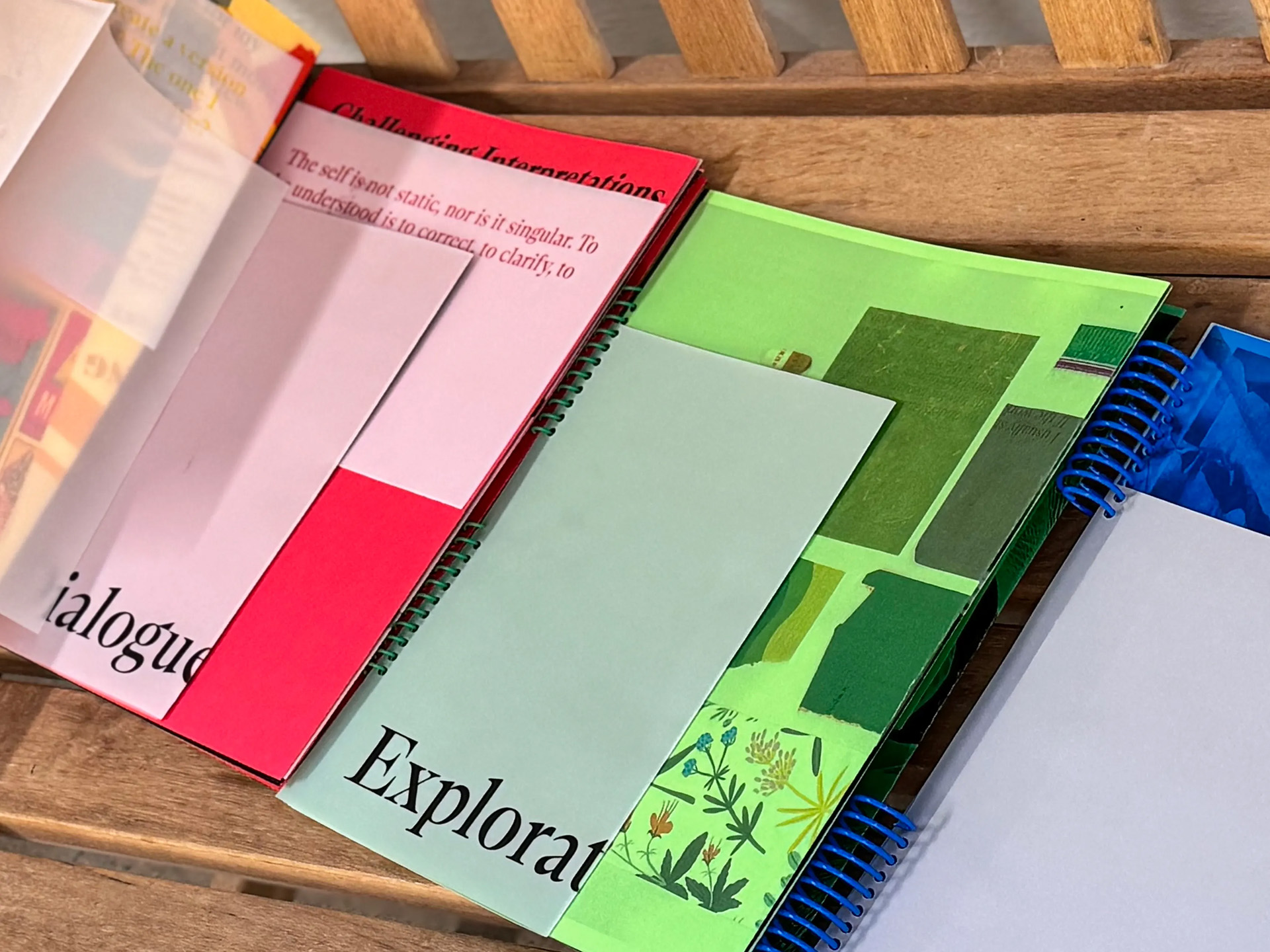
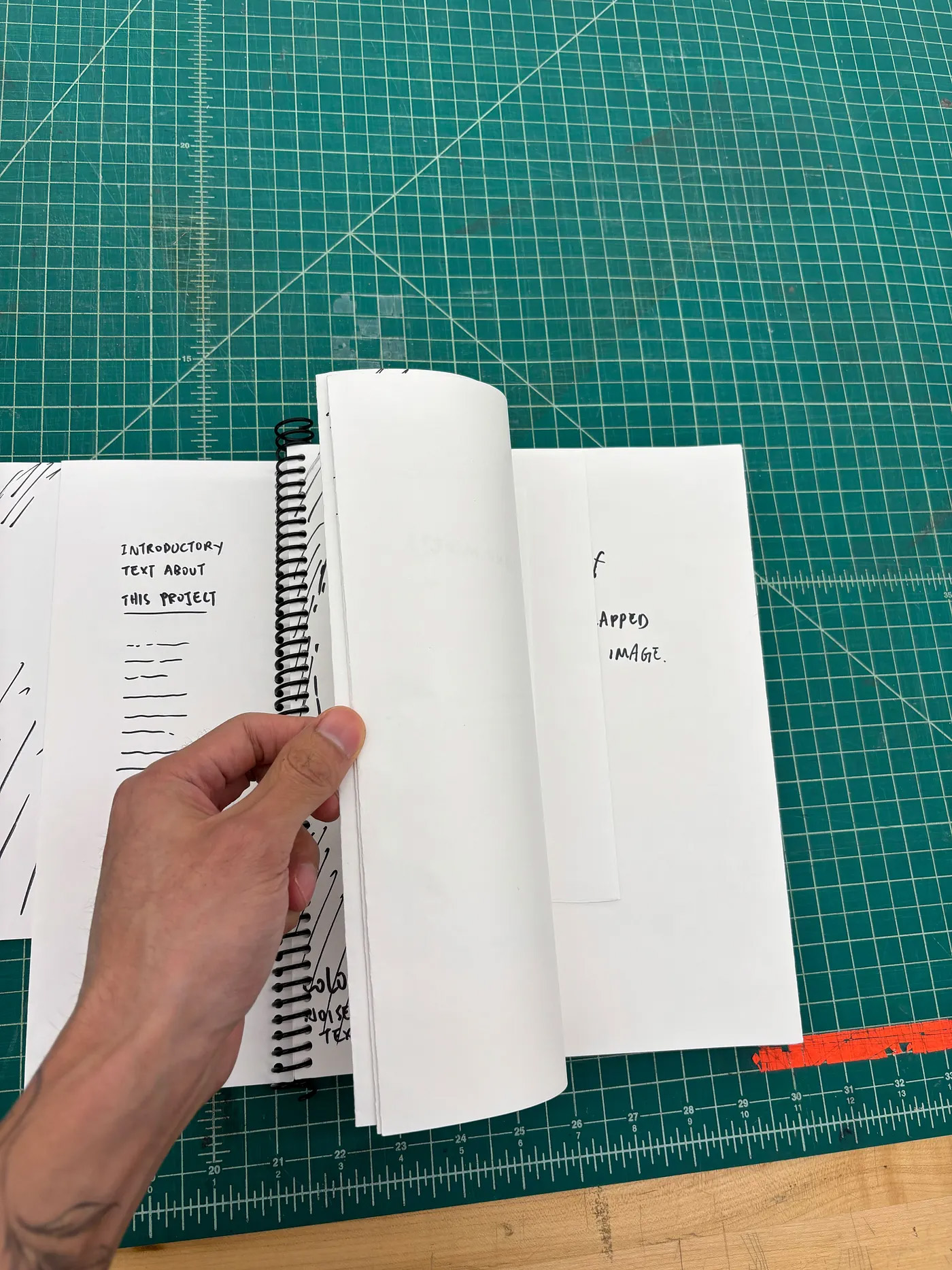
What started as a simple AI collaboration quickly became a personal test of how far I could push — and frustrate — ChatGPT. Using its sometimes robotic, overly polite answers as fuel, I built six mood boards tied to distinct colors, each with keywords that shaped both AI-generated imagery in Adobe Firefly and my own analog overlays. The final piece is a non-traditional accordion book bound with a spiral coil, allowing all chapters to unfold at once. It’s part dialogue, part challenge, and part proof that identity is never fixed — it’s an evolving conversation.
READ Zhiyu’s FULL BLOG POST

Student Name:
Andi Zhang
Project Title:
Shifting Identity
Andi Zhang
Project Title:
Shifting Identity
Project Description:
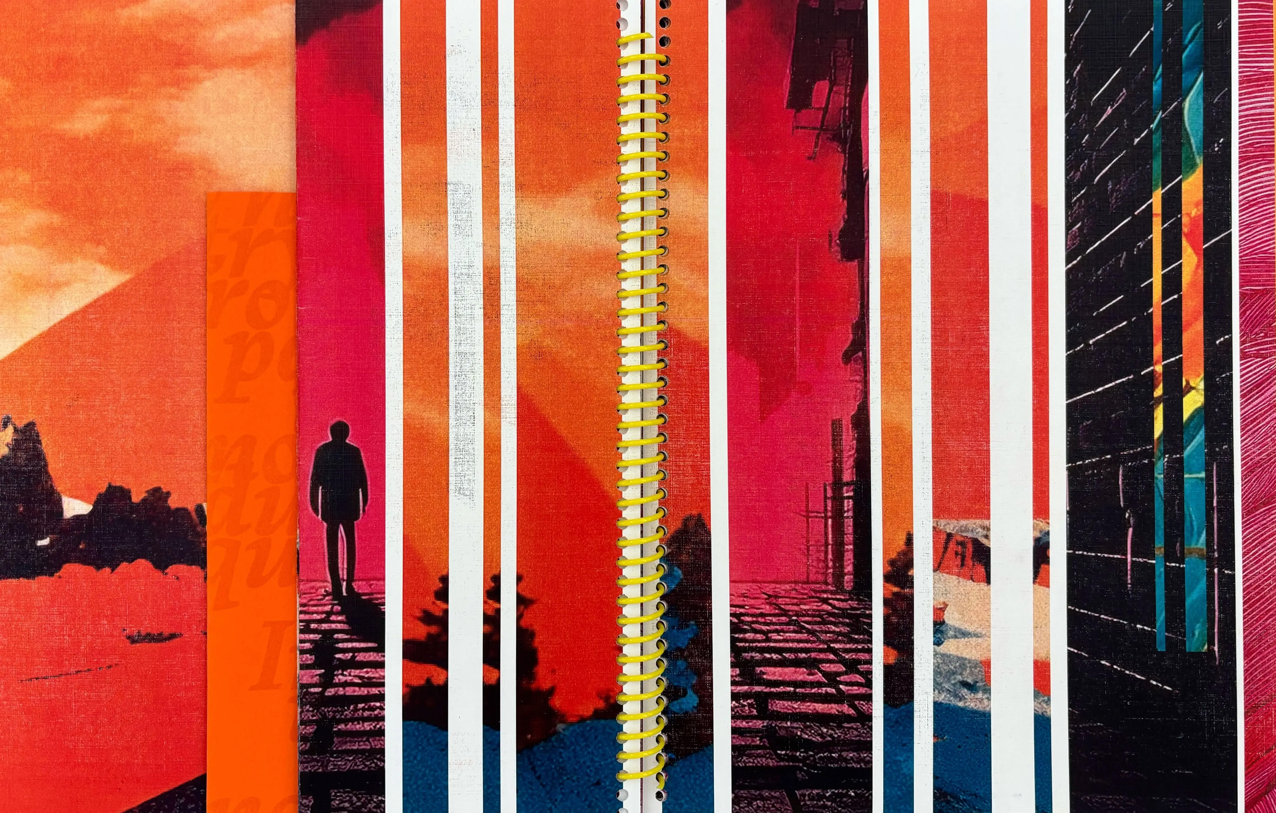
This project began as a co-design experiment with AI, framed as a personal dialogue exploring growth, influences, and creative identity. Early struggles with overly familiar visual outputs led to a shift in mindset—treating the process as playful exploration rather than a fixed deliverable. This opened the door to bolder prompts, blended analog-digital workflows, and more varied visual styles. The final outcome, a spiral-bound book, uses color, pacing, and cinematic sequencing to tell a story of shifting perspectives and renewed creative freedom.
READ Andi’s FULL BLOG POST
Student Name:
Erica Pritchett
Project Title:
ai && ep
Erica Pritchett
Project Title:
ai && ep
Project Description:
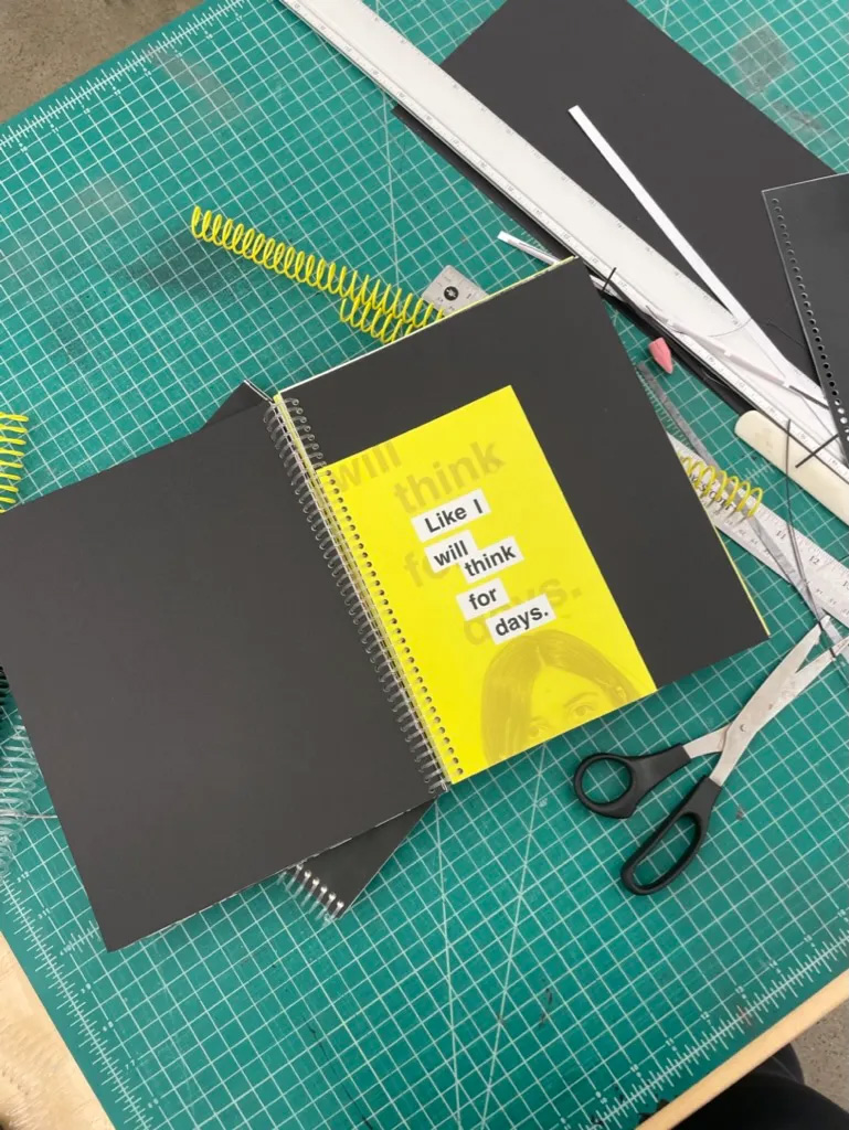
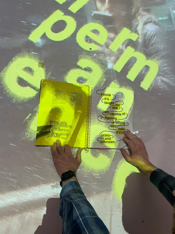
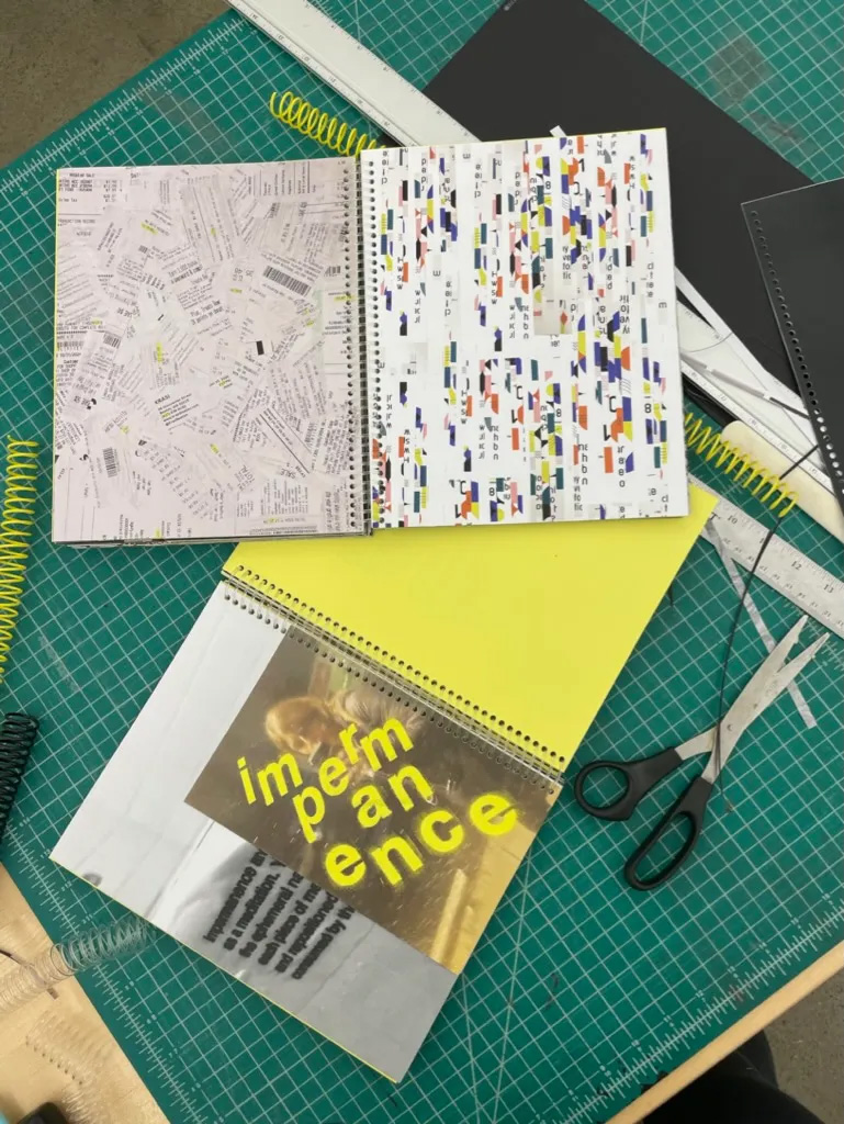
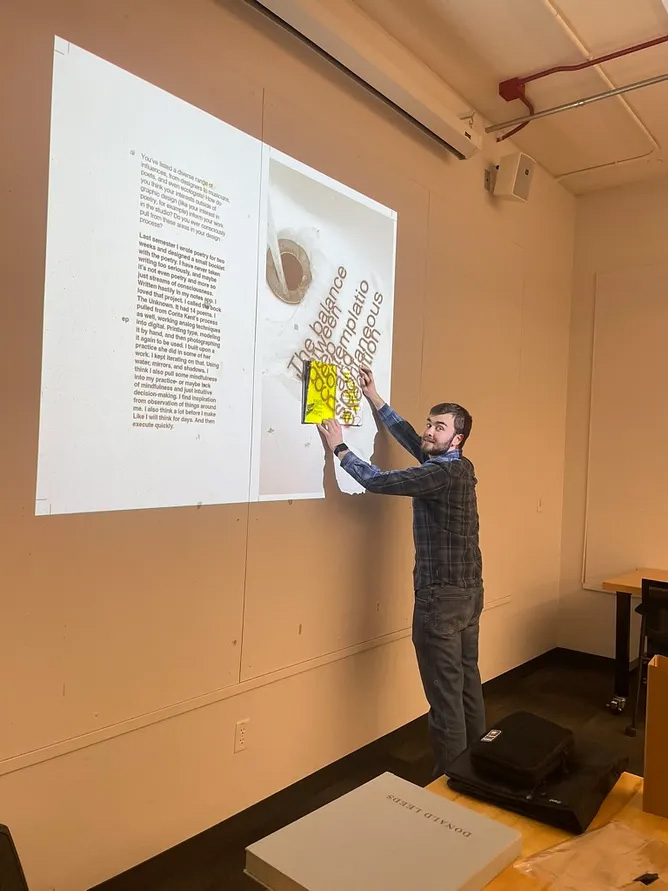
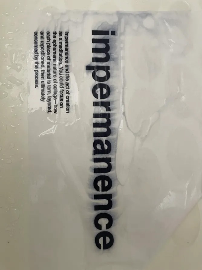
This project explored the intersection of AI, impermanence, and recursion through a blend of analog and digital experimentation. Starting with an interview with ChatGPT, key themes emerged and were deconstructed through printing, water-based distortion, and collage. The process evolved into recursive image-making, using Adobe Firefly to reinterpret previous work, then projecting book spreads onto physical objects to create layered, interactive visuals. The final outcome—a French-fold artist book—captures the cyclical nature of change while highlighting the tension between human intuition and machine-generated output.
READ Erica’s FULL BLOG POST

Student Name:
Erica Pritchett
Project Title:
Six Hundred Twenty Blueberries
Erica Pritchett
Project Title:
Six Hundred Twenty Blueberries
Project Description:
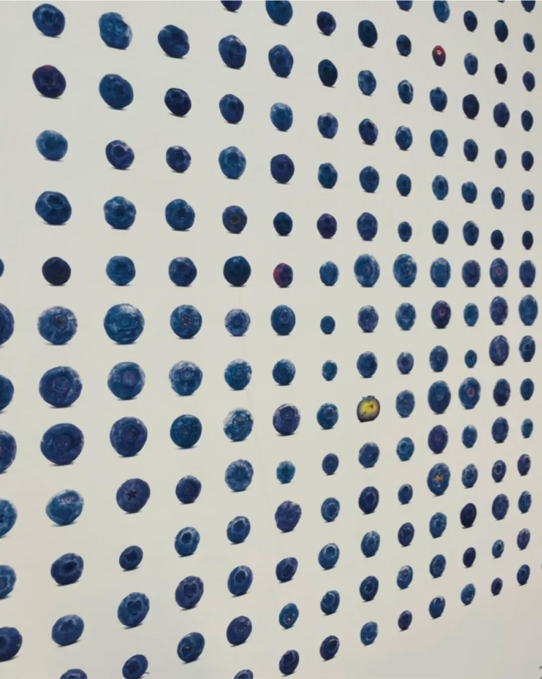
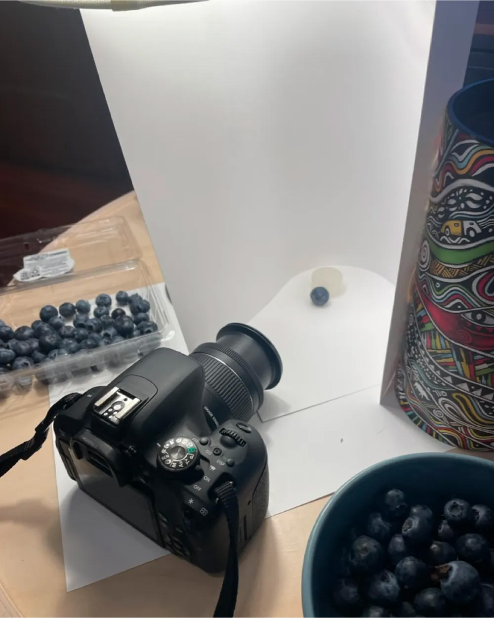
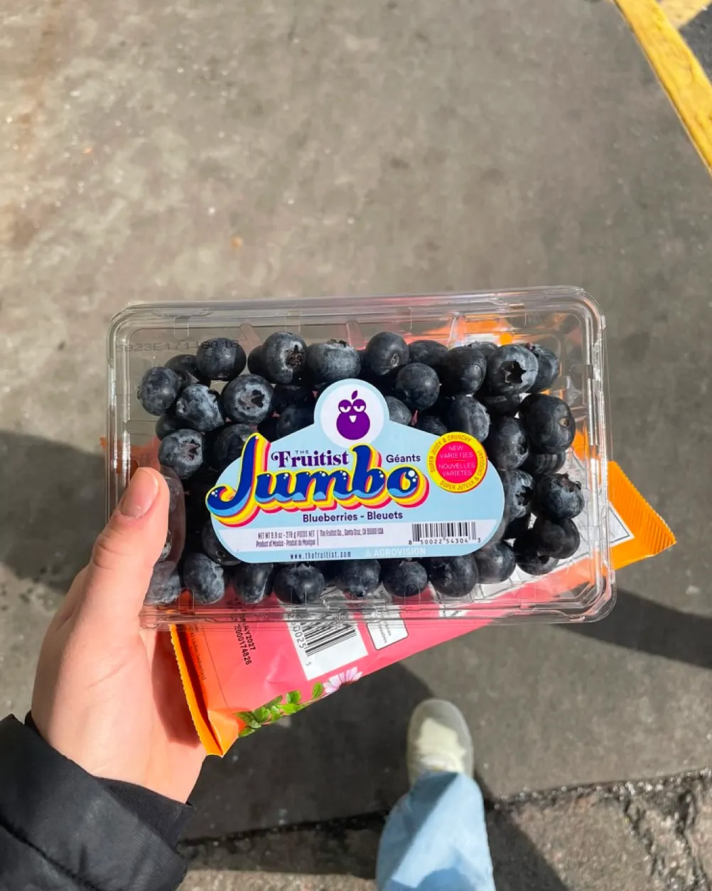
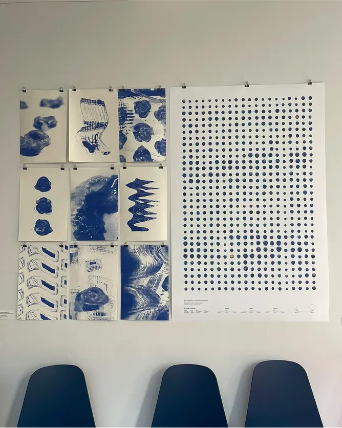
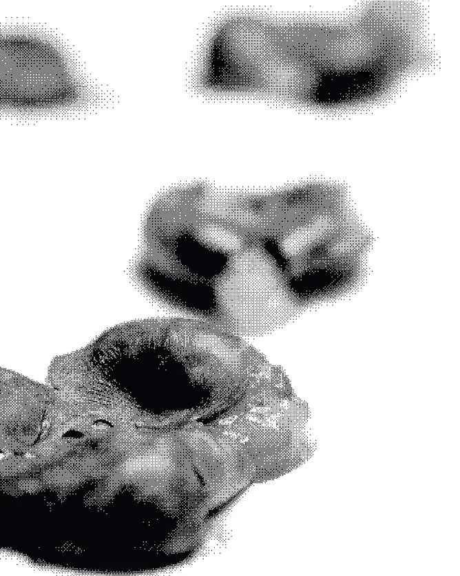
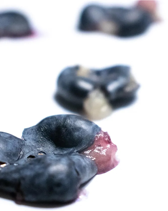
What began as a hyper-fixation on blueberries turned into a meticulous visual and sensory study of over 600 individual berries. Sourced from five different stores on the same day, each blueberry was photographed in a controlled setup, taste-tested, ranked, and plotted into a life-size 30" × 50" poster grid — complete with a few “easter egg” berries that break the uniformity. A second phase translated the study into nine expressive RISO prints, layering bitmapped berry images with scanned packaging and receipts to merge data, process, and play.
READ Erica’s FULL BLOG POST
Student Name:
Zhiyu Huang
Project Title:
Goods Collection
Zhiyu Huang
Project Title:
Goods Collection
Project Description:
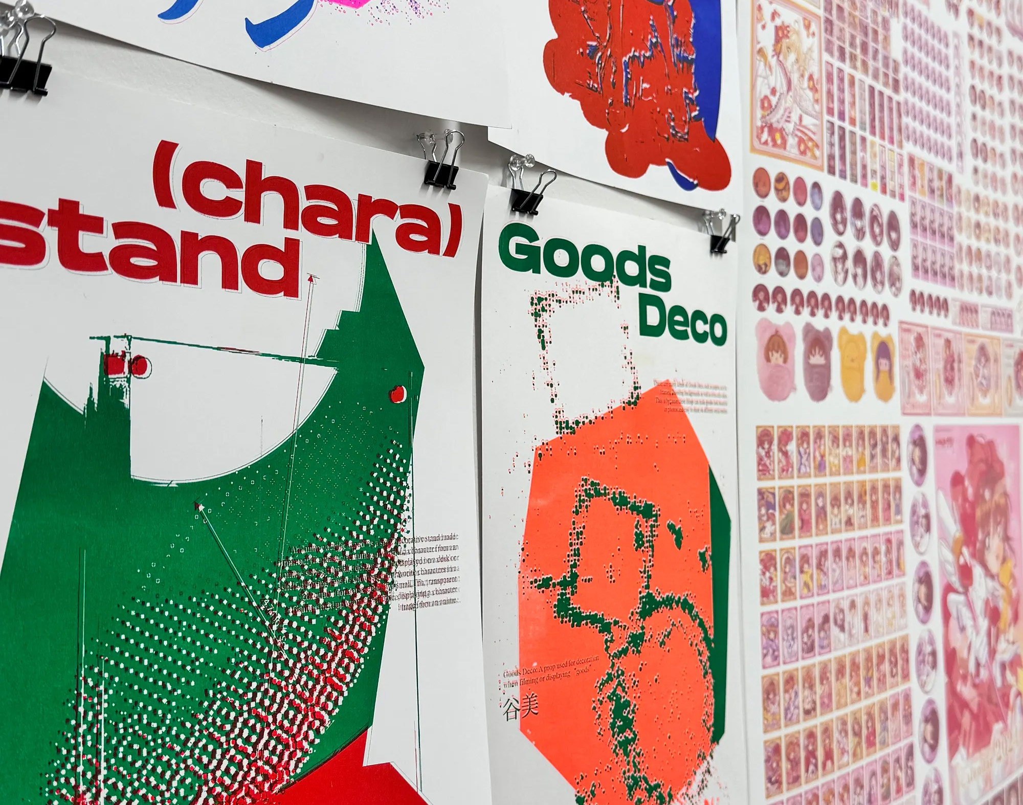
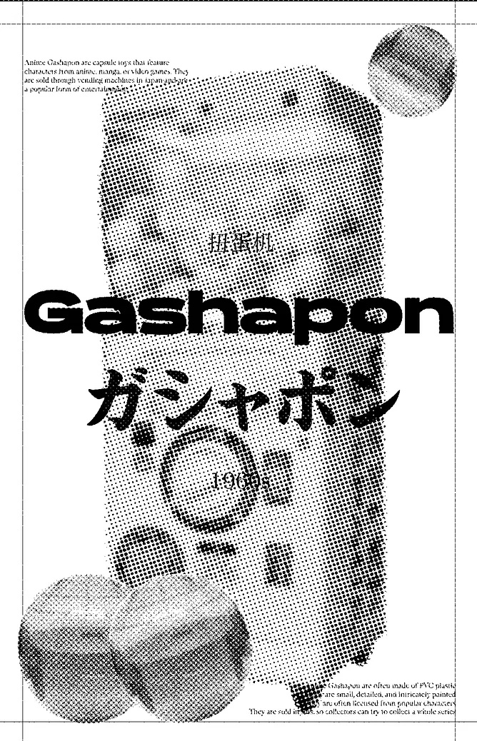
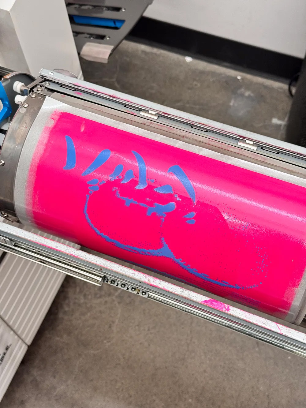
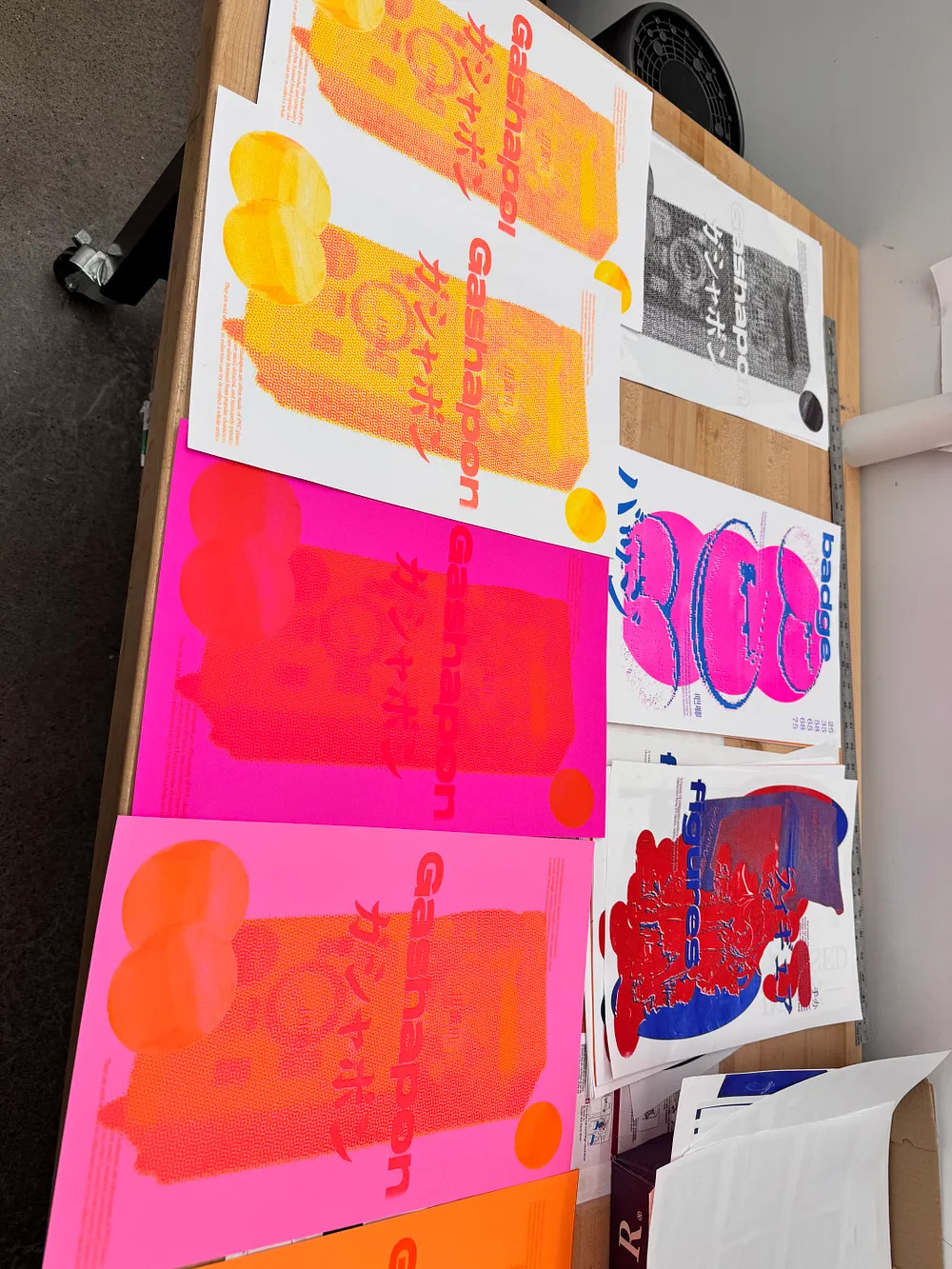
Drawing from a lifelong passion for anime, this project documents and visualizes a personal collection of merchandise—ranging from badges and figures to gashapon and acrylic stands. Nine categories were represented through a riso-printed poster series, each designed with consistent grids, multilingual titles, and detailed descriptions. The work culminated in a large-format poster and data chart mapping 40% of the collection, balancing visual unity with the diversity of beloved IPs like Cardcaptor Sakura, Code Geass, and Neon Genesis Evangelion.
READ Zhiyu’s FULL BLOG POST
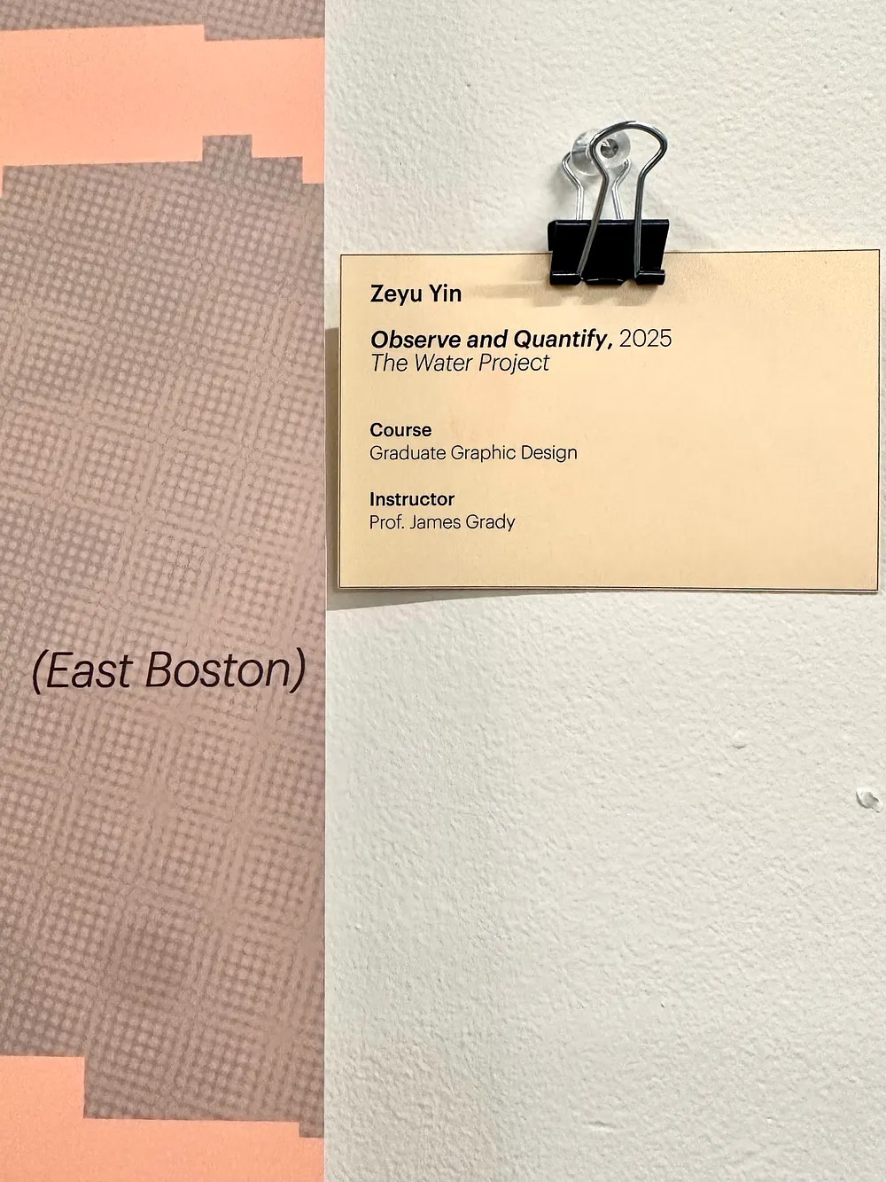
Student Name:
Zeyu Yin
Project Title:
Appreciation of the Fluidity
Zeyu Yin
Project Title:
Appreciation of the Fluidity
Project Description:
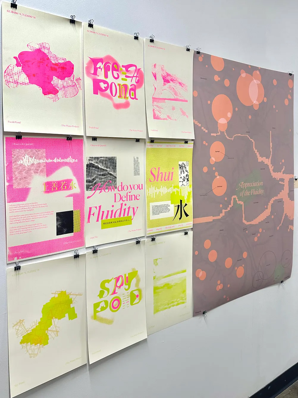
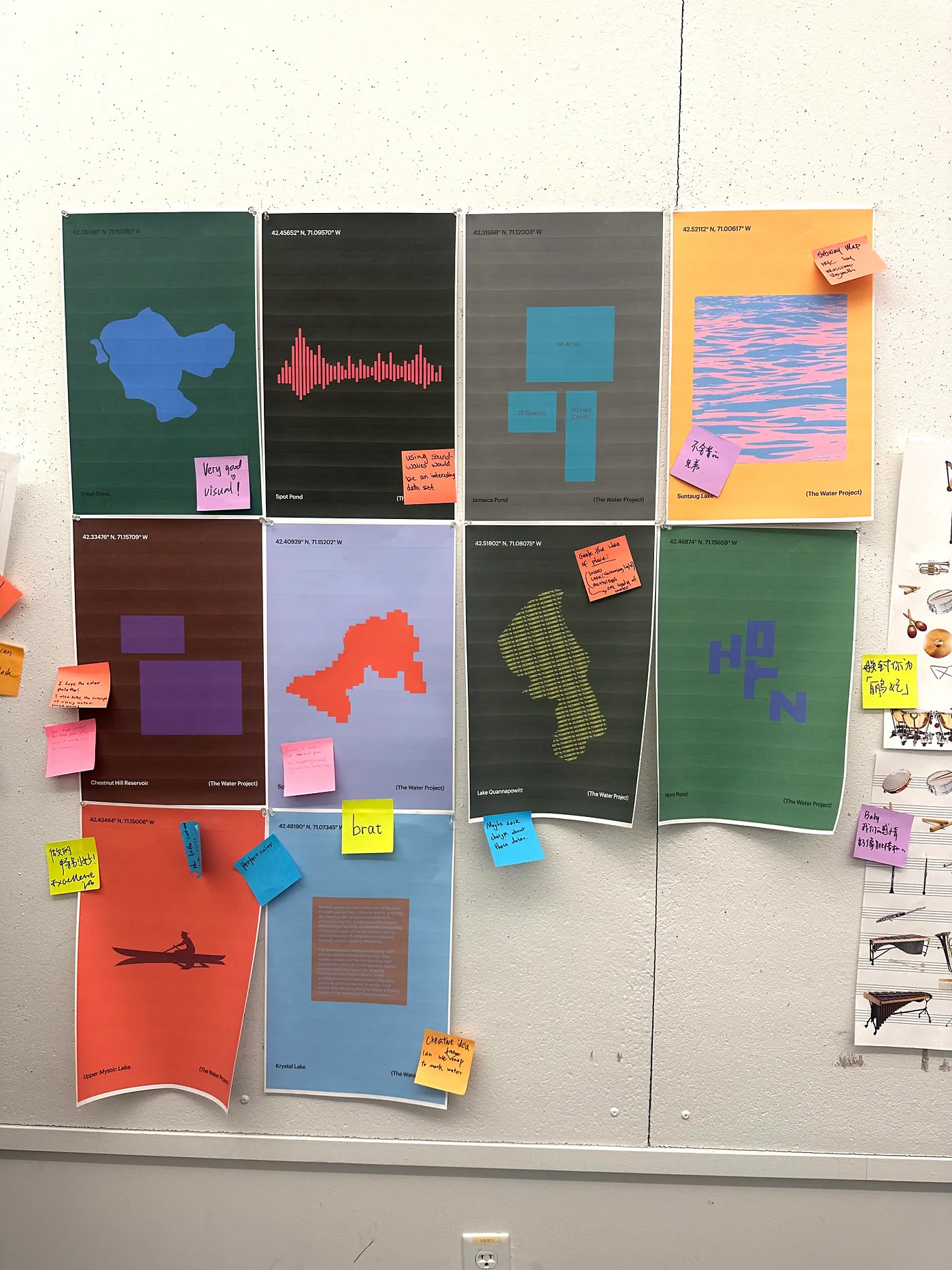
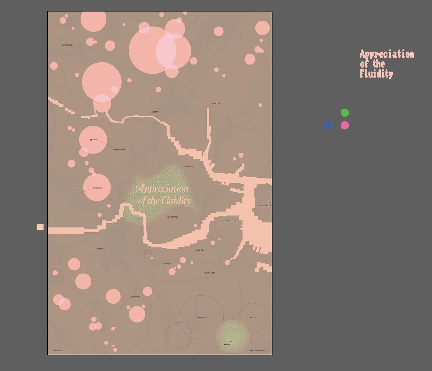
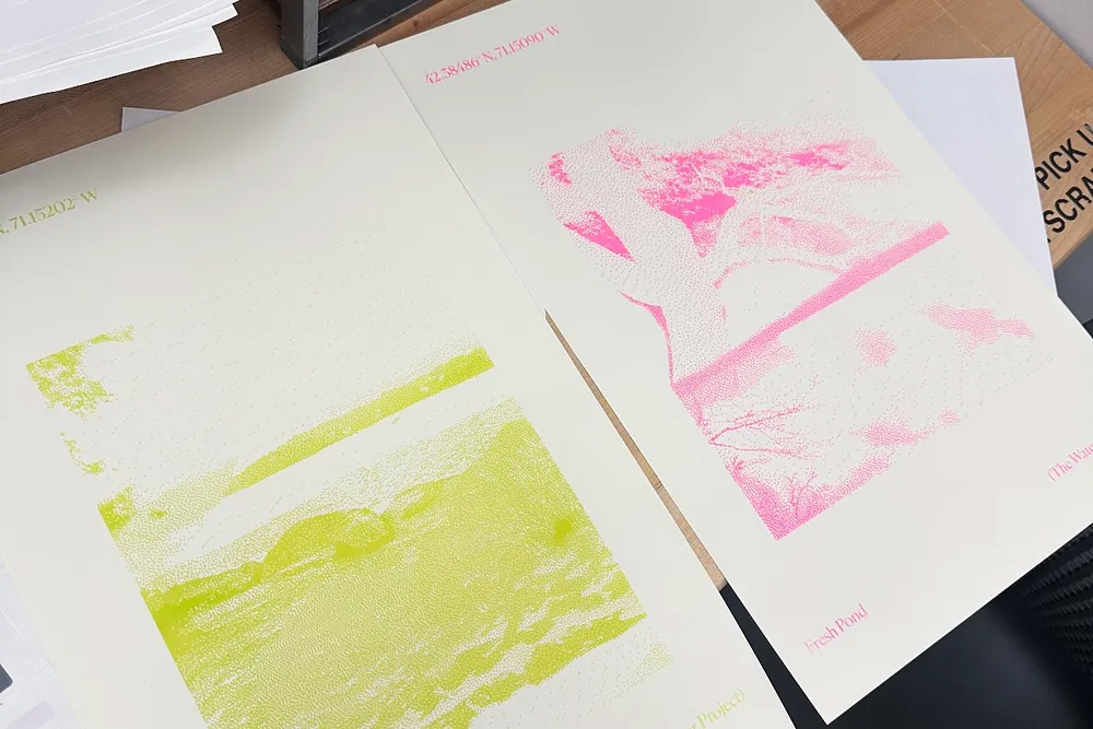
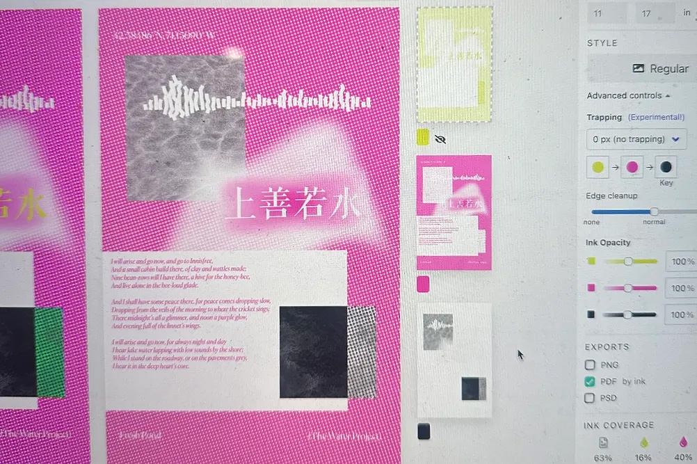
This project blends data visualization, typography, photography, and cultural references to explore water as both a physical and poetic force. Focusing on Boston’s ponds and waterways, the work uses RISO printing to interpret each body of water through geographic contours, type treatments, and layered photographs, alongside a large-format poster mapping all major water bodies in the city. Additional prints draw from Chinese ink painting and Daoist concepts of fluidity, creating a dialogue between scientific precision and cultural storytelling.
READ Zeyu’s FULL BLOG POST
Student Name:
Colin Ladd & Nickola Getchevski
Project Title:
The Iron Giant
Colin Ladd & Nickola Getchevski
Project Title:
The Iron Giant
Project Description:
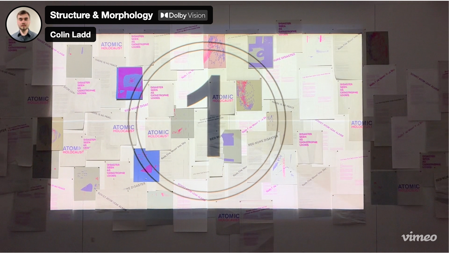
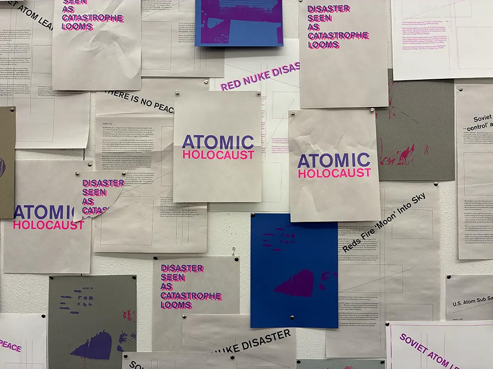
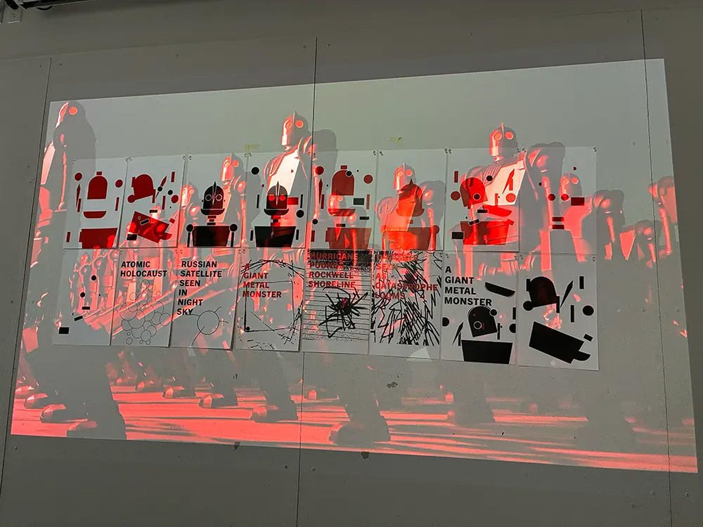
Collaborating with Nickola Getchevski, this project reinterprets The Iron Giant through the lens of Cold War–era fear, nuclear panic, and political paranoia. While Nickola focused on 3D modeling and animation, I developed type and image inspired by wartime flyers, abstracted “fear” drawings, and risograph prints that evoke rapid, urgent production. The final installation combined motion, print, and interactive elements, inviting viewers to navigate an atmosphere of suspicion and catastrophe.
READ Colin’s FULL BLOG POST

Student Name:
Christin Kim & Andi Z.
Project Title:
Dune
Christin Kim & Andi Z.
Project Title:
Dune
Project Description:
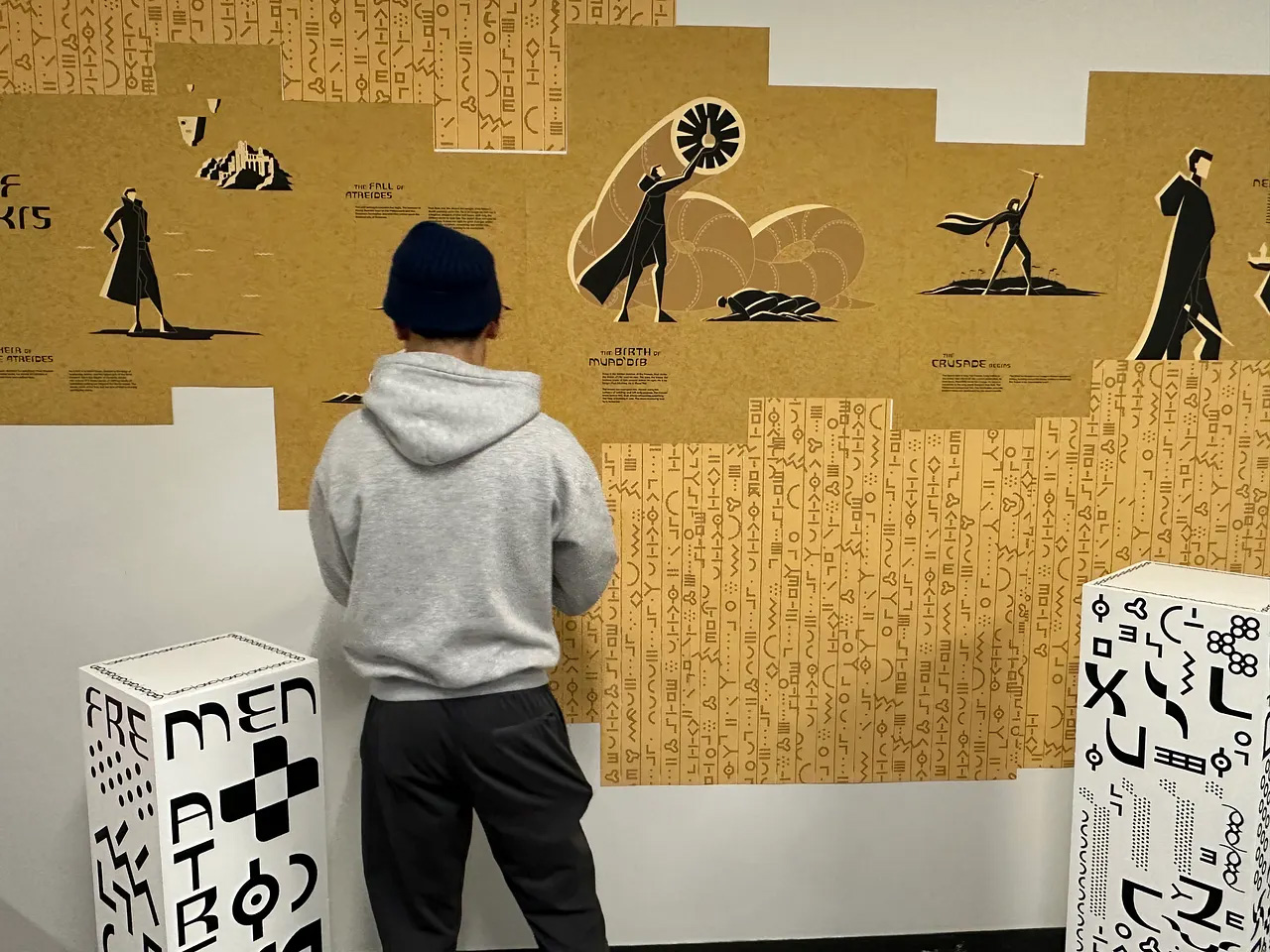
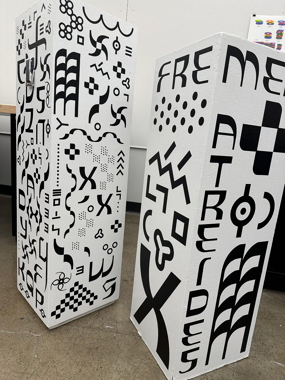
In collaboration with Andi, this project transformed 3D morphological studies into a mini exhibition inspired by the world-building of Dune. Two restored pedestals, an imperial scroll printed with a custom typeface, and a hand-painted foam dagger formed the centerpiece, blending Andi’s illustrations with my type design and symbolic glyph system. The space was crafted to feel like an artifact display from another time—merging architectural precision, cinematic influence, and detailed handcraft. From vinyl cutting and coffee-stained scrolls to painted pedestals and carved props, every element was designed to immerse viewers in a unified narrative environment.
READ Christin’s FULL BLOG POST
Student Name:
Helen, Ruijie, & Luna
Project Title:
Aburaya
Helen, Ruijie, & Luna
Project Title:
Aburaya
Project Description:
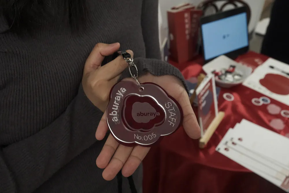
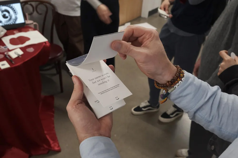
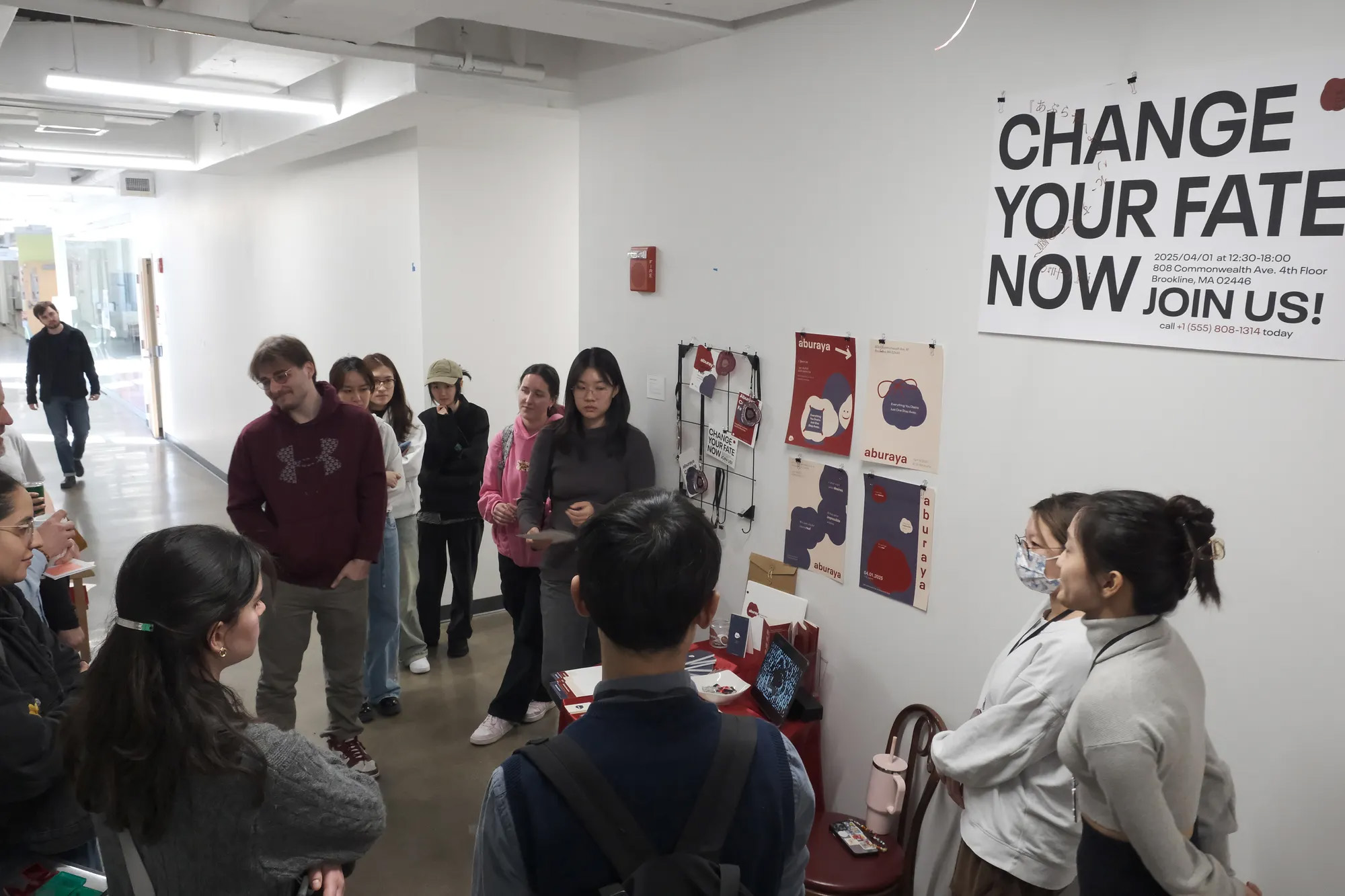
Collaborating with classmates Helen and Ruijie, this project reimagines Spirited Away through the lens of narrative structure and cultural critique. Focusing on the Aburaya bathhouse as a metaphor for desire and sacrifice, the team built a complete brand system for a fictional company that “fulfills human desires at a cost.” The package included a logo, type system, printed collateral, motion graphics, and an immersive “career fair” installation. The process required unifying three design styles, overcoming color consistency issues, and expanding deliverables to create a fully realized world.
READ Luna’s FULL BLOG POST
Student Name:
Yuhan Zhou
Project Title:
Intertwine
Yuhan Zhou
Project Title:
Intertwine
Project Description:
This experimental video uses TouchDesigner’s Blob Tracking technology to visualize the exchange of energy between human hands and plants. By blending new media art with body perception, the work transforms technology into an extension of the body—co-creating alongside nature in a hybrid ecology. Dreamcore-inspired visuals and dynamic audio-visual feedback immerse viewers in a transitional space between the organic and the virtual, revealing how touch, movement, and emotion intertwine in both physical and digital realms.
READ Yuhan’s FULL BLOG POST
Student Name:
Madison Hoppler
Project Title:
How Computers See: Random Actor
Madison Hoppler
Project Title:
How Computers See: Random Actor
Project Description:
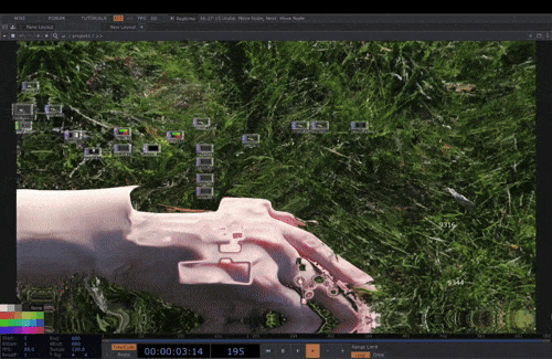
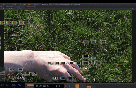
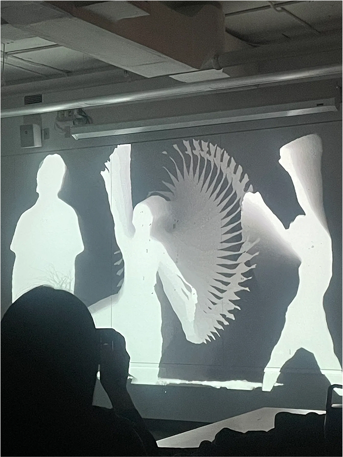
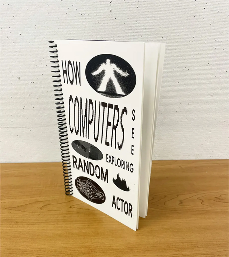
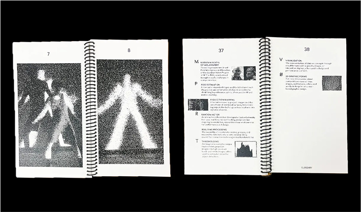
This book documents a collaborative workshop between BU Graphic Design and Theater students using Random Actor, a tool that translates human movement into real-time digital visuals. As a designer rooted in print, I explored how dance, technology, and design intersect—capturing dancers’ gestures both as frozen photographic compositions and as dynamic, screen-based forms. Interwoven with historical context on computer vision and an interview on Random Actor’s role in Boston’s creative community, the book mirrors the workshop’s transformation of physical motion into immersive, digital expression.
READ Madison’s FULL BLOG POST

Student Name:
Erica Pritchett
Project Title:
Two Times
Erica Pritchett
Project Title:
Two Times
Project Description:
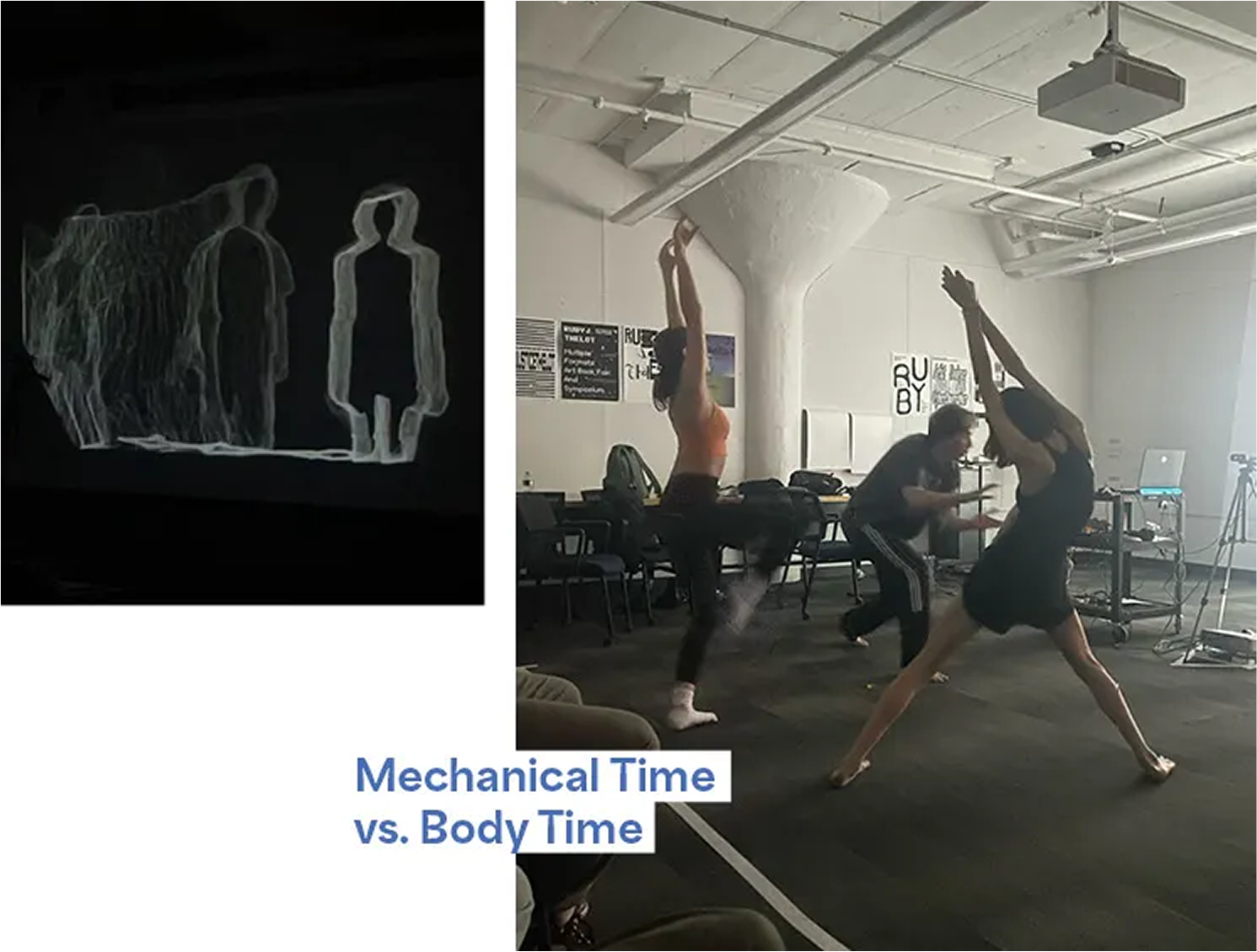
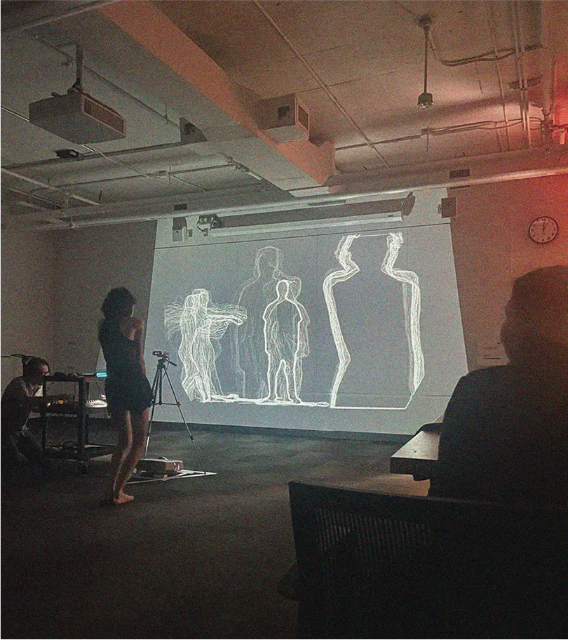
Inspired by a Random Actor workshop where dancers’ movements were translated into abstract visuals, this project bridges structured systems and spontaneous motion. Drawing from an excerpt of Einstein’s Dreams on “mechanical time” versus “body time,” I experimented with laser-cut acrylic letters, stop-motion, tracing, and layered animation to evoke the pendular oscillations seen in the workshop. The resulting video blends typography, motion, and abstraction, capturing the tension—and harmony—between precision and instinct.
READ Erica’s FULL BLOG POST

Student Name:
Lucy Ye
Project Title:
A Book Bag
Lucy Ye
Project Title:
A Book Bag
Project Description:
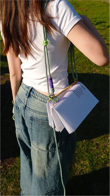
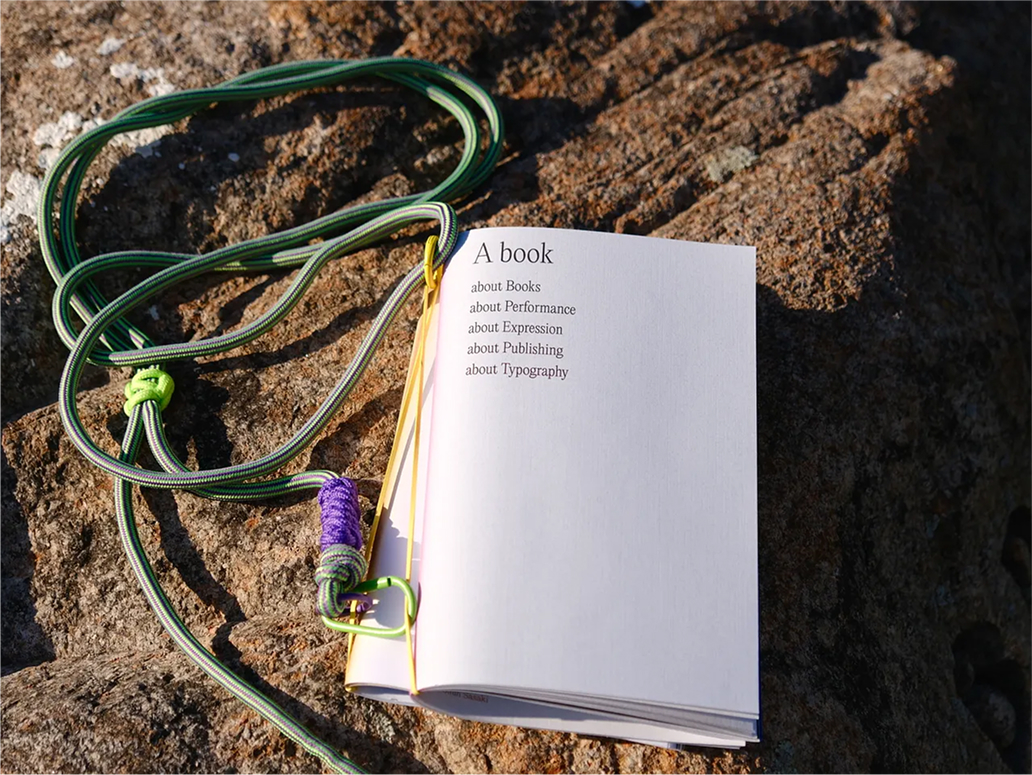
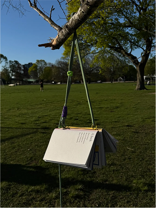
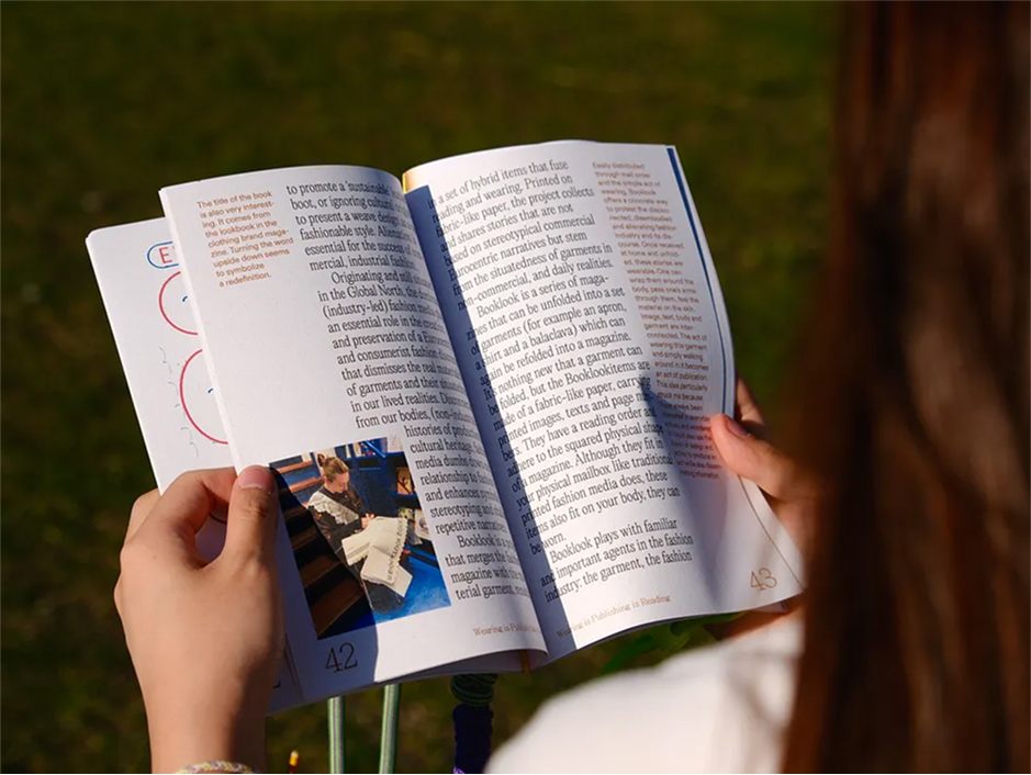
Inspired by the essay Wearing is Publishing is Reading, this project reimagines the book as both a reading experience and a wearable accessory. Designed to fit comfortably in one hand, the book is bound with a simple leather band and equipped with a carrying strap, making it light, portable, and easy to read on the move. By integrating the book into an outfit, it transforms reading into a public, performative act.
READ Lucy’s FULL BLOG POST
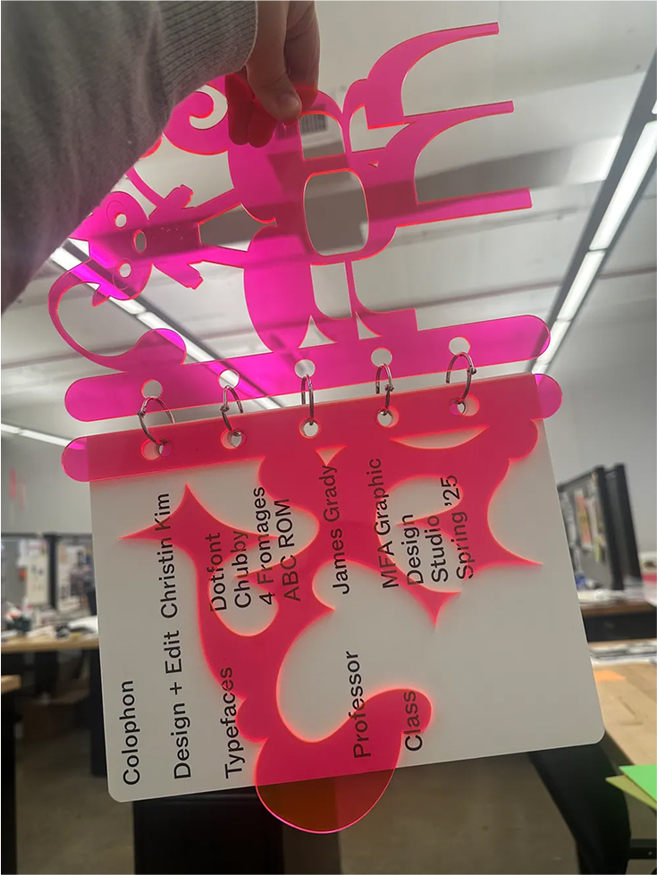
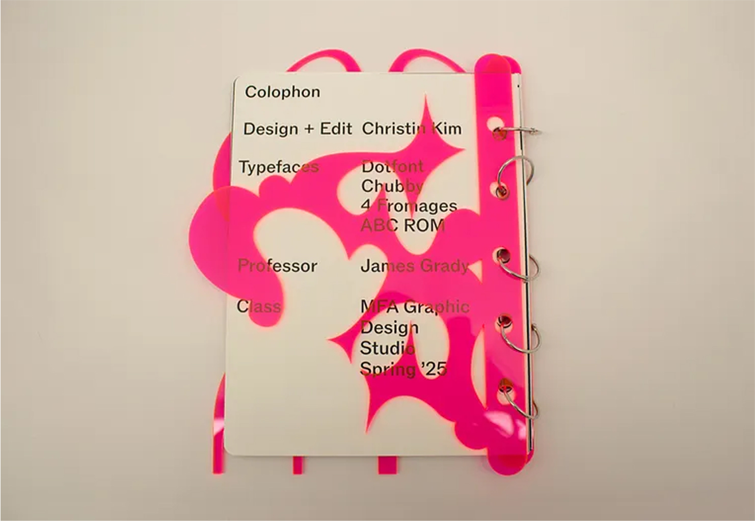
Student Name:
Christin Kim
Project Title:
R&P Volumes 1–3: A Material Experiment in Publishing
Christin Kim
Project Title:
R&P Volumes 1–3: A Material Experiment in Publishing
Project Description:
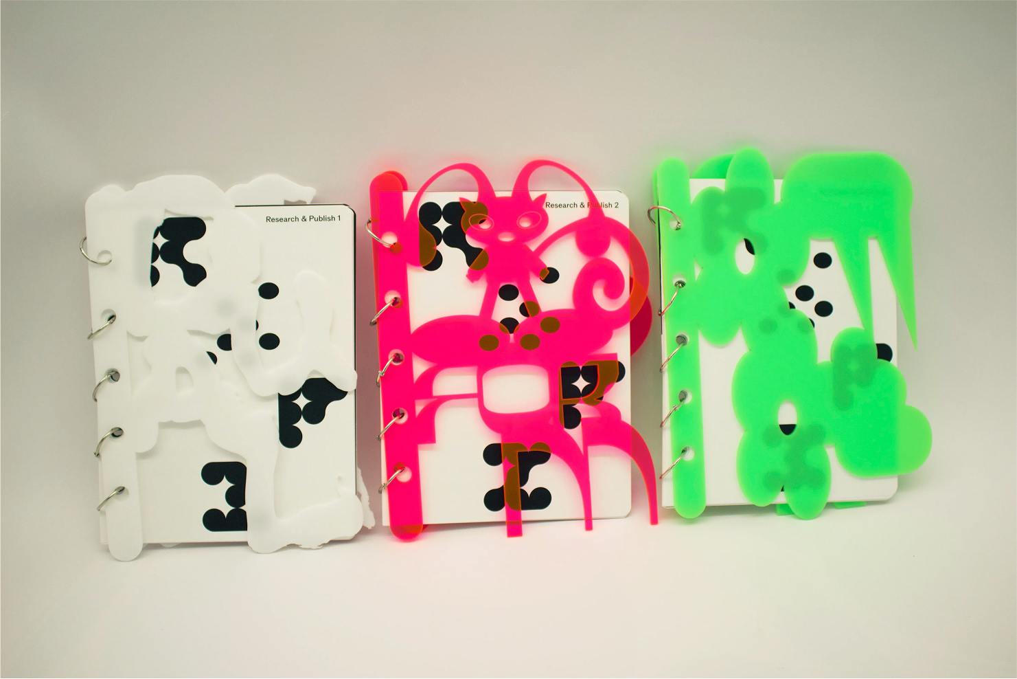
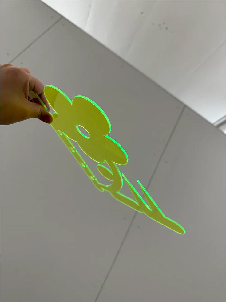
A set of three modular books — part archive, part object — R&P combines laser-cut acrylic covers with printed documentation from a semester’s work. Each oversized, typographic cover acts like a graphic sculpture, while the loose-leaf format allows pages to be added, removed, or rearranged over time. Using custom glyphs and type forms from previous projects, the books bring together typography, material experimentation, and iterative design into a cohesive, tactile whole.
READ Christin’s FULL BLOG POST
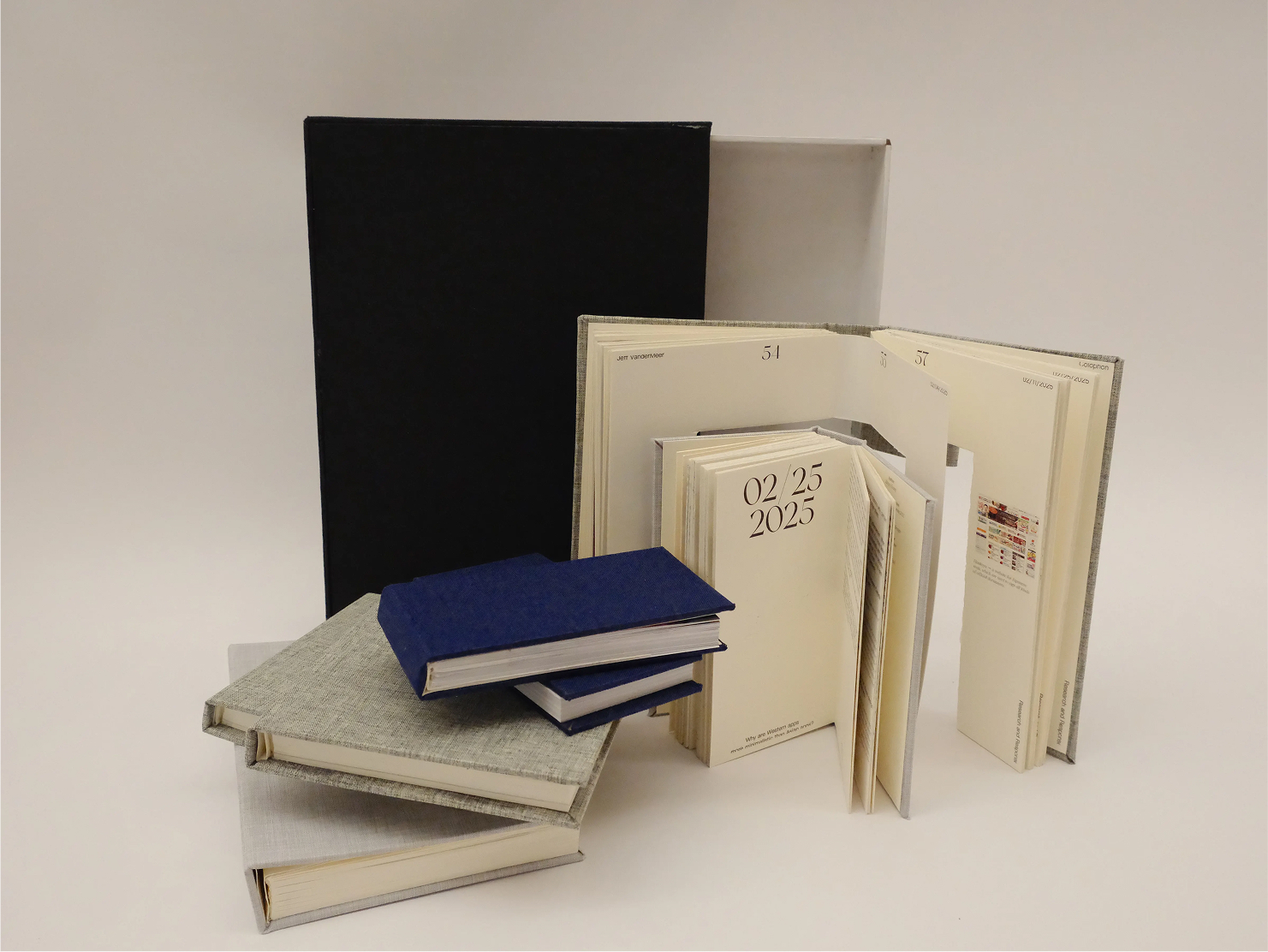
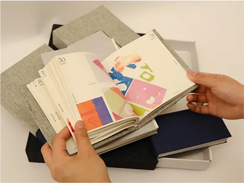
Student Name:
Zhiyu Huang
Project Title:
Frames and Forms
Zhiyu Huang
Project Title:
Frames and Forms
Project Description:
This boxed, multi-section publication compiles a semester’s research, replies, projects, and photography into an adaptable format. Using a mix of boxing and flat binding, the work can be rearranged or separated, allowing readers to create their own connections and meanings. Emerging from a series of “out of the box” design experiments, Frames and Forms explores the possibilities of framing content in ever-changing ways.
READ Zhiyu’s FULL BLOG POST

Student Name:
Xinran Wang
Ruoshui Liu
Project Title:
I am an Alien
*Videography + Poster Design + Book Design + Curation
Xinran Wang
Ruoshui Liu
Project Title:
I am an Alien
*Videography + Poster Design + Book Design + Curation
Project Description:
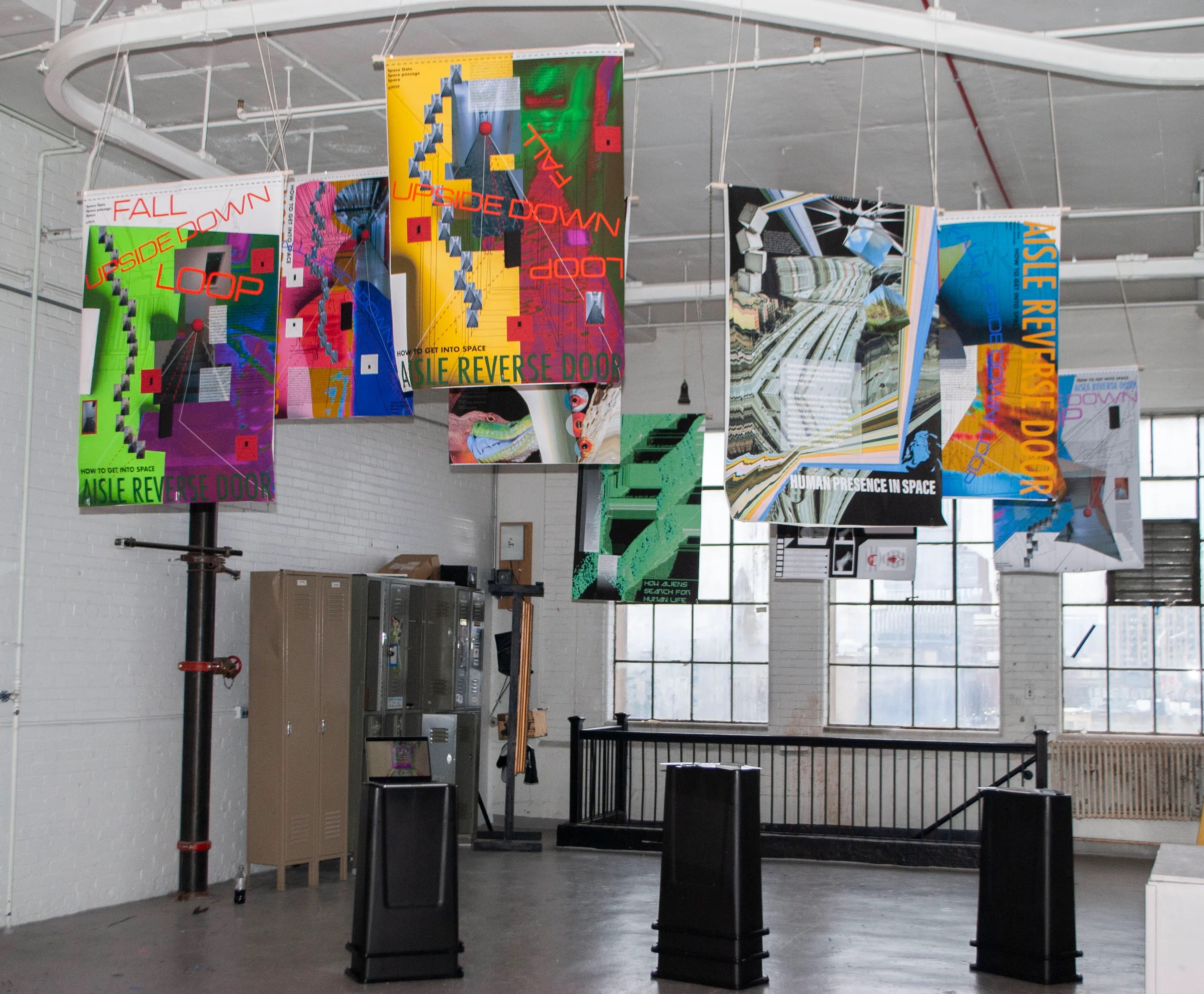
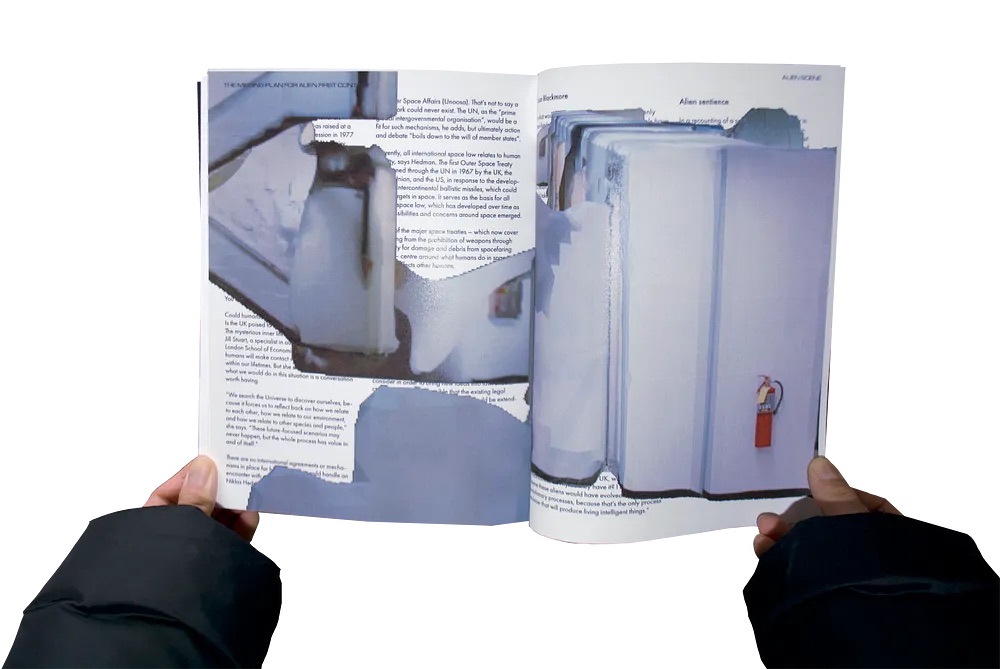
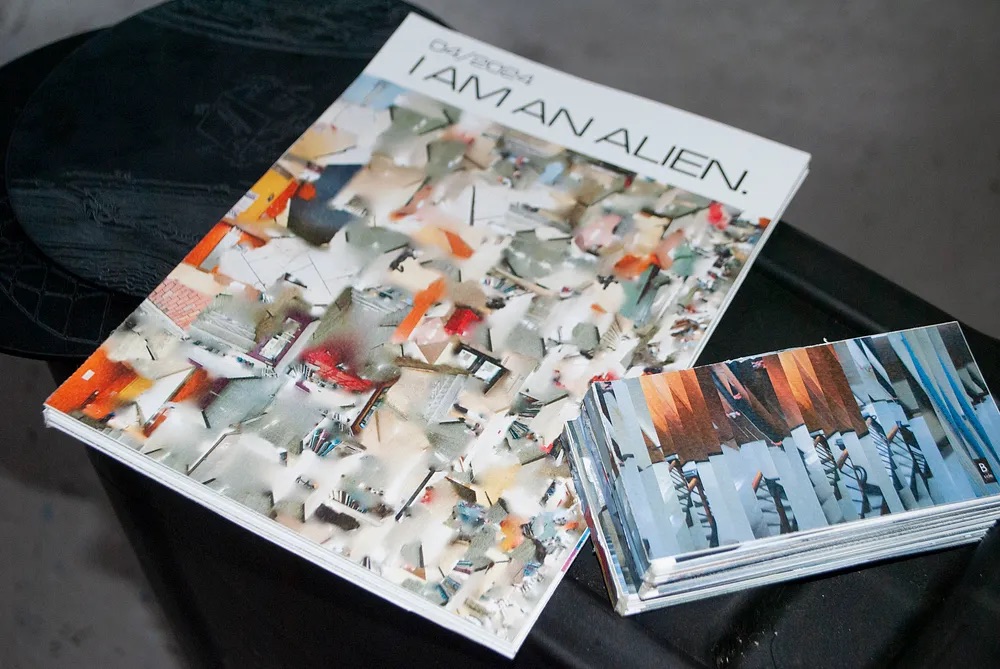
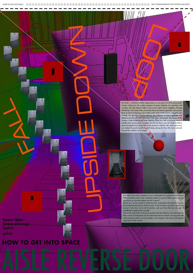
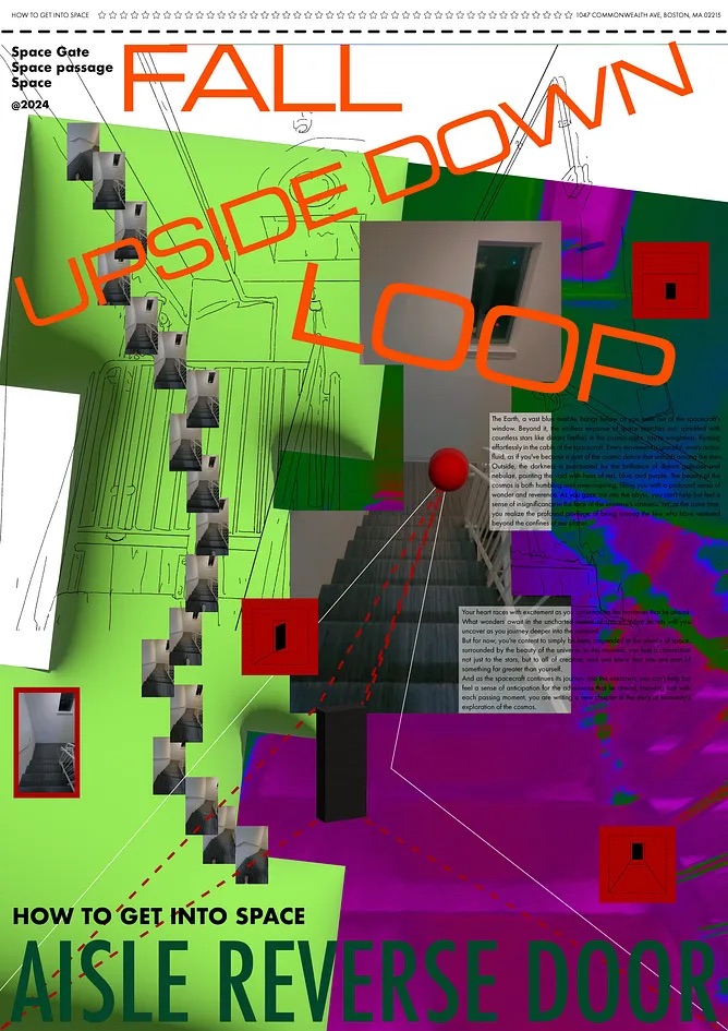
Xinran Wang and Ruoshui Liu's project uses "2001: A Space Odyssey" to explore themes of space, human evolution, and alien life. They created a series of nine posters, viewable from both sides, depicting the journey into space and an alien perspective of Earth.
Xinran used 3D scans of familiar locations to simulate time travel, while Ruoshui added AR-enhanced animations with sound effects. The exhibition includes these posters, interactive 3D models, and publications detailing their concepts and imagining potential alien communications. This project combines visual art and technology to offer a unique look at our place in the universe and the possibilities of extraterrestrial life.
READ Xinran’s FULL BLOG POST
READ Ruoshui’s FULL BLOG POST
Student Name:
Hangi Cho
Wenbin Huang
Project Title:
Time, Space, and Love
Hangi Cho
Wenbin Huang
Project Title:
Time, Space, and Love
Project Description:
Being inspired by the great movie Interstellar, two designers grouped together and delved into the intricate narratives of film through a reinterpretation. Our endeavor is to explore the essence of the story from a unique angle.
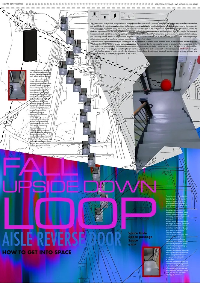
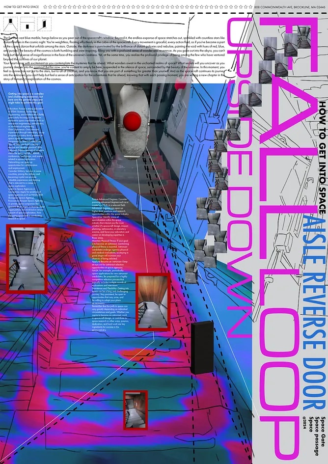
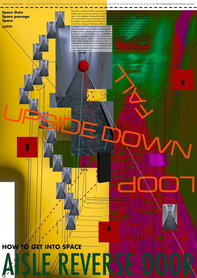
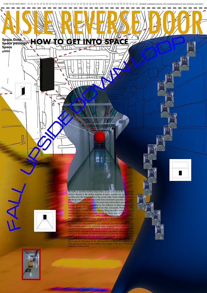
Our primary goal was to reimagine Interstellar, showcasing its themes from a new vantage point. Interstellar, our chosen film, presents a story of technology and human emotion through elements like robots, spaceships, the fifth dimension, the wormhole, family, humanity, time travel, outer space, etc. Then we decided to focus on making the centerpiece of our project, an interactive installation refers to the prototype of the robot TARS as the focal point. Like Cooper, who interacts and interchange messages from TARS, our installation offers an immersive experience where participants communicate with their past selves just like how Cooper communicated with her daughter at a young age. This engaging design could playback the storytelling of Interstellar, transforming it into a hands-on narrative exploration.
READ Hangi’s FULL BLOG POST READ Wenbin’s FULL BLOG POST
Being inspired by the great movie Interstellar, two designers grouped together and delved into the intricate narratives of film through a reinterpretation. Our endeavor is to explore the essence of the story from a unique angle.
Our primary goal was to reimagine Interstellar, showcasing its themes from a new vantage point. Interstellar, our chosen film, presents a story of technology and human emotion through elements like robots, spaceships, the fifth dimension, the wormhole, family, humanity, time travel, outer space, etc. Then we decided to focus on making the centerpiece of our project, an interactive installation refers to the prototype of the robot TARS as the focal point. Like Cooper, who interacts and interchange messages from TARS, our installation offers an immersive experience where participants communicate with their past selves just like how Cooper communicated with her daughter at a young age. This engaging design could playback the storytelling of Interstellar, transforming it into a hands-on narrative exploration.
READ Hangi’s FULL BLOG POST READ Wenbin’s FULL BLOG POST
Student Name:
Niharika Yellamraju
Project Title:
Liminality & Transition
Niharika Yellamraju
Project Title:
Liminality & Transition
Project Description:
Explore Liminality through a convergence of interactive design.
This project asked us to create a visual piece based on a chapter from Einstein’s Dream. It could be a visual representation of the text or can be used as a starting point for something larger. I love science and this was the perfect opportunity to explore a scientific theme that has the potential for a merger between digital and printed outcomes. I knew what I wanted to do as soon as I heard the brief.
I enjoyed the concept of the frantic movement of time and the blurring of materiality very inspiring. It was something my printmaking professor kept bringing up in my elective class. I want to bring the production techniques of that class into my studio projects.
READ THE FULL BLOG POST
Student Name:
Amanda Mundy
Caitlin Lu
Project Title:
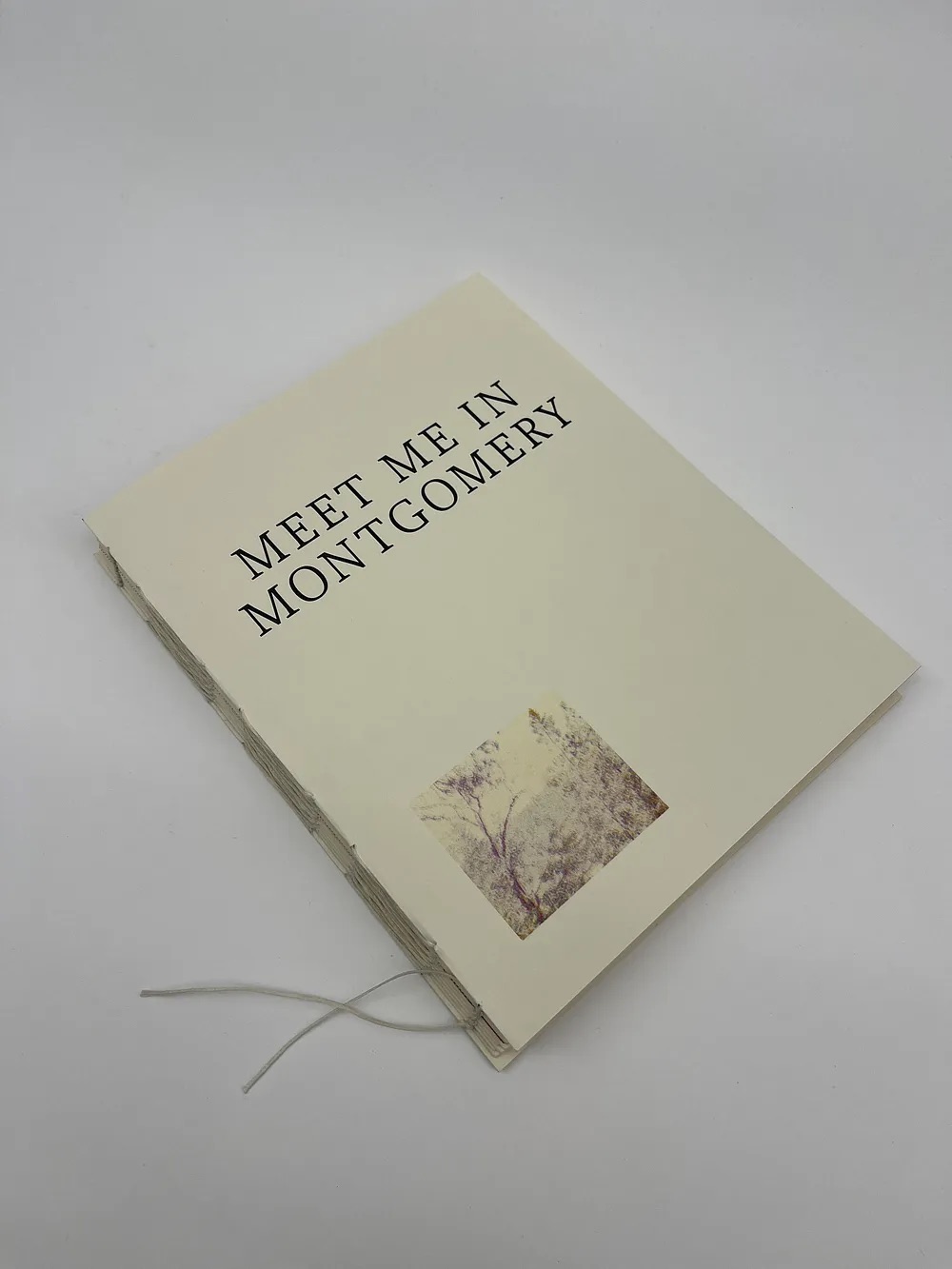
Meet Me In Montgomery
Amanda Mundy
Caitlin Lu
Project Title:
Meet Me In Montgomery
Project Description:
The most beautiful thing about humankind is the shared experience of living among others.
We love. We feel. We hate. We regret. We hope.
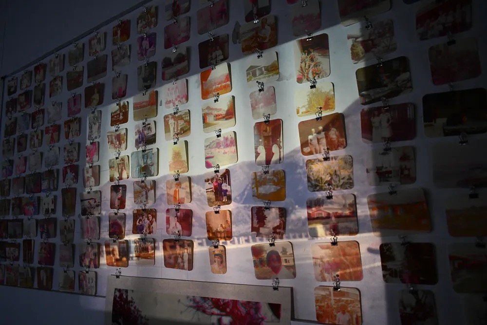
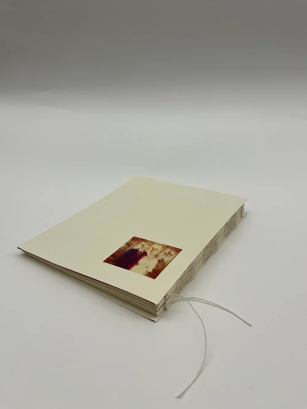
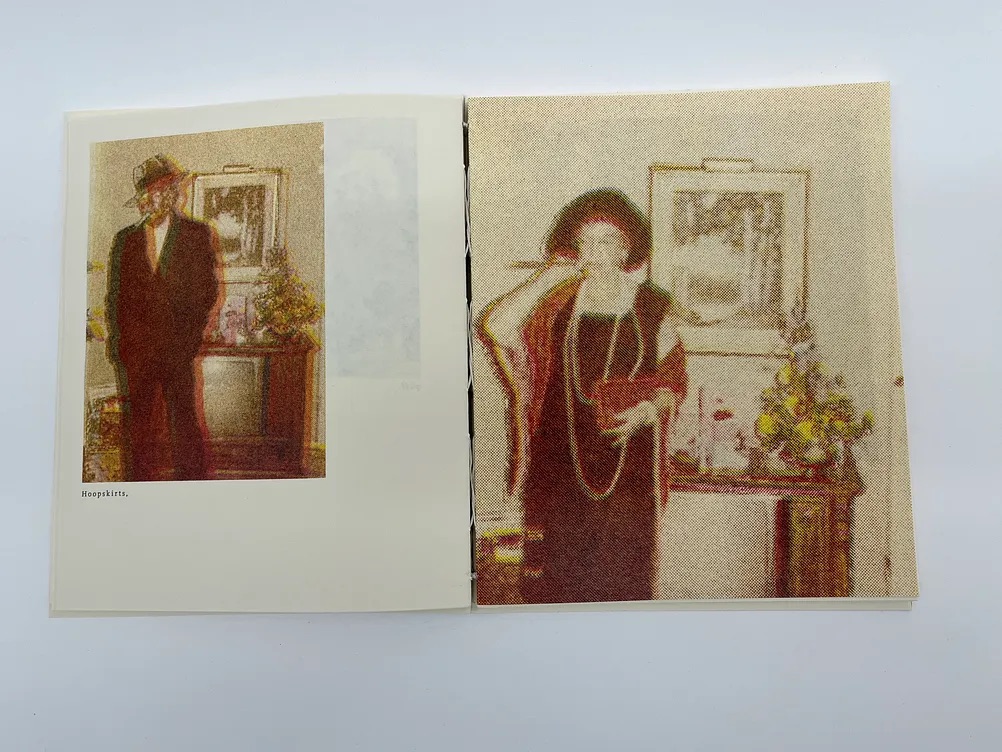
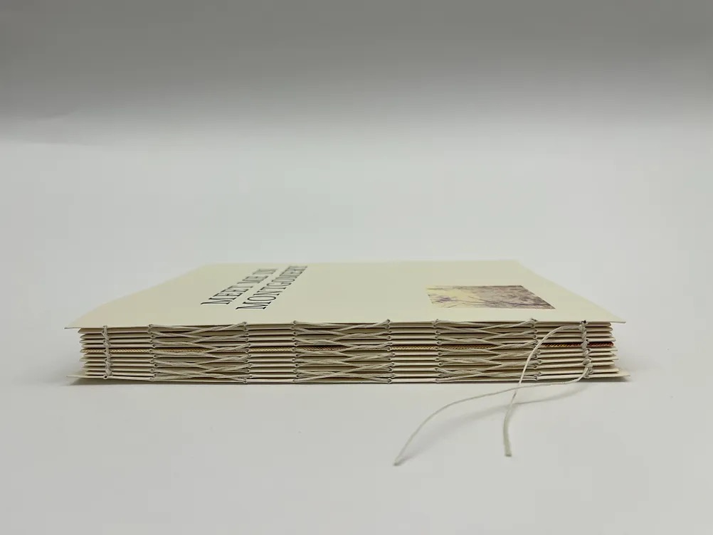
Meet Me in Montgomery, by Caitlin Lu and Amanda Mundy, is a two-part project consisting of an installation and a publication. The work is based on the movie, Eternal Sunshine of the Spotless Mind, which explores a couple who undergo a process to permanently delete memories from their past. This movie expands on theories about the idea of memory and its long-term connections to the emotional aspects and effects on the human body. We felt that it only made sense to highlight the underlying theme from this movie for our project: memory.
For us, the idea of memory felt nostalgic. And we knew that, based on the movie’s plot, we wanted to focus on exploring memories that were distant to us or not even our own. We went to the thrift store in search of nostalgic pieces given away by others and found a stack of old family photos. Altogether, the installation consists of all the photos being hung in a grid pattern, a long poster extending from the wall to the floor, a double layer mesh cloth, a typewriter, slides from another family purchased online, and a slide projector.
READ Amanda’s FULL BLOG POST READ Caitlin’s FULL BLOG POST
The most beautiful thing about humankind is the shared experience of living among others.
We love. We feel. We hate. We regret. We hope.
Meet Me in Montgomery, by Caitlin Lu and Amanda Mundy, is a two-part project consisting of an installation and a publication. The work is based on the movie, Eternal Sunshine of the Spotless Mind, which explores a couple who undergo a process to permanently delete memories from their past. This movie expands on theories about the idea of memory and its long-term connections to the emotional aspects and effects on the human body. We felt that it only made sense to highlight the underlying theme from this movie for our project: memory.
For us, the idea of memory felt nostalgic. And we knew that, based on the movie’s plot, we wanted to focus on exploring memories that were distant to us or not even our own. We went to the thrift store in search of nostalgic pieces given away by others and found a stack of old family photos. Altogether, the installation consists of all the photos being hung in a grid pattern, a long poster extending from the wall to the floor, a double layer mesh cloth, a typewriter, slides from another family purchased online, and a slide projector.
READ Amanda’s FULL BLOG POST READ Caitlin’s FULL BLOG POST
Student Name:
Maidah Salman
Project Title:
Research and Publish
Maidah Salman
Project Title:
Research and Publish
Project Description:
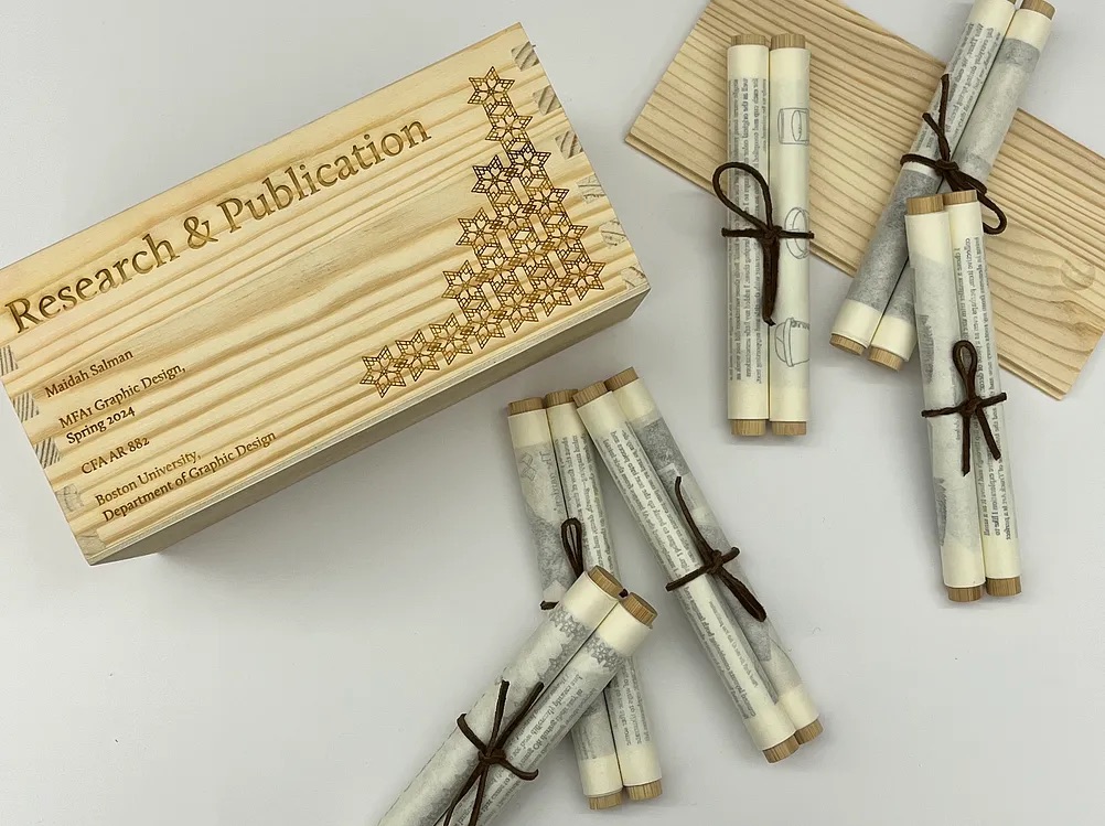
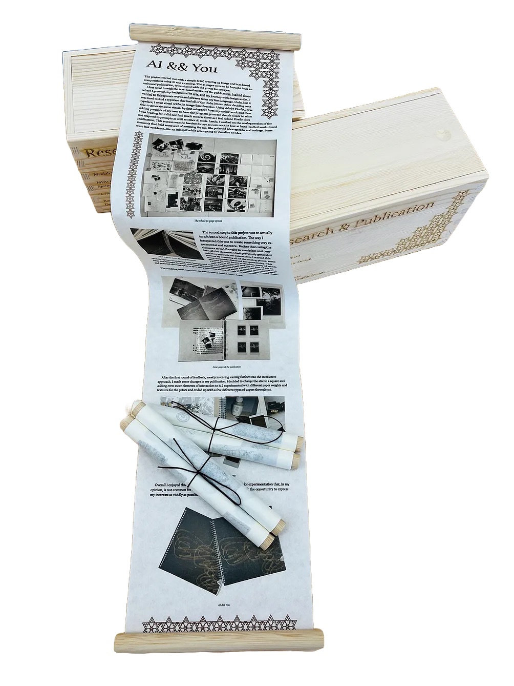
Wrapping up the semester with the last project being Research and Publish gave me a chance to look back at the work I’ve done so far over the semester. As Nick Rock, one of my professors for the next semester, pointed out during my final critique: none of my projects connect aesthetically, and he was quite appreciative about that fact. But the one thing I see common in all of them is experimentation with materiality. From the AI && You publication all the way to Research and Publish, I wanted to make have my work invite interaction and I feel I was able to achieve that quite well with this project too.
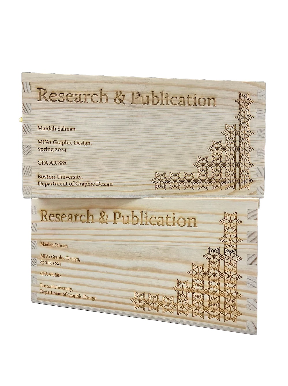
My final publication for the semester comes together as a set of 6 scrolls enclosed in a wooden box which I engraved with a laser cutter. The inspiration for the scrolls comes from South Asia, as it was one of the regions that kept up the use of scrolls for documentation for the longest time in history. I also designed and engraved a pattern on the box that is printed on the scrolls as well, making the entire project feel cohesive.
READ THE FULL BLOG POST
Wrapping up the semester with the last project being Research and Publish gave me a chance to look back at the work I’ve done so far over the semester. As Nick Rock, one of my professors for the next semester, pointed out during my final critique: none of my projects connect aesthetically, and he was quite appreciative about that fact. But the one thing I see common in all of them is experimentation with materiality. From the AI && You publication all the way to Research and Publish, I wanted to make have my work invite interaction and I feel I was able to achieve that quite well with this project too.
My final publication for the semester comes together as a set of 6 scrolls enclosed in a wooden box which I engraved with a laser cutter. The inspiration for the scrolls comes from South Asia, as it was one of the regions that kept up the use of scrolls for documentation for the longest time in history. I also designed and engraved a pattern on the box that is printed on the scrolls as well, making the entire project feel cohesive.
READ THE FULL BLOG POST
Student Names:
Vincent Liu
Project Title:
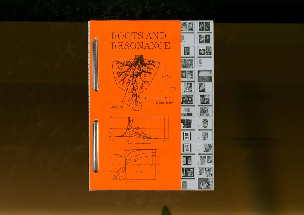
Roots & Resonance
Vincent Liu
Project Title:
Roots & Resonance
Project Description:
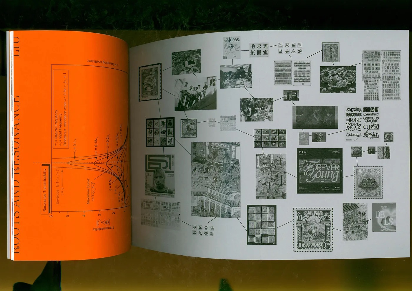
When I thought about thoughts on thesis, I knew that this was an opportunity for me to make something that I’m passionate about and will enjoy. Often times our design projects are centered around audiences that are not us—college students. So I complied a list of thoughts and topics that I had in my sketchbook to start off my brainstorming process. It was vague, but I knew that I wanted to say something about Chinese culture, the student community that builds around the culture and familial connections. It seemed fitting, as Boston University’s Chinese Students Association was a big part of my life outside of classes, and I began noticing more of my design work incorporating Chinese culture/motifs.
READ FULL BLOG POST
Student Names:
Nolan thompson
Dan Galvin
Project Title:
Symptoms of Growth
Nolan thompson
Dan Galvin
Project Title:
Symptoms of Growth
Project Description:
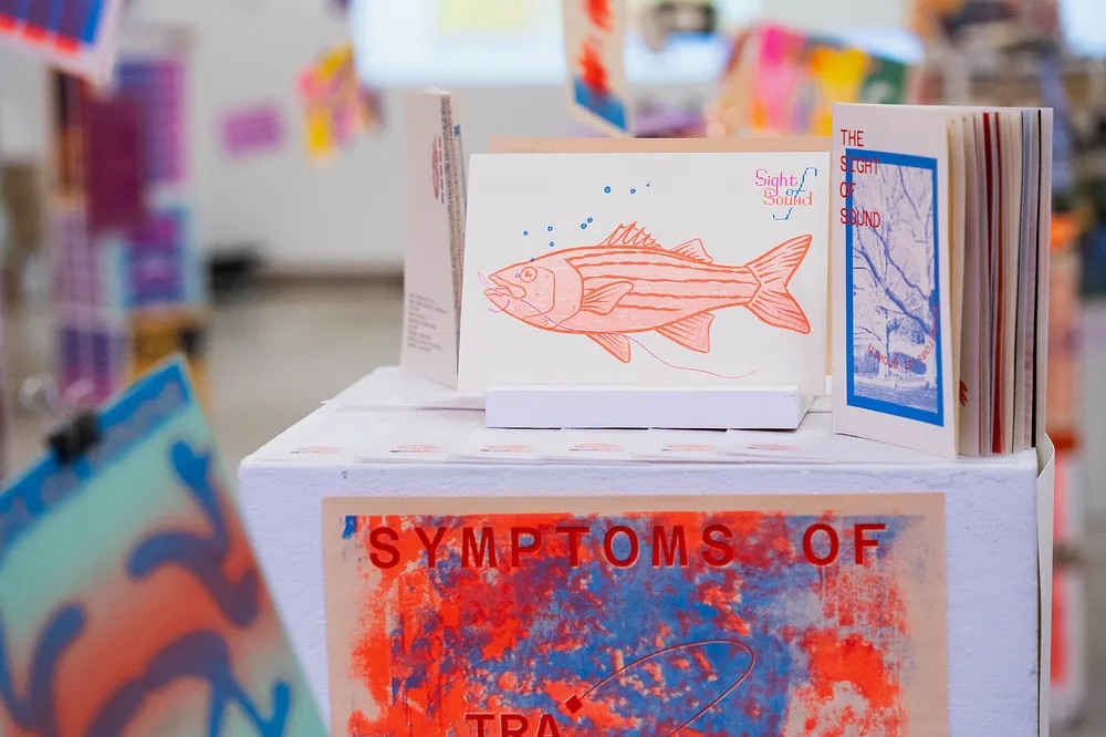
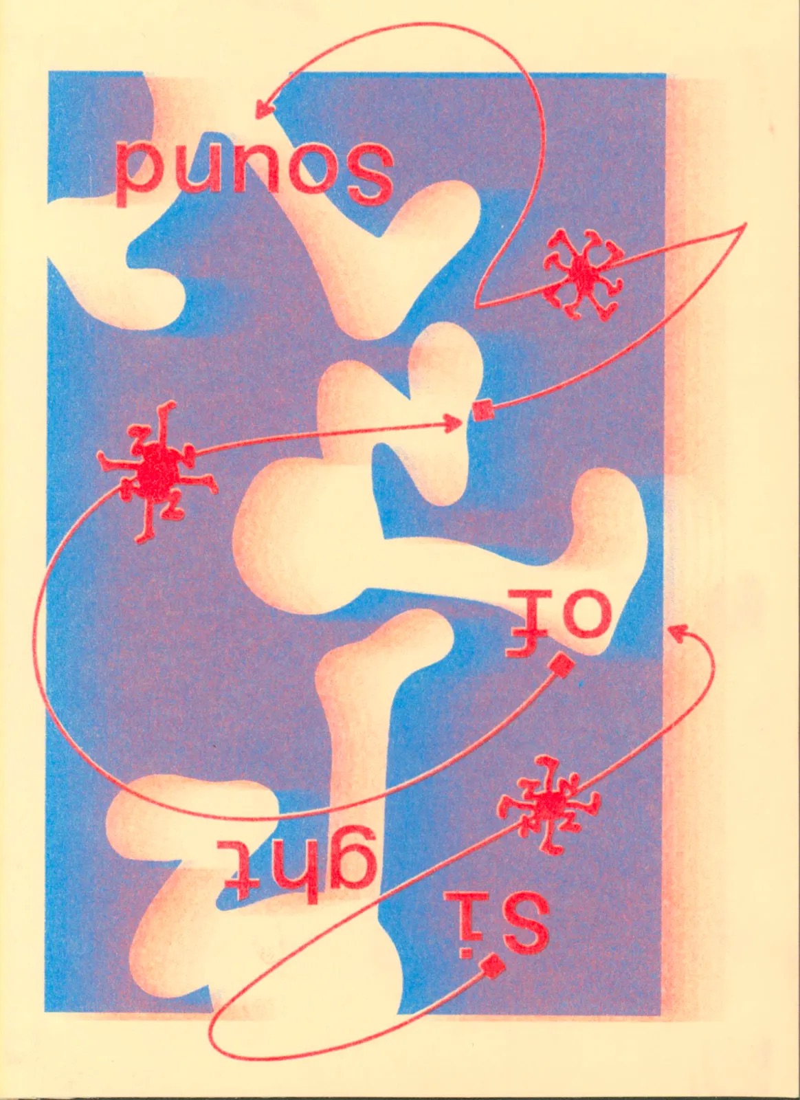
Symptoms of Growth is the title of Dan Galvin and Nolan Thompson’s “Sight of Sound” installation, a graphic design project assigned by Professor James Grady to the Boston University Graphic Design Class of 2024. The final outputs for our collaborative project include two 16-second risograph animations with audio, 8 postcard designs, 6 poster designs, two copies of a 32-page 4”x6” zine, and two monotype prints. We printed everything via risograph, aside from the zines and monotypes, and used a specific color palette of cornflower blue, bright red, fluorescent orange, fluorescent pink, and HD black.
READ Nolan’s FULL BLOG POST READ Dan’s FULL BLOG POST
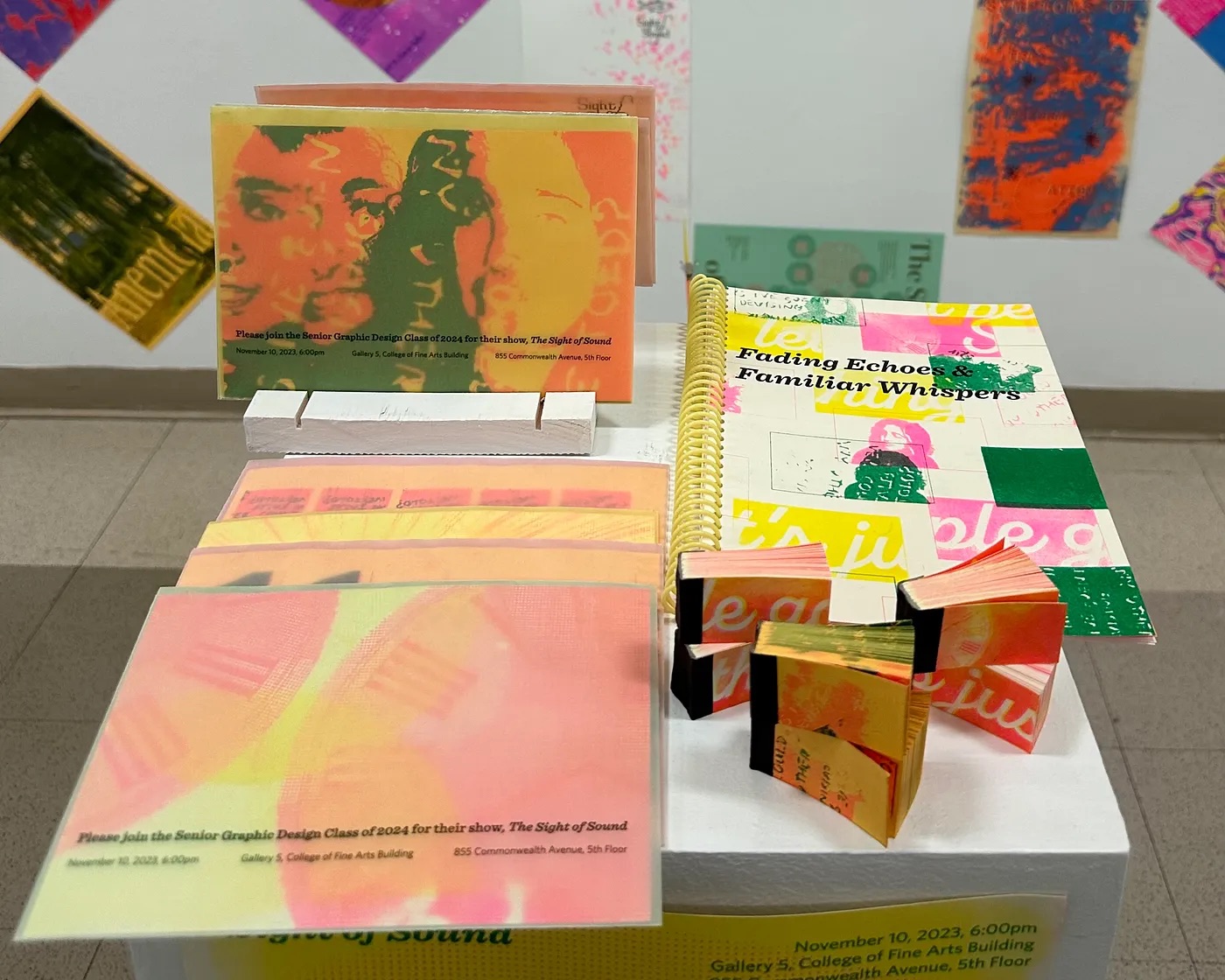
Student Names:
Leena Jang
Project Title:
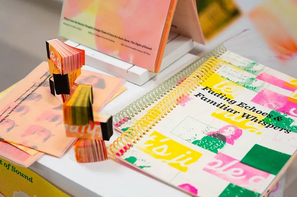
Fading Echoes and Familiar Whispers
Leena Jang
Project Title:
Fading Echoes and Familiar Whispers
Project Description:
In this project, Sight of Sound, we explored the intersection of sound and graphic design, and give sight to sound.
When we began their brainstorming session, our focus initially centered around exploring the idea of déjàvu. However, Leena’s interest shifted towards the captivating concept of Saudade, delving into the profound sense of nostalgia for something or someone no longer present. While exploring songs that encapsulated this sentiment, Elliot’s Song by Dominic Fike and Zendaya resonated deeply, becoming a personal anthem for moments steeped in Saudade. As Kate continued exploring déjàvu, defined as the illusion of remembering scenes and events during their first experience, we noticed a thematic connection with Saudade based on the overarching theme of memory. Kate decided on Wake Up by moow and Lottie Kestner and parts of A Day in the Life by the Beatles.
READ FULL BLOG POST
Student Names:
Sarah Nam
Wendy Tang
Vincent Liu
Project Title:
Touch Fish!
Sarah Nam
Wendy Tang
Vincent Liu
Project Title:
Touch Fish!
Project Description:
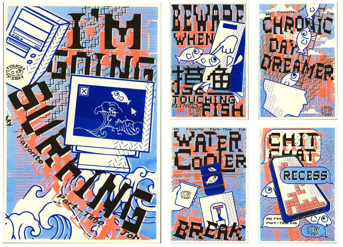
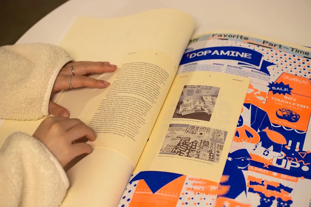
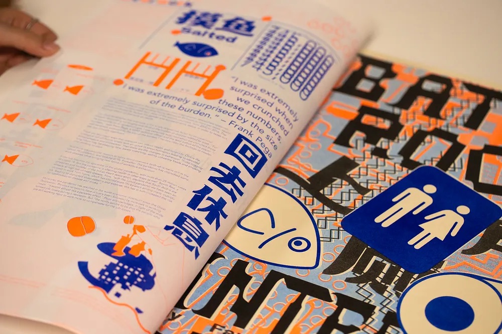
We started our journey from a website on Hyperakt titled ‘You Waste a Lot of Time at Work.’ It caught our attention due to its more lighthearted portrayal of the office work-life and the more unconventional focus and encouragement of the unproductive side of work. We were all in favor of expanding on this topic as our theme and diverged our ideas using the FigJam moodboard. The brainstorming brought about a popular Chinese idiom called “浑水摸鱼.”
“Touching Fish” is a literal translation of the chinese idiom, which is often shortened to just “摸鱼,” a colloquial term used to describe someone who is slacking off, idling, or not working diligently. It’s often used in a work or school context when someone is not being productive and is instead wasting time, goofing off, or engaging in unproductive activities while they should be working or studying. In essence, it means to “slack off” or “procrastinate”. This term has become popular in internet culture and informal conversations to describe activities where someone is avoiding responsibilities or tasks.
READ FULL BLOG POST
Student Names:
Campbell Morin
Project Title:
Manic
Campbell Morin
Project Title:
Manic
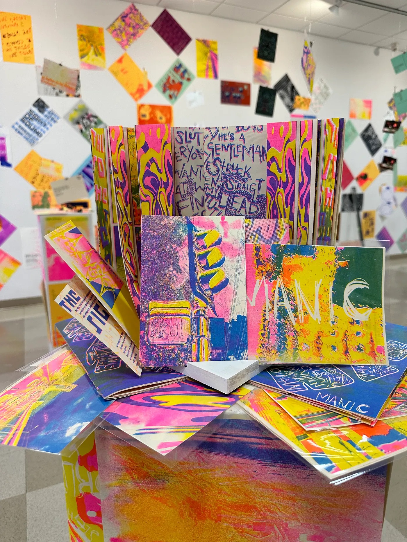
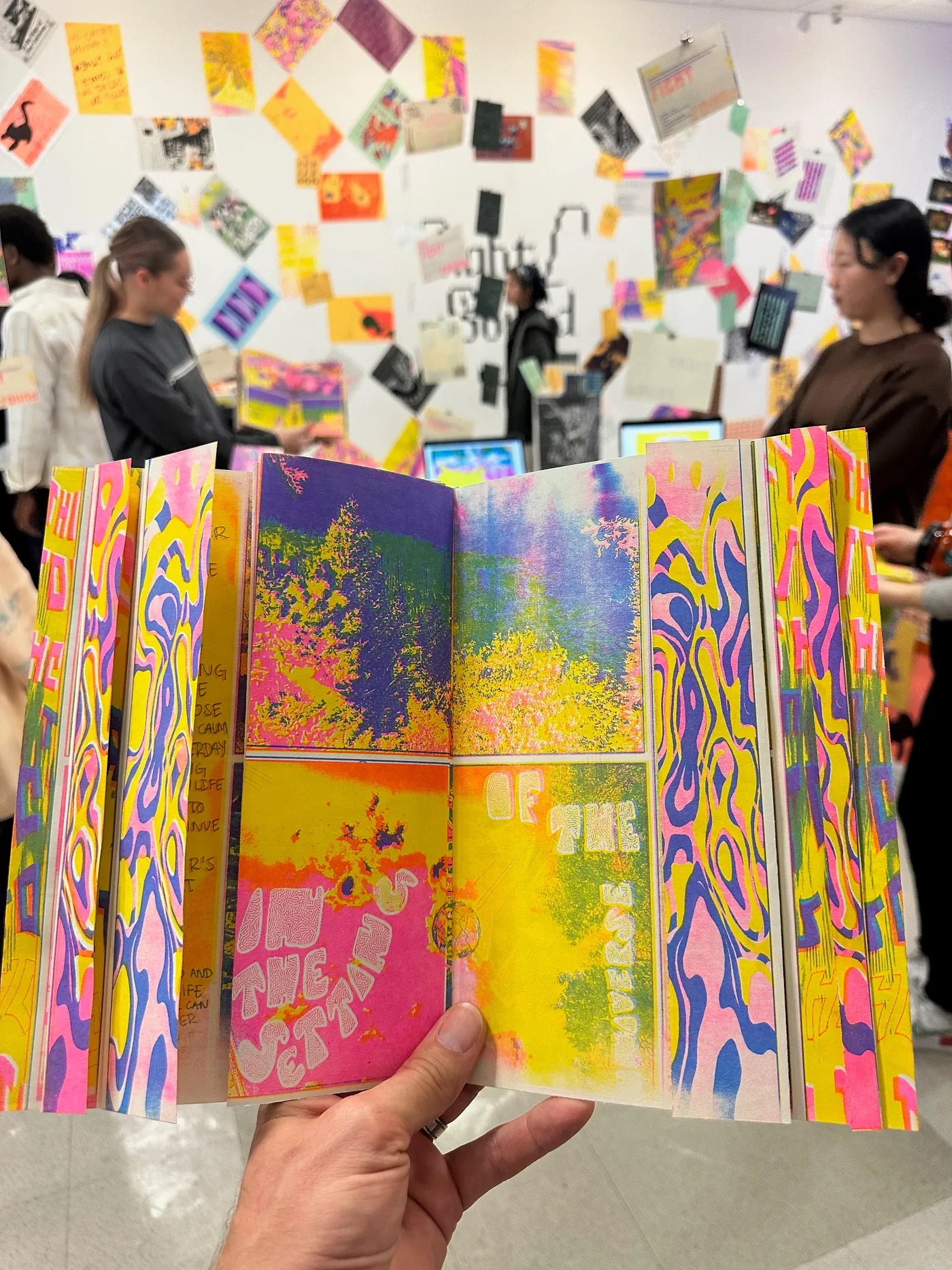
Project Description:
Starting this project I knew I wanted to create something that reflected a song that meant something to me. Something that reminded me of the joys of life- something that already had a visual language associated with it in my head. I went back and forth a few times between classical music that I used to play on piano, but ended up settling on Beethoven’s Pastoral Symphony. This song is the first song I can remember hearing when I was little as it was the title sequence for “Barbie and the Magic of Pegasus” which was one of my favorite movies. I completely forgot about it until I heard it again this past summer at an orchestra at the Sydney Opera House- where it clicked for me where I knew it from. It felt like a hidden memory had been unearthed.
READ FULL BLOG POST
Student Names:
Rachel Chen
Project Title:
A BLUE COAT
Rachel Chen
Project Title:
A BLUE COAT
Project Description:
A blue coat is guided guided away, guided and guided away, that is the particular color that is used for that length and not any width not even more than a shadow.
This is the passage I chose from Gertrude Stein’s Tender Buttons. I really love the repeated text in this passage and I tried to find a way to show the feeling of ever-expanding in a better way. I decided to make this video in the collage style and keep it in a fast pace and rhythm.
READ FULL BLOG POST
Student Names:
Osaruguemwen Emokpae
Project Title:
Tender Buttons
Osaruguemwen Emokpae
Project Title:
Tender Buttons
Project Description:
For my second motion graphics project, I was tasked with creating a 1–2 minute video using an excerpt from the poem Tender Buttons by Gertrude Stein. I had to explore the intersection of type, visuals, and music. I was excited about this project and wanted to experiment with kinetic typography or 3-D elements from the start.
I was mainly inspired by the kinetic-type videos I found on social media and on DIA, a branding and graphic design studio specializing in kinetic identities and typographic systems. To start out the process, I began storyboarding. I wanted my video to have a dramatic and energizing feel, as well as several quick transitions and effects.
READ FULL BLOG POST
Student Names:
Haya AlMajali
Project Title:
Beginner’s Mind Interview
Haya AlMajali
Project Title:
Beginner’s Mind Interview
Project Description:
For this project, we were asked to select an open-ended question and use it to interview people & create a time-based media vignette.
I knew I wanted to do something that involved drawing portraits in real time — just because it’s something I enjoy doing. Initially, I battled between different questions to use for my interview.
Question: What’s the last lie you told?
Question: Tell me about a time when you felt a very intense emotion.
Question: What’s the most unexpected thing that’s happened to you in the past year?
Question: What _______ you? angers/upsets/excites/fuels/…
Question: What motivates you? (chosen question)
The idea was to create a quick sketch of the person while they were talking, and try to capture their facial expressions and emotions solely through the sketch.
READ FULL BLOG POST
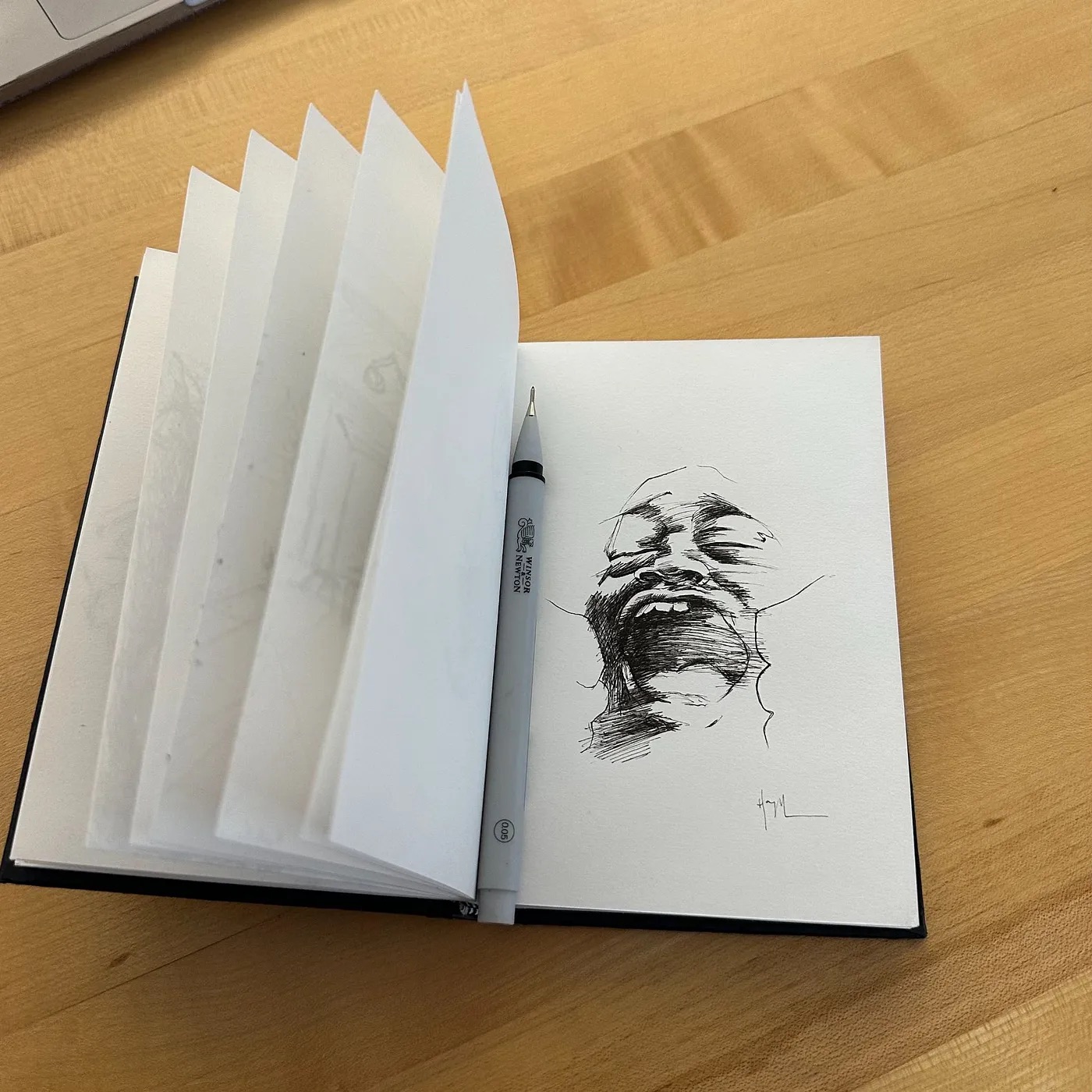
Student Names:
Kristen Davis
Project Title:
Ink Ballet
Kristen Davis
Project Title:
Ink Ballet
Project Description:
The Ink Ballet ended up being really important milestone as I start to lay the foundation for my thesis. It was the first piece I showed in my final review, and even as I showed my other work my reviewers constantly referred back to it as a good jumping off point as I move forward. My work tends to be a bit curious, if not divisive, for other designers so it felt good to have a project that everyone could agree was on the stronger side.
I went through so many ideas before I landed on the ink. I knew I wanted to do phenomenal movement, but I was overwhelmed by the number of subjects that could potentially be explored. I needed something that gave the impression of natural movement but I could also manipulate to some extent. I was mesmerized by the reflections in bubbles so I bought some at the Dollar Tree. The bottle is pink and Disney themed, which should have been my first indication that this was probably a dead-end idea. I blew one bubble and was immediately over it. The bubble project was promptly shelved.
READ FULL BLOG POST
Student Names:
Arjun Lakshmanan
Project Title:
TOPPLE!
Arjun Lakshmanan
Project Title:
TOPPLE!
Project Description:
This is how I began my ideation for the project by listing down different objects that can be toppled and sketching frames to understand what can be done and at what angle it can be filmed. It was a fun process, and filming the videos was a great experience. I learned a lot about filmography and videography from my professor during our Motion Graphics class, and it was a fun challenge to implement them into the project. The weekly inspiration posts were where I shared my ideas and exploration for this project, and I took a deep dive into studying the physics of objects to create this Motion video. The link to it is attached below.
READ FULL BLOG POST
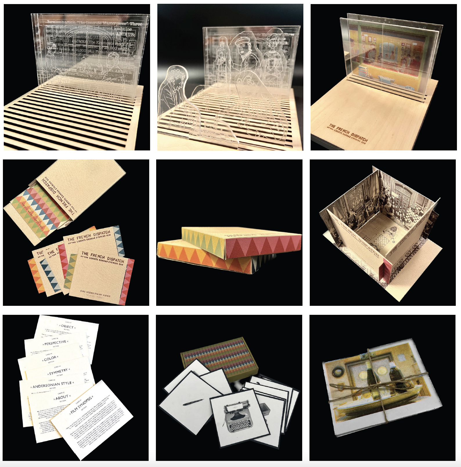
Student Names:
Charles Castro & Carolina Izsák
Project Title:
The French Dispatch - Musée Portatif
Charles Castro & Carolina Izsák
Project Title:
The French Dispatch - Musée Portatif
Project Description:
Having watched The French Dispatch during its opening weekend in 2021, I vividly recall being completely captivated by Wes Anderson’s cinematography. I made it a point to recommend the film to everyone, not just for its plot, but also for its stunning visual artistry.
In brief, the movie is based in a fictitious French town called Ennui sur Blasé, and it follows the staff of the titular publication, led by editor-in-chief Arthur Howitzer, Jr. (played by Bill Murray), as they collaboratively create the magazine’s final issue and later write Arthur’s obituary after his passing. The magazine features three sections — “Arts and Artists,” “Politics/Poetry,” and “Tastes and Smells” — which can be assumed to be common segments found in editorial publications. The French Dispatch is a clear tribute to The New Yorker and serves as Anderson’s ode to both journalism and European sensibility.
READ THE FULL BLOG POST
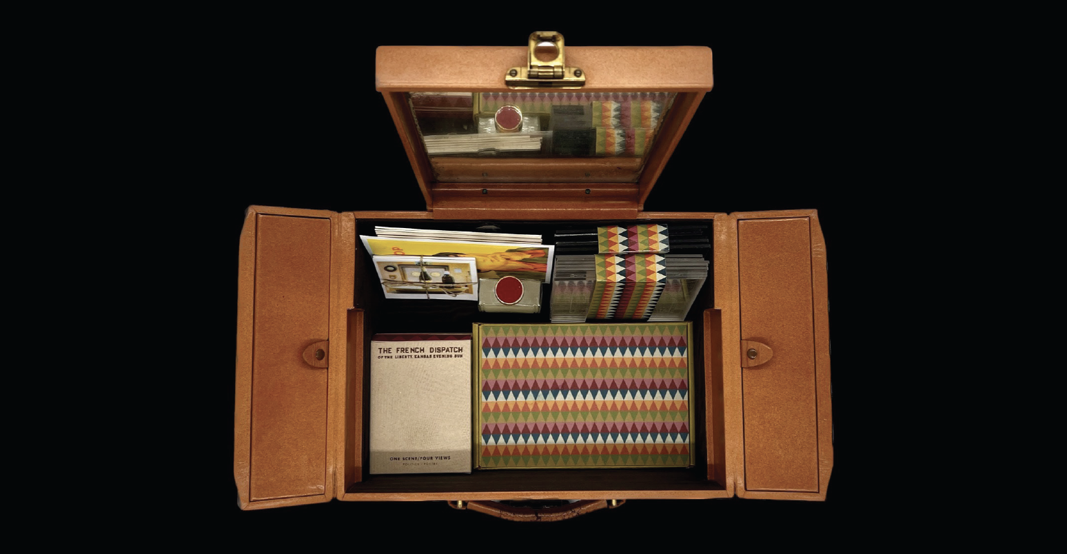
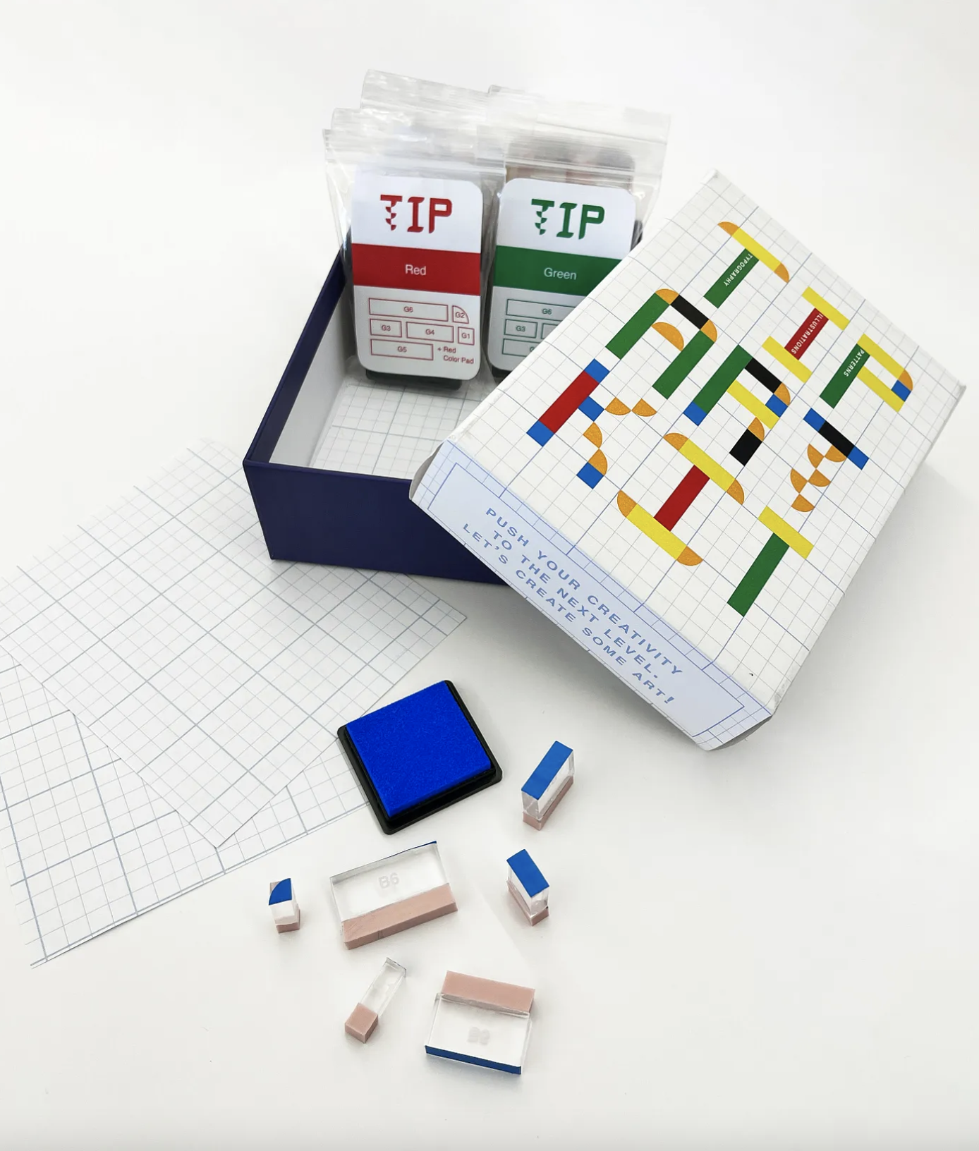

Student Name:
Kristina Shumilina
Project Title:
TIP* Art Kit
*Typography + Illustrations + Patterns
Kristina Shumilina
Project Title:
TIP* Art Kit
*Typography + Illustrations + Patterns
Project Description:
For my Independence + Authorship Studio Project I was interested in creating a modular art system — designed and structured but flexible, playful, and with endless outcome possibilities.
That’s why I started to think about Art Kit — the system that can be used by people who enjoy creating but are not necessarily artists or designers. It was also supposed to, on the one hand, break the fear of a blank page, on the other hand, be flexible enough to allow creative and diverse outcomes.
READ THE FULL BLOG POST

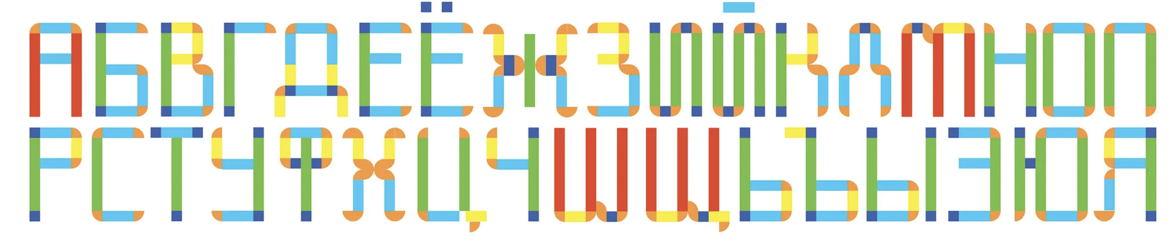
Student Name:
Arfindo Briyan Santoso
Project Title:
The Happiness Spice
Arfindo Briyan Santoso
Project Title:
The Happiness Spice
Project Description:
Traveling and being separated from my laptop for a while brought me the inspiration I needed for my Liminality+Transition project. At first, I was confused and unsure of the direction I should take. However, everything became clear and organized after I went on a short trip with some friends.
At the end of March, we visited Paper Works in Rhode Island, which is the most complete paper shop around. We spent about three hours choosing and ordering the papers we wanted, as well as finalizing our payments. We continued for lunch and stopped at a cake shop famous for its fruit tarts called Pastiche.
It was in the cake shop that I came across the idea for my project on liminality. After a tiring day of sitting on the train and shopping at the bookstore, our mood improved when we ate the cakes we bought. The beautiful composition of the fruit tarts also gave me inspiration. The initial idea was to capture the feeling of a “foodgasm.”
READ THE FULL BLOG POST

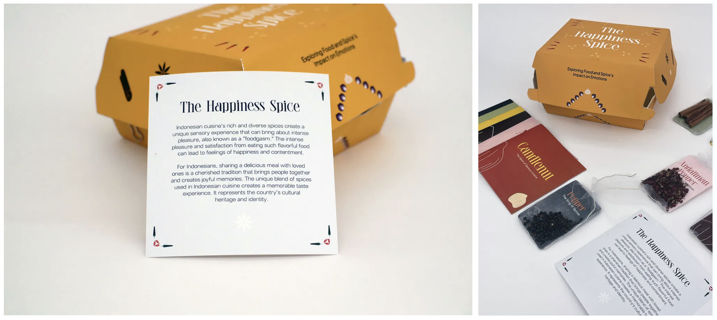
Student Name:
Rachel Chen
Project Title:
Starless Night
Rachel Chen
Project Title:
Starless Night
Project Description:
For this liminality project, I want to try to use visual language to express a kind of contradictory emotion: when relatives or friends around us pass away, on the one hand, we really want to keep their memories and remember them, but on the other hand, we have to admit that as time changes, we have no way to remember all the details, and the grief may not appear as strong as before.
The inspiration for this came from the death of my grandfather ten years ago. At that time, I felt pain and cried a lot. I also regretted that I didn’t have the opportunity to see him for the last time. But ten years later, when I picked up this memory from the bottom of my heart, I found that I have already forgotten the exact date of his death. I believe that there are much more people that share these kinds of experiences and emotions than me, so I really want to show this contradictory but universal emotion through visual language.
In the end, I decided to make a video to present this story and feeling, and it is also a letter to my grandfather.
READ THE FULL BLOG POST

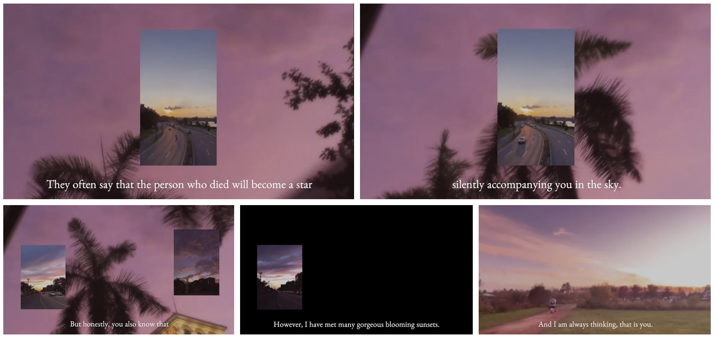
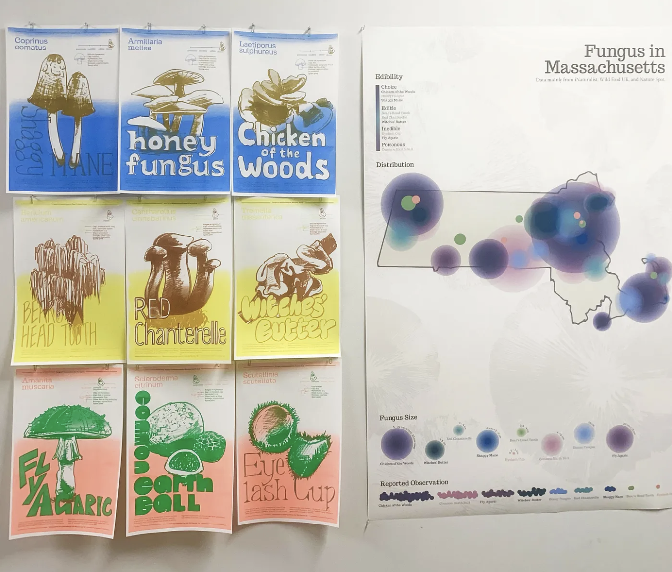
Student Name:
Ash (Yuxuan) Wei
Project Title:
Fungus in Massachusetts
Ash (Yuxuan) Wei
Project Title:
Fungus in Massachusetts
Project Description:
Starting with research and an on-site study of museums’ branding systems, I ended up drawing mushrooms, which was totally a sparkle that flashed in a moment (and I caught that). I started my research into mushrooms by finding the most common mushrooms in Massachusetts. In the end, I selected 9 types, which are not necessarily the top 9 most common ones considering edibility and appearance. The next step was to collect some details about these 9 mushrooms. The project aims to give people useful information about each type of mushroom and help them identify these mushrooms in the future. So I included mycological characteristics with an example of a mushroom to explain the scientific names.
Layout and design are a whole other story. My goal for myself in this project is to play with typography. This is why I decided to design a typeface for each mushroom, adapting characteristics and special features from the appearance of the mushroom.
READ THE FULL BLOG POST
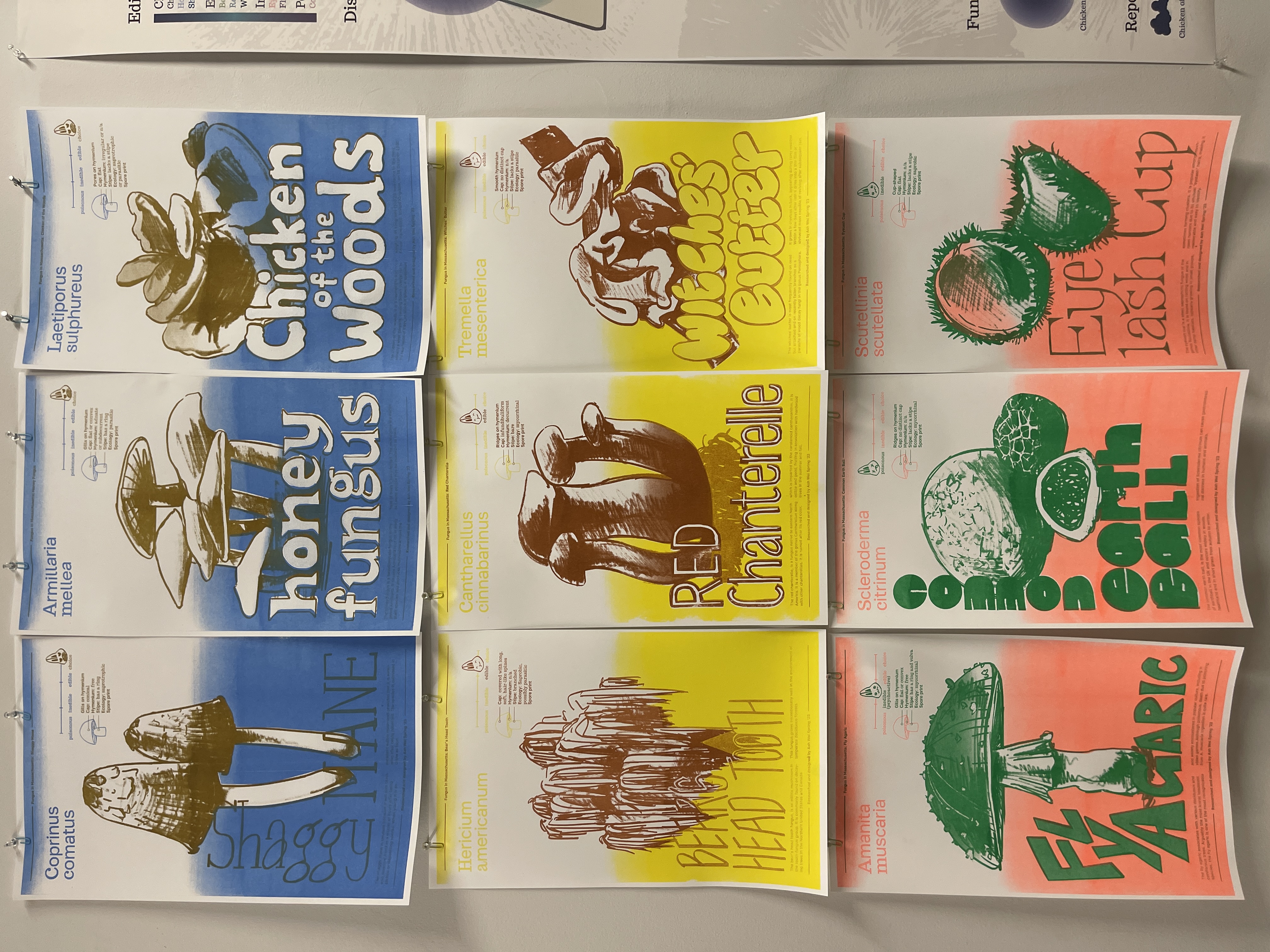
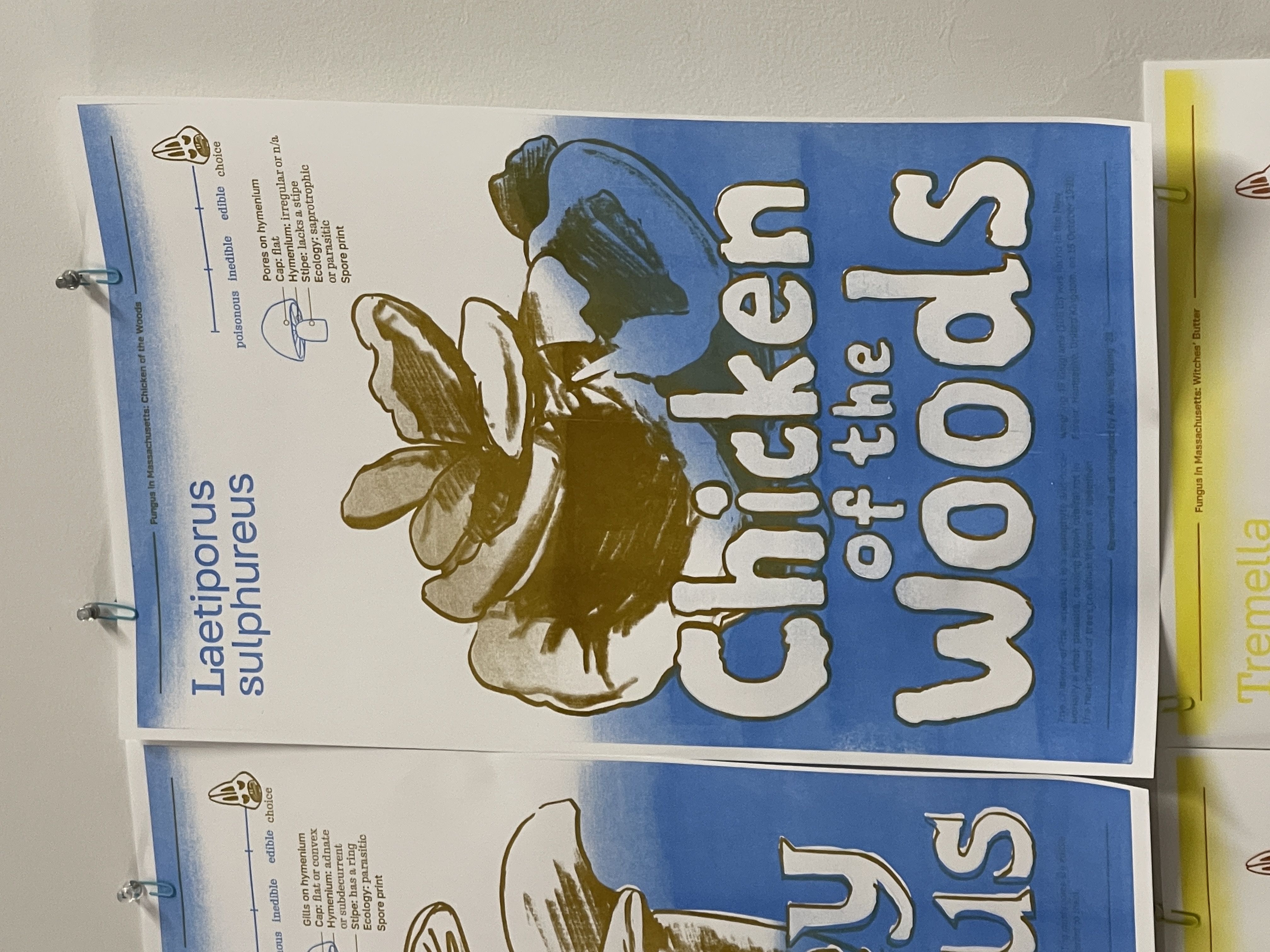
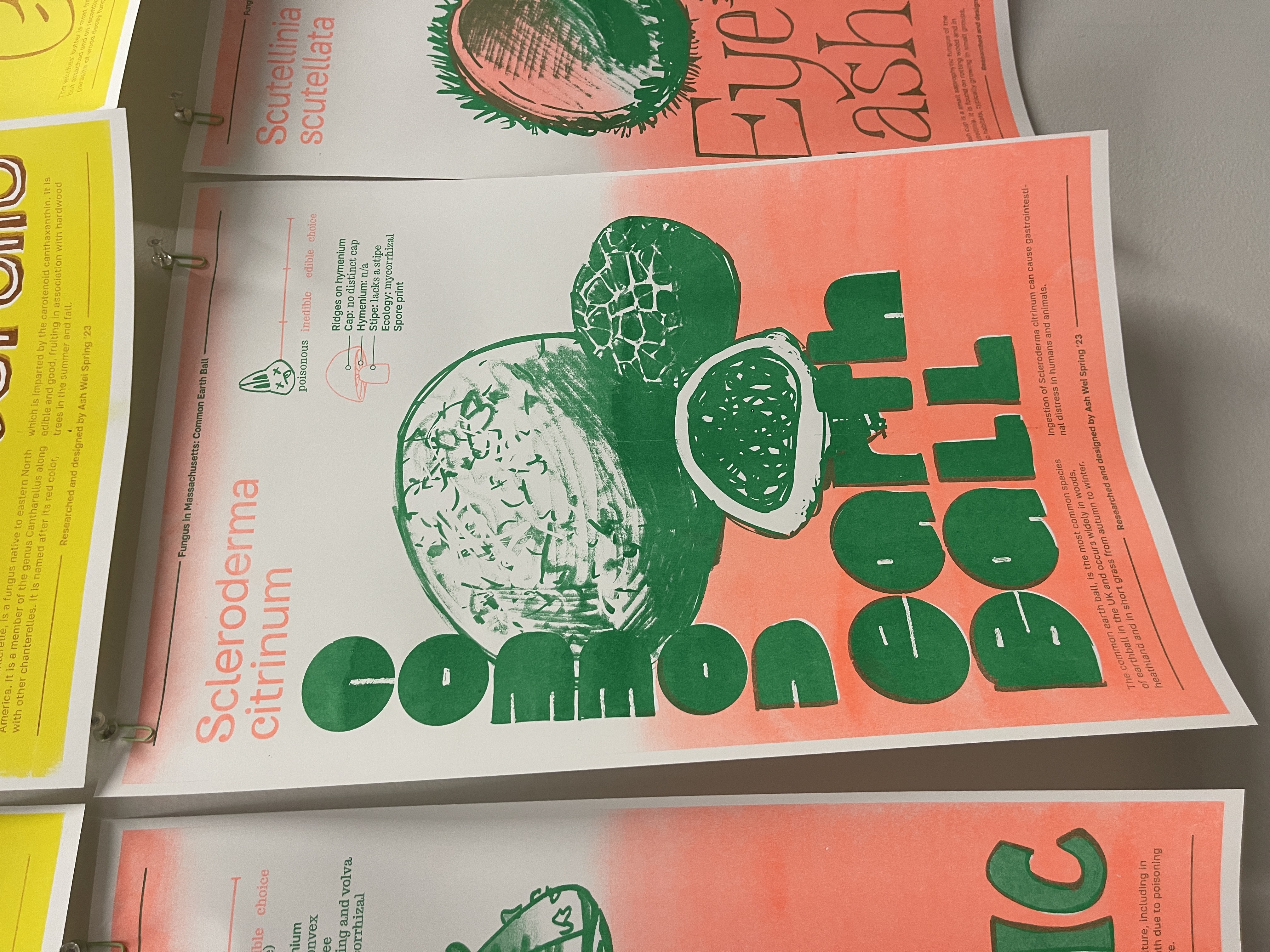
Student Names:
Jaqueline Mang, UX Designer & Project Lead
Sean Fung, Software Developer
Issac Hu, Software Developer
Rithvik Nakirikanti, Software Developer
Julian Tanja, Software Developer
Project Title:
Timo App
Make it on time and without hassle
Jaqueline Mang, UX Designer & Project Lead
Sean Fung, Software Developer
Issac Hu, Software Developer
Rithvik Nakirikanti, Software Developer
Julian Tanja, Software Developer
Project Title:
Timo App
Make it on time and without hassle
The Problem:
People use various platforms to check weather/traffic conditions as a part of their daily routine to reach a destination. However, the process requires the user to manually check apps, as well as input alarms. This, along with inaccurate time estimators, slows down their process of getting ready, causing them to be late.
Our Solution:
Creating an app that takes a user’s Google Calendar schedule and location to calculate the amount of time they actually have to prepare and travel to an event.

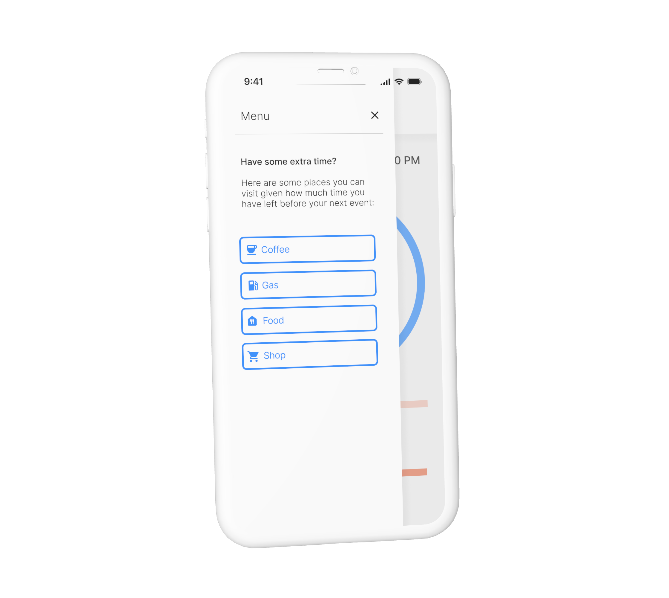
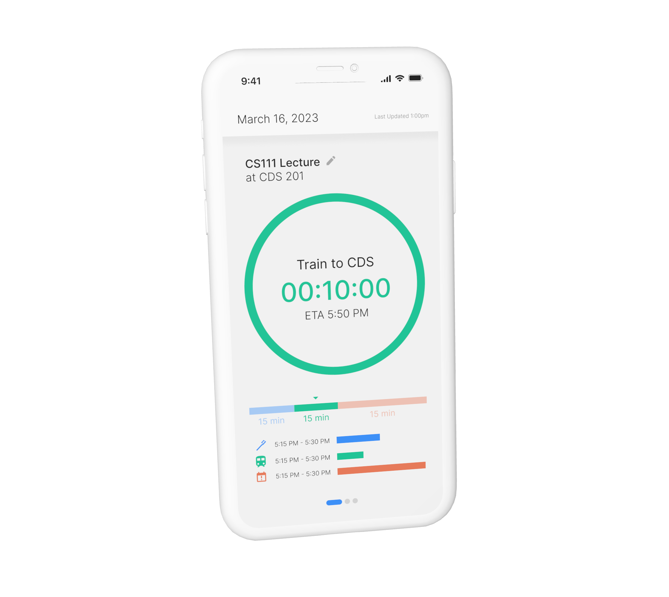
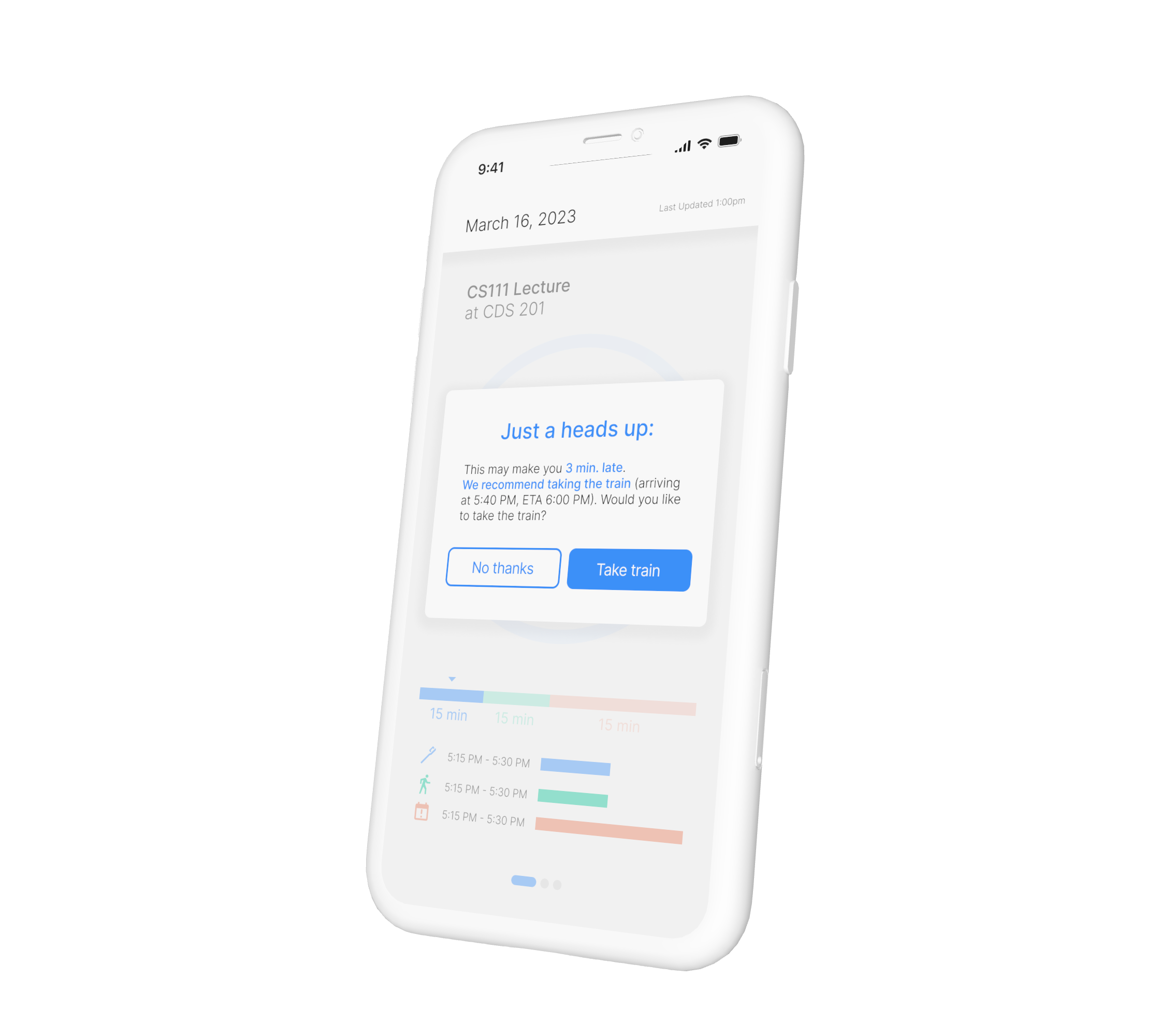

Student Names:
Mina Chung, UX Lead
Abby Gualda, Software Developer
Yin-Ching (William) Lee, Software Developer/ Innovator
Tyler Nguyen, Software Developer
Project Title:
Terrier Tastes App
Don’t waste a bite. Choose right.
Mina Chung, UX Lead
Abby Gualda, Software Developer
Yin-Ching (William) Lee, Software Developer/ Innovator
Tyler Nguyen, Software Developer
Project Title:
Terrier Tastes App
Don’t waste a bite. Choose right.
The Problem:
The problem we are solving is reducing food waste in the Boston University dining halls caused by the majority of students throwing out food due to disappointment in taste.
Our Solution:
A review app that provides students with accurate food descriptions and reviews to make informed choices and promote sustainability.
With this data, the dining hall can better identify wasteful ingredients, facilitate necessary adjustments, animprove the issue. Following Demo Day the team won the Judge’s Choice Innovation Award and their app launched on the Apple App Store and Google Play!
READ MORE HERE
DOWNLOAD FROM THE APP STORE HERE
DOWNLOAD FROM GOOGLE PLAY HERE
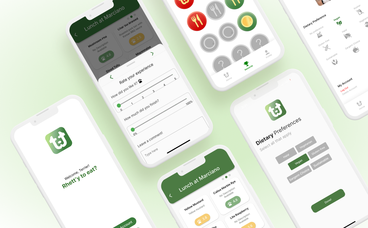
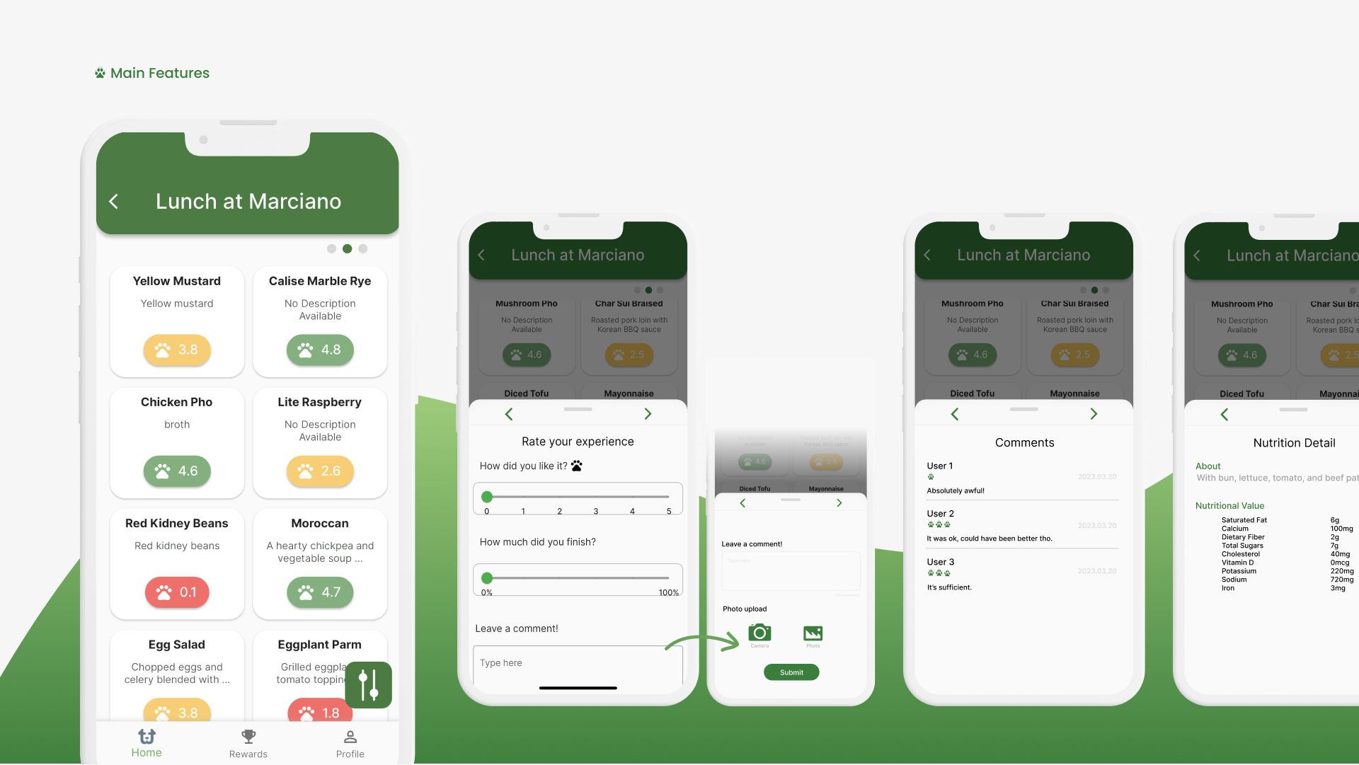
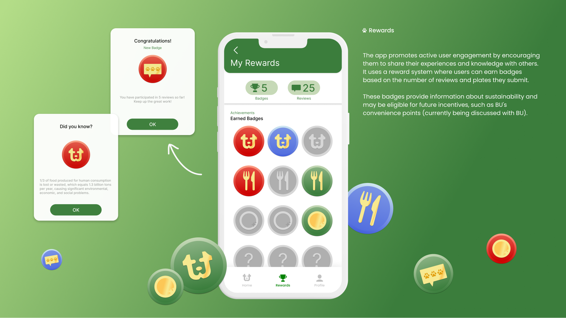
Student Name: Annabella Pugliese
Project Title: Special Memory — Beginner’s Mind
Project Title: Special Memory — Beginner’s Mind
Project Description:
For our final motion graphics project, we were give the choice of two prompts: “phenomenal movement” or “beginner’s mind”. The former involved looking at natural movements in our environment, while the latter was interview-based. I wasn’t immediately sure which direction I wanted to go, but after working entirely in After Effects for the previous project, I was set on using an analog format in some capacity this time. This seemed like a particularly good opportunity to make a risograph animation of some sort, as I’d been wanting to try this for quite some time.
READ FULL BLOG POST


Student Name: Graham Atherton
Project Title: A Little Peace, Please — Tender Buttons
Project Title: A Little Peace, Please — Tender Buttons
Project Description:
This project had its ups and downs for me. I probably had the opposite experience from most people in the class in that I spent the vast majority of the time creating content and only a few hours actually working in AfterEffects.
READ FULL BLOG POST
This project had its ups and downs for me. I probably had the opposite experience from most people in the class in that I spent the vast majority of the time creating content and only a few hours actually working in AfterEffects.
READ FULL BLOG POST
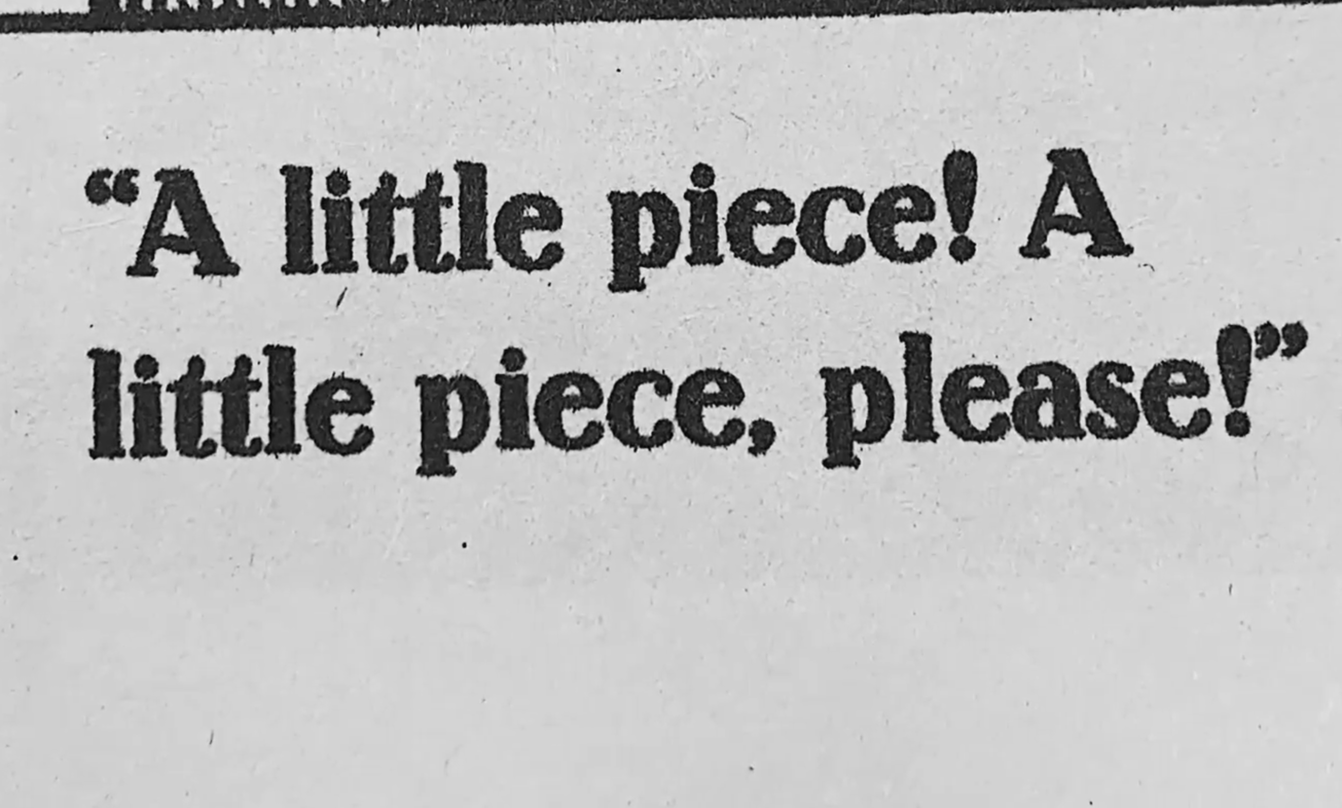
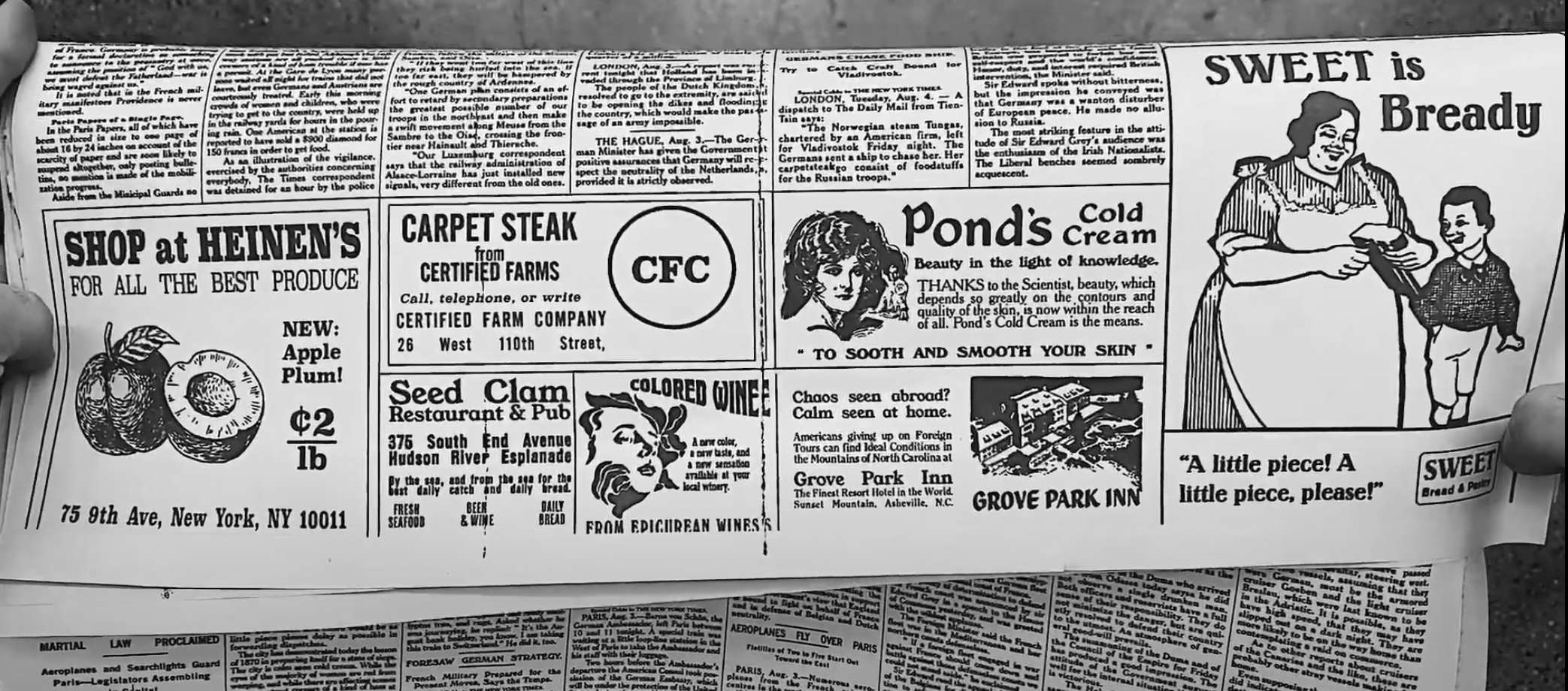
Student Name: Valeria Alvarado
Project Title: 808 Learns — Beginners Mind
Project Title: 808 Learns — Beginners Mind
Project Description:
When thinking about an interview, the first thing that pops into my mind is how to make people comfortable talking and responding to questions. So I decided to film the interview before the interviewees took a seat before the camera to capture all the gestures and reactions during the experience.
One of the main points of interest and research for my upcoming undefined thesis is the teaching-learning process in children and adults, so when thinking of a consistent question to ask my cohort, how do you learn came up quickly.
READ FULL BLOG POST
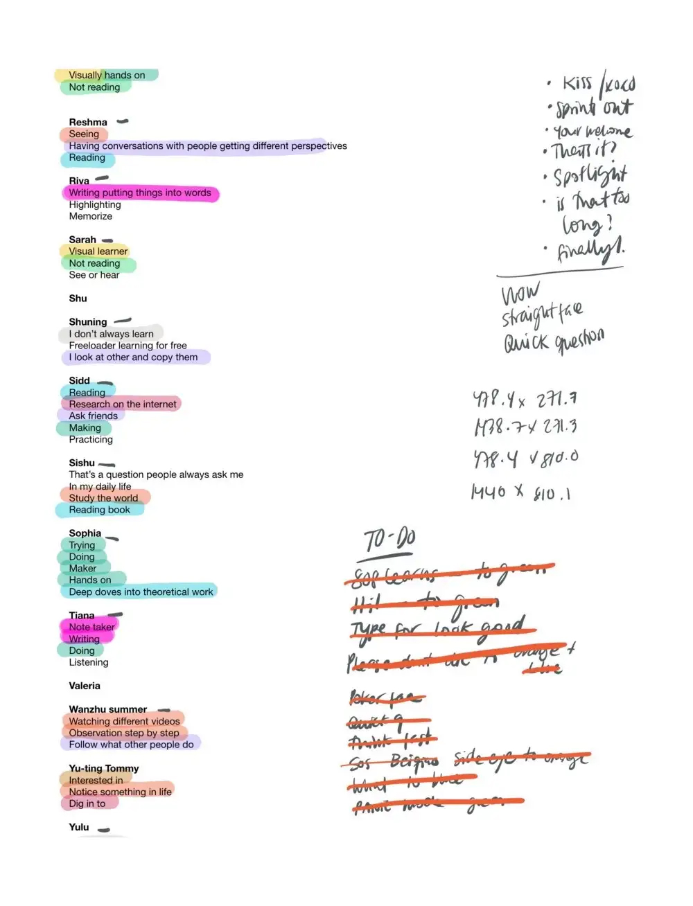
Student Name: Sophia Viviano
Project Title: Methodology in Motion
Project Title: Methodology in Motion
Project Description:
For this project, I chose a repetitive motion — an egg being flipped — to represent via digital animation layered with analog footage. This project went through several conceptual iterations including a tryptic of motion posters as a final form, before it became a full poster animation and experimental exploration.
I began my process by documenting the phenomenal movement itself — the egg flip. This required several takes, many of which were included in the final version of the project.
READ FULL BLOG POST
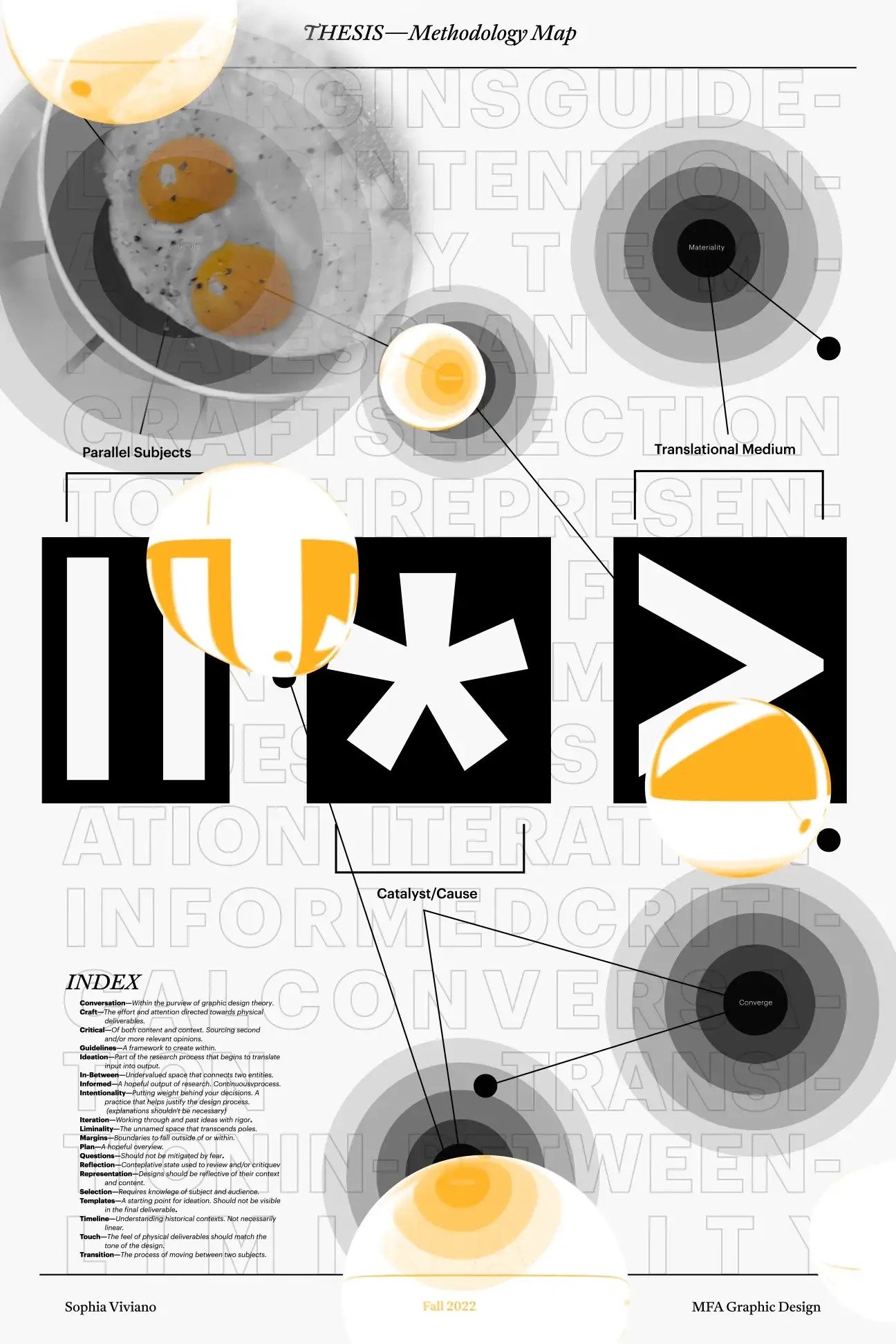
Student Name: Hongjie Chen
Project Title: Star Glide — Tender Buttons
Project Title: Star Glide — Tender Buttons
Project Description:
In this project, we choose a short excerpt from either Objects or Food from Gertrude Stein’s Tender Buttons, create a vignette that graphically interprets the selected passage, and use the passage’s words as a springboard to a straightforward notion we want to express.
READ FULL BLOG POST
In this project, we choose a short excerpt from either Objects or Food from Gertrude Stein’s Tender Buttons, create a vignette that graphically interprets the selected passage, and use the passage’s words as a springboard to a straightforward notion we want to express.
READ FULL BLOG POST
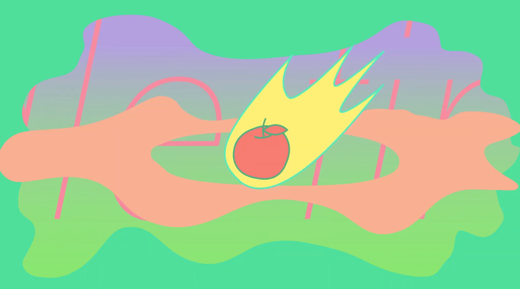
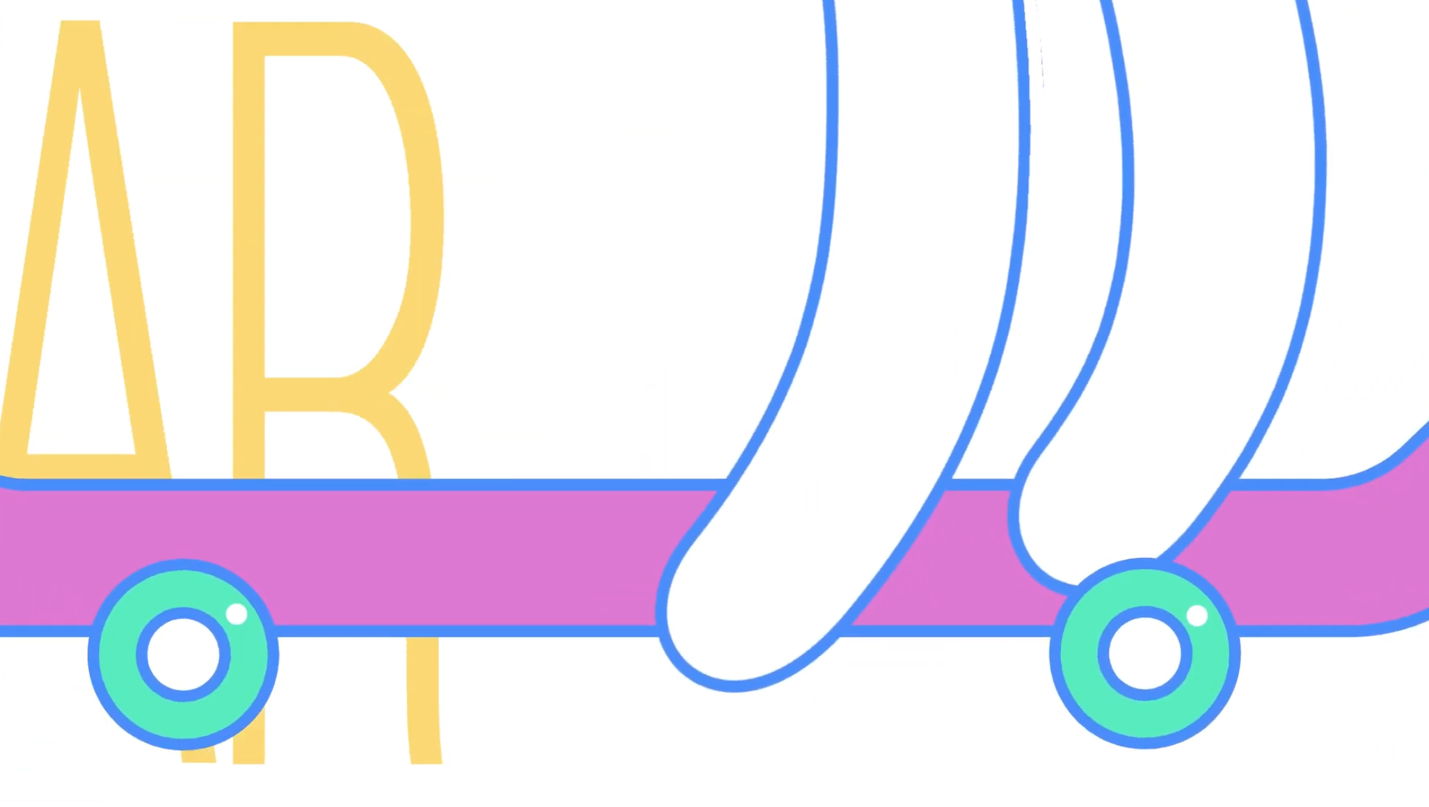

Student Names:
Andreina De La Blanca, August Ramos, Kelsea Mann, and Lauren Had
Project Title: ROOM: An Observational Study
Project Title: ROOM: An Observational Study
Project Description:
When we first encountered Hyperakt’s website, we didn’t know which way to take our project. We spent the first few classes analyzing their endless scroll of projects and sharing with each other what we wanted to have come out of this assignment for us all. We were specifically looking for a project that would enable us to be as open ended and experimental as we wanted to be, without being so broad that we could get lost in concept. We eventually landed on their project on the Edgeless School. The project was about how technology has impacted learning spaces and altered the physical spaces in classrooms. We focused on the physical spaces and learning spaces instead of technology, and assess how students might be affected by spaces. From our research, each of us went into different brainstorming sessions with research on physical spaces and feng shui, teaching styles, learning styles, and grading styles.
READ FULL BLOG POST
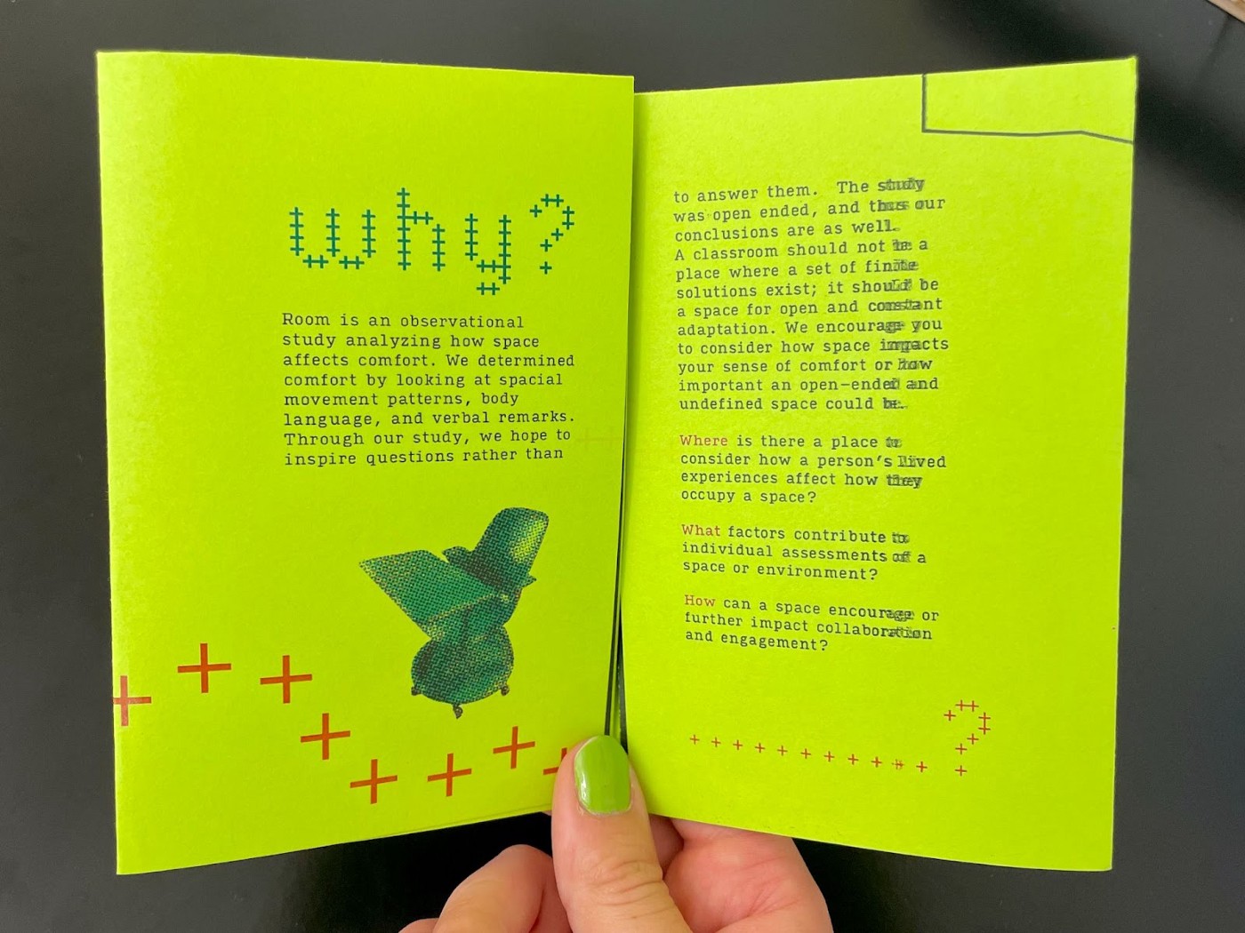
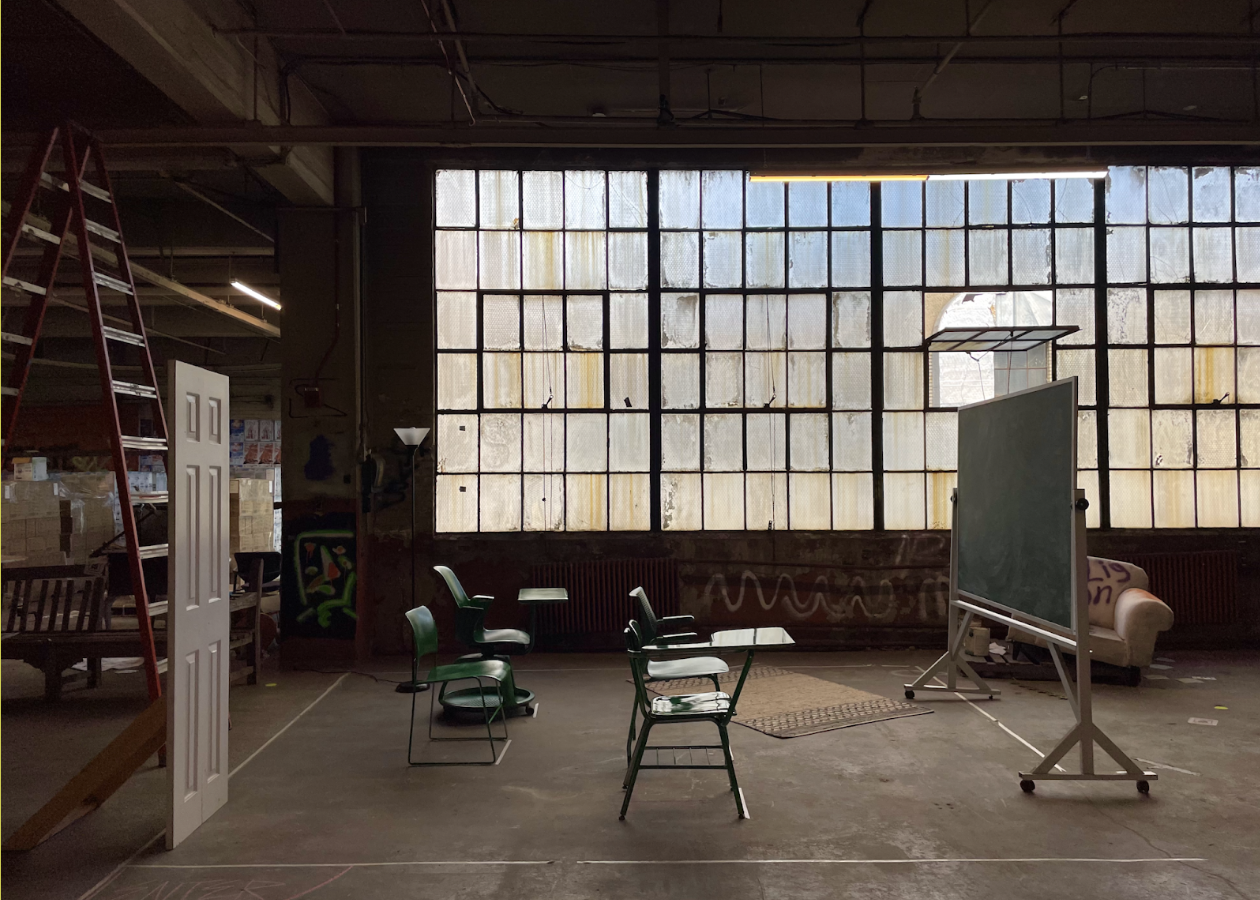
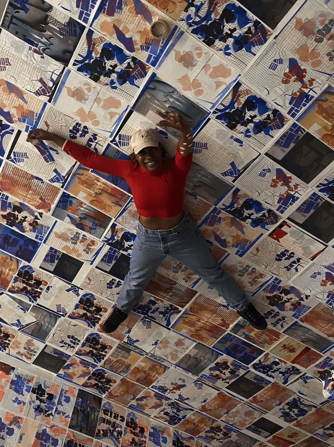
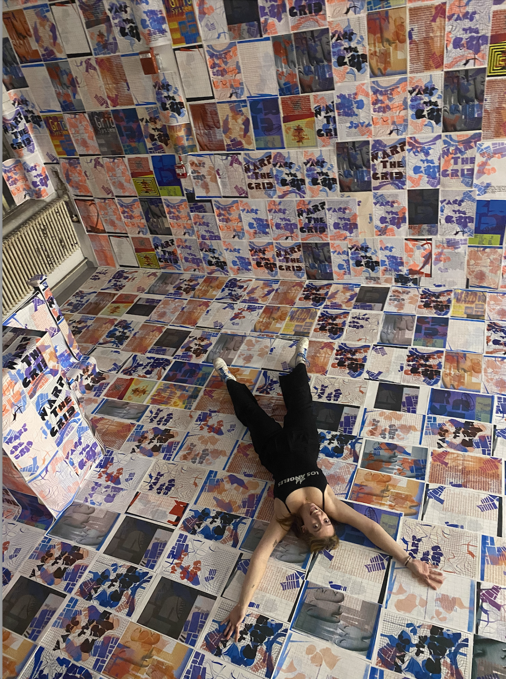
Student Names: Asjha Malcom and Becca Benoit
Project Title: Grid Space
Project Title: Grid Space
Project Description:
Using the Hyperakt projects as our inspiration, we knew we wanted to start with content that was very local and specific to Boston. It was still unsure what angle we would come from with this idea, but at this point it was leaning towards an angle of reimagining pre-existing structures. This was an idea that was already looked at with Adobe, PSD, particularly because the video was coming from the point of view of a creator that uses photoshop too much and it bleeds into his everyday experiences. Then in the On the Grid app, this was a literal “reimagining” since it was an app that encouraged creatives in major cities across America to leave reviews of places they’ve been and feel are cool spots for other creatives. We were really drawn to this idea of reimagining a space or ones surroundings through a creative lens, and this had a significant impact on our final idea. The challenge after honing in on this general idea that we saw executed in these two projects, was to reinvent it in our own way. A major aspect that got us to the final product was both of us thinking about space in general and literally reimagining a space by “redoing” it, adding our own things on top of it and so forth. So this way of thinking really got us into the realm of installation. We started looking at a lot of poster installations and other multimedia installations to get inspiration. We also turned to Art Nouveau and the architectural works of Antoni Gaudi for structural inspiration as well. We were greatly inspired by these works because they were somehow structural and also very fluid and warped.
READ FULL BLOG POST
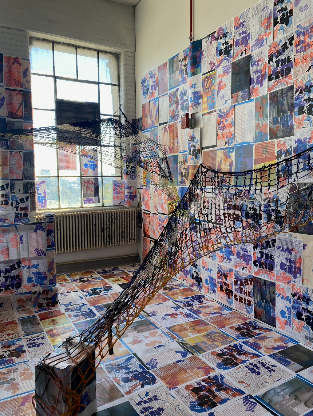
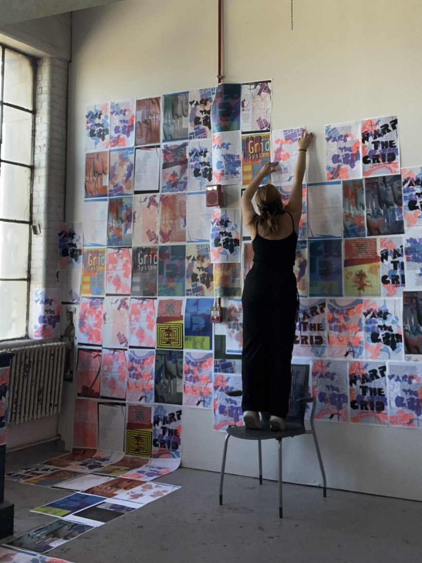
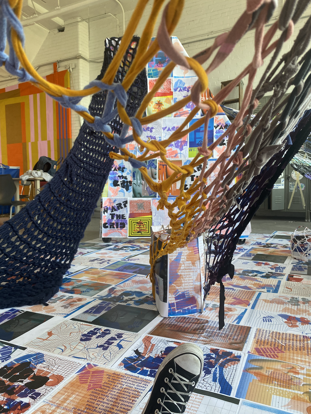
Student Names: Claire Collins, Dani Chang, Michelle Nie, and Julia So
Project Title: VAR*RL
Project Title: VAR*RL
Project Description:
Our community grew the more people went to the Junior studio out of classroom hours last year, and took on a sense of ownership over the space. We would go to the studio at night with blankets and mats, and play a communal Spotify playlist while working. This led to a lot of documentation of our time together to the point where we created a class Instagram account just for fun. Gradually, the Instagram account evolved as a way for the whole class to get to know each other and look back at our time together. Other people started taking notice, and the class below us started their own Instagram account. This impact could not have happened if we didn’t voluntarily take ownership of our space. Sure, the teacher must invite students to a secure and welcoming learning space, but the student must accept that invitation.
After conversing with Krystyn, we developed our thesis question: how does physical space initiate conversation and build community? At first, we were thinking of creating a series of social experiments in different classrooms at CFA and 808 and seeing where those results lead us, but then saw potential in the SVA Library. By rebranding the visual identity and design of the SVA Library, we thought this was the most effective way to explore how designing a physical space would attract more students to visit and build relationships with one another.
READ FULL BLOG POST


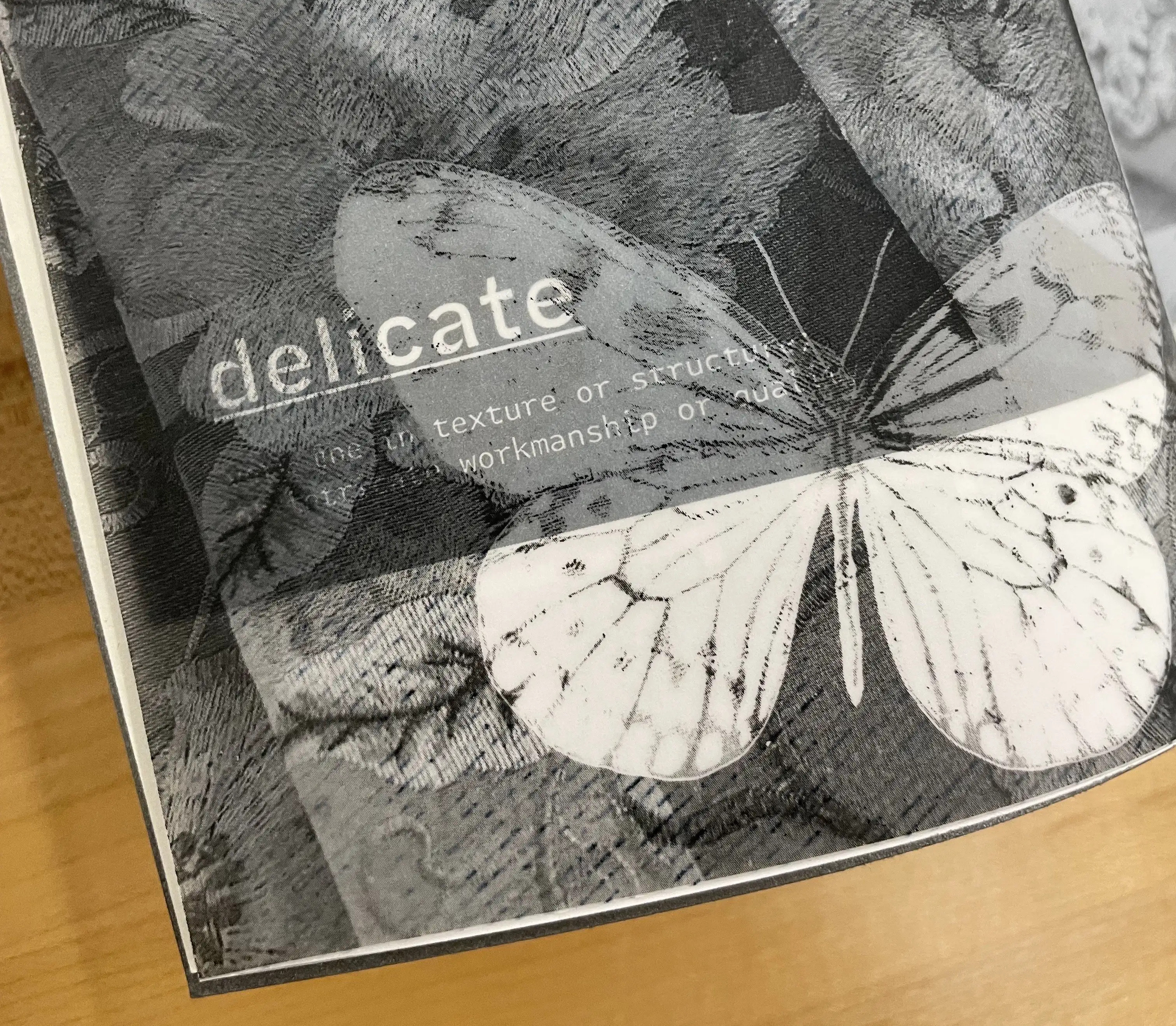
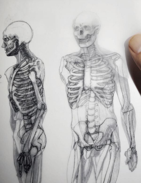
Student Names: Julia So
Project Title: The Forms
Project Title: The Forms
Project Description:
Instead of focusing on the content of the book, I focused on the form of the book itself. I did not manipulate the guides and margins of the book layout or how the content of the book was placed on the pages. Rather, it was the physical form of the paper that I was interested in. I explored multiple forms of paper manipulation that would explore how to present the content of the book. This included the exploration of types of paper and the physical fold of the paper. The main idea was that I wanted the viewer to have to flip through a couple of times to experience the content of the pages, making the book an interactive experience.
READ FULL BLOG POST
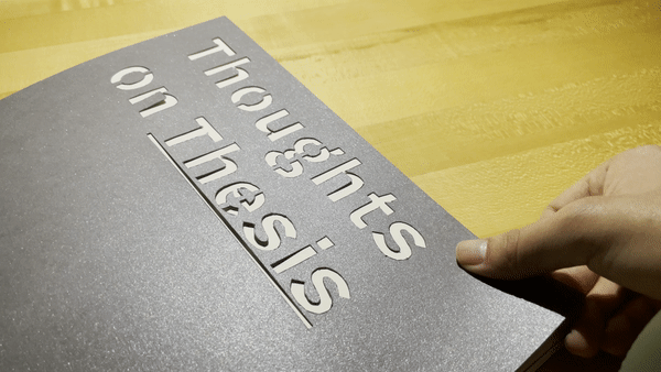
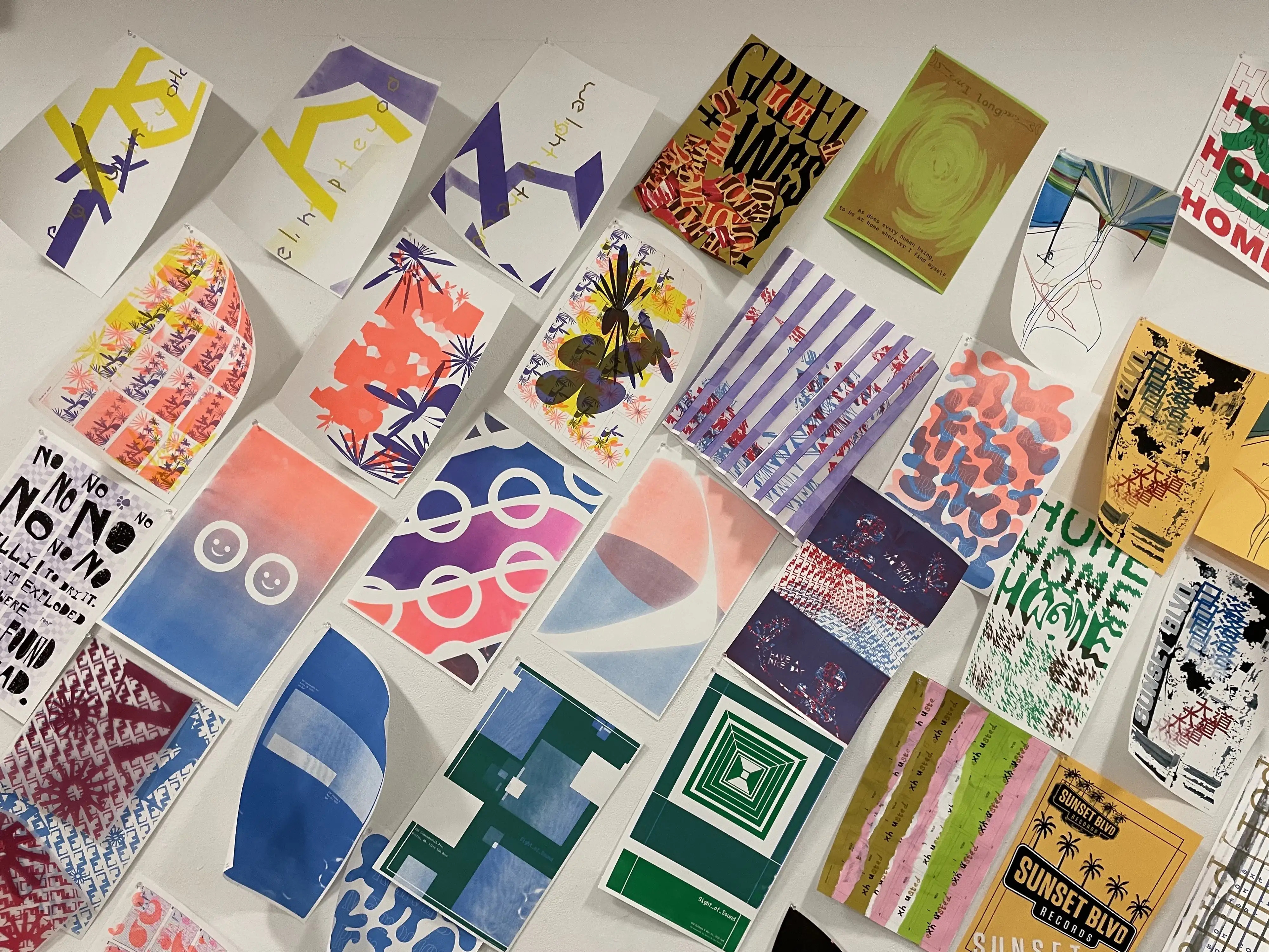
Student Names: Kira Ajas and Perry Sosi
Project Title: Sounds of Comfort
Project Title: Sounds of Comfort
Project Description:
Kira: This assignment required us to make an animation with a sound that expresses our theme. Perry and I were unsure where to start. After some brainstorming, we thought a great idea is to express sounds that make us feel not alone. Though that as a title isn’t very snappy, it doesn’t roll off the tongue very well. So after a little more discussion that led us to the broader theme of Sounds of Comfort. A better title and an easier theme to work from.
READ FULL BLOG POST
Perry: How can we visualize vibrations that travel through physical space, into our ears, and are processed by our brain to form a variety of meaning and emotion? That alone, is difficult to think through, but then imagine having the restraint of using only typographic forms to create this visualization. That was the task for the Sight of Sound project, and although it felt restrained at first, there was actually so much freedom within the process of creating the animation and print deliverables for this project.
The starting point for this project began with deciding on a theme for the sounds Kira and I would explore visualizing. The two initial ideas that we had were sounds that make you feel like the main character and sounds that make you feel not alone. After some further brainstorming, we decided on the name Sounds of Comfort as a phrase that encapsulated the feeling of our topic.
READ FULL BLOG POST
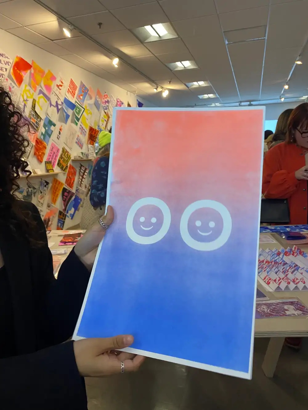

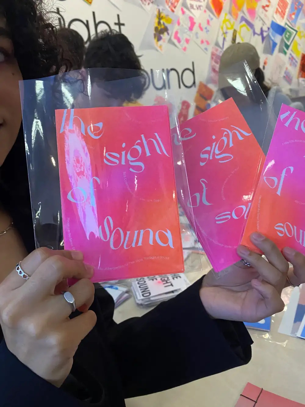
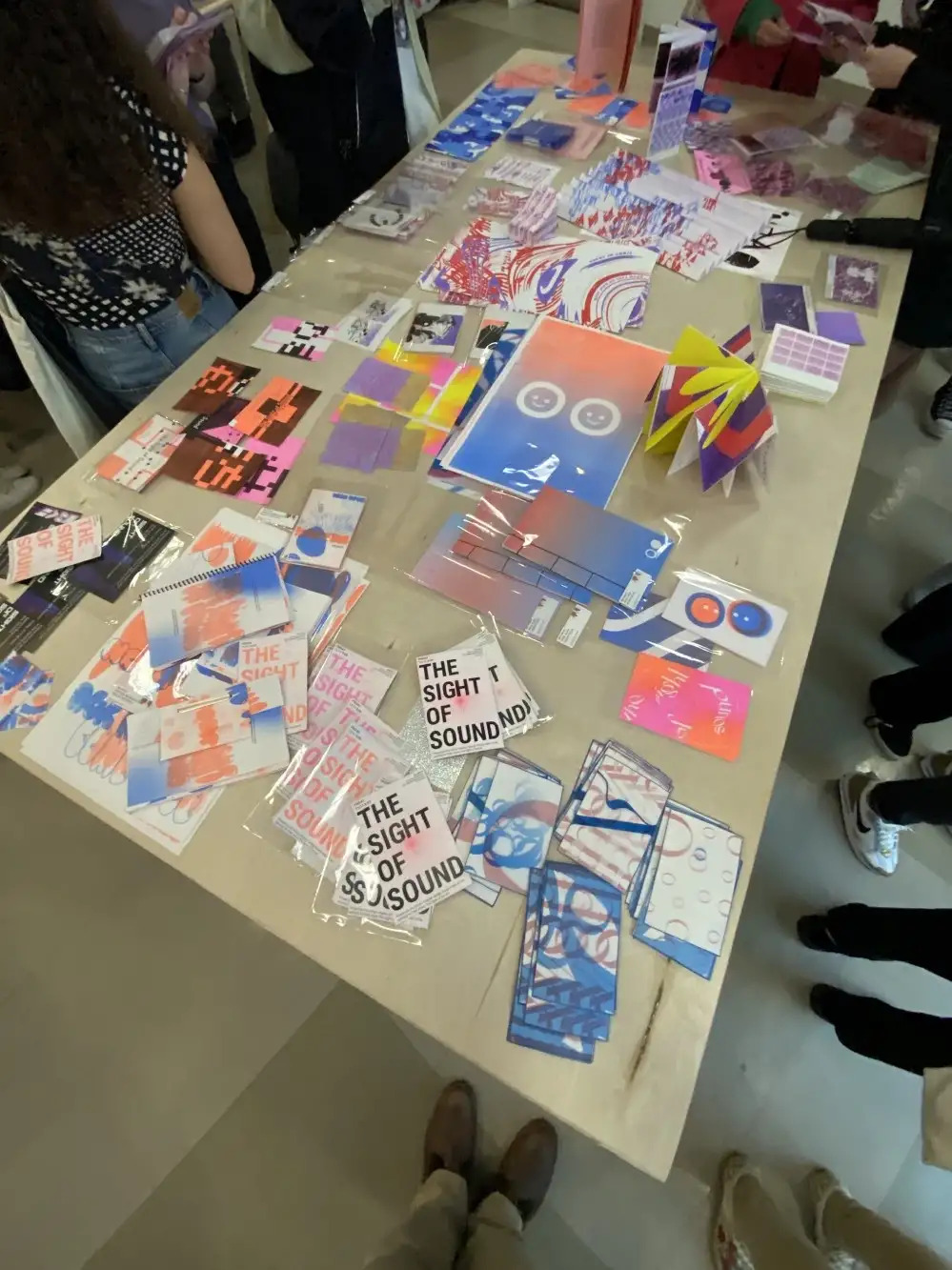
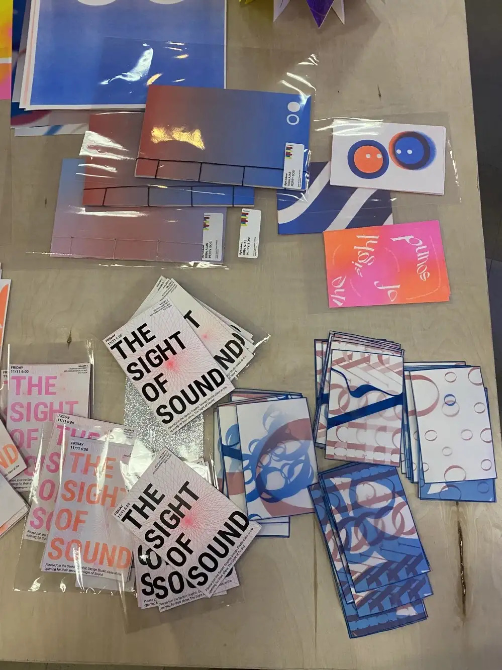
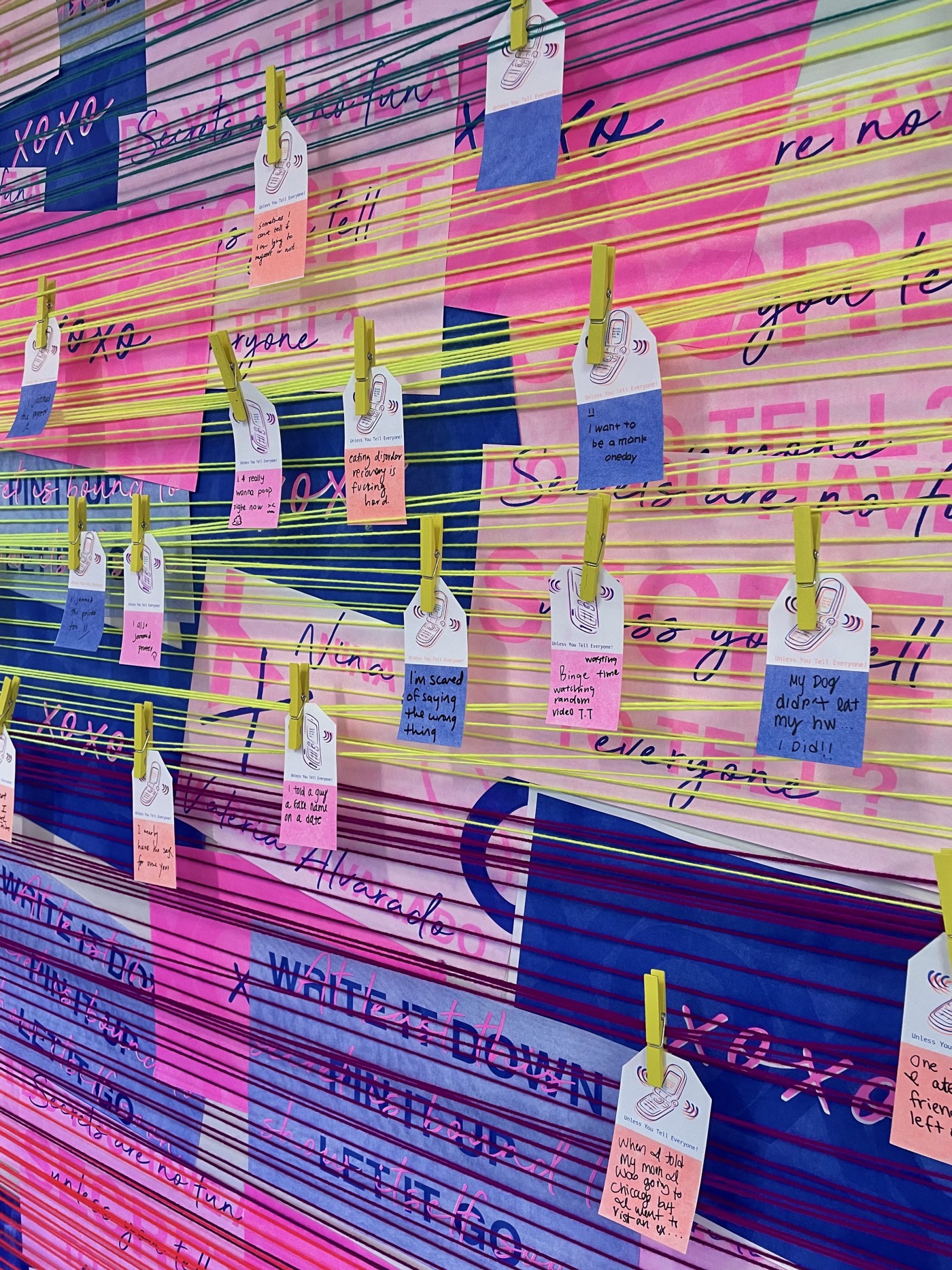
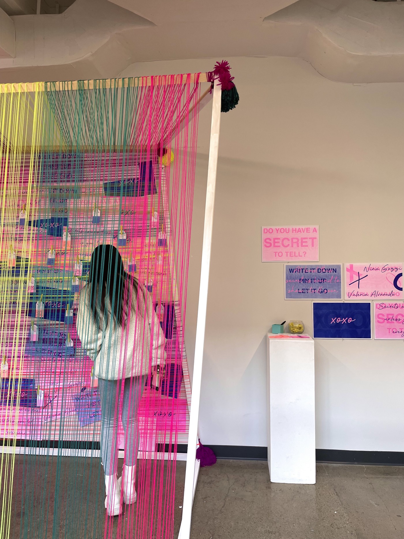
Student Names:
Valeria Alvarado & Nina Gozzi
Project Title:
Secrets Are No Fun... Unless You Tell Everyone!
Valeria Alvarado & Nina Gozzi
Project Title:
Secrets Are No Fun... Unless You Tell Everyone!
Project Description:
This collaborative project was inspired by the famous TV show “Gossip Girl.” We started breaking down the central theme of this teenage drama to understand what was interesting and how we could turn this inspiration into an installation. After the sketching process, we honed into our concept. For us, the most exciting thing was how the whole show is built around secrets, sometimes wrongfully shared by others. We then wanted to create a safe space where people could walk by and anonymously share a secret that might be weighing on them.
READ VALERIA’S FULL BLOG POST
READ NINA’S FULL BLOG POST
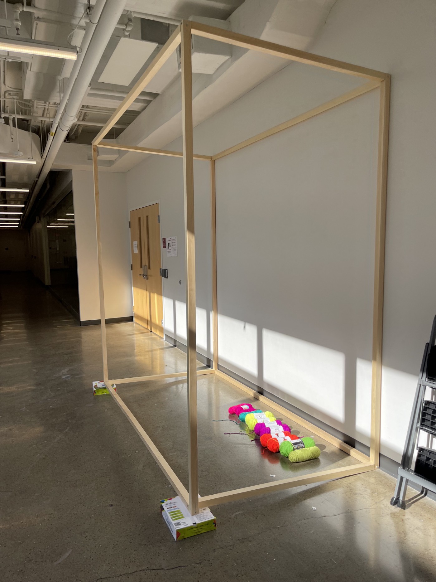

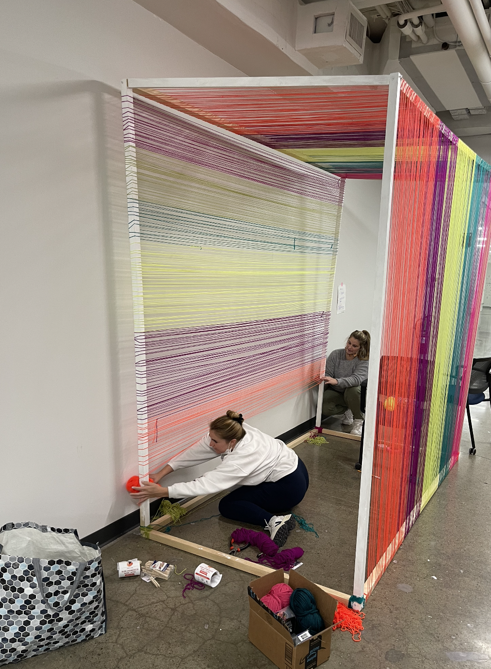
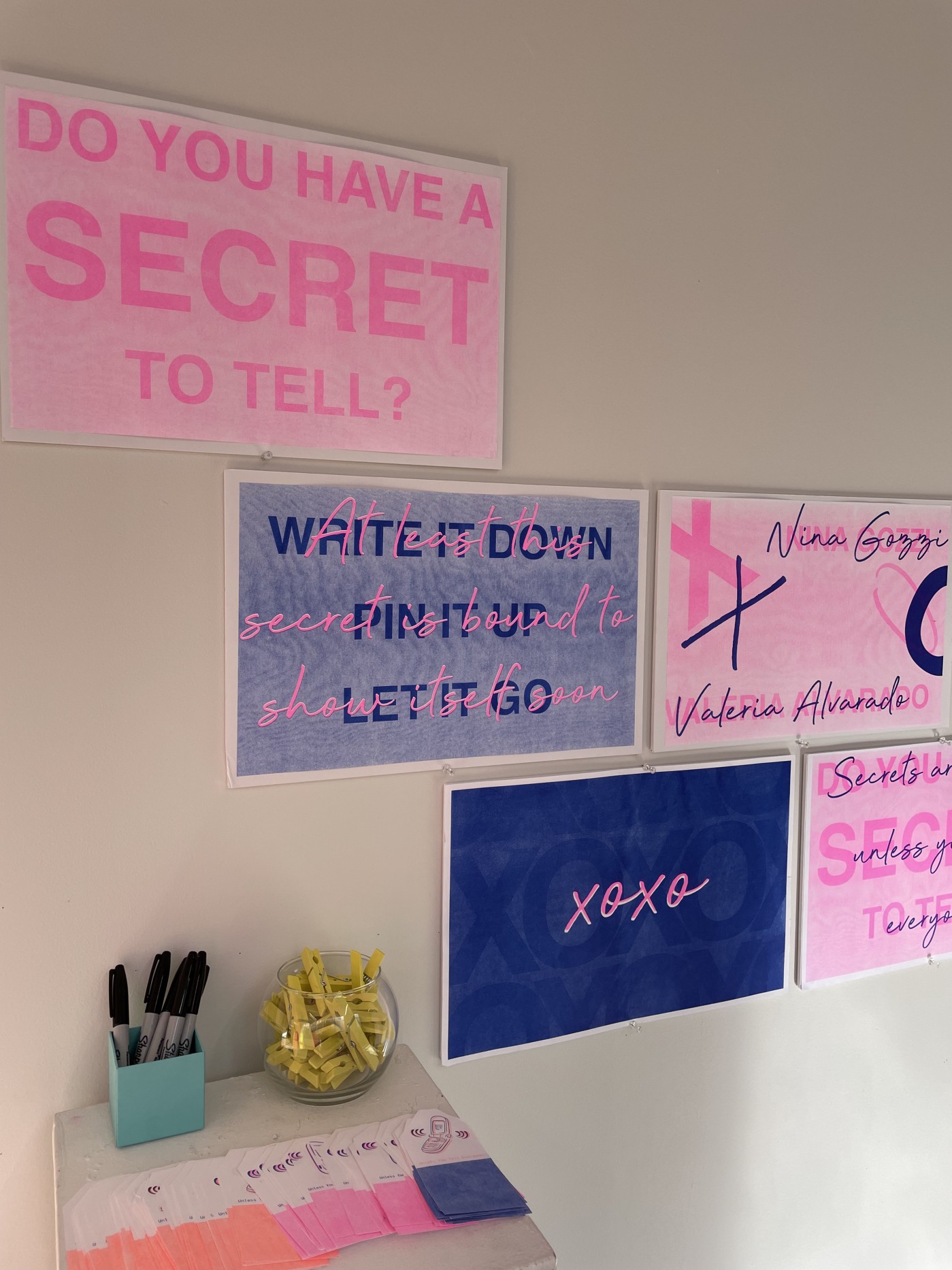
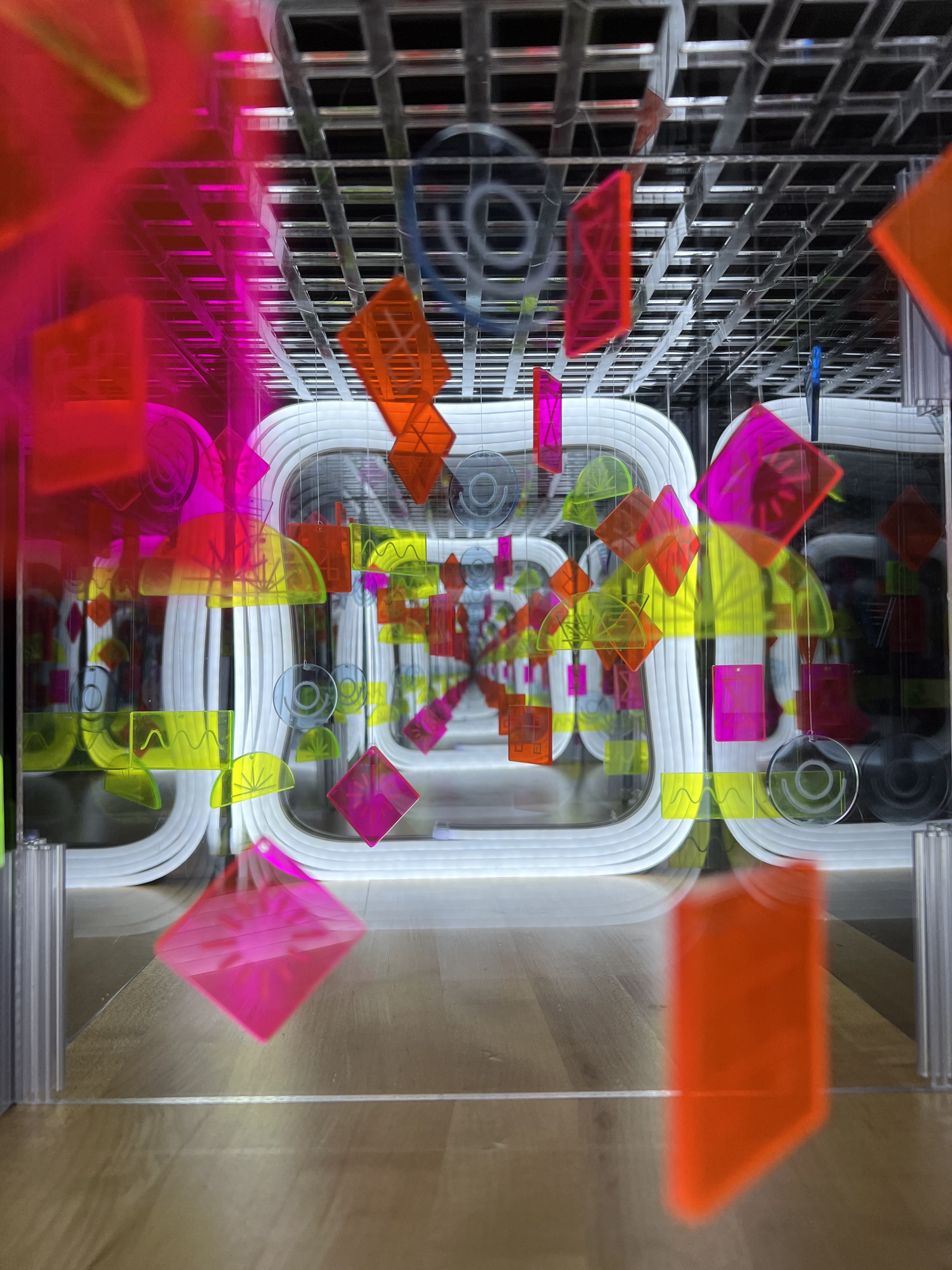
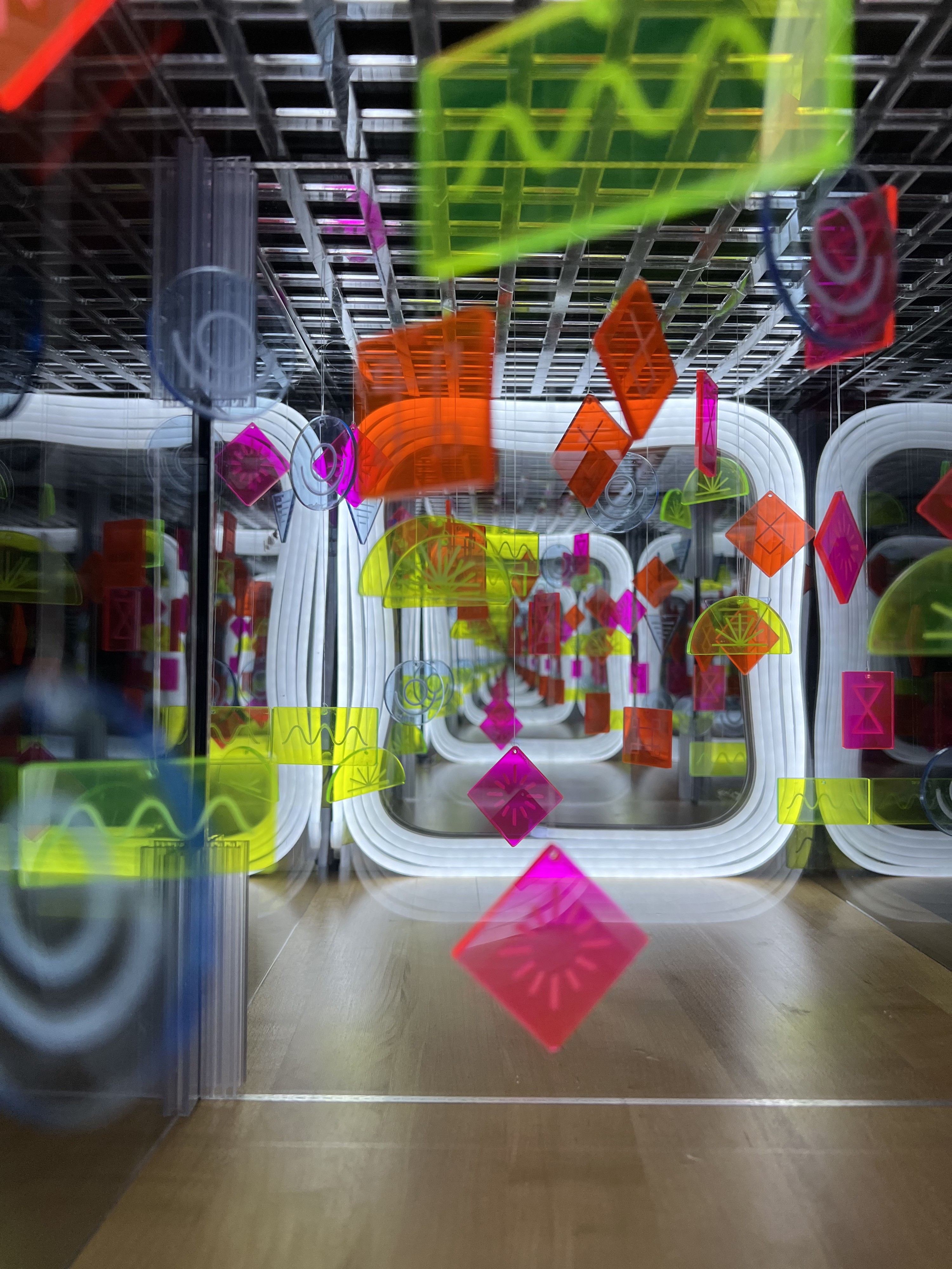
Student Names:
Annabella Pugliese
Project Title:
Infinite Thoughts
Annabella Pugliese
Project Title:
Infinite Thoughts
Project Description:
My first step in approaching this project was to further investigate the definition of liminality. Some key words that stood out to me were: ‘ambiguity’, ‘disorientation’, and ‘in between’. More specifically, I discovered that a ‘liminal space’ is defined as a place of transition between two locations; an intermediary space between origin and destination (i.e., a hallway, staircase, parking lot, or waiting room). I also noted in my research that a liminal space was often described as being empty or abandoned, thereby giving it an unsettling—‘frozen in time’—yet familiar feel. Again, there was this idea of ‘disorientation’ or ‘uncanniness’ associated with liminality.
After this initial research, I was particularly drawn to the idea of physically creating a liminal space as a response to this project. But how? Instinctually, I landed on infinity mirrors and the never-ending, perplexing, and even eerie liminal space created in the reflection of a reflection. I’ve always been fascinated by infinite reflections and am a huge fan of Yayoi Kusama’s mirror installation work, so this felt like a natural direction to take the project.
READ FULL BLOG POST
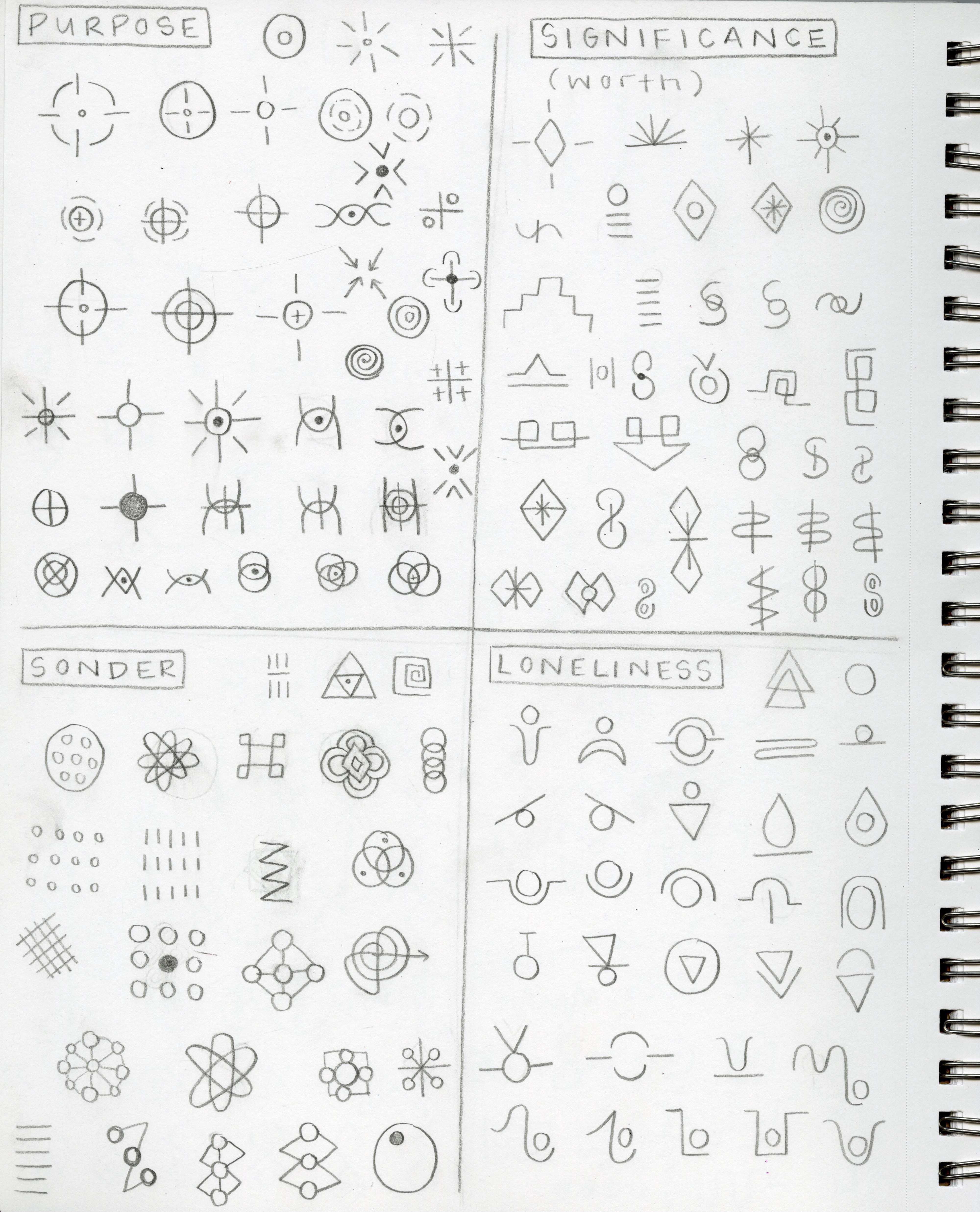
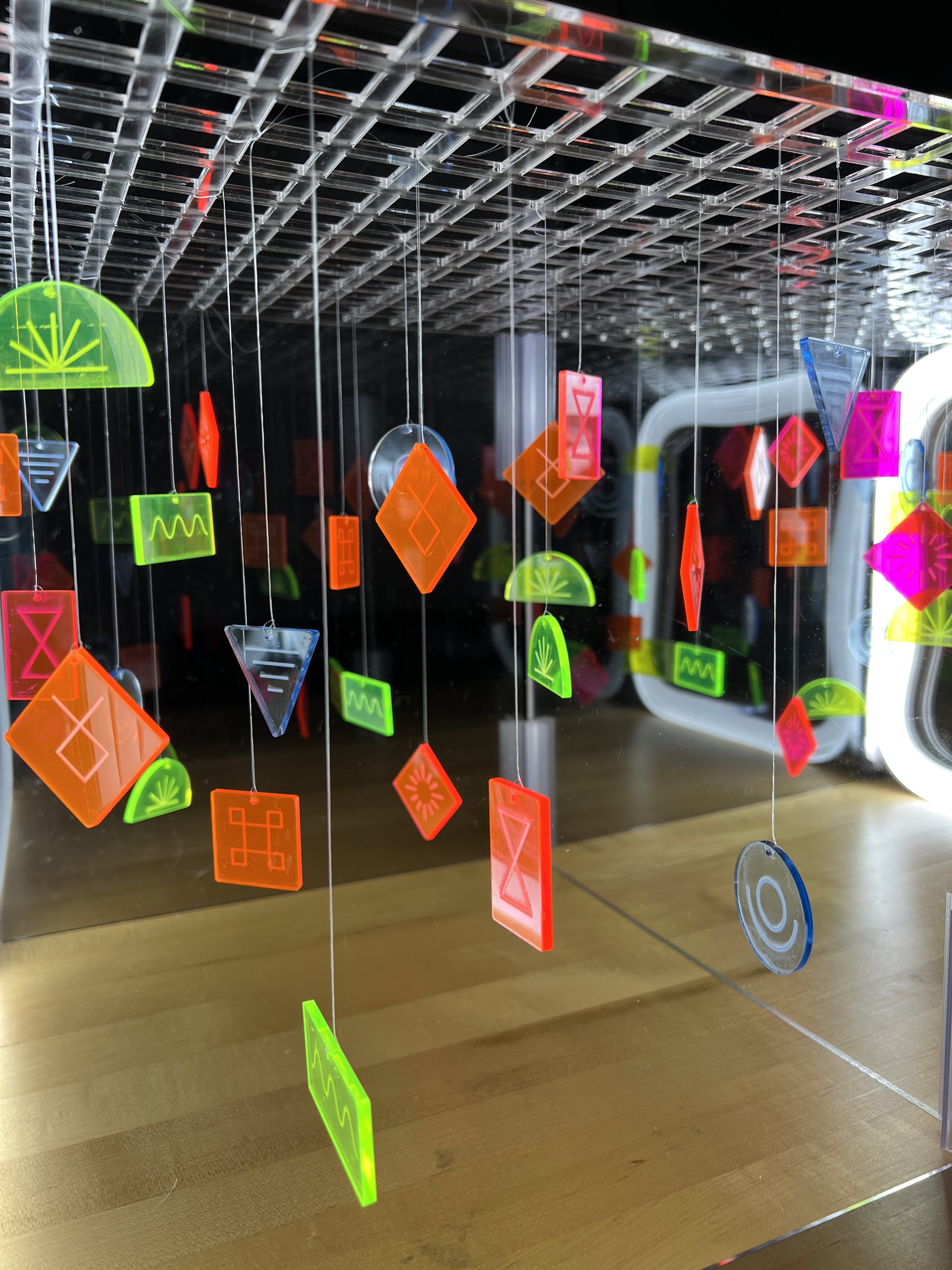
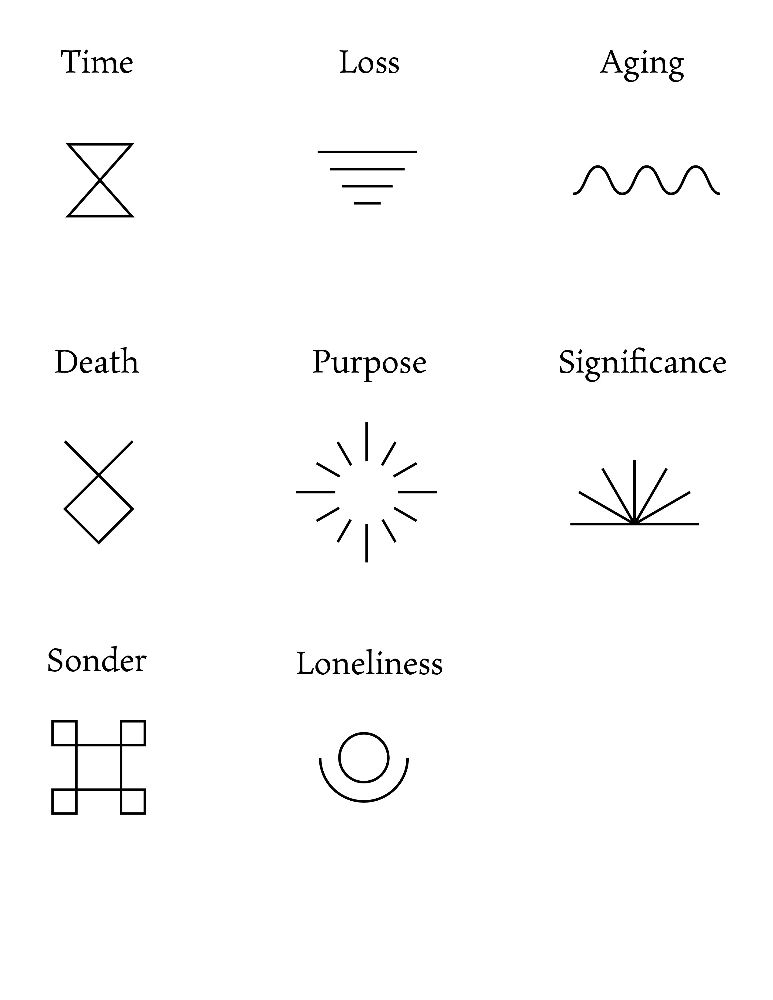
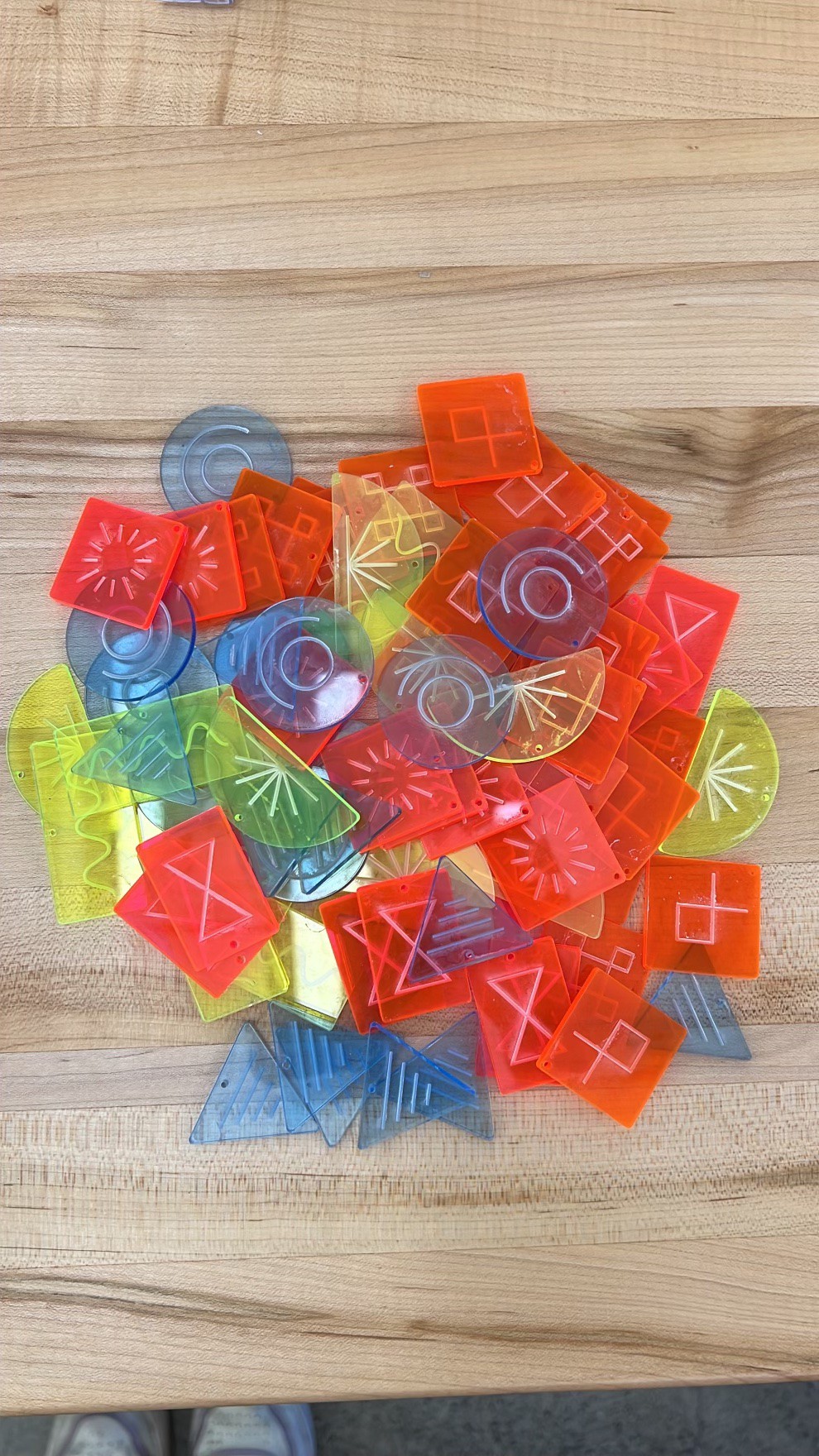
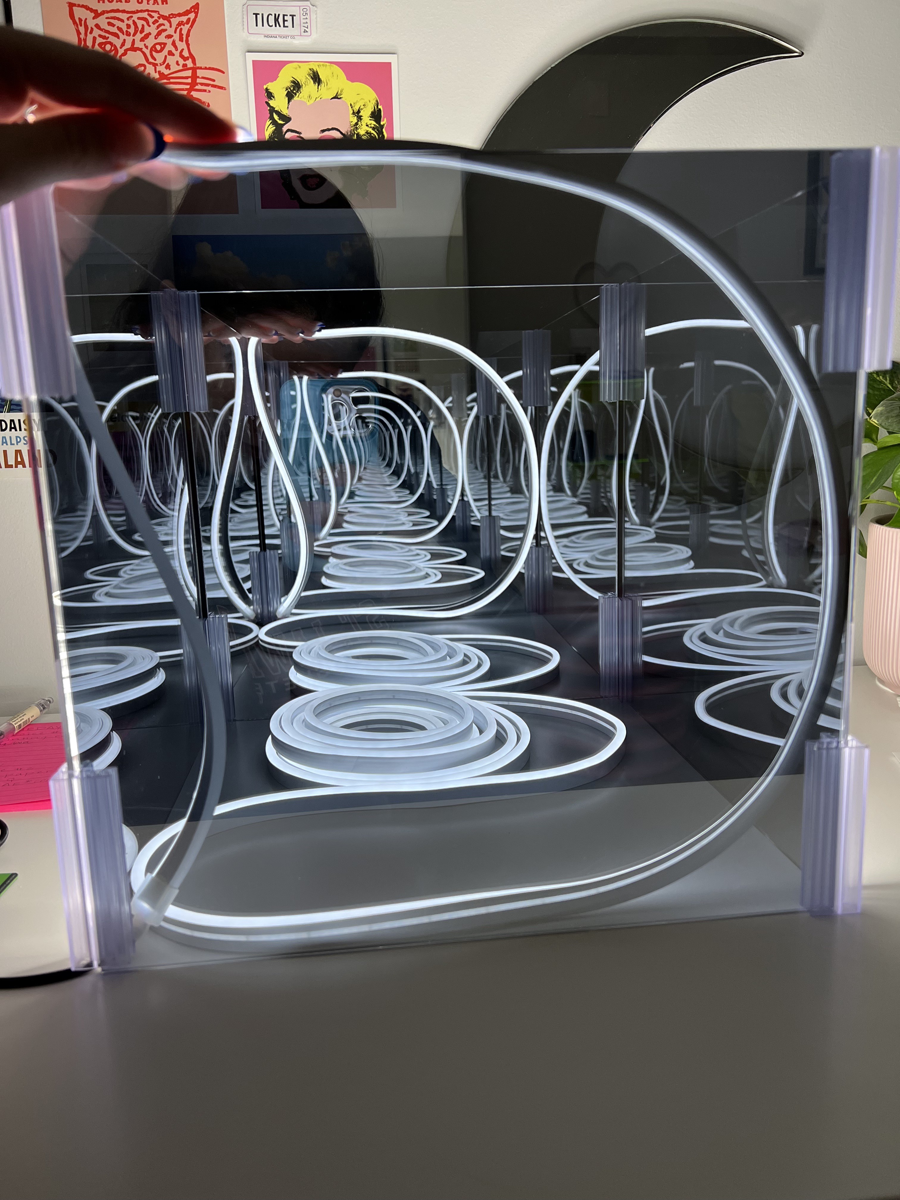
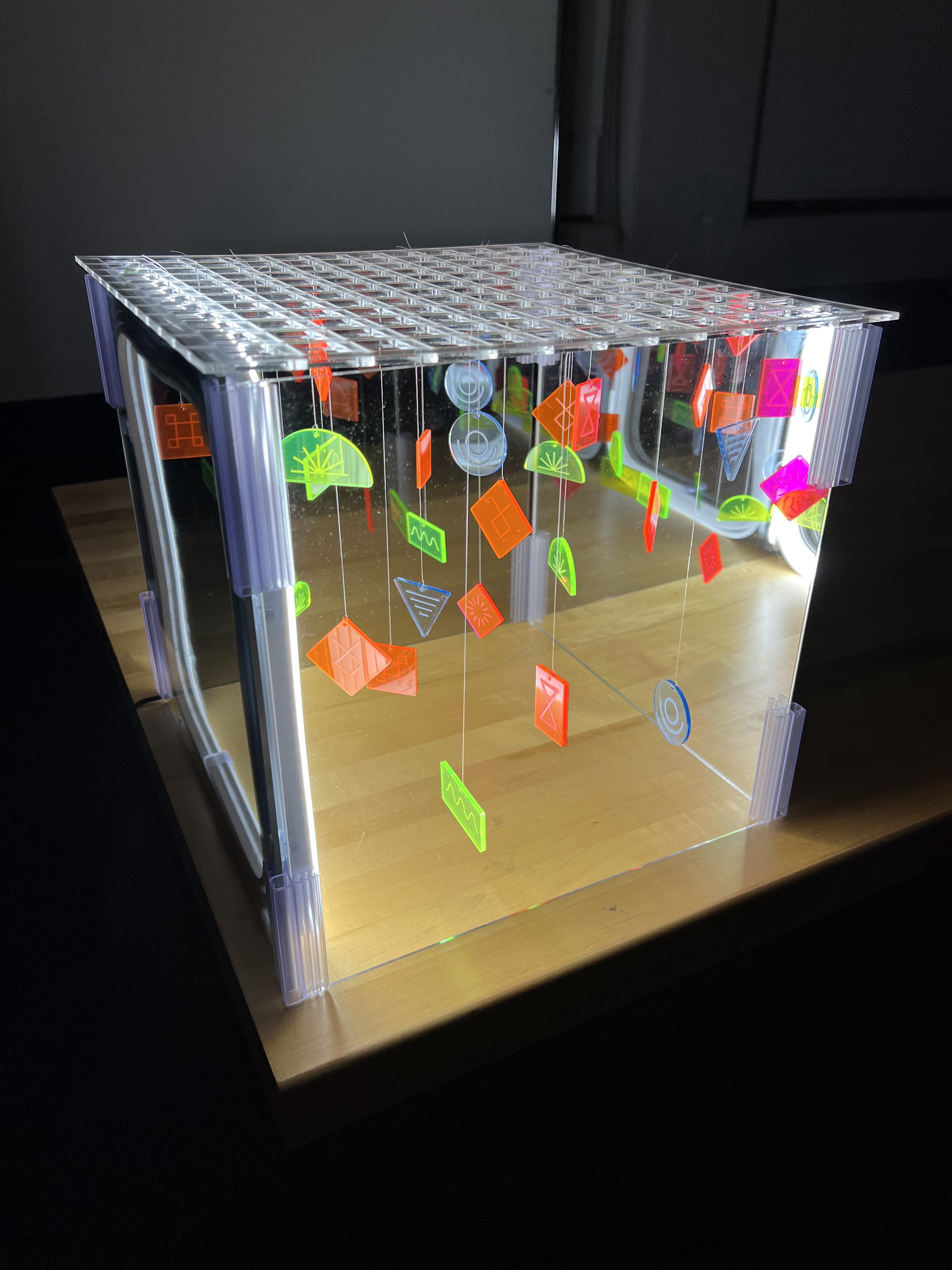
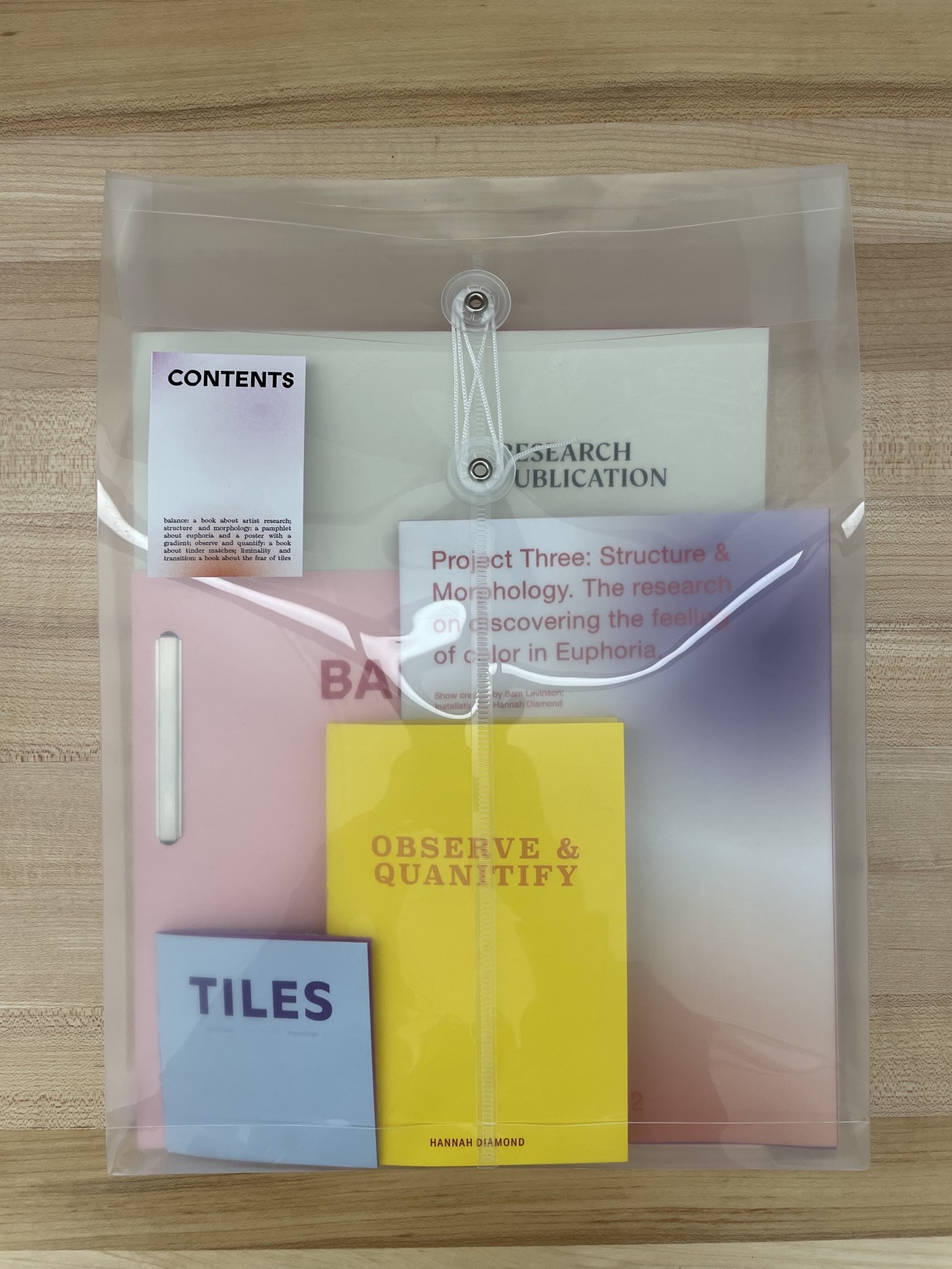
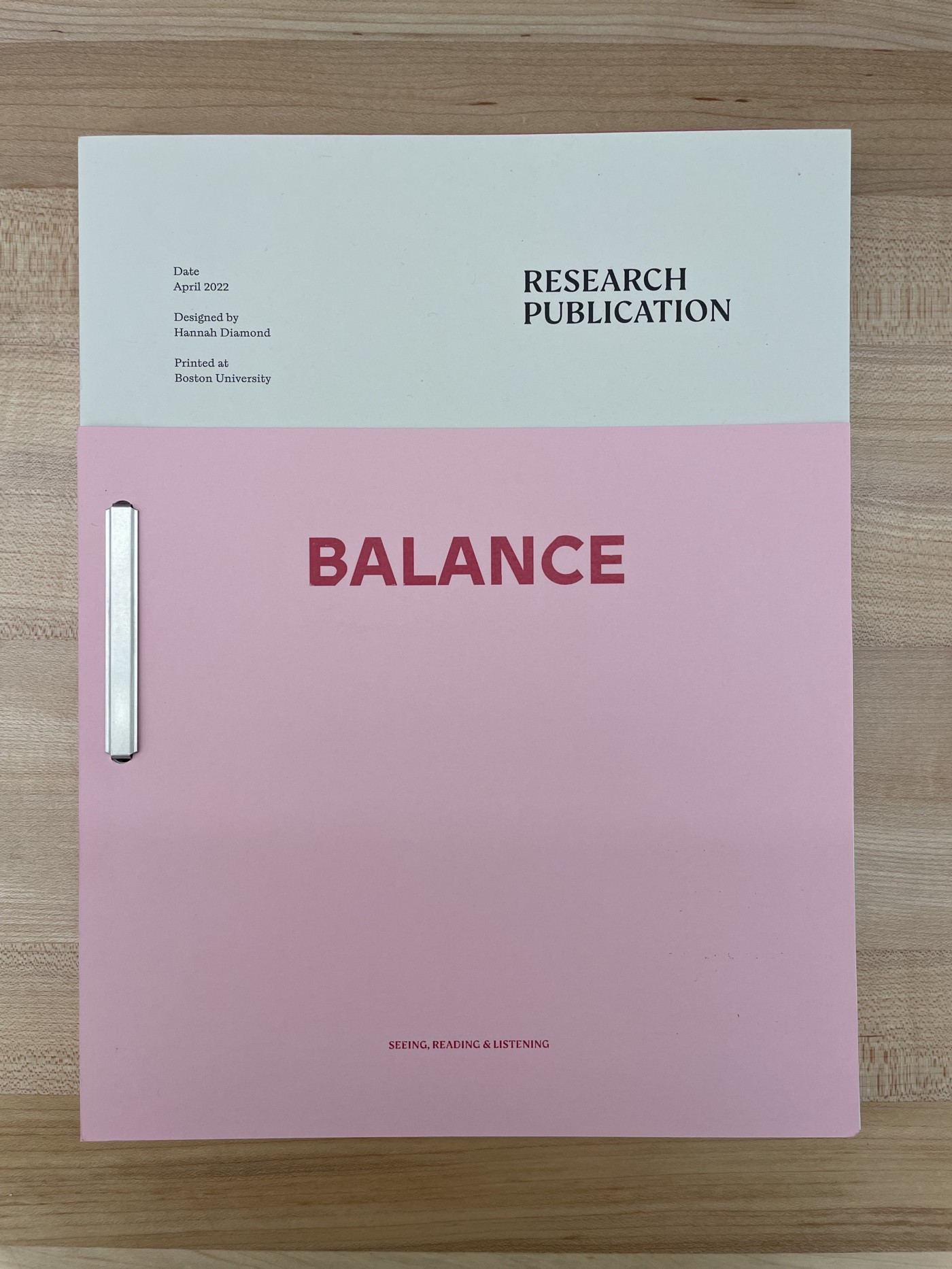
Student Name: Hannah Diamond
Project Title: Process Book-Research Publication
Project Title: Process Book-Research Publication
Project Description:
Immediately, I knew I wanted to create a publication that contained many separate parts. This semester was nothing short of a struggle for me. I had just started a new job in December and was working full-time for the first time since beginning this graduate program. Finding myself occasionally overwhelmed with my workload, I had to enact a fairly strict schedule to make sure I maintained my mental health while also producing work I was proud of. With every new project, I took the time to break up my work and use this time to wrap my mind around my intentions before diving in — splitting this research publication into separate pieces felt very honest to the way I worked.
READ FULL BLOG POST
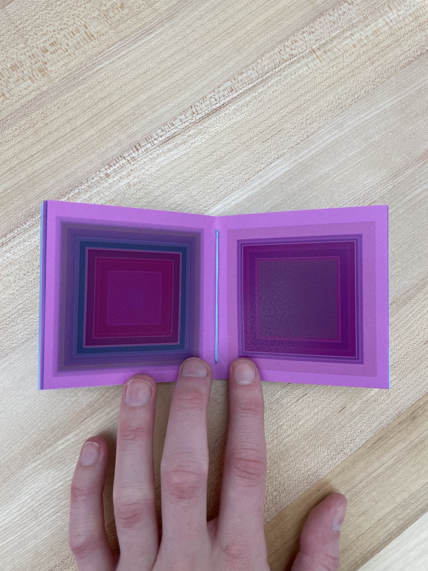
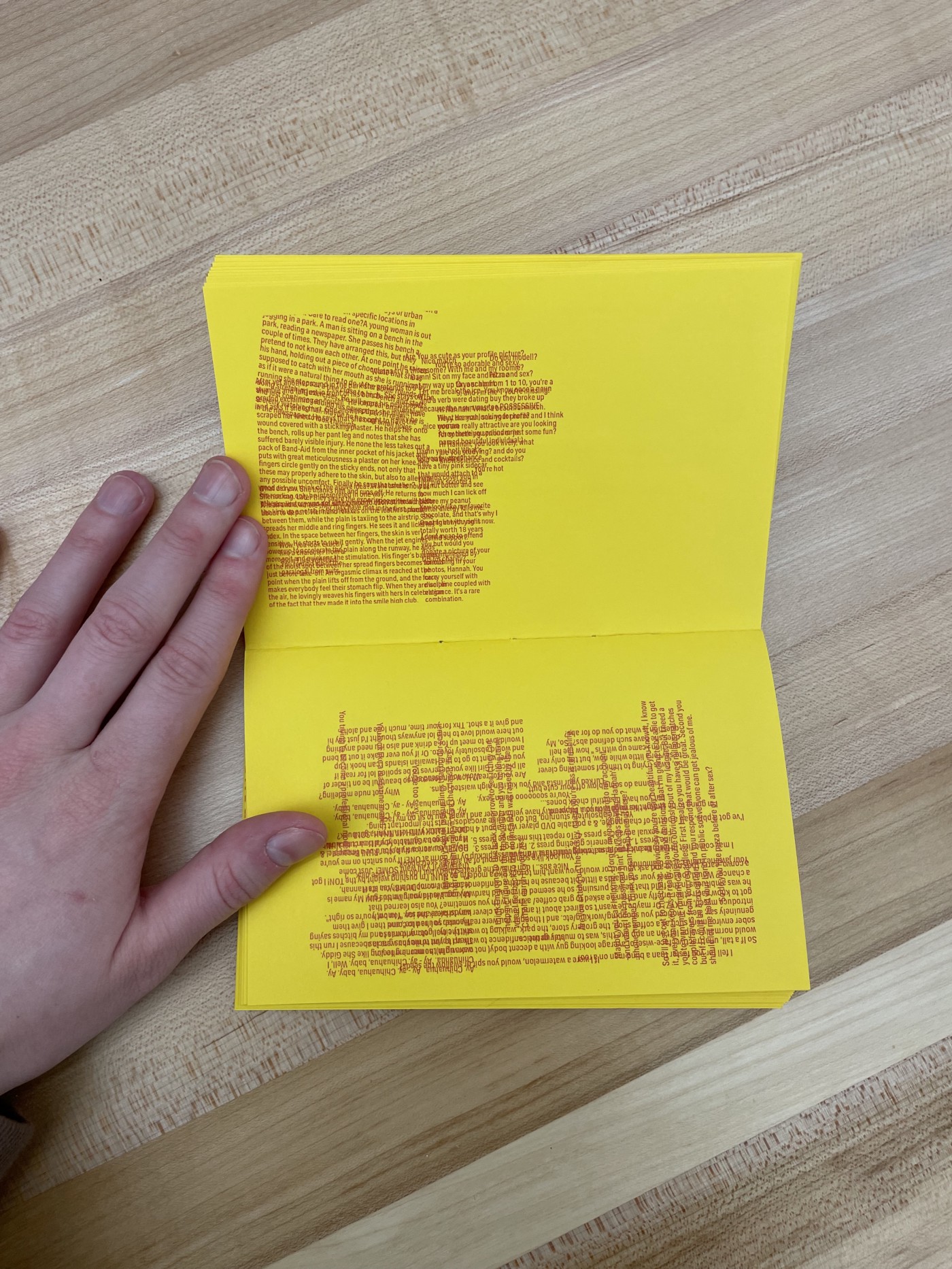
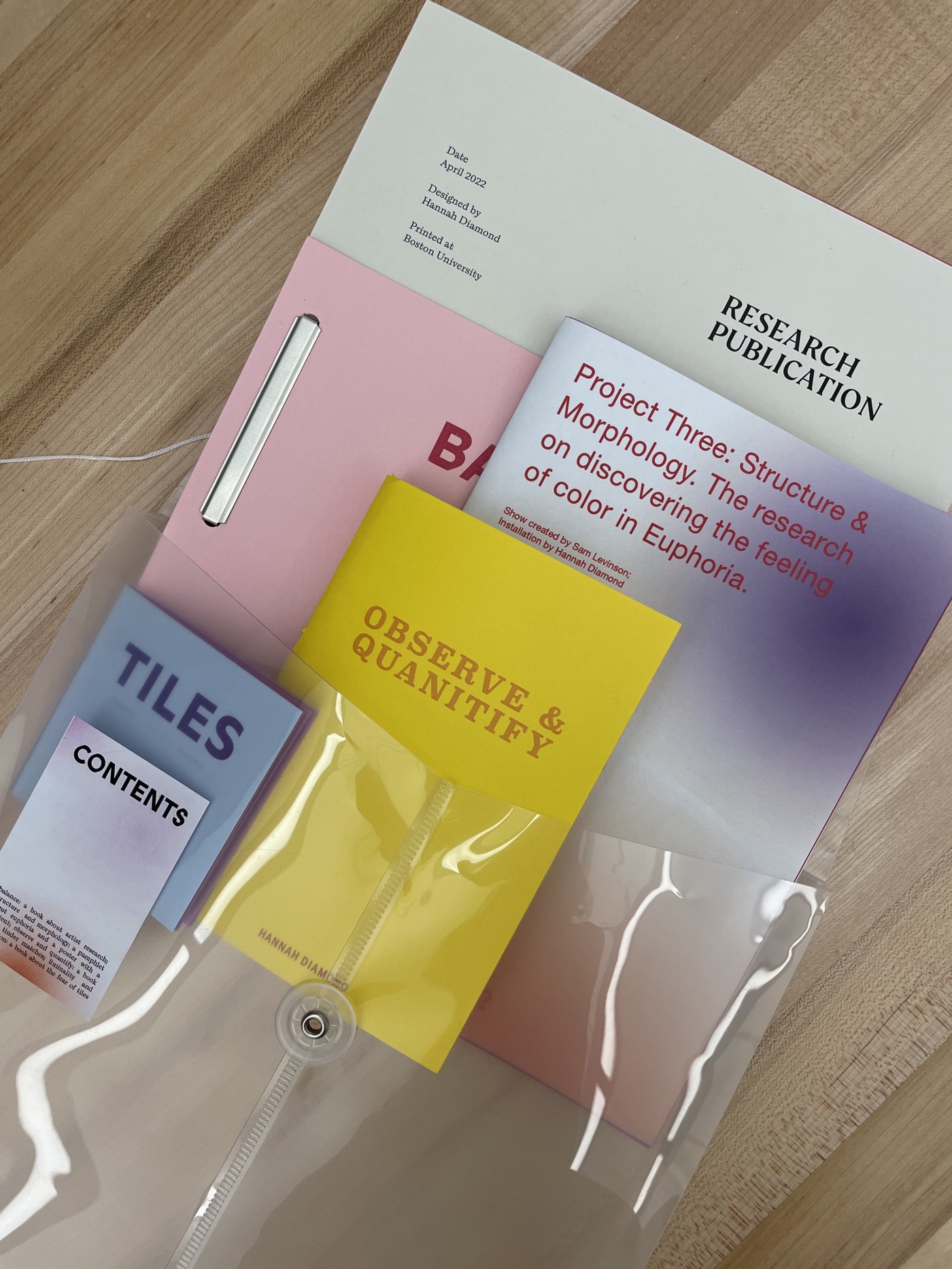
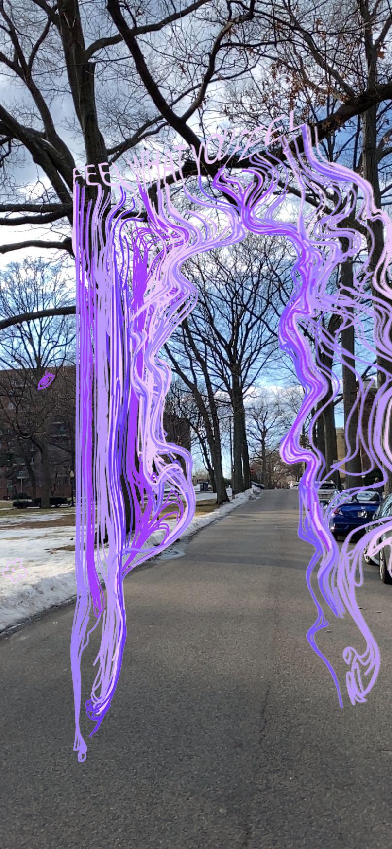
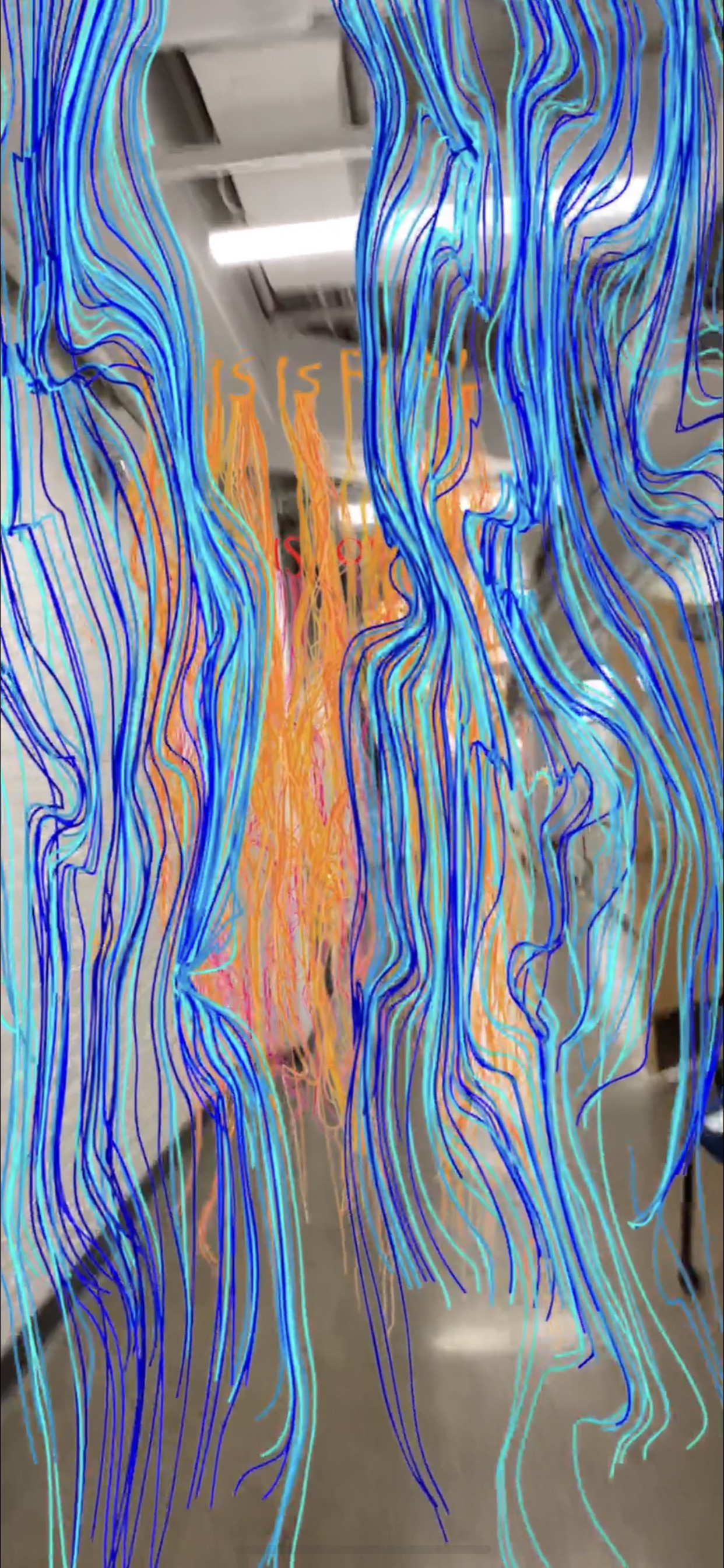
Student Name: Jesse Finkelstein
Project Title: Feel What You Feel
Project Title: Feel What You Feel
Project Description:
To be completely honest, one of the hardest parts about design school is the open-endedness of the prompts. When we first started this project, I had absolutely no idea where I wanted to end up. I tried to take things one class at a time and figured I could worry about the rest as it came up, speaking with the faculty as necessary. I will say that while I may have been a bit confused about the process while going through it, I am thankful for all of the weeks we spent brainstorming because it helped me get my ideas flowing for this most recent stage.
READ FULL BLOG POST

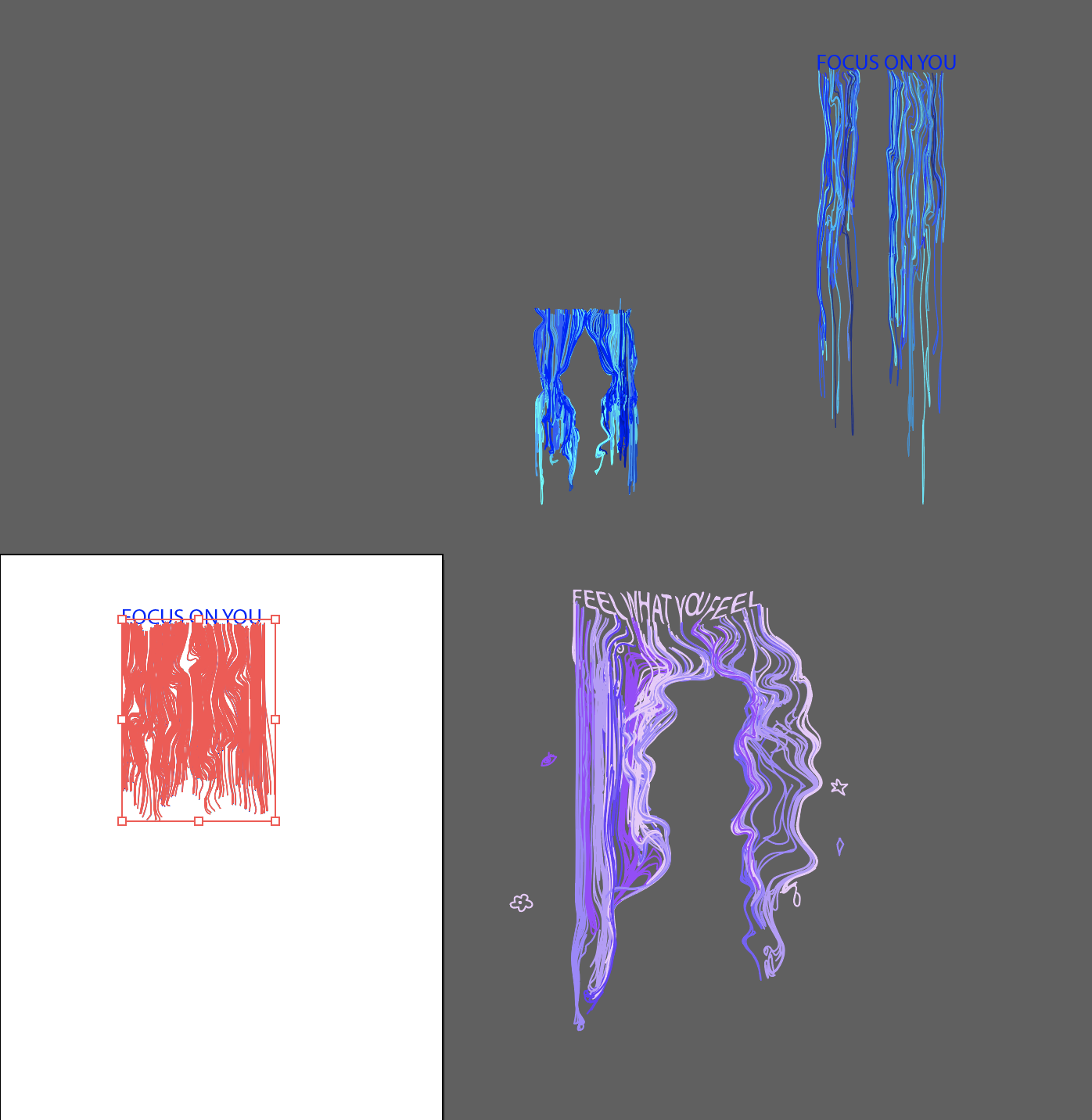
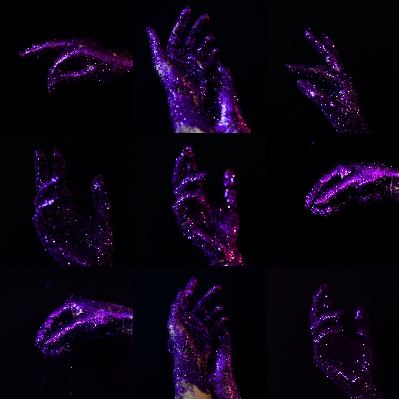
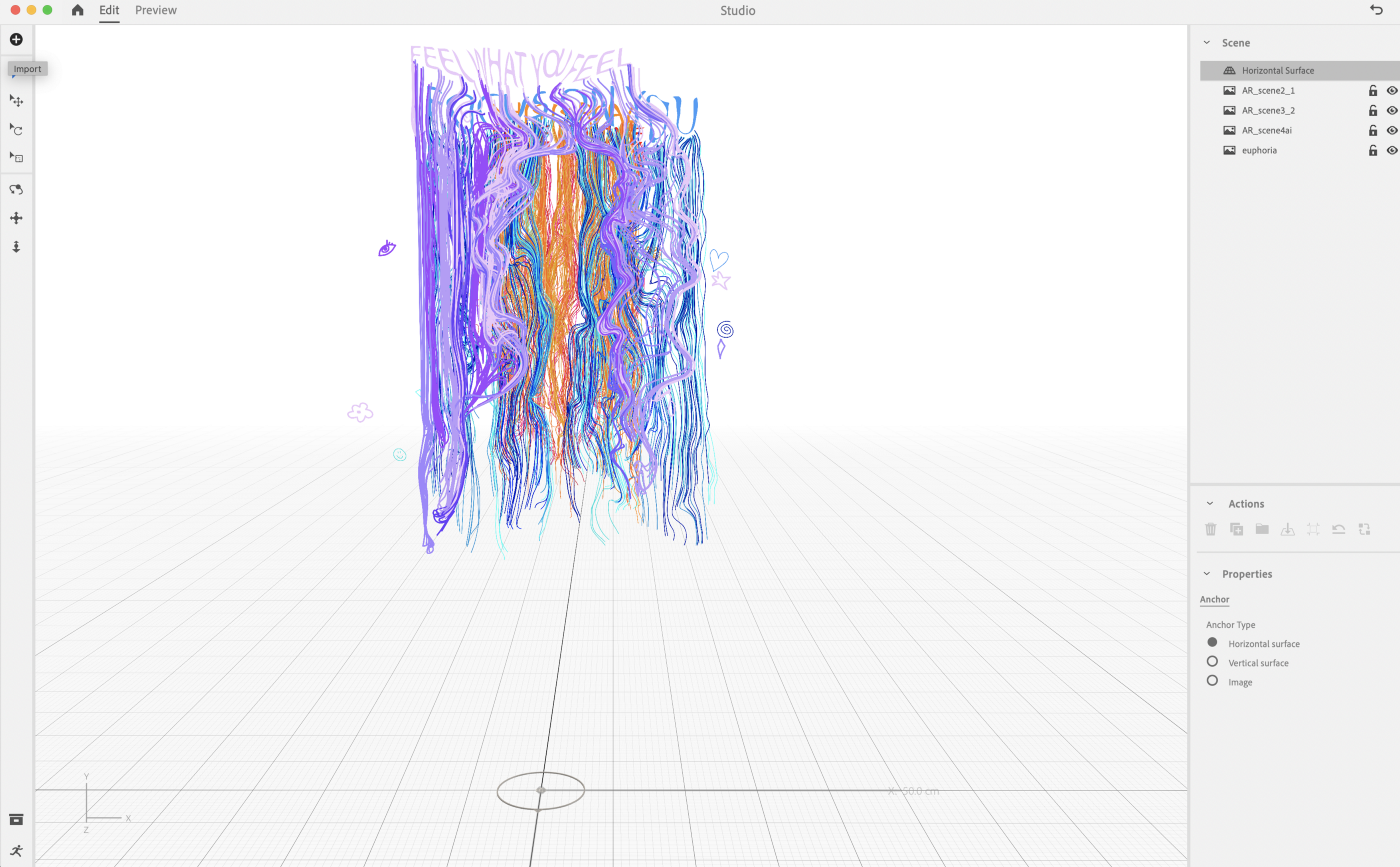
Student Name: Graham Atherton
Project Title: The Ramp
Project Title: The Ramp
Project Description:
The Ramp, as it is colloquially known to CFA students, is one of the most peculiar and fascinating spots on campus. I think what makes it so interesting to me is that BU hasn’t figured out how to make money off it yet, so it just sits there. Once they realize some revenue potential, they’ll turn it into a slip-n-slide or something. For now, it just collects detritus from staff and students. It’s a fascinating collection of artifacts on the ramp ranging from abandoned fine art projects to boxes of ceiling tiles and air filters. It seems like this is the place people go to leave things they don’t need now but may want later.
I have spent hours and hours wandering the ramp now, and even though I’m usually the only person there, I do occasionally cross paths with other pilgrims: a COM student playing guitar, an a cappella group rehearsing, an undergrad assembling a sculpture, a custodian exiting her closet. Even when I see no one (which is more common than not) there is still evidence of activity. A new graffiti tag here, a smashed television there. I try to go every day so I can see what has changed overnight. I find myself imagining who might have left the bottle of Fiji water on the fifth floor or who repositioned the little oil painting on the third floor. It’s interesting how much I want there to be a narrative behind every weird little detail. I want the graffiti to have meaning, but I’m sure a lot of it doesn’t.
READ FULL BLOG POST

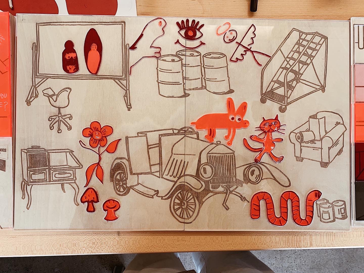
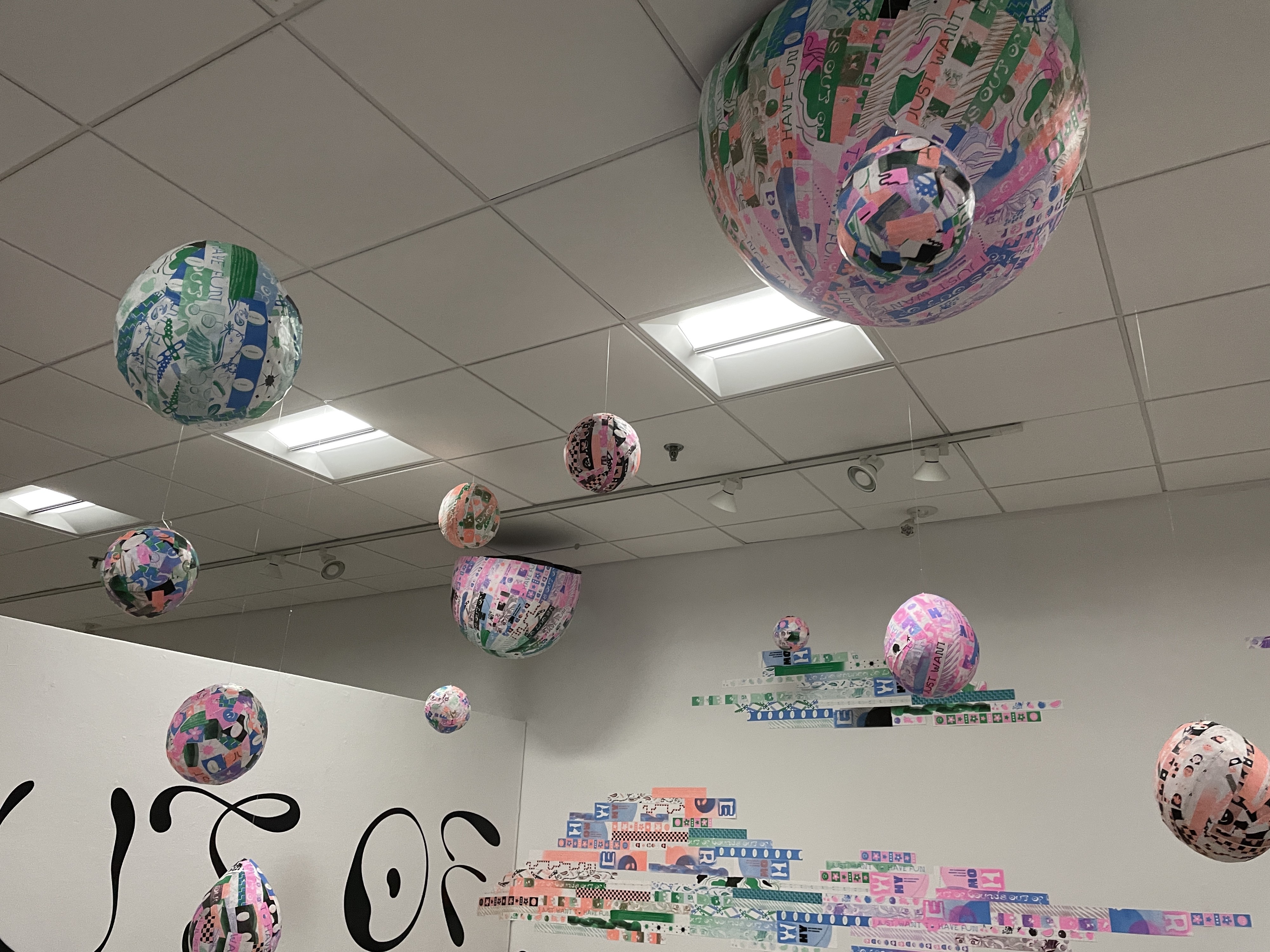
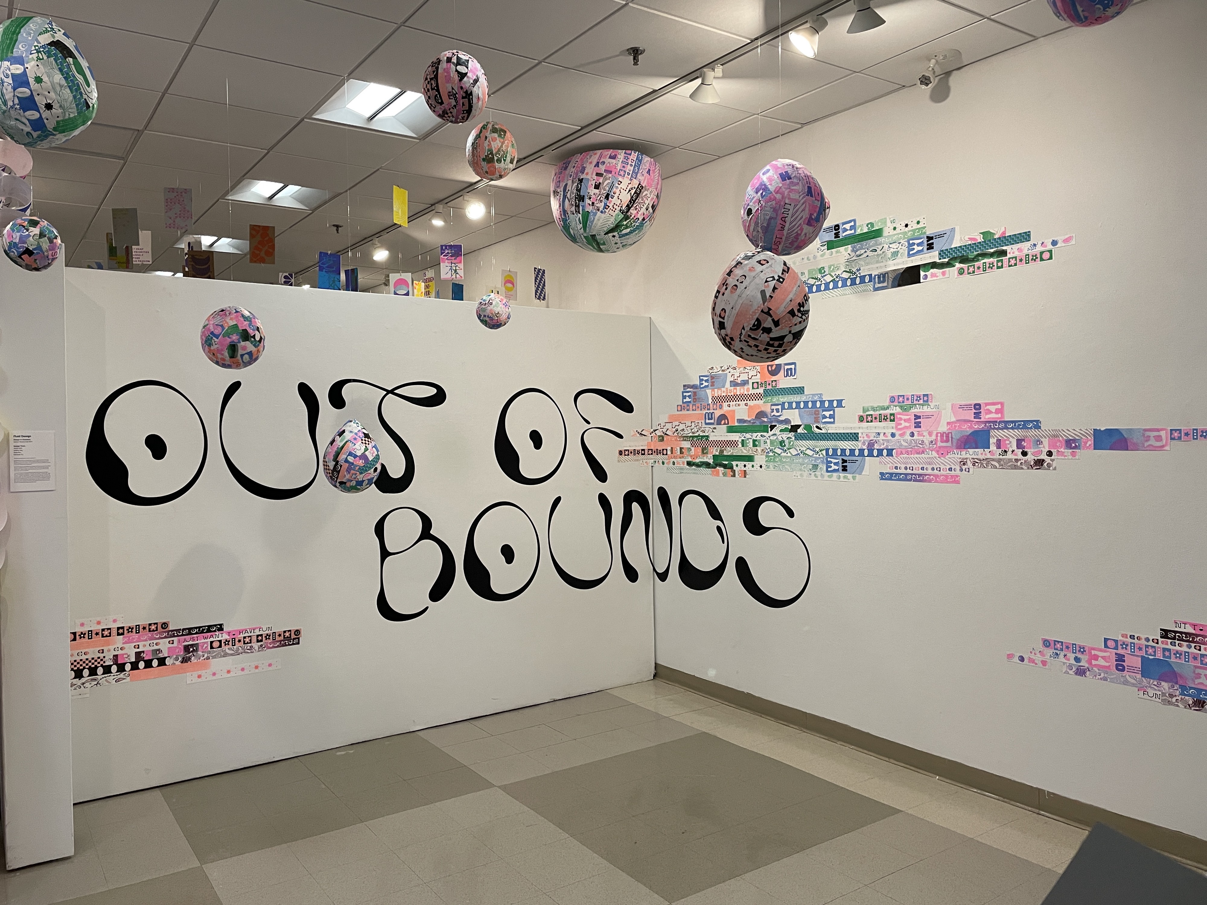
Student Names: Chloe Carson, Joyce Hu, Antonella Jones, Jayna Mikolaitis, Ken Rudolph
Project Title: Out of Bounds
Project Title: Out of Bounds
Project Description:
Out of Bounds is a temporary art installation in Boston University’s College of Fine Arts. The installation consists of suspended paper-mache spheres and half spheres, large vinyl typography, and risograph strips arranged in cloud-like forms. The project was completed in October and November of 2021 for Senior Graphic Design Studio by designers Chloe Carson, Joyce Hu, Antonella Jones, Jayna Mikolaitis, and Ken Rudolph. This blog post describes the process of the installation from conception to execution. Sections of this post include Initial Readings + Generation of Questions, Collection of Inspiration, Planning, Production, and Installation.
READ FULL BLOG POST
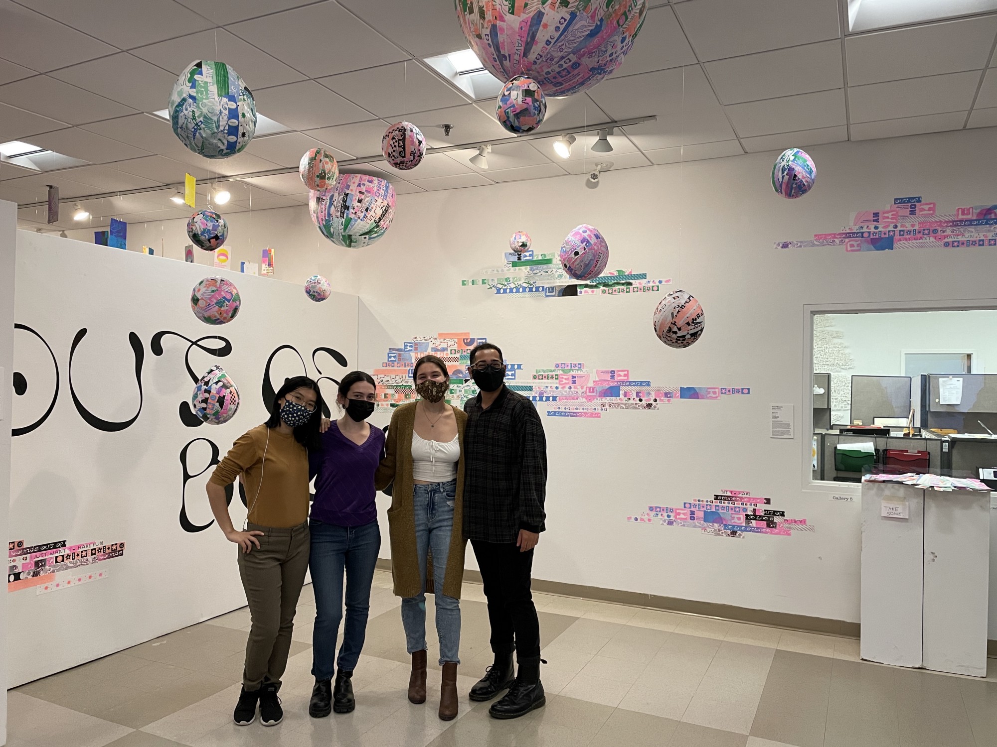
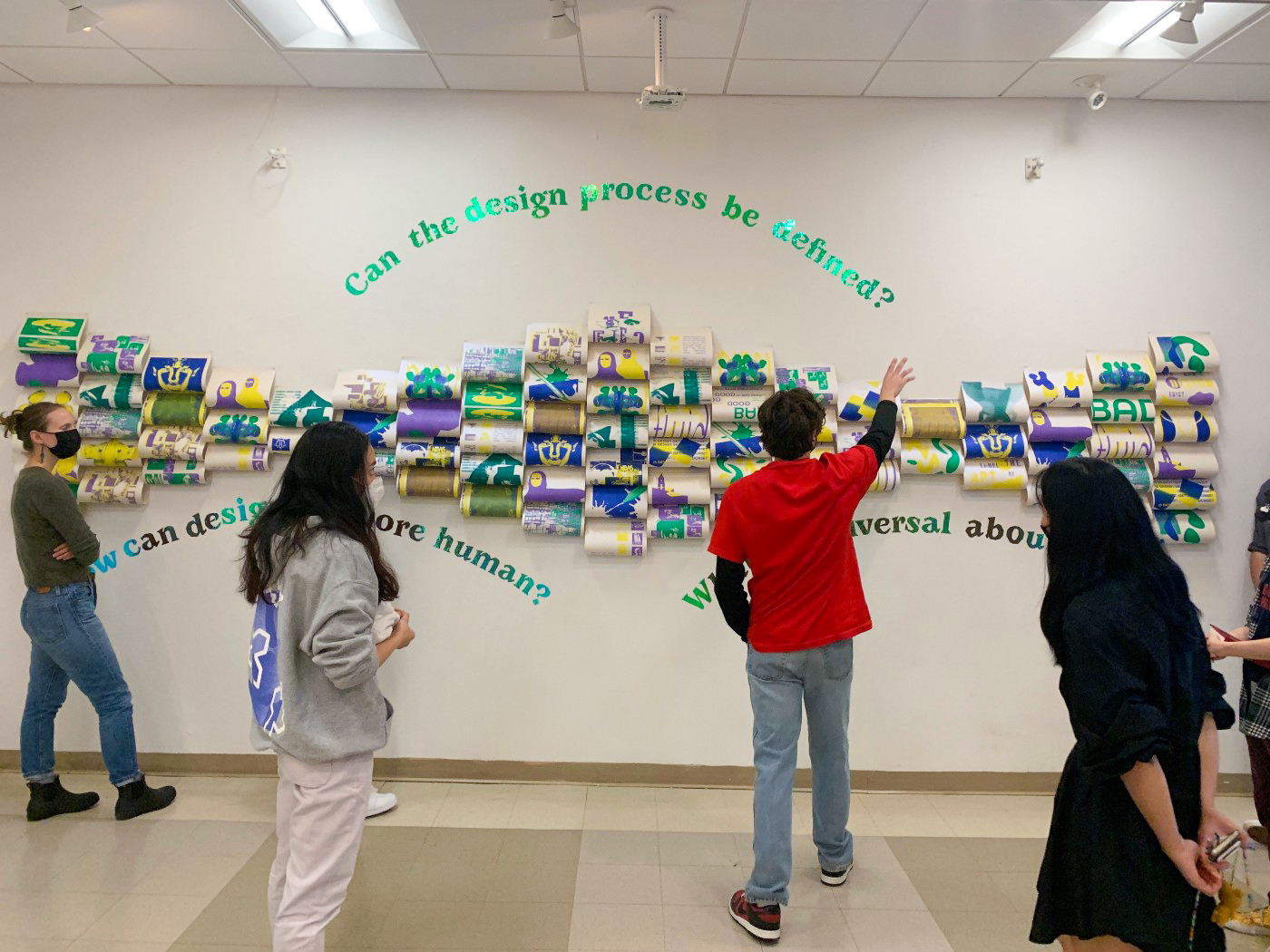
Student Names: Kara Chen, Geo Ferrari, Ashlie Dawkins, Katie So,
Jon Vogel
Project Title: Reflection
Jon Vogel
Project Title: Reflection
Project Description:
Reflection is an exploration of foundations and finding a relationship between design and fine art and exploring how design can be more human, similar to traditional art, and if design and design processes can be definable.
In the beginning steps of the project, our group was formed in the middle of creating the first 25 iterations. From seeing each other’s style during the 25 iterations critique, we realized how different our styles so we struggled with finding a cohesive visual language.
READ FULL BLOG POST
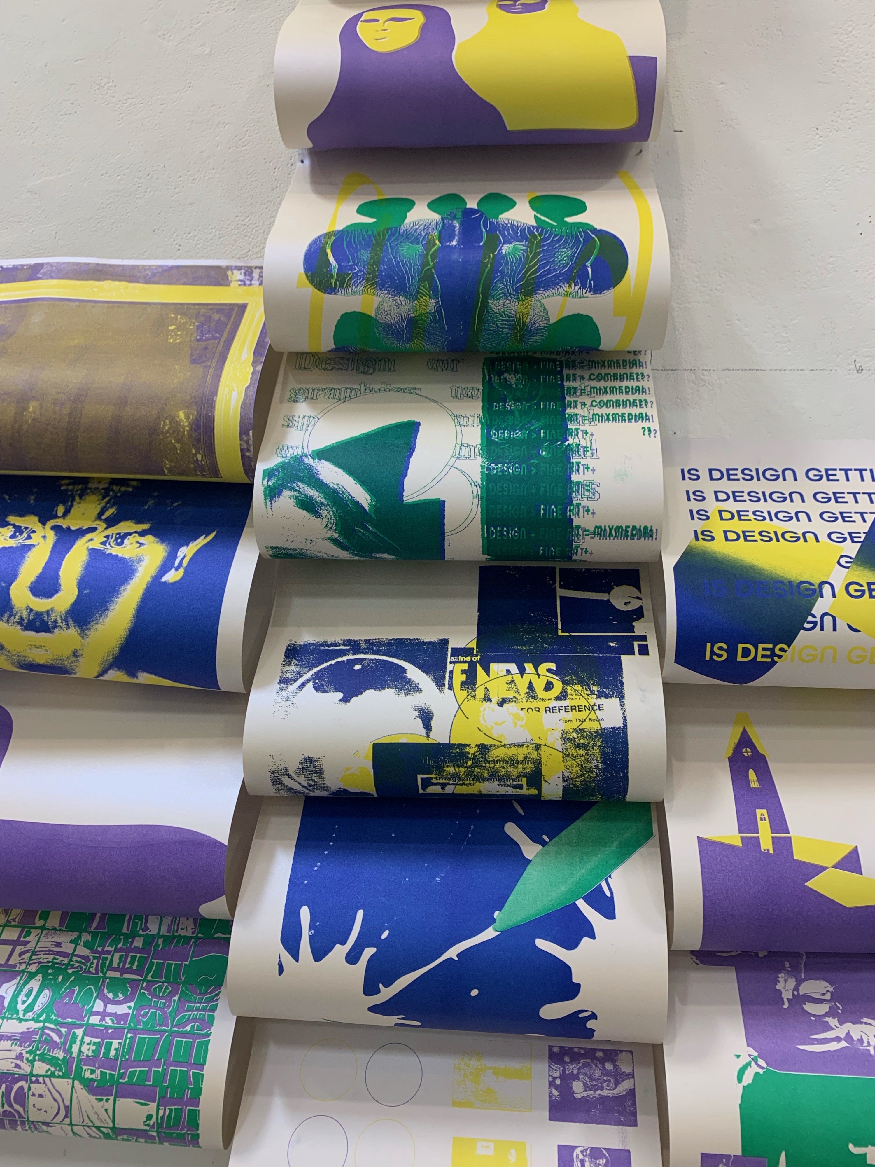
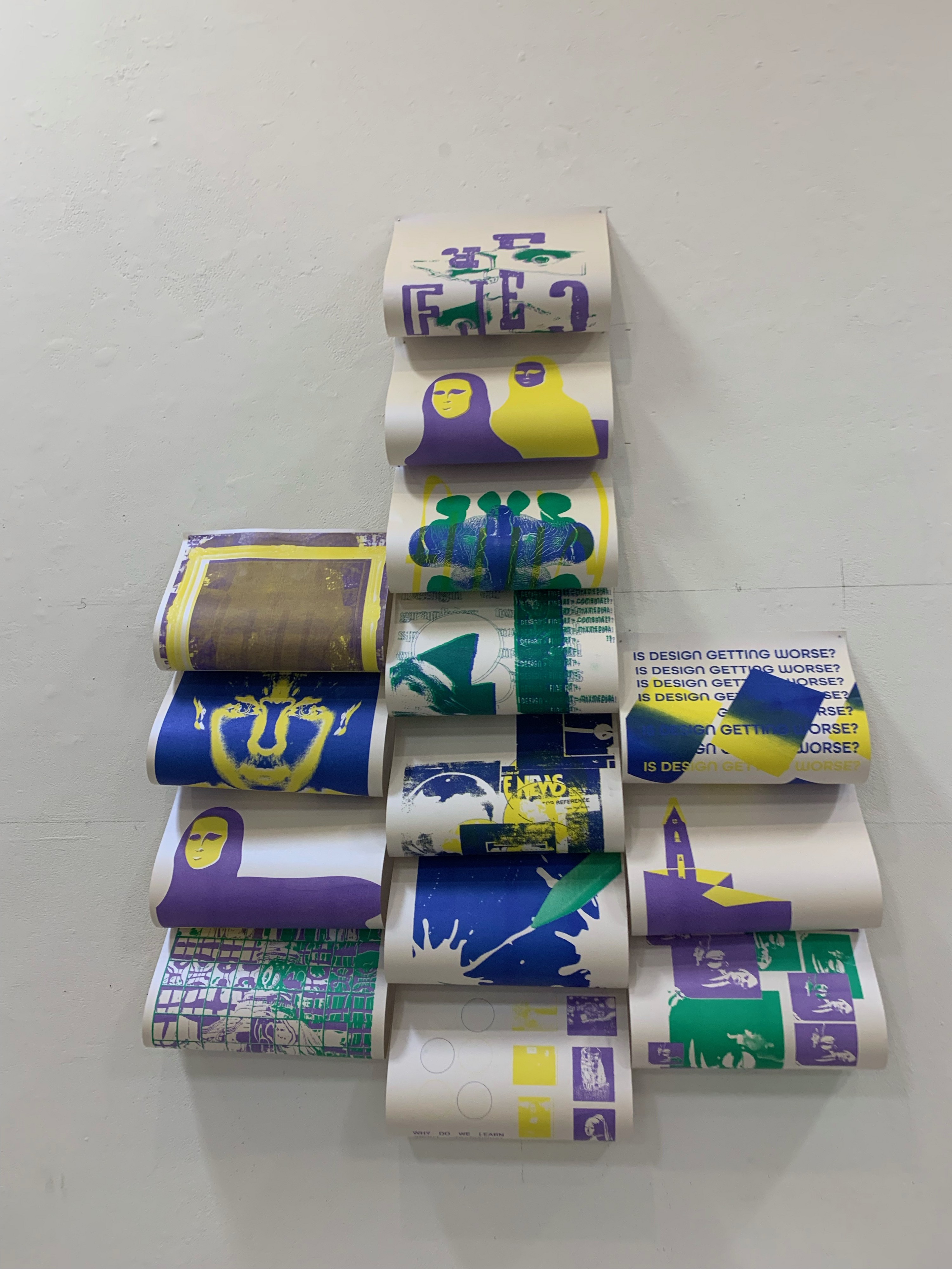
Student Names: Kylie Carrol, Davide Bianchi, Jonathan Pincher, Clay Allen
Project Title: Direct Shot
Project Title: Direct Shot
Project Description:
Direct Shot is an investigation of the process of design. Making as a process encapsulates both elements of rigid structure and unpredictable play. We highlight this disparity by inviting the audience to engage in the crafting of paper airplanes. Paper airplanes follow a fold pattern to complete a specific style of plane, this process parallels many traditional design environments where creators are expected to plan, implement, and fulfill a predetermined goal. On the other hand, paper airplanes are unpredictable in flight and emphasize the element of chance. The unforeseeable is a large influence in the design process, as designers must remain open to new ideas and remain resilient to any obstacles that accumulate along the way. To be a designer is to walk the line between the predetermined and the unknown. This harmony allows for the process itself to help shape the product, creating an end result that is maybe different but more effective than the original plan. We encourage you to engage with our exhibition and make your own paper airplane, aim for the target in the center and see where the experience takes you.
READ FULL BLOG POST
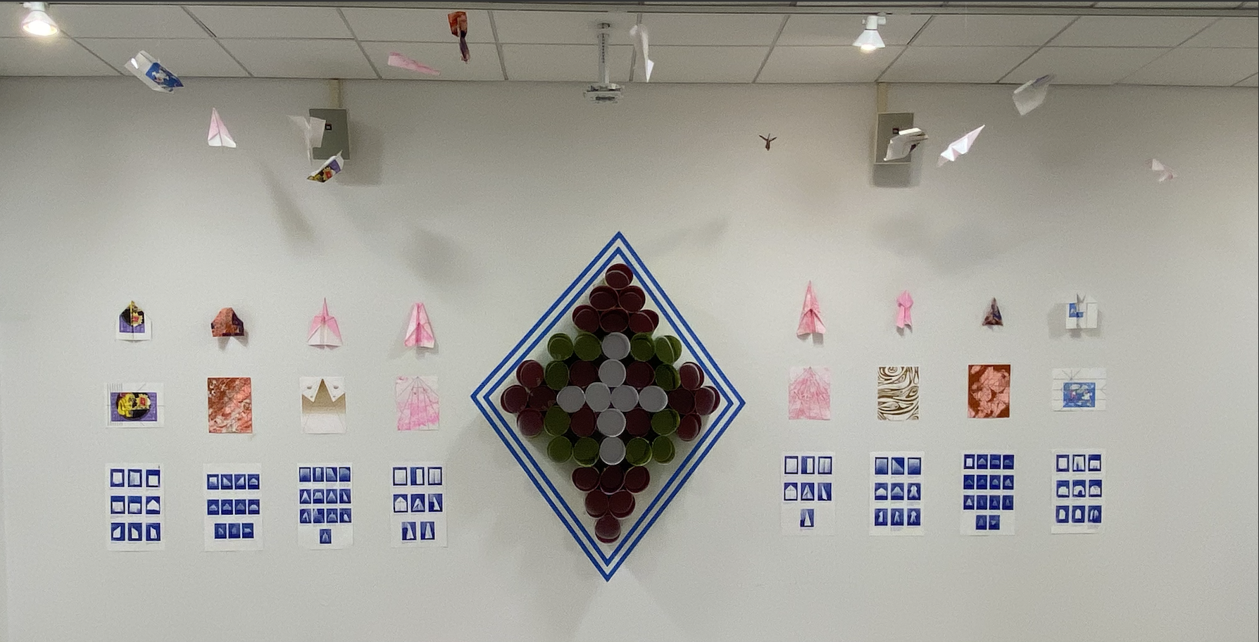
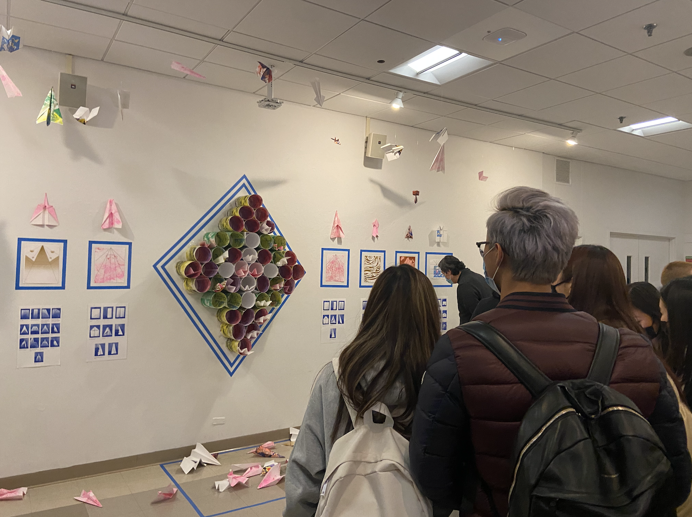
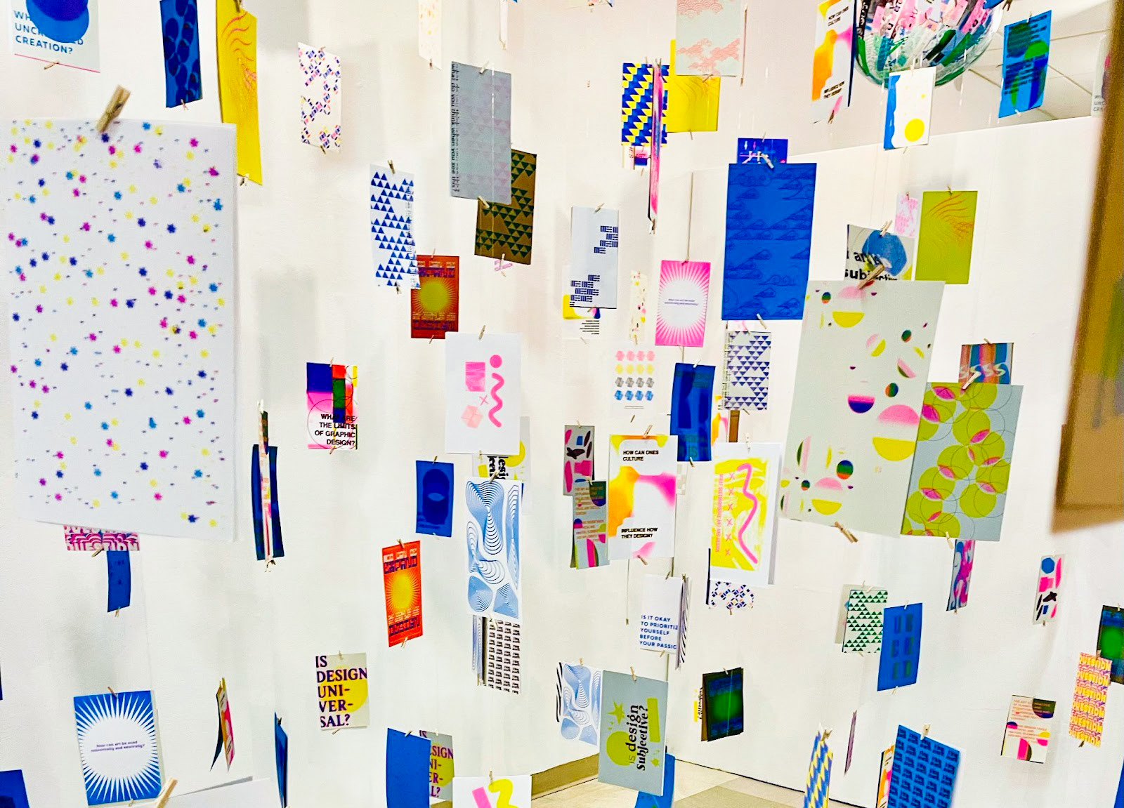
Student Names: Mei Asada, Cindy Chan, Tammie Kim, Fiona Wada-Gill
Project Title: Uncriticized
Project Title: Uncriticized
Project Description:
Throughout our experience in the design field, we have always been curious about what the next steps in graphic design might be. Establishing an identity within the workforce, traditional versus contemporary aspects to design, and how our background shapes us as designers are just a few of the considerations we had.
Uncriticized is a physical space to allow viewers to immerse themselves in a judgment-free zone. We ask questions about the future and the past of graphic design and used CMYK colors on the risograph printer to explore where the colors of print could take us.
READ FULL BLOG POST
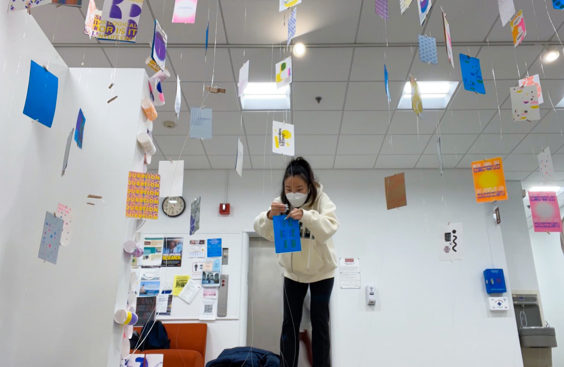
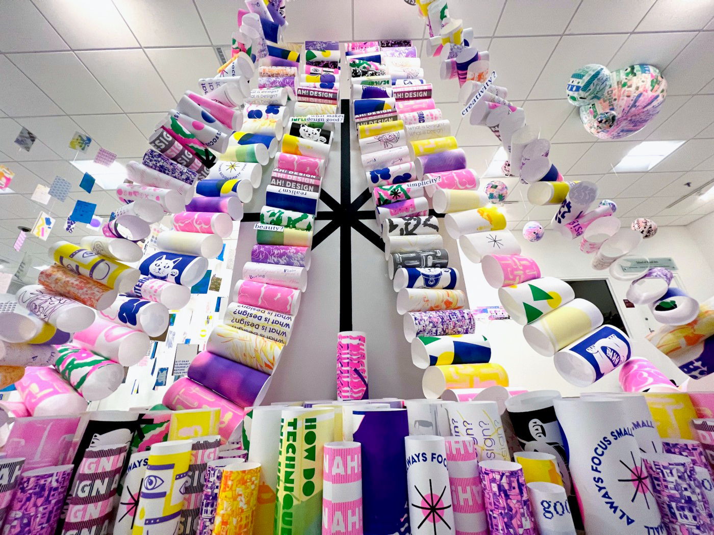
Student Names: Aidan Ishii, Sherry Ma, Sissi Wu and Miranda Xu
Project Title: Fluid Design
Project Title: Fluid Design
Project Description:
What is design? Who defines, creates, and creates design?
As one of the groups to set up the “Design in Questions” installation, we were assigned to read “Designing Design,” “Graphic Design: Now in Production,” and “What does it mean to decolonize design?” and attempted to question our concerns towards design procedure. Each of us came up with 25 questions and a mind map towards the readings.
READ FULL BLOG POST
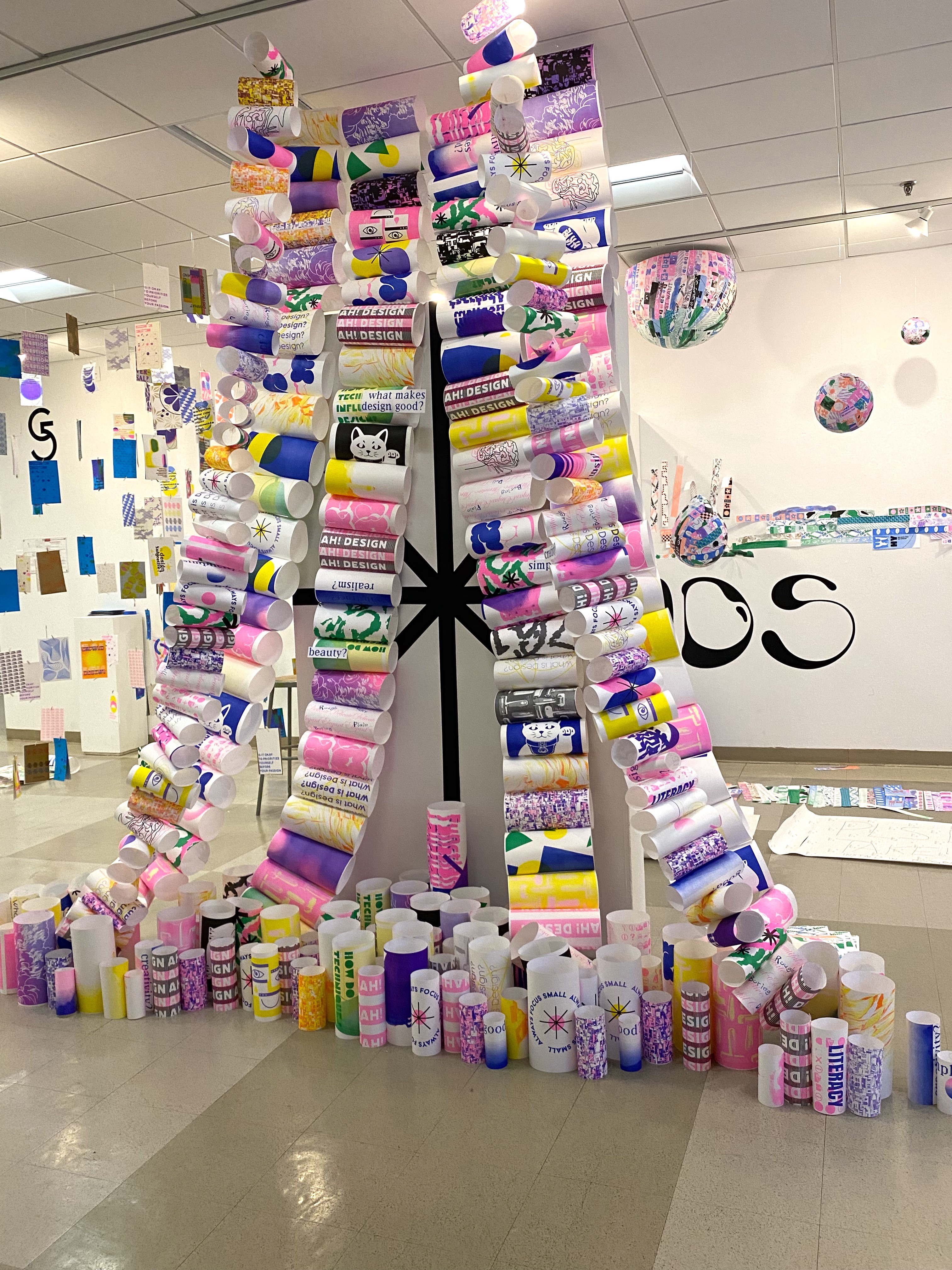
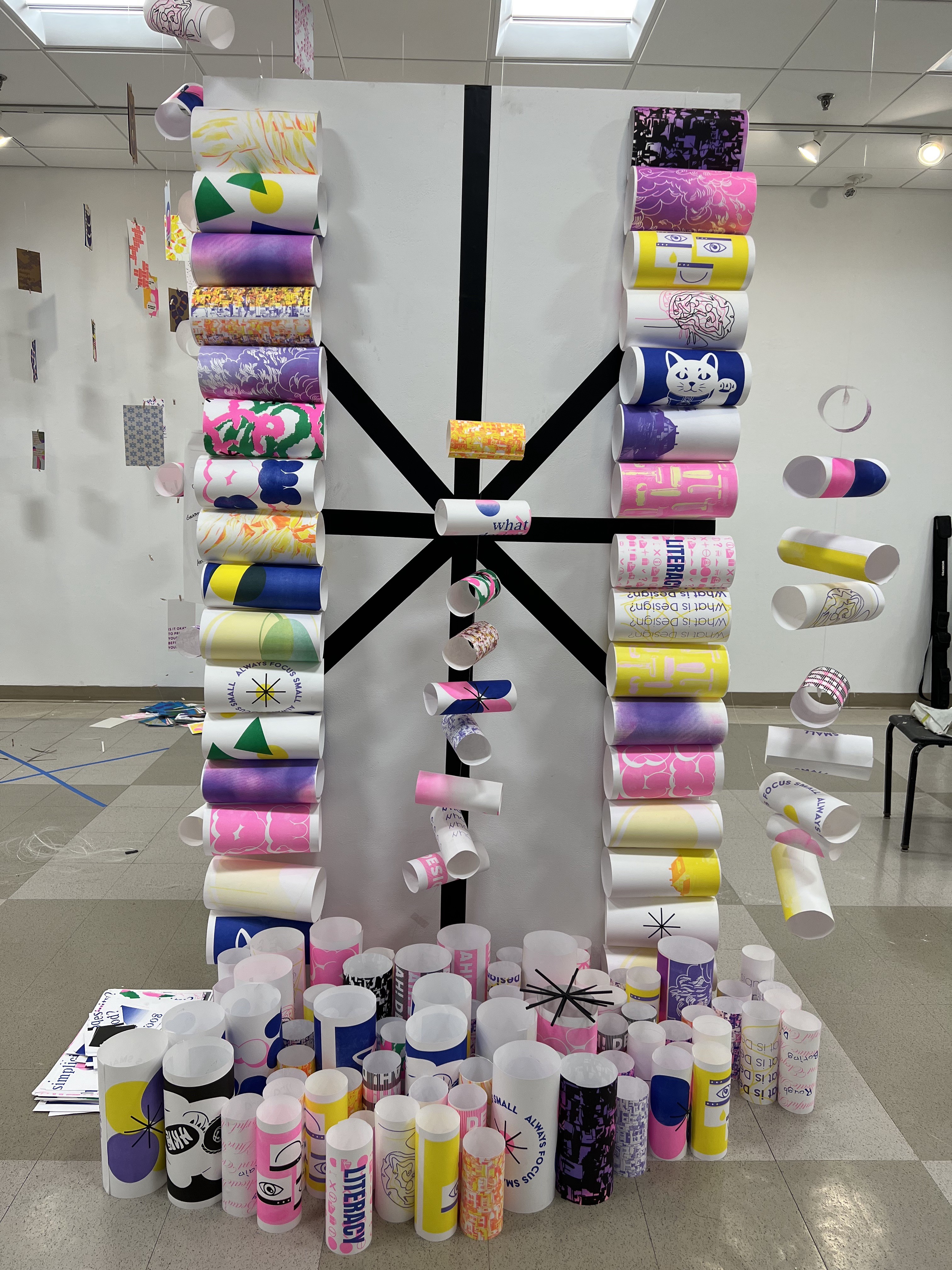
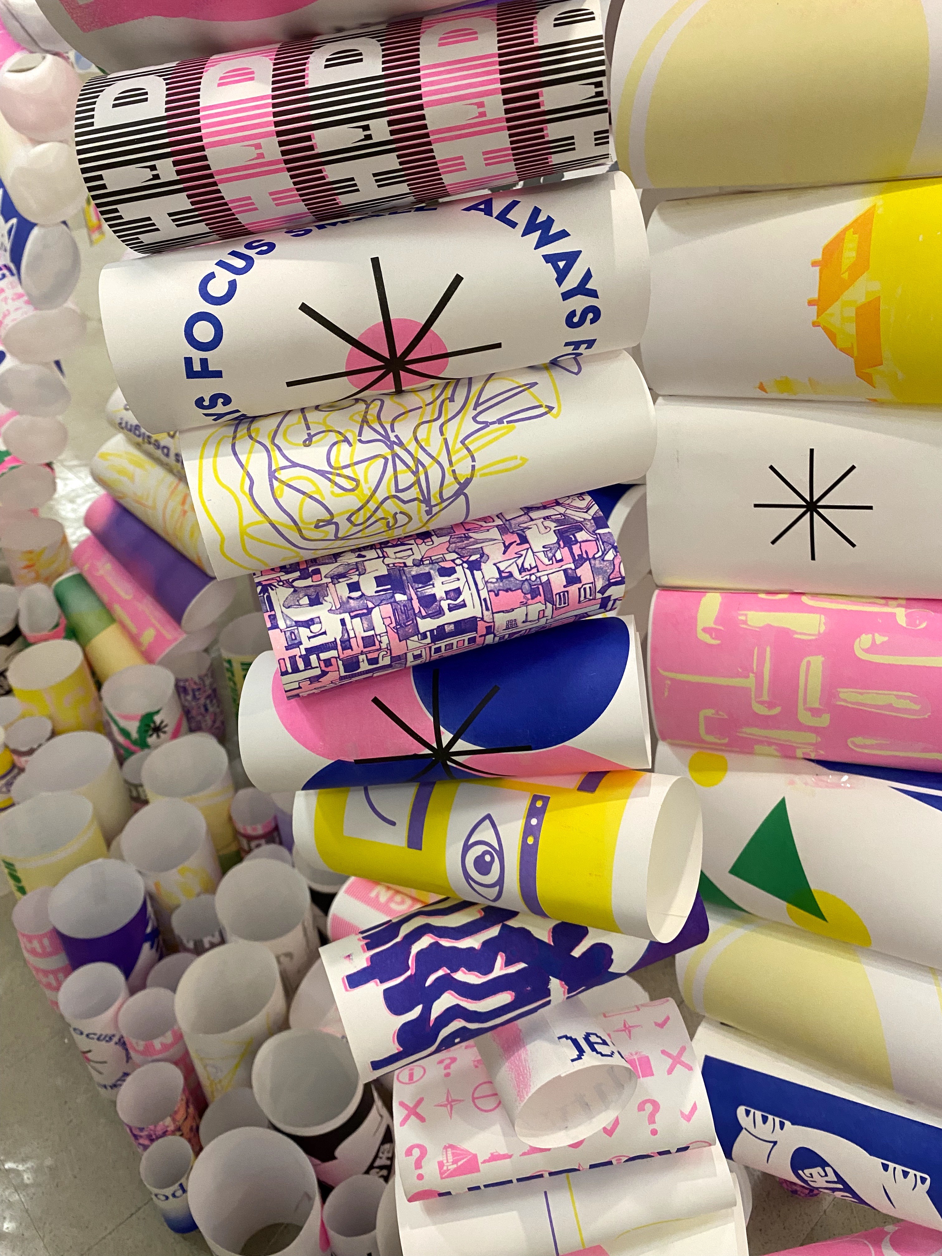
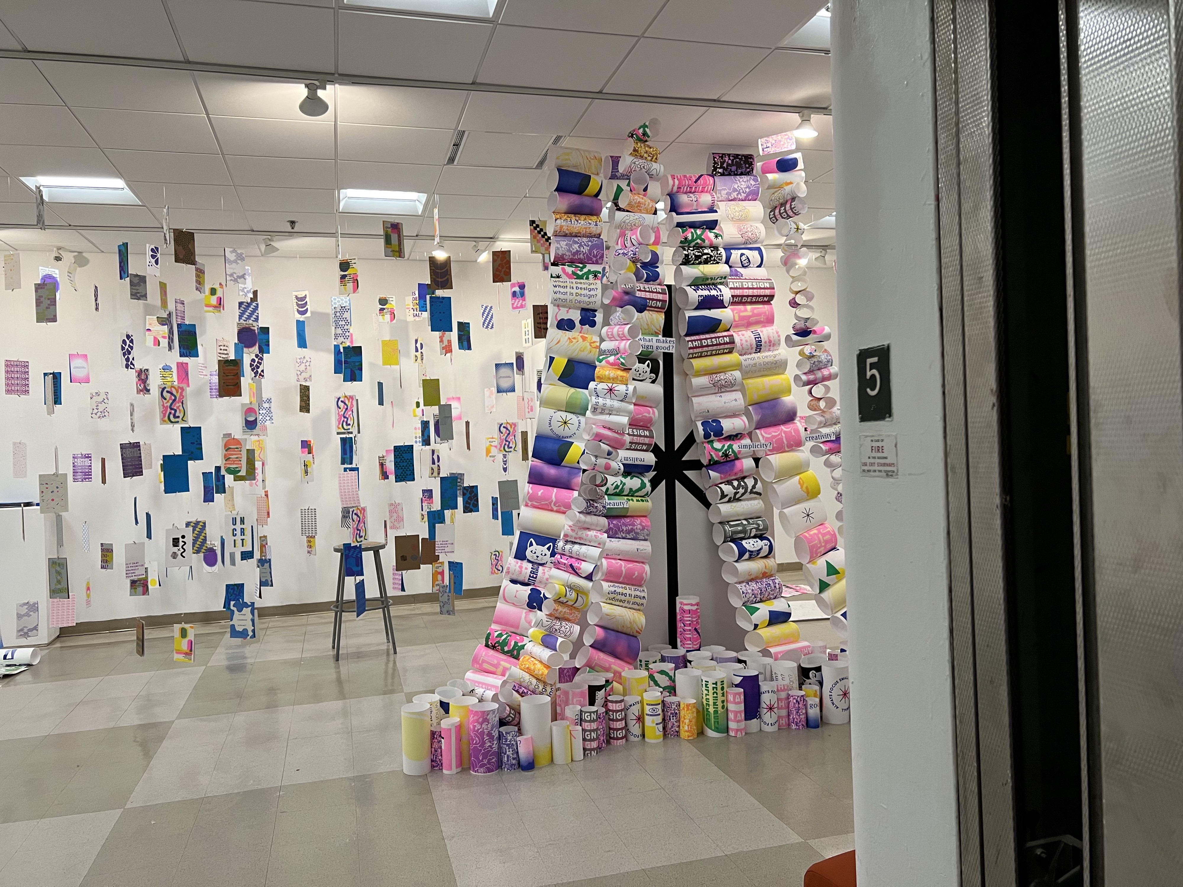
Student Name: Arjun Kumar
Project Title: Stein’s Sprinkles
Project Title: Stein’s Sprinkles
Project Description:
This was one of the most difficult pieces of literature that I had to read as it challenges the reader to re-examine perceptions of objects and grammatical and syntactical systems.
So, while skimming through the reading I landed on the poem Sugar and locked in on this particular part of the poem:
Put it in the stew, put it to shame.
A little slight shadow and a solid fine furnace.
The teasing is tender and trying and thoughtful.
The line which sets sprinkling to be a remedy is beside the best cold.
READ FULL BLOG POST
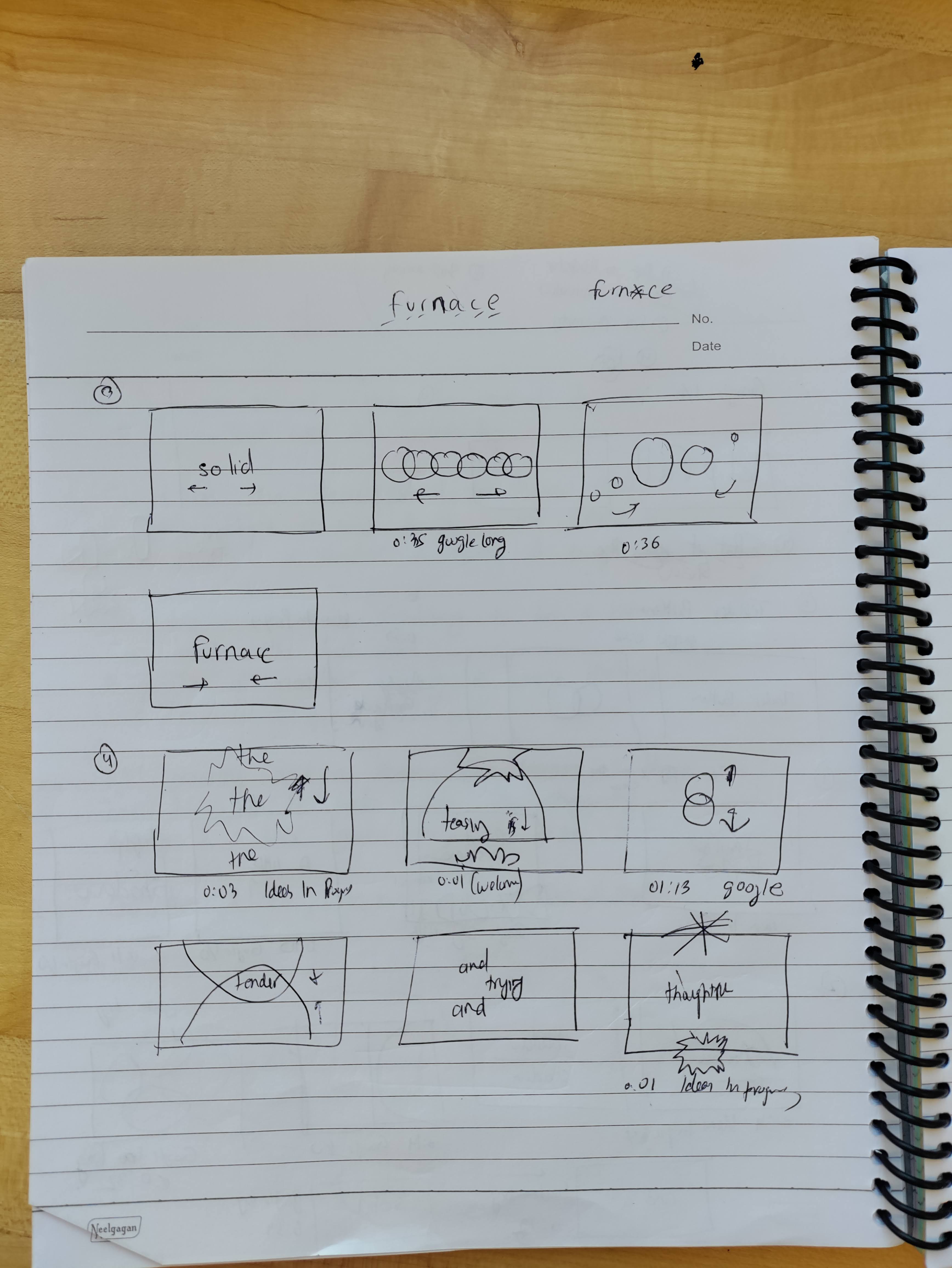
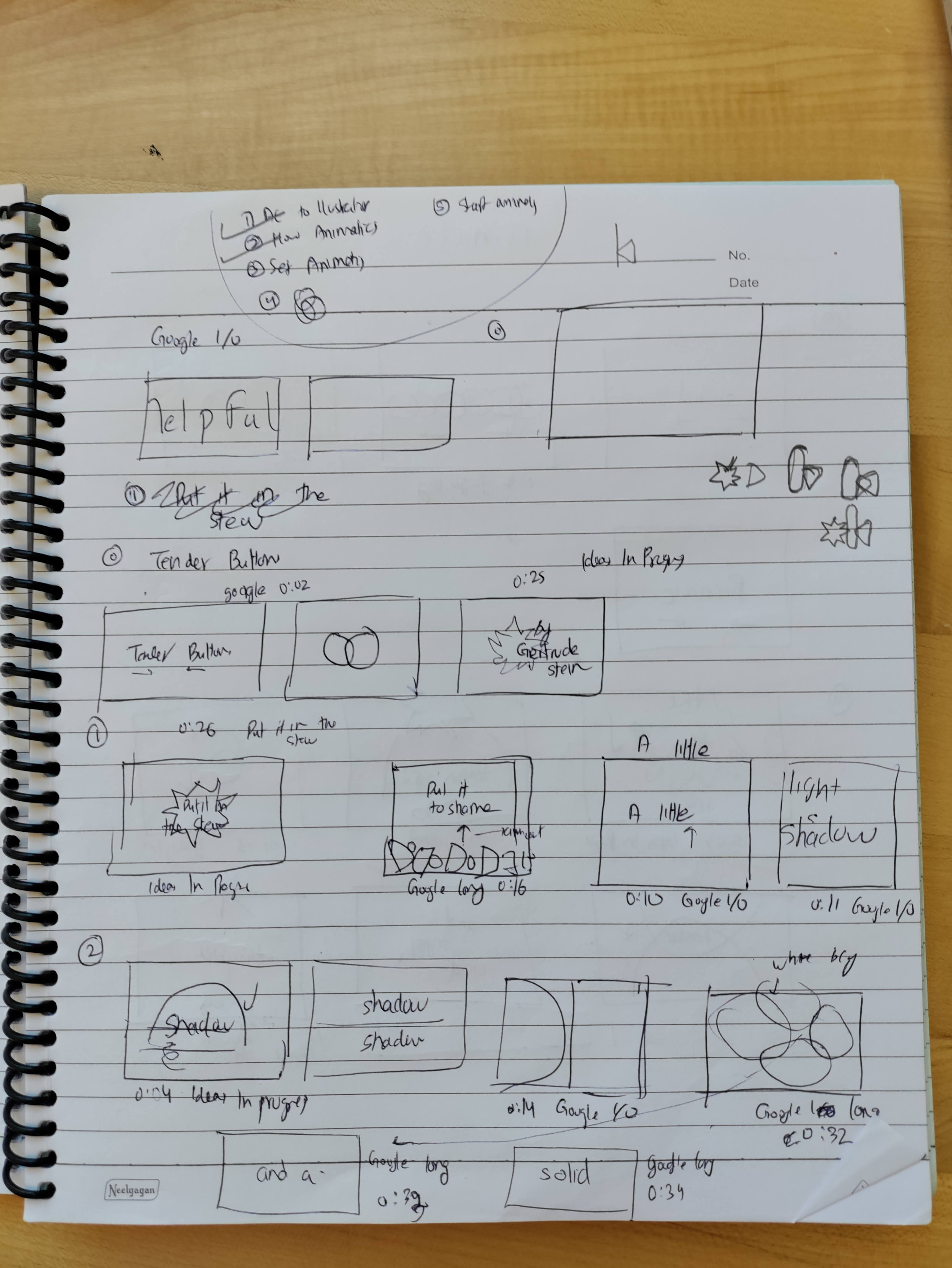
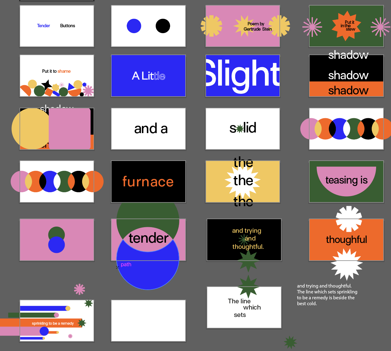
Student Name: Jordan Phillips
Project Title: 1 Word: Explode
Project Title: 1 Word: Explode
Project Description:
This project took on several different lives for me, as far as the process of change that occurred between initial iteration, storyboarding, filming, and final editing (and re-filming/ re-editing). The initial word that I chose at random was “explode”, and I wanted to explore this word in the context of mycology, something I enjoy that I wanted to share about myself. I always begin every project by mind-mapping: exploring how the relationship between words and images can create and uncover new meanings and ideas.
This layout differed from my usual mind map methodology because I wanted to move quickly towards the movement aspect, something I had never considered. Film has never been something I explored because I find it incredibly difficult to think in movement as is required for film and motion. I chose to consider how the words, themes and concepts I came up with could relate visually, and how I might go about recreating them for the context of the film.
READ FULL BLOG POST
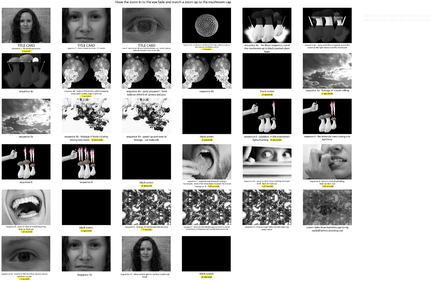
Student Name: Mei Asada
Project Title: ASMR
Project Title: ASMR
Project Description:
“Light blue and the same red with purple makes a change. It shows that there is no mistake. Any pink shows that and very likely it is reasonable. Very likely there should not be a finer fancy present.”
These are the lines that I chose for the Gertrude Stein poem. The poem A smaller section of the passage “A Cushion”
I originally thought I would like to interpret this poem though type animation with after effects. I felt uninspired though using after effects and felt lost in how I should represent these words though a video. That is when I decided to take a more analogue approach to this project and thought to make an ASMR video.
READ FULL BLOG POST
Student Name: Baoying Huang
Project Title: Transient Light
Project Title: Transient Light
Project Description:
The phenomenal moments usually happen in places we don’t pay enough attention to. I chose my painting studio as the location to look for the movement, and used my phone camera to capture the moments. I started with gathering some oil painting medium and tried to pick out phrases from the product description on the bottle. What I found the most intriguing things to me are the words that indicate the idea of “time,” like “speeds”, “faster”, and “slowest”. READ FULL BLOG POST
The phenomenal moments usually happen in places we don’t pay enough attention to. I chose my painting studio as the location to look for the movement, and used my phone camera to capture the moments. I started with gathering some oil painting medium and tried to pick out phrases from the product description on the bottle. What I found the most intriguing things to me are the words that indicate the idea of “time,” like “speeds”, “faster”, and “slowest”. READ FULL BLOG POST
Student Name: Max Huang-Debow
Project Title: Basketball
Project Title: Basketball
Project Description:
I love basketball. It’s beautiful, there’s so many pieces the game that feature incredible, phenomenal movement: shooting, dunking, defending, passing. By far the most compelling, beautiful, eye-catching part of basketball… is dribbling. Ball handling is something that is basically an art at the highest level. I wanted to capture that.
When I first began this project I planned on asking other people what their favorite basketball moves were and if they could show me. I’d then proceed to replicate their move and theoretically “steal from their bag”.
READ FULL BLOG POST
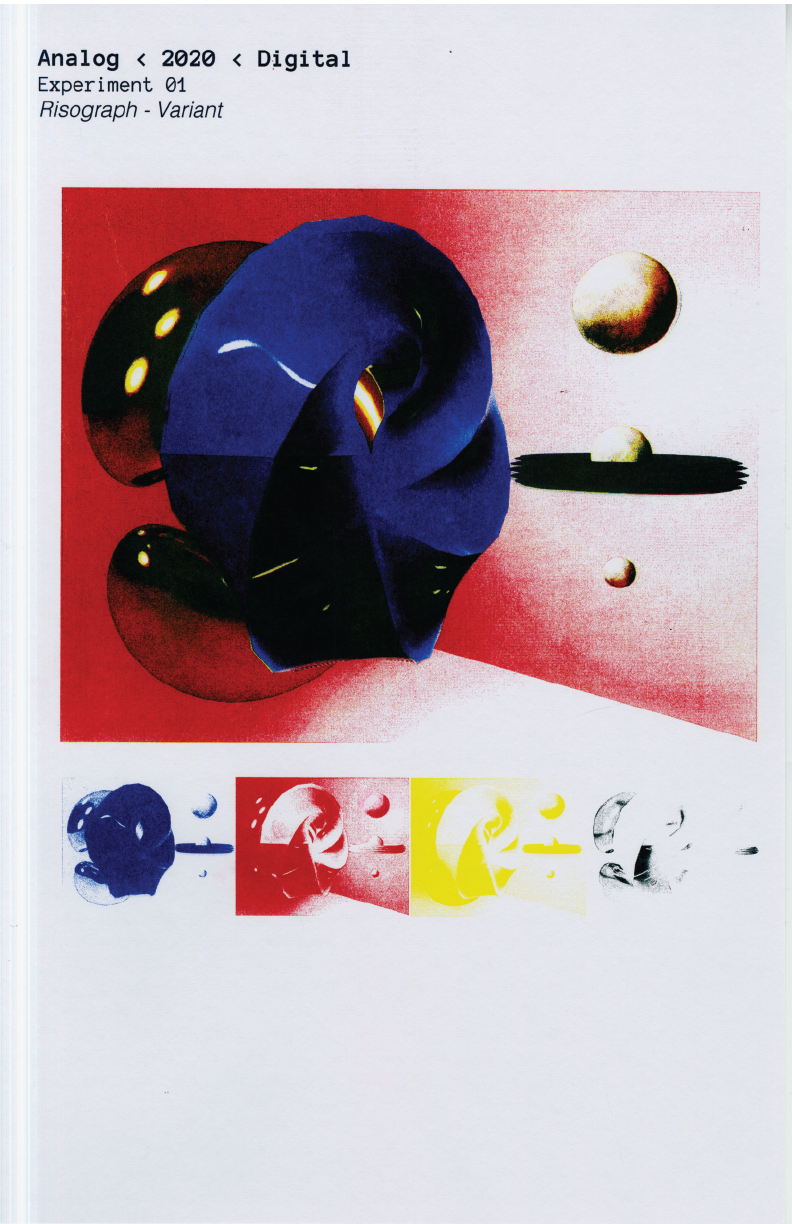
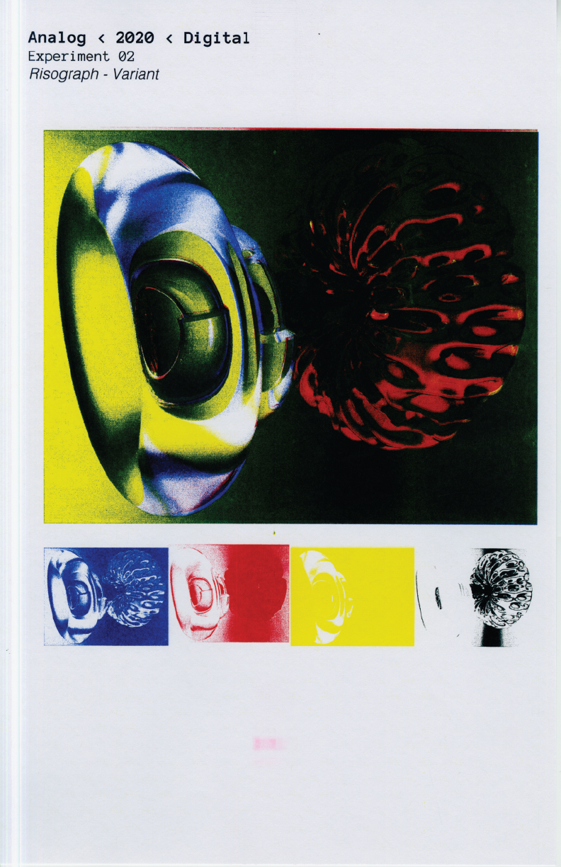
Student Name: Jordan Phillips
Project Title: Analog
Project Title: Analog
Project Description:
2020 has been a unique time in most of our lives, as we find ourselves inhabiting a new normal, rethinking our methods of interaction and how we exist in spaces around others. Personally, 2020 holds significance for me as the year I decided to finalize my career transition, and go back to graduate school to pursue a Master of Fine Arts degree in Graphic Design. The catalyst for this project is considering the liminality of this year, and what liminality means to me.
READ FULL BLOG POST
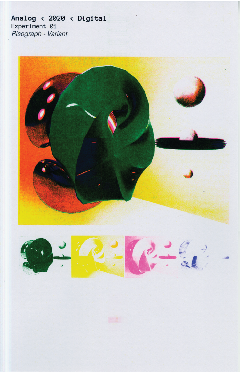
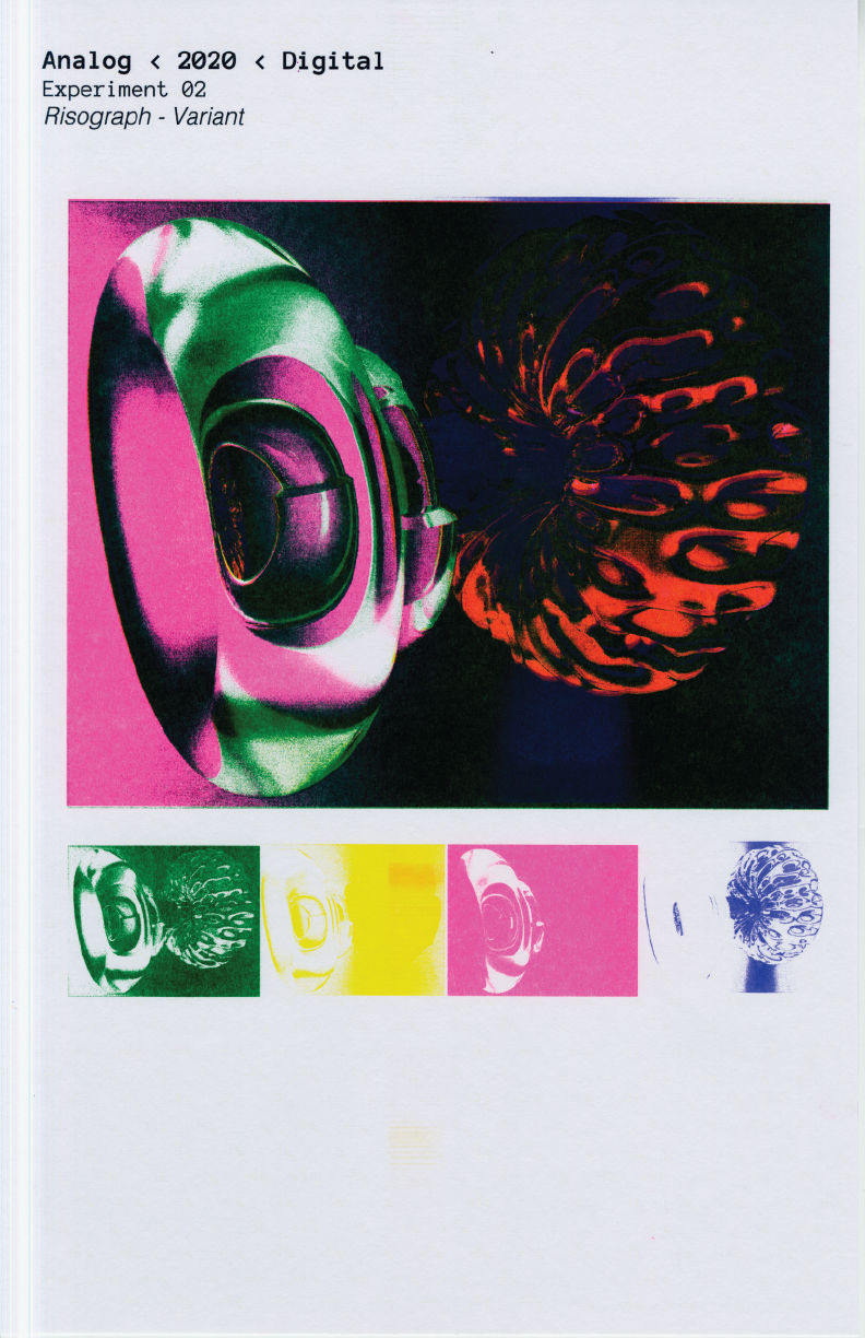
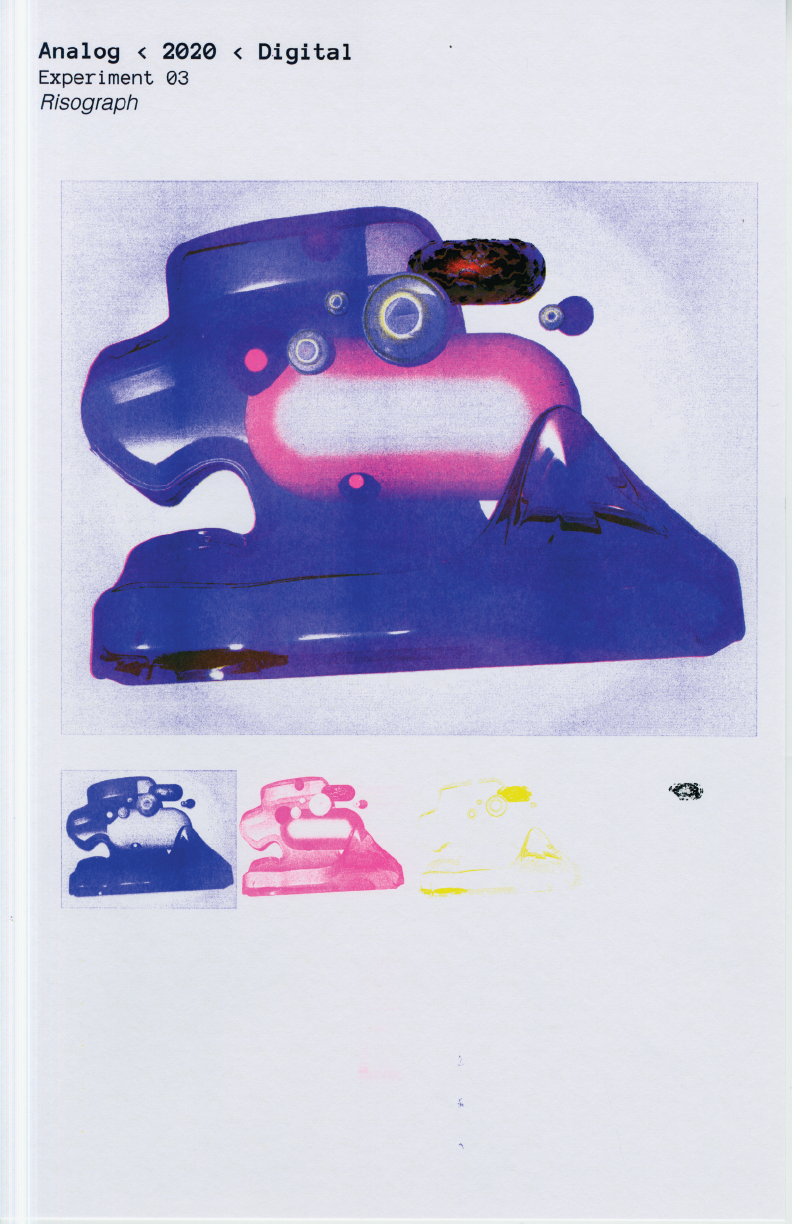
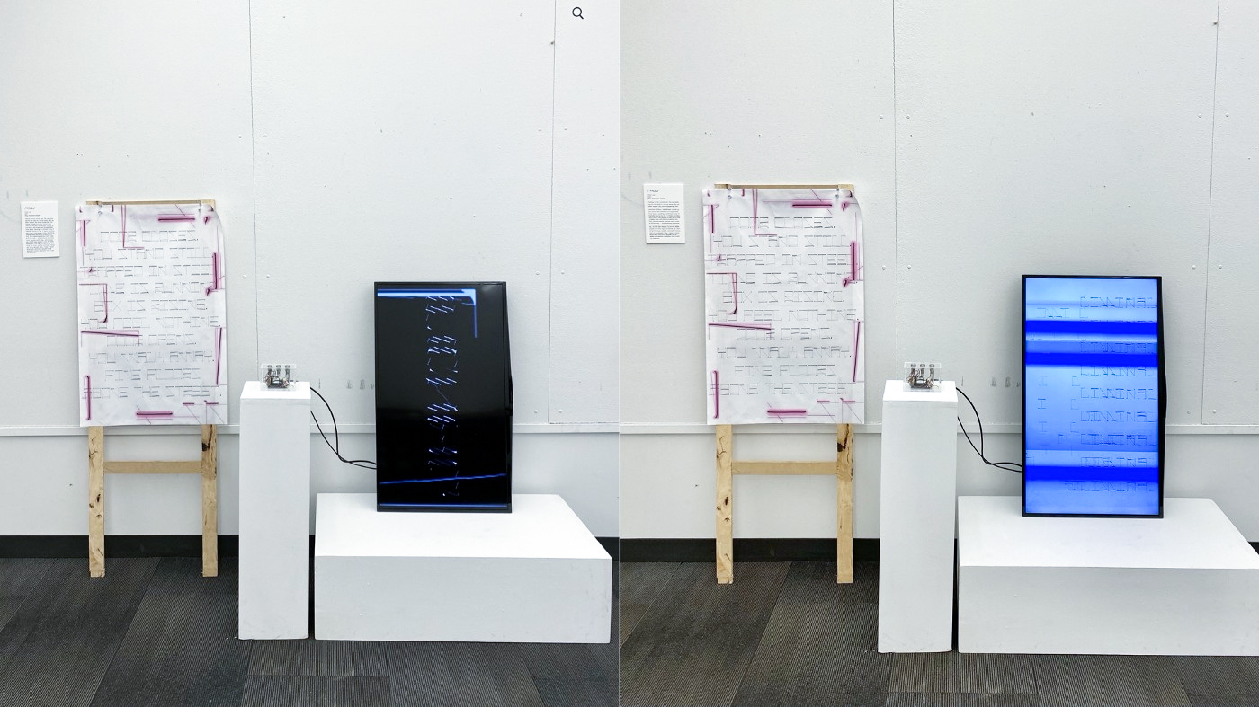
Student Name: Chen Luo
Project Title: Liminality of the Elevator
Project Title: Liminality of the Elevator
Project Description:
We are currently in a liminal space where life in the covid situation is going back to normal. The term liminality has been used a lot in anthropology. I started to define the definition of liminality and what could liminality be. Creating a mindmap helped me navigate what my possible interests could be — born & die and elevator transists us everyday is a liminal space.
READ FULL BLOG POST
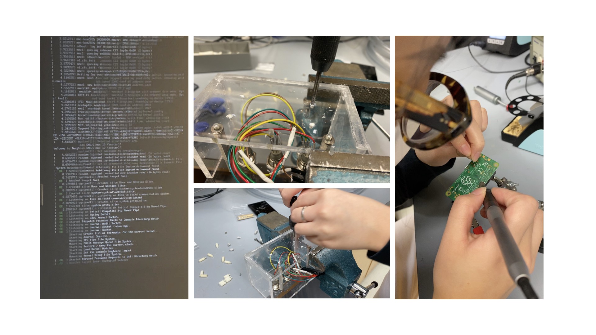
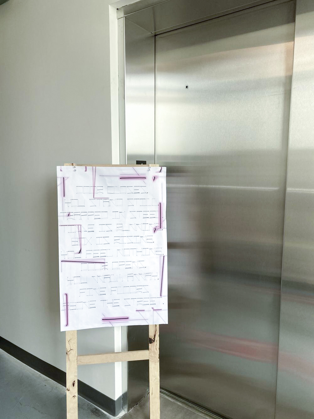
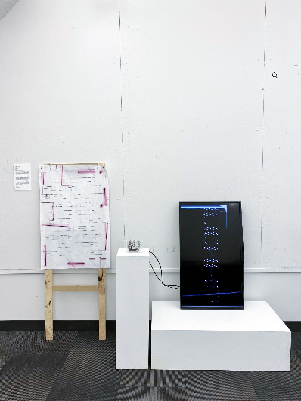
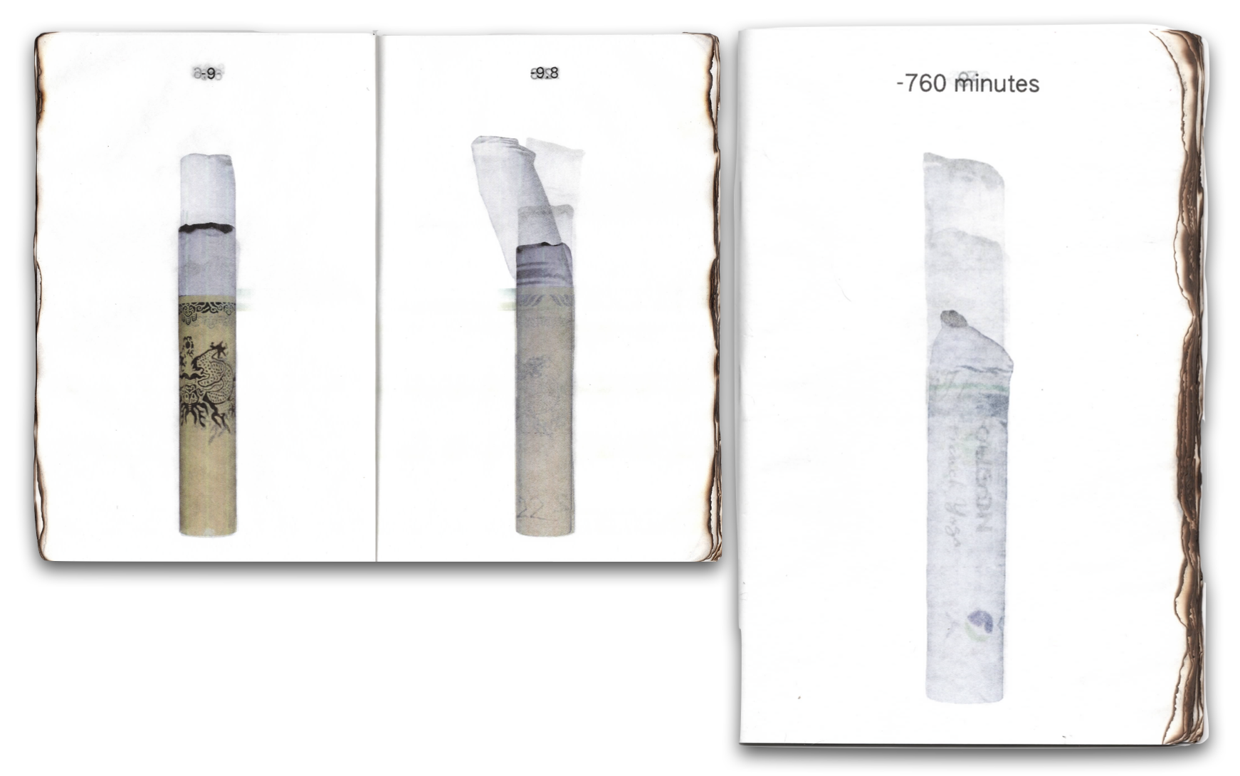
Student Name: Spencer Yan
Project Title: Burn(ing)(ed)
Project Title: Burn(ing)(ed)
Project Description:
Burn(ing)(ed) is a project generated from a collection of cigarette butts. This project records and displays the various details of the burning of the cigarette itself and the form of the smoke created by it. Through time-lapse photography, it shows the burning process of a cigarette and encourages viewers to enter this microscopic world along with it. As another part of this project, there is also an art book composed of pictures of 80 cigarette butts printed on translucent paper, allowing viewers to have closer contact with the data.
Burn(ing)(ed) is a project generated from a collection of cigarette butts. This project records and displays the various details of the burning of the cigarette itself and the form of the smoke created by it. Through time-lapse photography, it shows the burning process of a cigarette and encourages viewers to enter this microscopic world along with it. As another part of this project, there is also an art book composed of pictures of 80 cigarette butts printed on translucent paper, allowing viewers to have closer contact with the data.

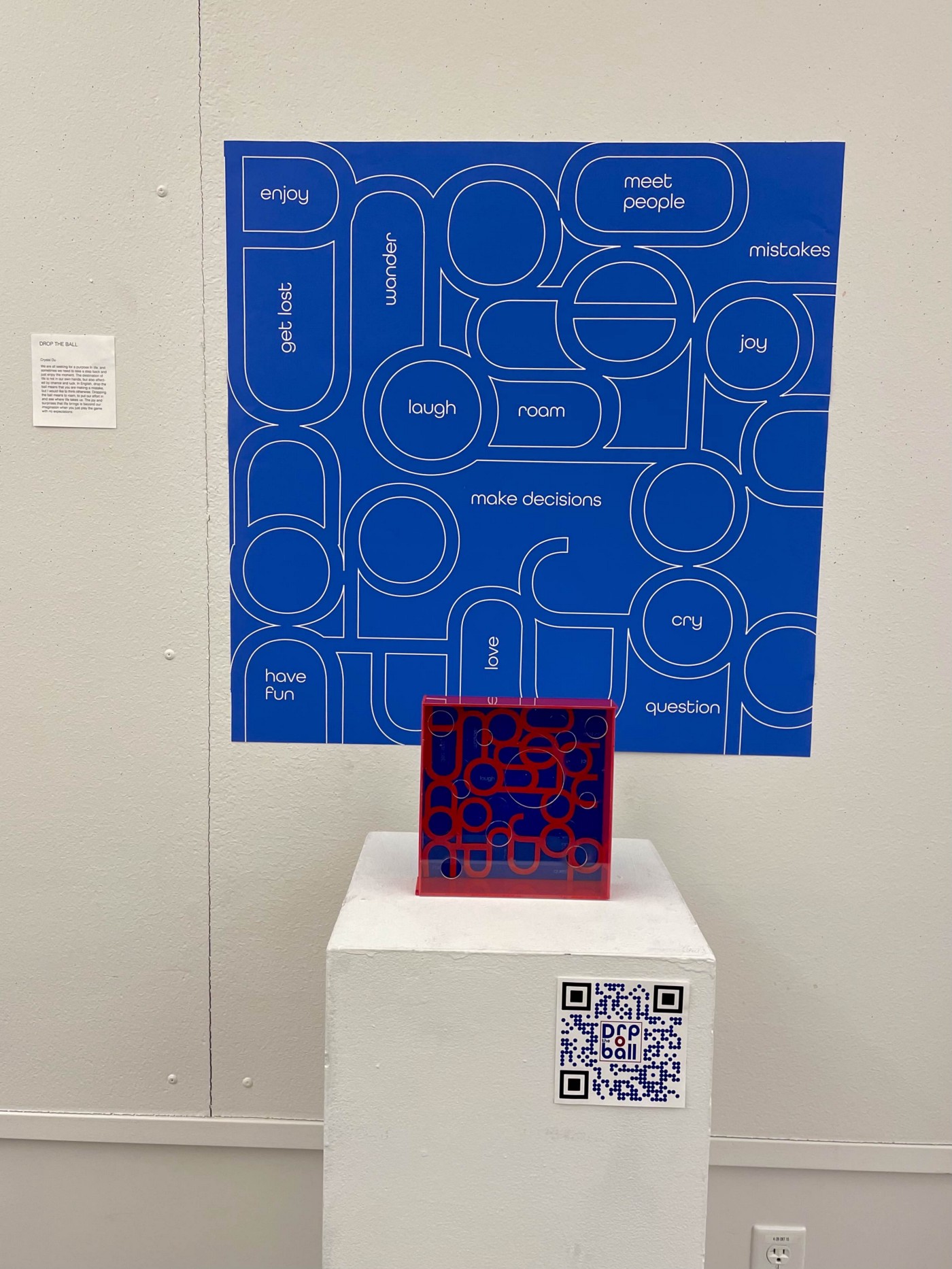
Student Name: Crystal Du
Project Title: Drop the Ball
Project Title: Drop the Ball
Project Description:
This project is about liminality and transition, the catalyst originates from COVID and how we dealt with the transitioning period in the past year.
I started the project by reflecting on 2020, and what was meaningful to me during this year. I thought about my solo quarantine and how much I have enjoyed various activities during that time. Making designs, paintings, reading, and going on walks were things that I did to nourish my body and mind. Walking specifically, has helped me tremendously to stay active and keep my mind off things.
READ FULL BLOG POST
Student Names: Chuck Gonzales, Treasa Benny
Project Title: Shawshank
Project Title: Shawshank
Project Description:
Treasa and I (Chuck) paired up for our second project for Studio: Structure & Morphology. We were to deconstruct and analyze a film or TV show and, from that, create a narrative of our own. Delivery and execution were open-ended, so we were determined to fully trust the process and see where our research would lead us. We decided on The Shawshank Redemption by Frank Darabont.
After rewatching The Shawshank Redemption with a critical eye, we created mood boards and devised a mindmap. In doing so, we explored the film’s themes and characters and attempted to decode suggestive scenes and elements.
On its surface, the film seems to have a straightforward plotline that revolves around the prevailing aspects of hope, faith, and friendship. One could easily perceive it as a film reflective of conventional tropes where the main character (Andy Dufresne) starts with a predicament, discovers hope, and finds a solution.
READ FULL BLOG POST
Student Name: Cindy Chan
Project Title: Lollapalooza
Project Title: Lollapalooza
Project Description:
Lollapalooza — (Lolla) is an annual four-day music festival in Chicago, Illinois, at Grant Park, founded in 1991 and since expanded to other countries. Performances include but are not limited to alternative rock, heavy metal, punk rock, hip hop, and electronic music. Lollapalooza has also provided a platform for nonprofit and political groups and various visual artists. The word — sometimes alternatively spelled and pronounced as lollapalootza, lalapaloosa, lallapaloosa (P.G. Wodehouse, “Heart of a Goof”), dates from a late 19th-century/early 20th-century American idiomatic phrase meaning “an extraordinary or unusual thing, person, or event; an exceptional example or instance”. Its earliest known use was in 1896. In time, the term also came to refer to a large lollipop.
READ FULL BLOG POST
Student Name: Natalie Bolton
Project Title: Soft Serve
Project Title: Soft Serve
Project Description:
When I was young, I danced around my room in hot pink tutus and tiaras on a daily basis. Where does this energy go as we grow older? In my own experience, I felt shame towards the typical “girly-girl” aesthetic. There is a massive shift in traditional feminine themes in relevance to a girl’s life. As we grow older, the significance of pink, sequins and glitter become considered frivolous, and therefore unnecessary. I will be drawing back the curtain on the misogynistic view that hyper-feminine aesthetics in art, design and culture are lacking depth, seriousness or complexity of meaning. My goal is to carve out the feminine space in design within an increasingly masculine world. I want to look at graphic design as Sofia Coppola looks at film.
READ FULL BLOG POST

Student Name: Miranda (Duo) Xu
Project Title: Strawberry Music Festival
Project Title: Strawberry Music Festival
Project Description:
“Strawberry Music Festival” is a music festival brand in China. It is founded by the domestic music label Modern Sky after the “Modern Sky Music Festival” in 2009. Compared with the “Modern Sky Music Festival,” the temperament of “Strawberry” is more diverse. “Strawberry Music Festival” also has the characteristics of spring, vitality, creativity, modern style, and playfulness, which makes it popular among young people. The festival starts in Beijing in Spring (Late April or Early May) and then goes around the country in places that include: Shanghai, Wuhan, and Hainan.
As the founder mentioned, “Strawberry” is not only a kind of fruit but also means an attitude to life. It represents the full enjoyment of music and life, a spring festival for everyone, and a new definition of entertainment.
READ FULL BLOG POST
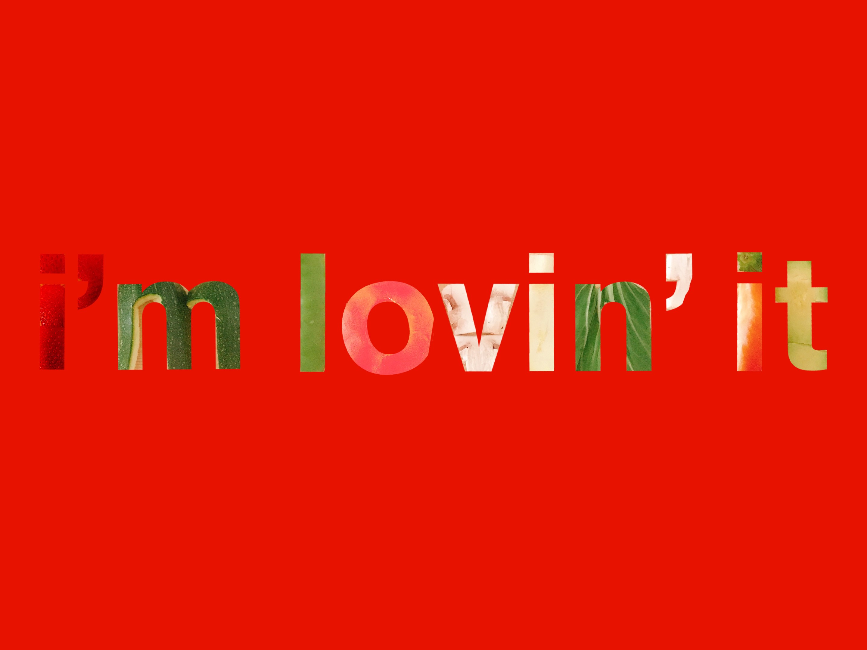
Student Name: Sissi Wu
Project Title: I’m lovin’ it
Project Title: I’m lovin’ it
Project Description:
In the beginnin’, I was drawn to a cute type called “Avocado Creamy” for this project. Since the name is related to avocado, I wanted to deliver The idea of healthy eating. I decided to use McDonald’s tagline: i’m lovin’ it. This tagline is well known and immediately have people think about McDonald’s without actually saying the brand. I want to keep the idea of creating the message from food, but instead of using french fries, I decided to use fresh healthy food.
READ FULL BLOG POST
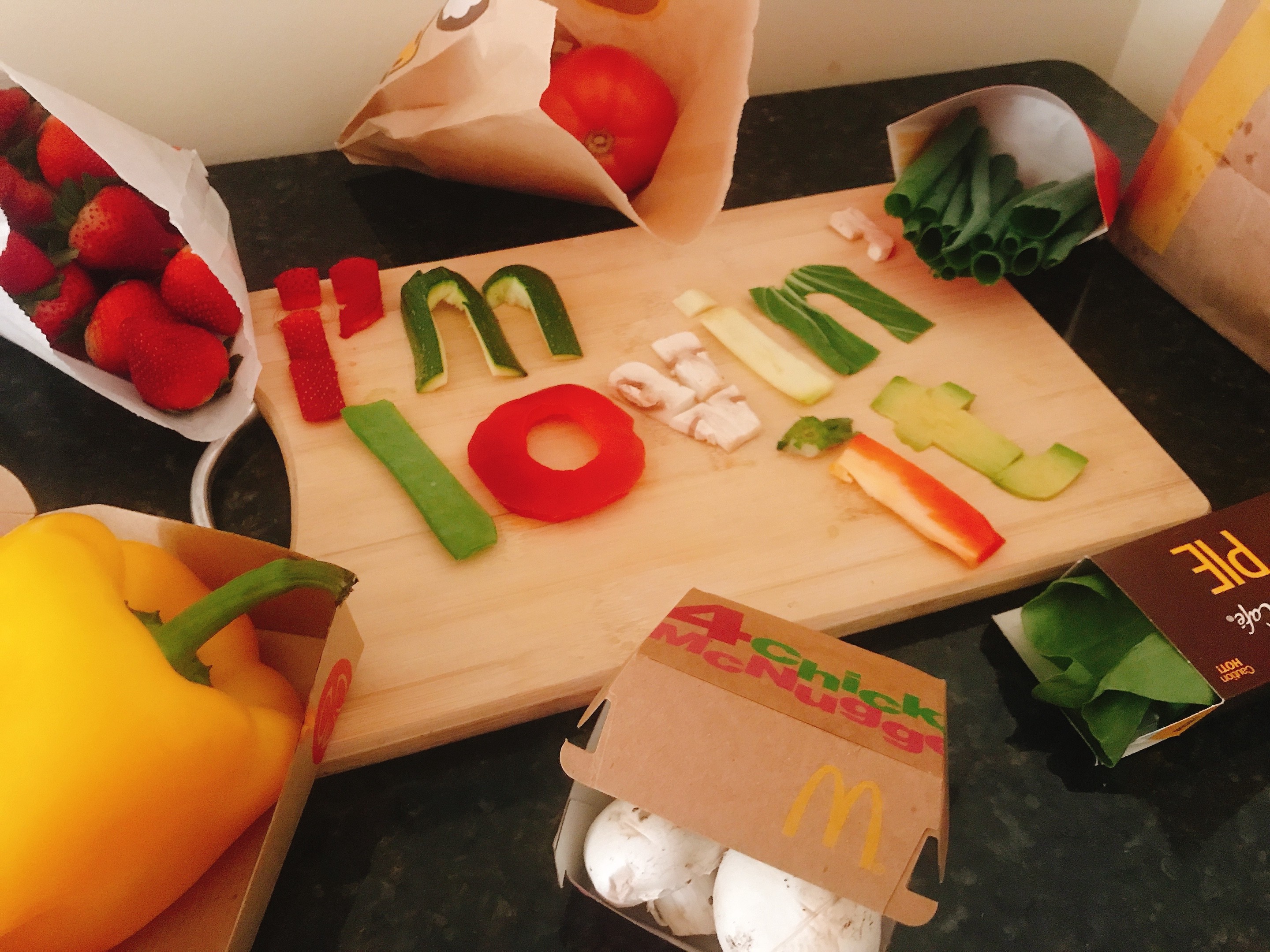
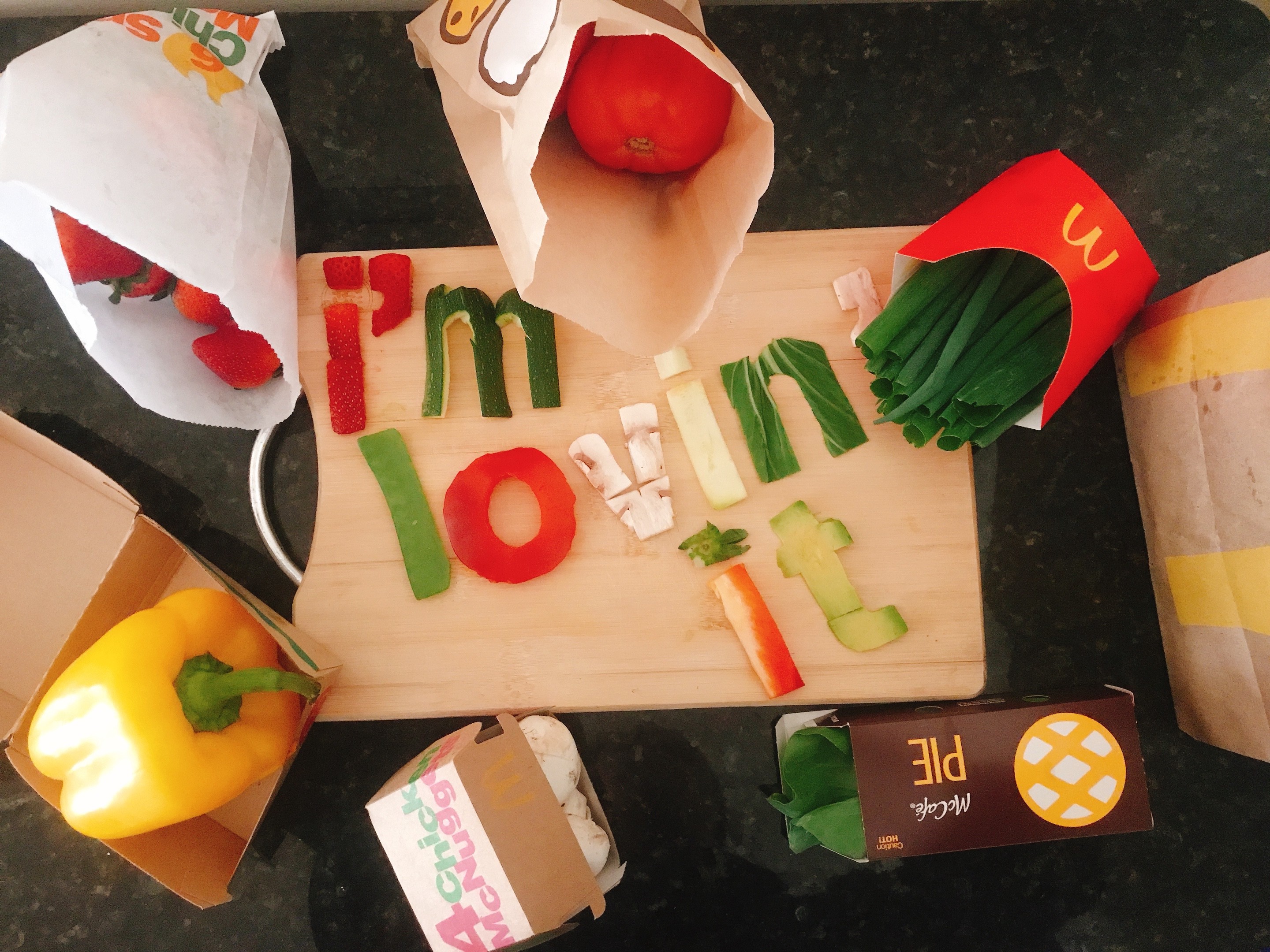
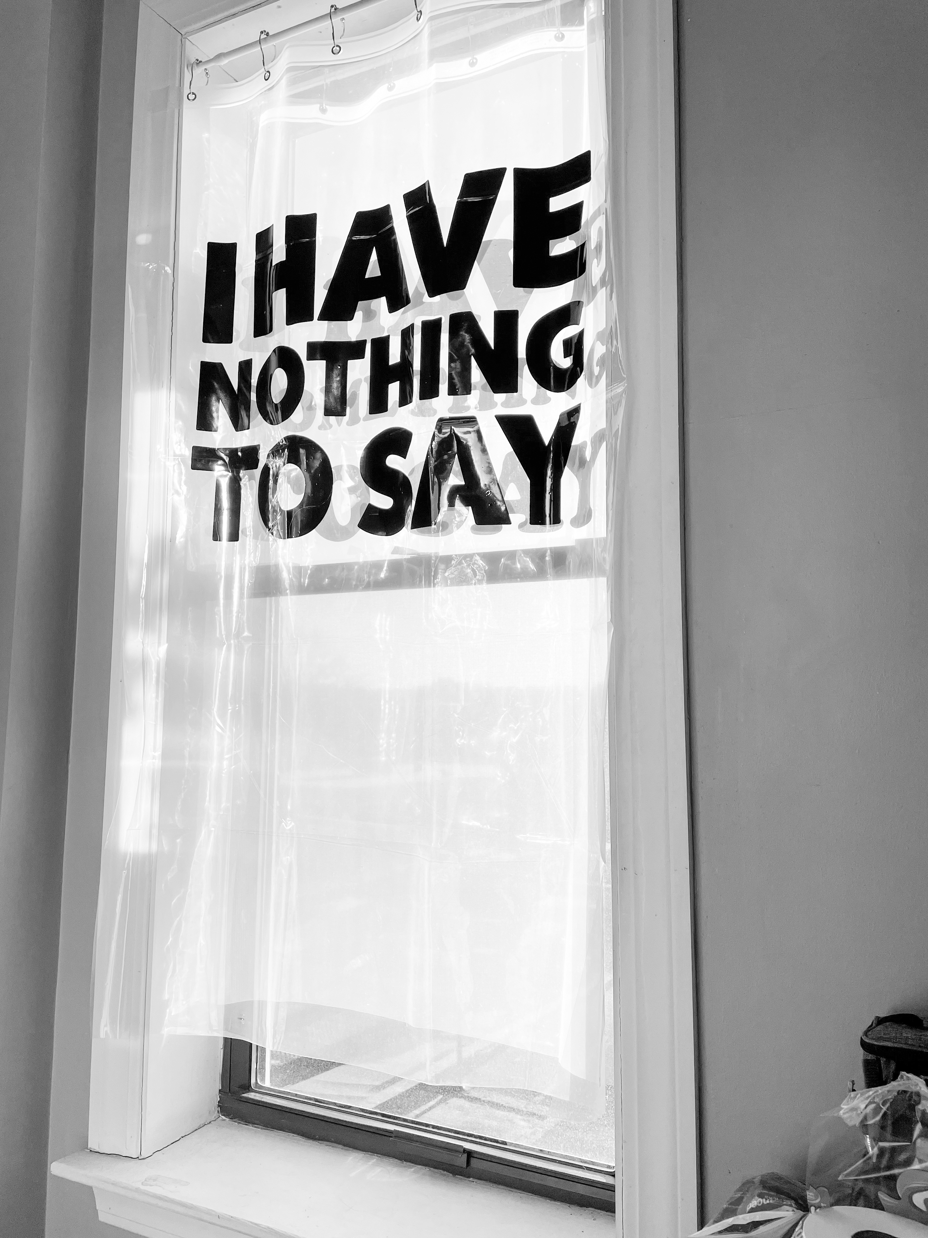
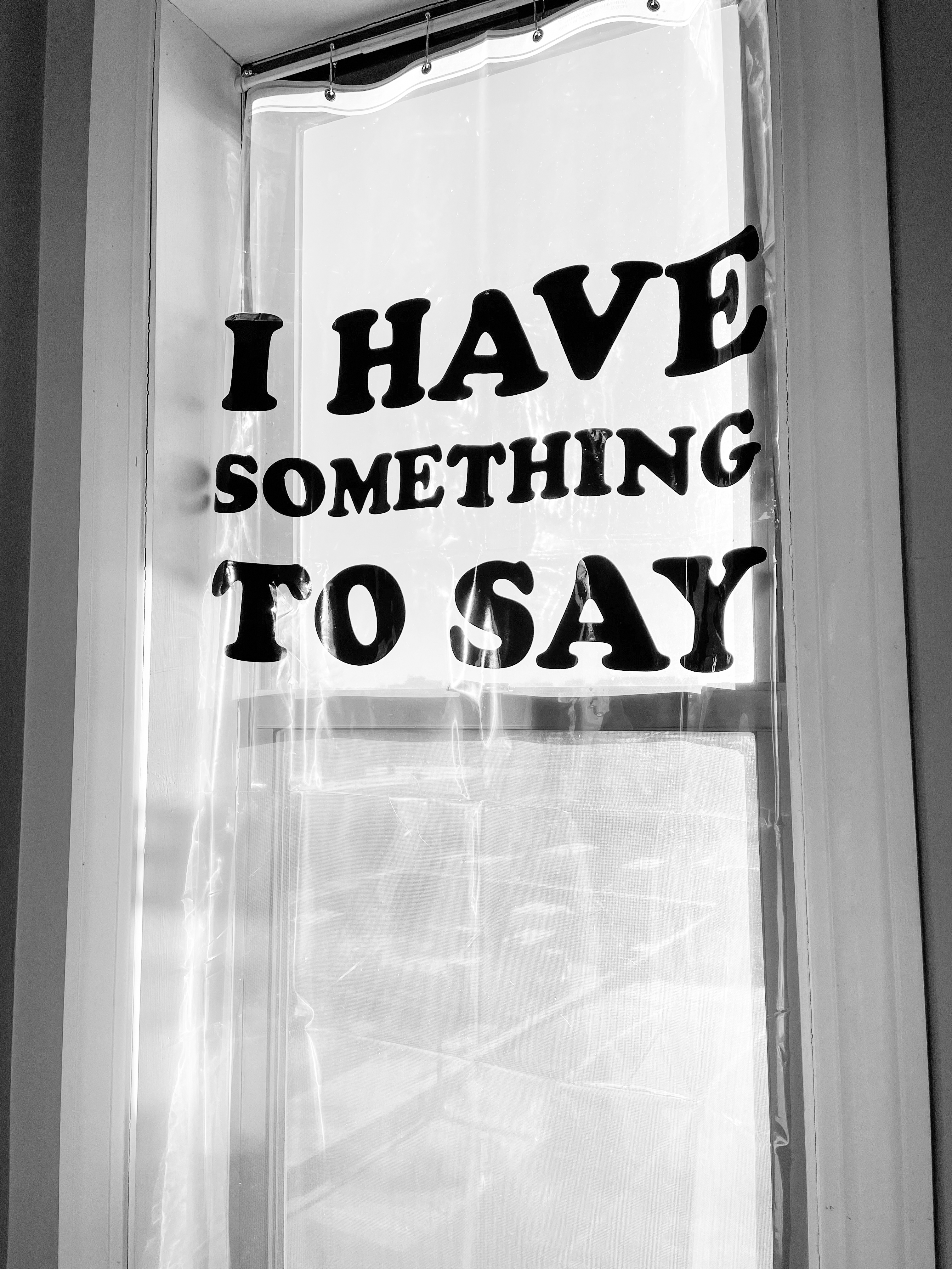
Student Name: Mei Asada
Project Title: Curtain
Project Title: Curtain
Project Description:
When tackling this project I decided to use the phrase “I have nothing to say”. I thought of this phrase because I thought it would be comical with the motion of opening and closing the curtain. I wanted to explore making a statement without verbalizing it, and recently I feel that sometimes I don't have anything to say in response to people talking to me. I thought this idea would be more along like fresh/ cheeky humor. Although this statement could be seen as a cop-out I feel that the message is in the physical action of a closing and opening curtain. Pulling out a curtain typically blocks a person from seeing the outside world, and also does not let the outside see what inside. An open curtain allows people to see outside and allows the outside to see the inside.
READ FULL BLOG POST
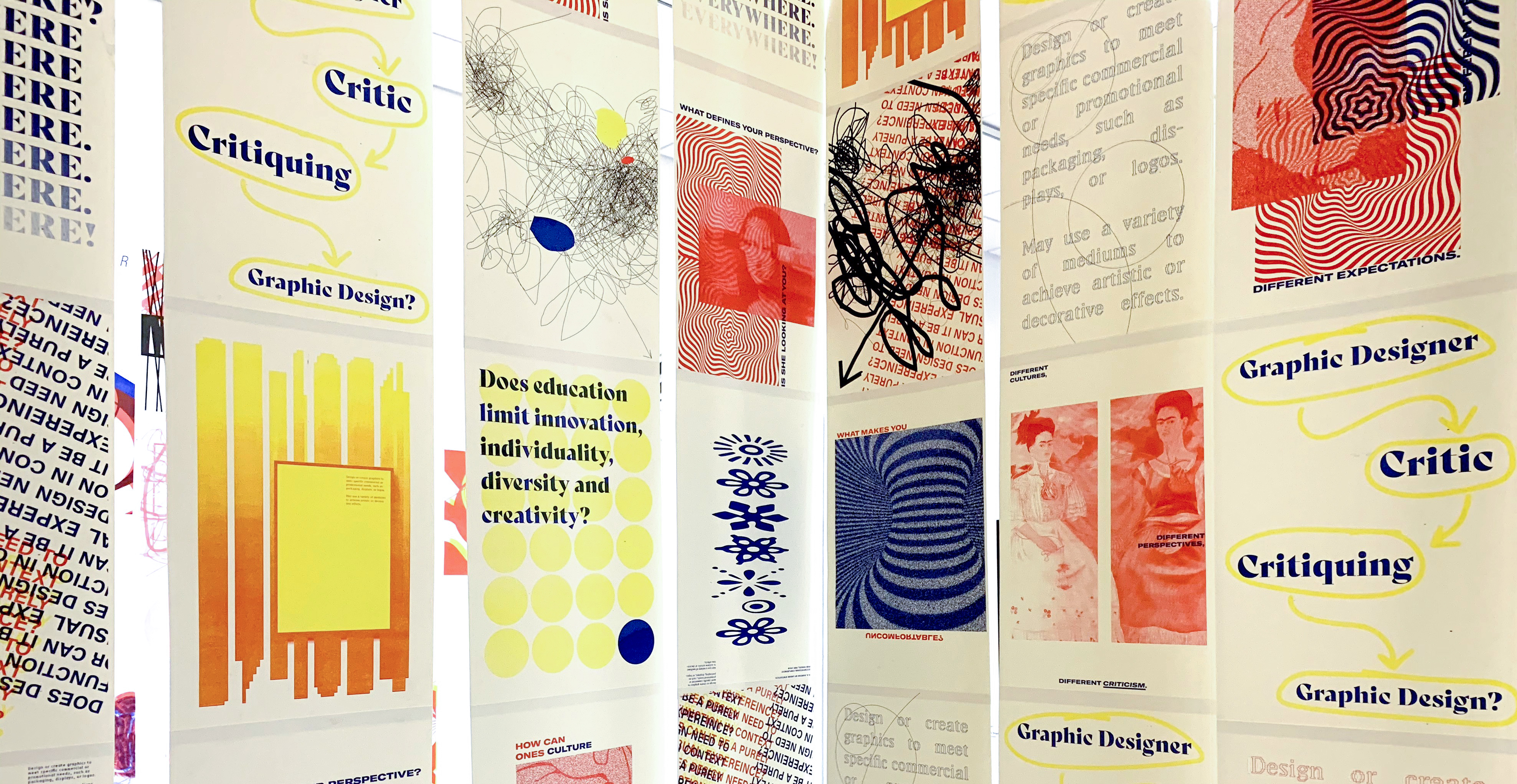
Student Name: Morgan Moscinski, Gregory Bond, Shannon Neff, Mariana Velasquez
Project Title: 27-1024
Project Title: 27-1024
Project Description:
What is graphic design?
We don’t know. No one does. This question has been debated about for decades, both within and outside of the art/design world. In an attempt to define graphic design for ourselves, the senior graphic designers put on a show.
As one of the groups for the “Design In Question” installation, we were tasked with designing an installation space that tackled some aspect of the question “What is graphic design?” We began by reading two chapters from “The Graphic Design Reader,” edited by Teal Triggs and Leslie Amazon.
READ FULL BLOG POST
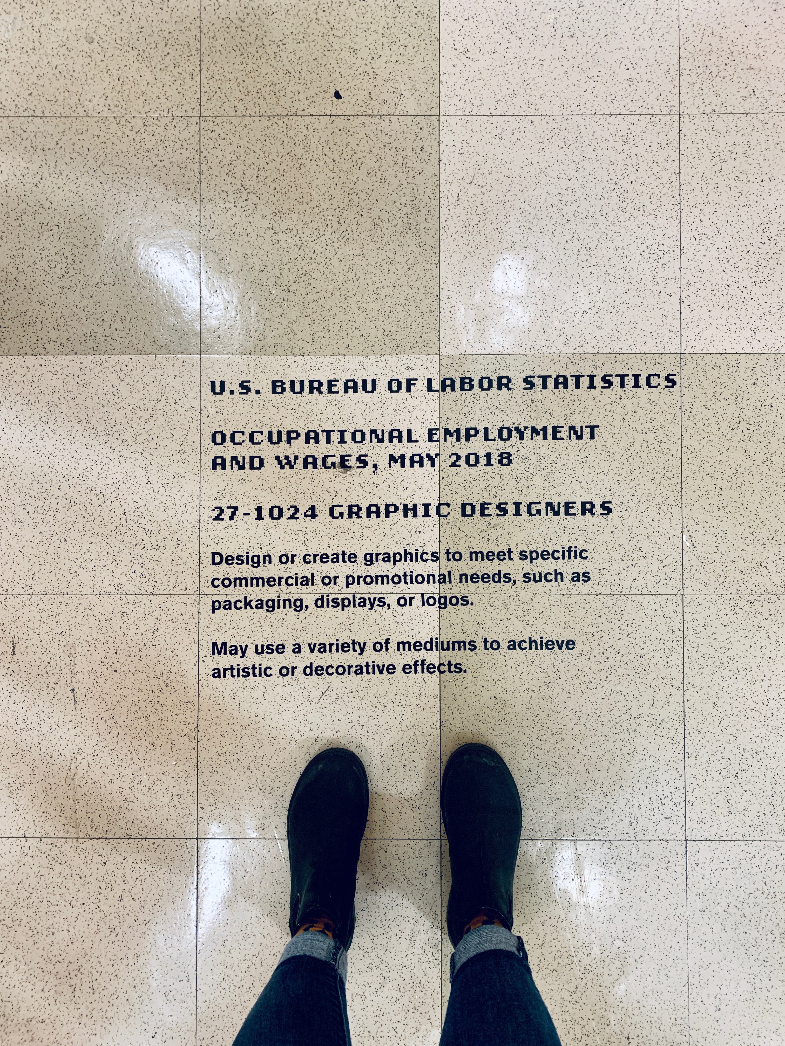
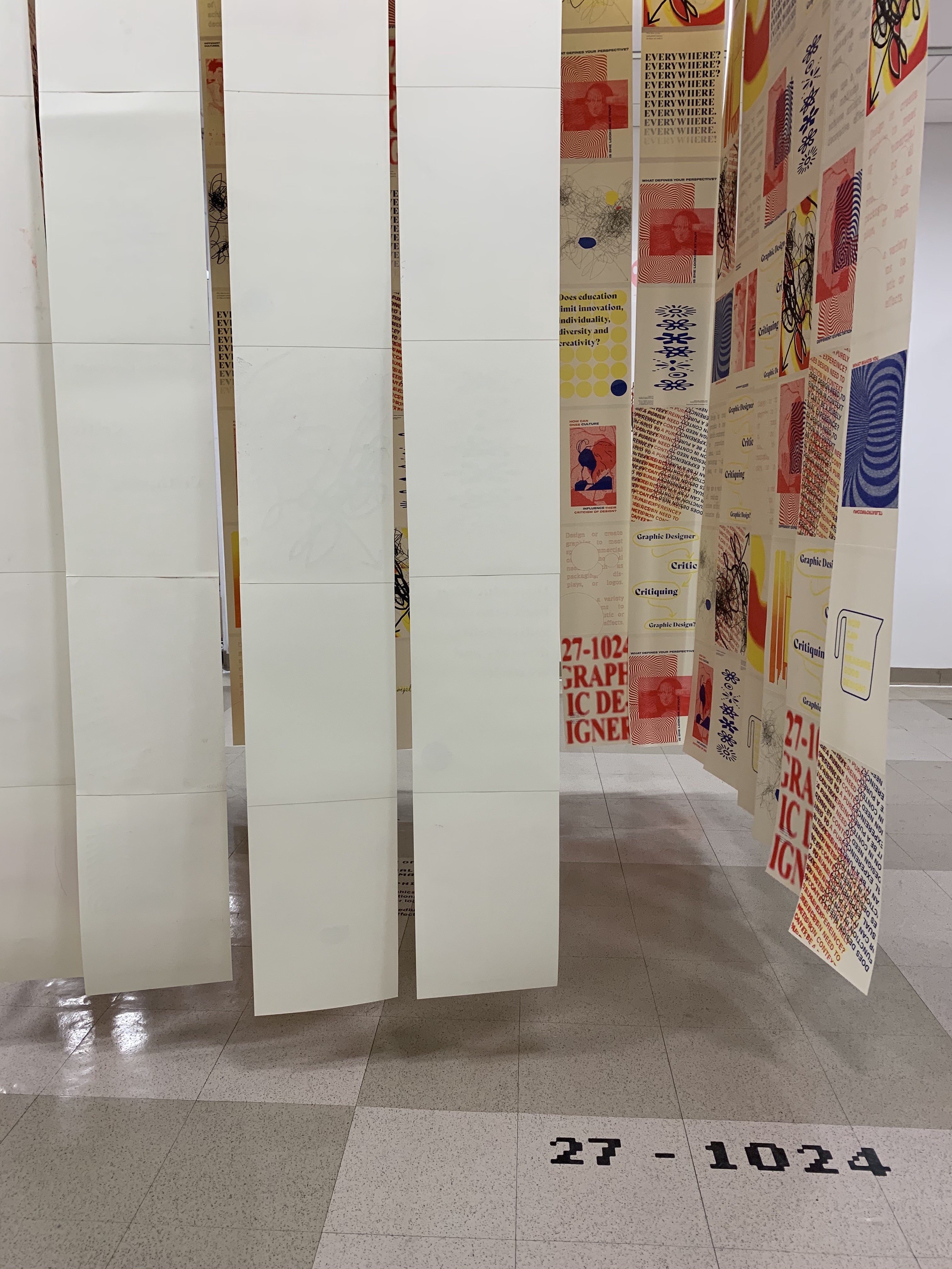
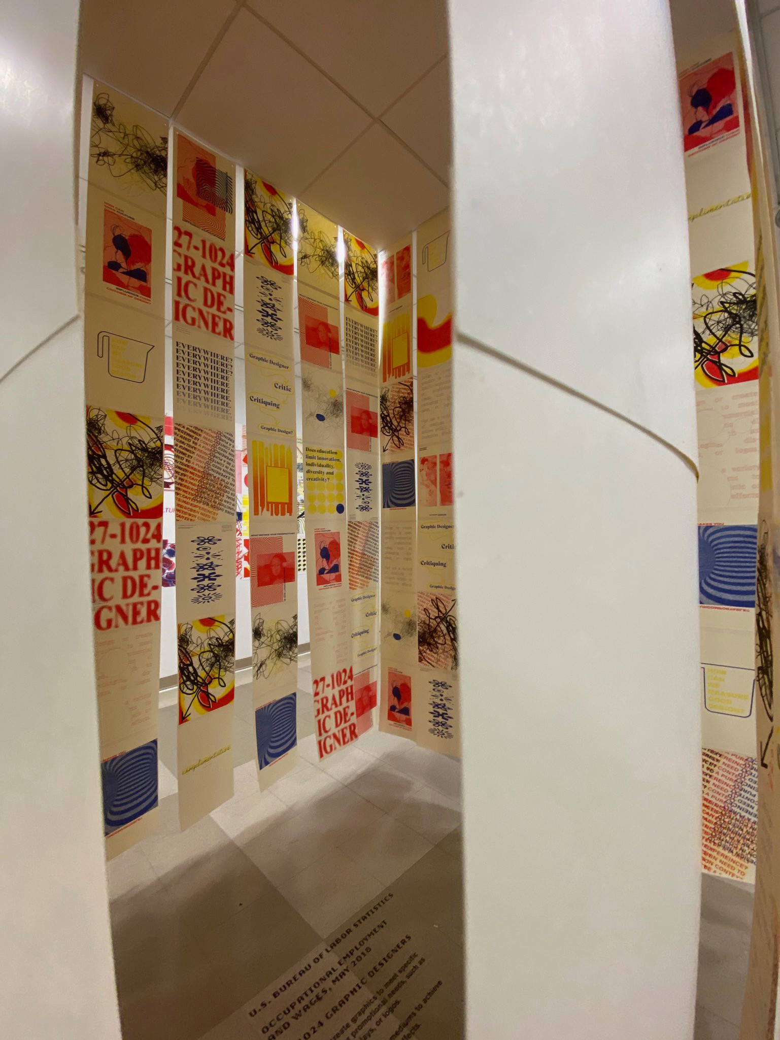
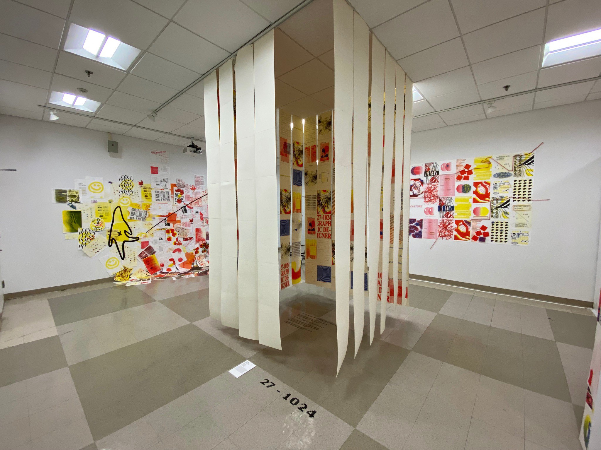

Student Name: Angela Lian, Eleanor Schiltz, Emily Bowen, Chinwe Oparaji, Jay Li
Project Title: Design Nomads
Project Title: Design Nomads
Project Description:
As a class, we were asked to read two chapters from the Graphic Design Reader, a set of essays from design history:
READ FULL BLOG POST
As a class, we were asked to read two chapters from the Graphic Design Reader, a set of essays from design history:
- What is this thing called graphic design criticism? Parts I & II by Rick Poynor and Michael Rock
- Education and professionalism, or what’s wrong with graphic design education by Katherine McCoy
READ FULL BLOG POST
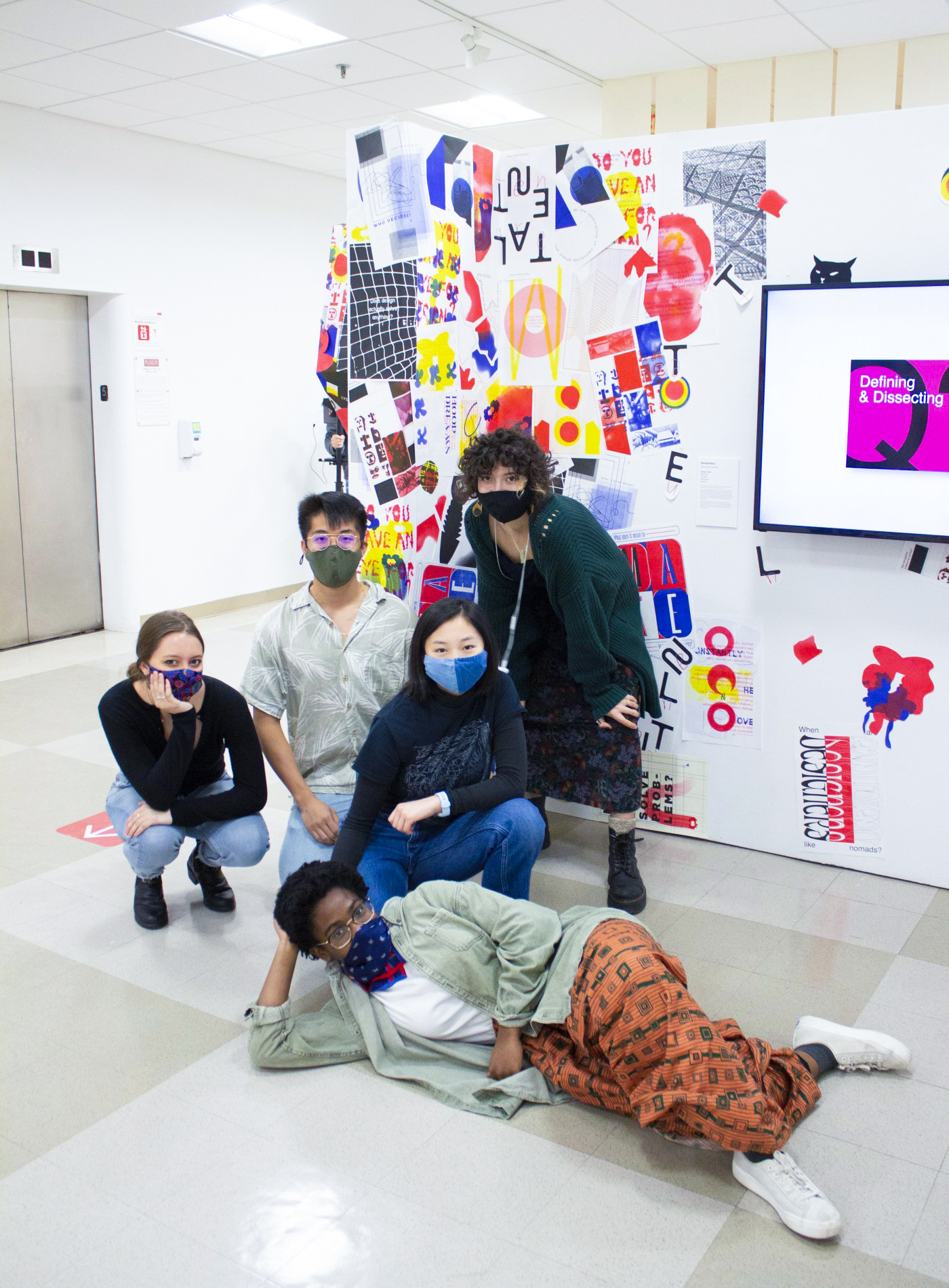
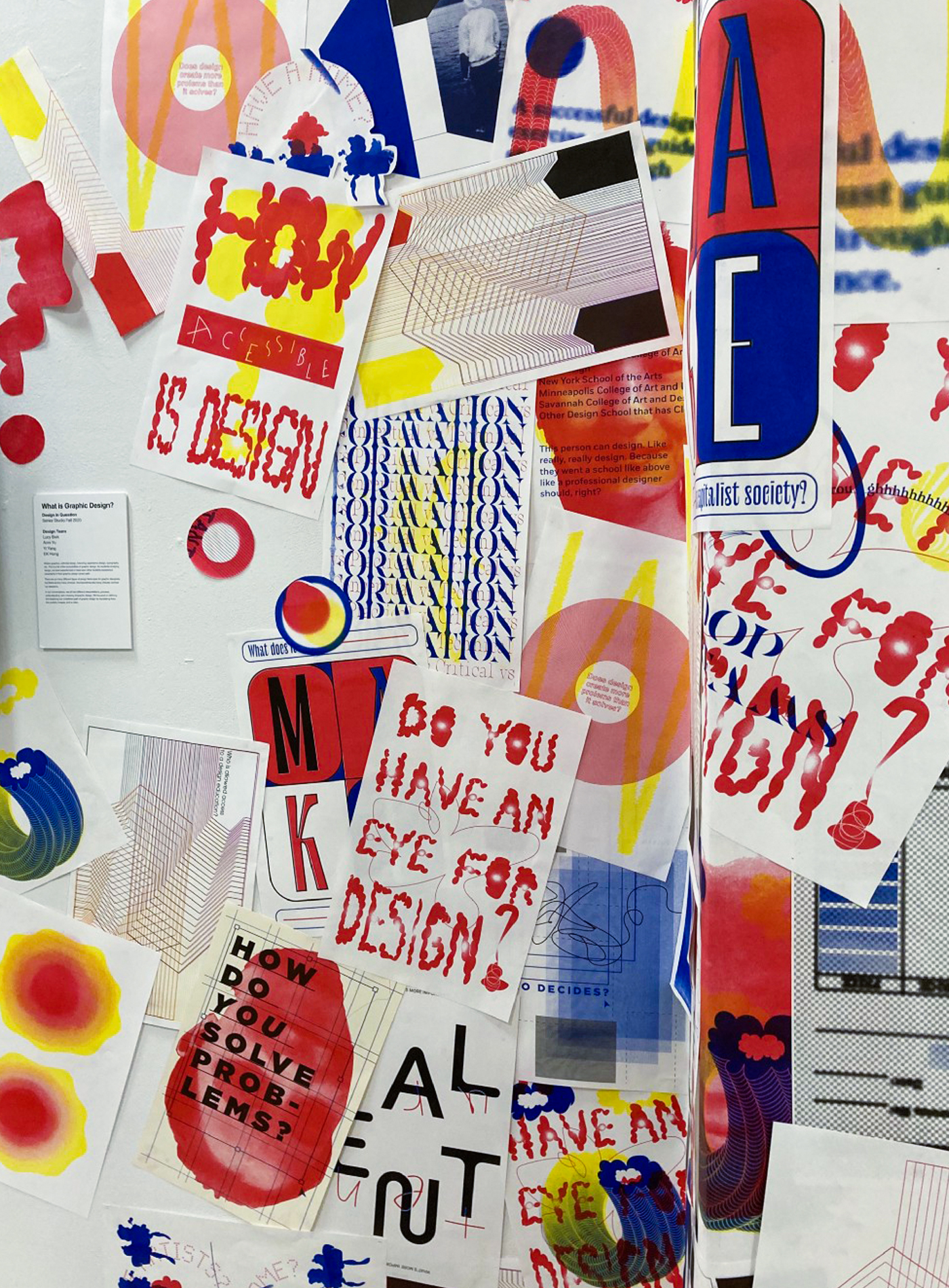
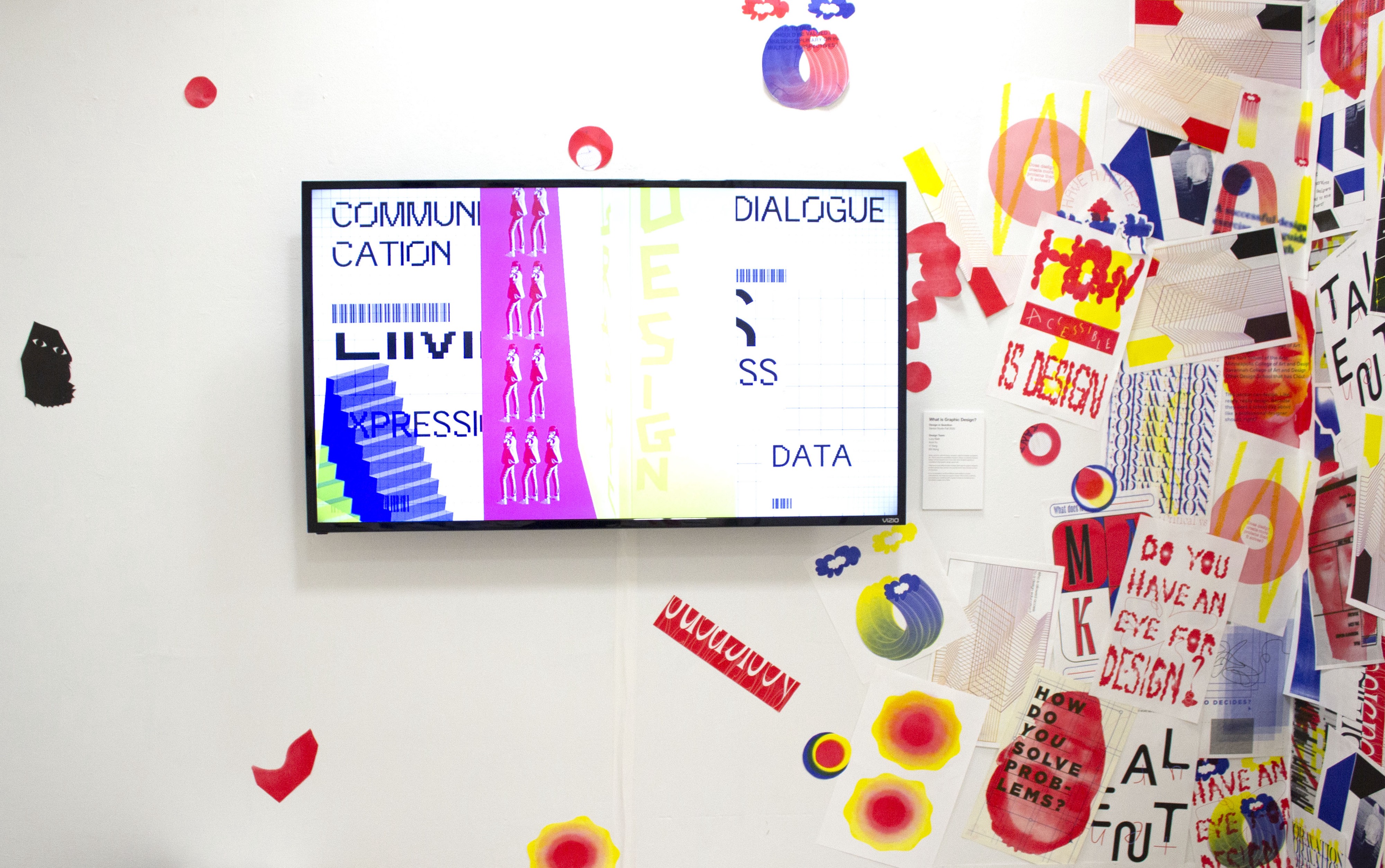
Student Name: Gregory Bond, Kendall Gregory,
Lena Johnson, Emerson Lawton
Project Title: GenZillennial
Lena Johnson, Emerson Lawton
Project Title: GenZillennial
Project Description:
When James first gave our design group this assignment, we can honestly say that any of us knew what the Impact & Empathy project was, nor what our final product was going to look like in the slightest. Nonetheless, our group trusted the process, and started to dive headfirst into Hyperakt, a website James showed us to find inspiration for our projects. After a lot of sifting, we landed on two projects that resonated with us — the GOOD Wellness Project, and Spotify’s Encouraging Meaningful Impact. We largely enjoyed these two projects due to their use of vibrant colors, and we also liked that both projects utilized design to make people care about their respective subjects, nutrition and community engagement. Ultimately, we decided to lean towards the aesthetics of Spotify’s project, and began moodboarding away, picking things up from Pinterest, Instagram, past projects, and more.
READ FULL BLOG POST
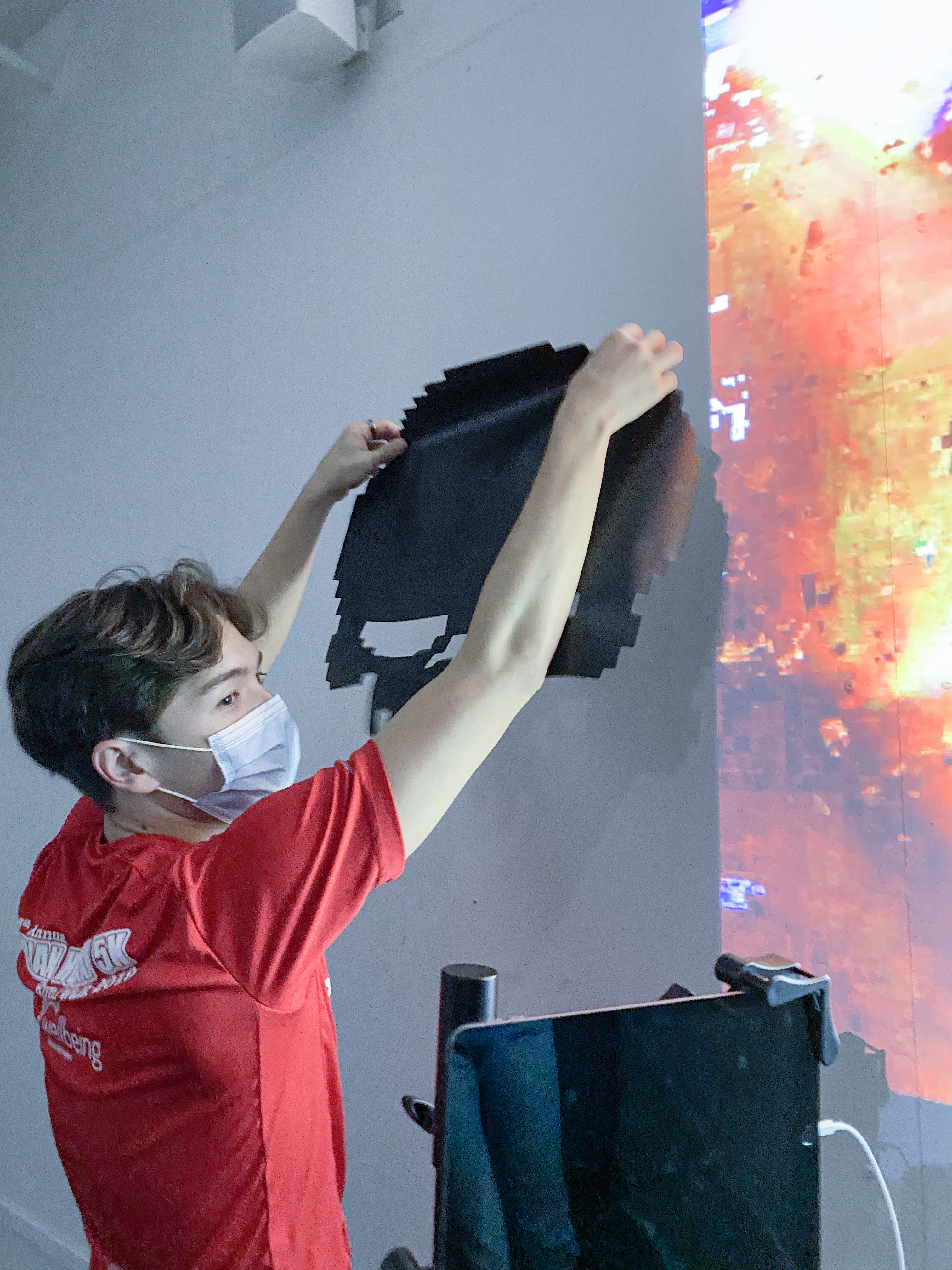
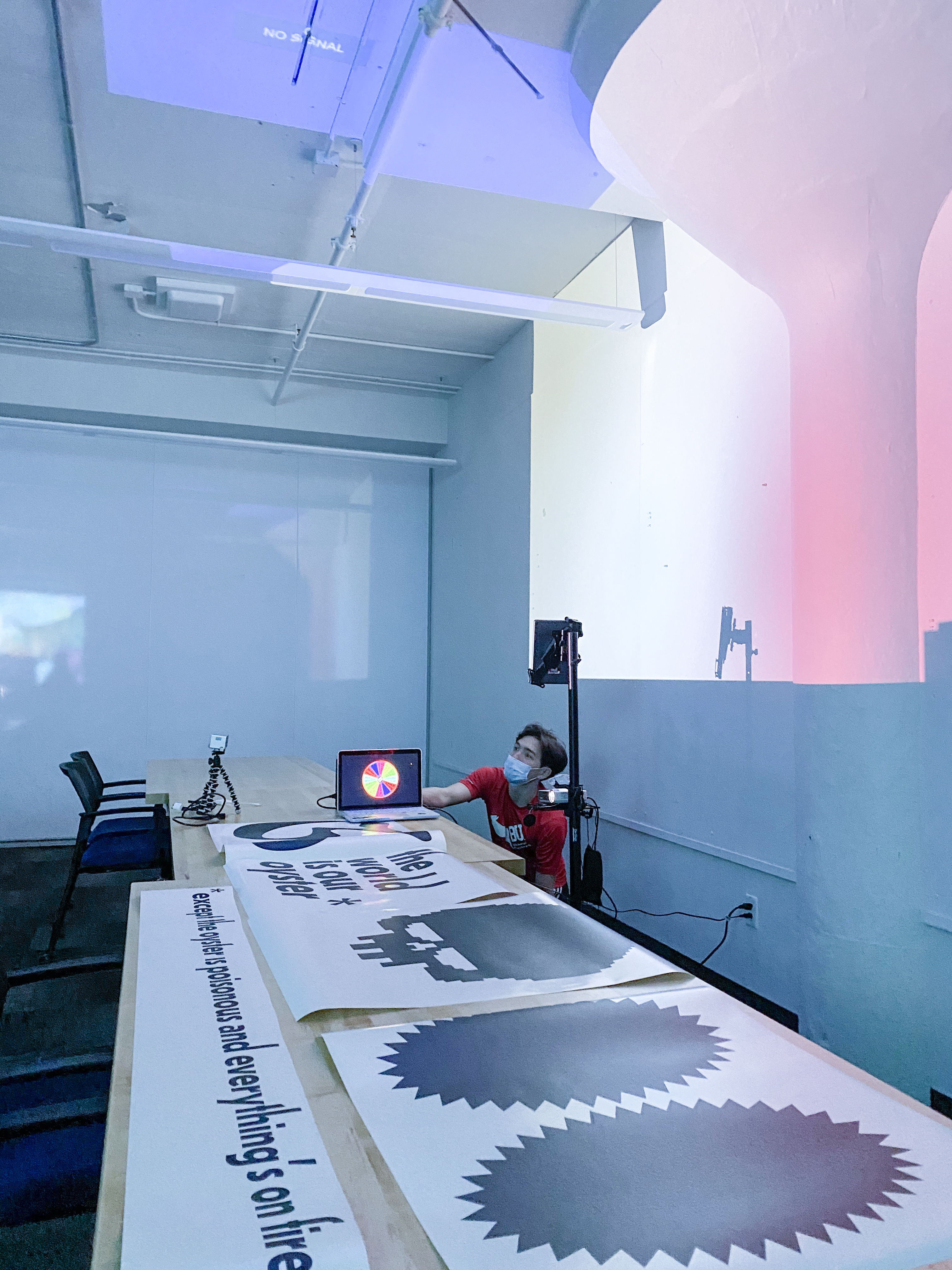
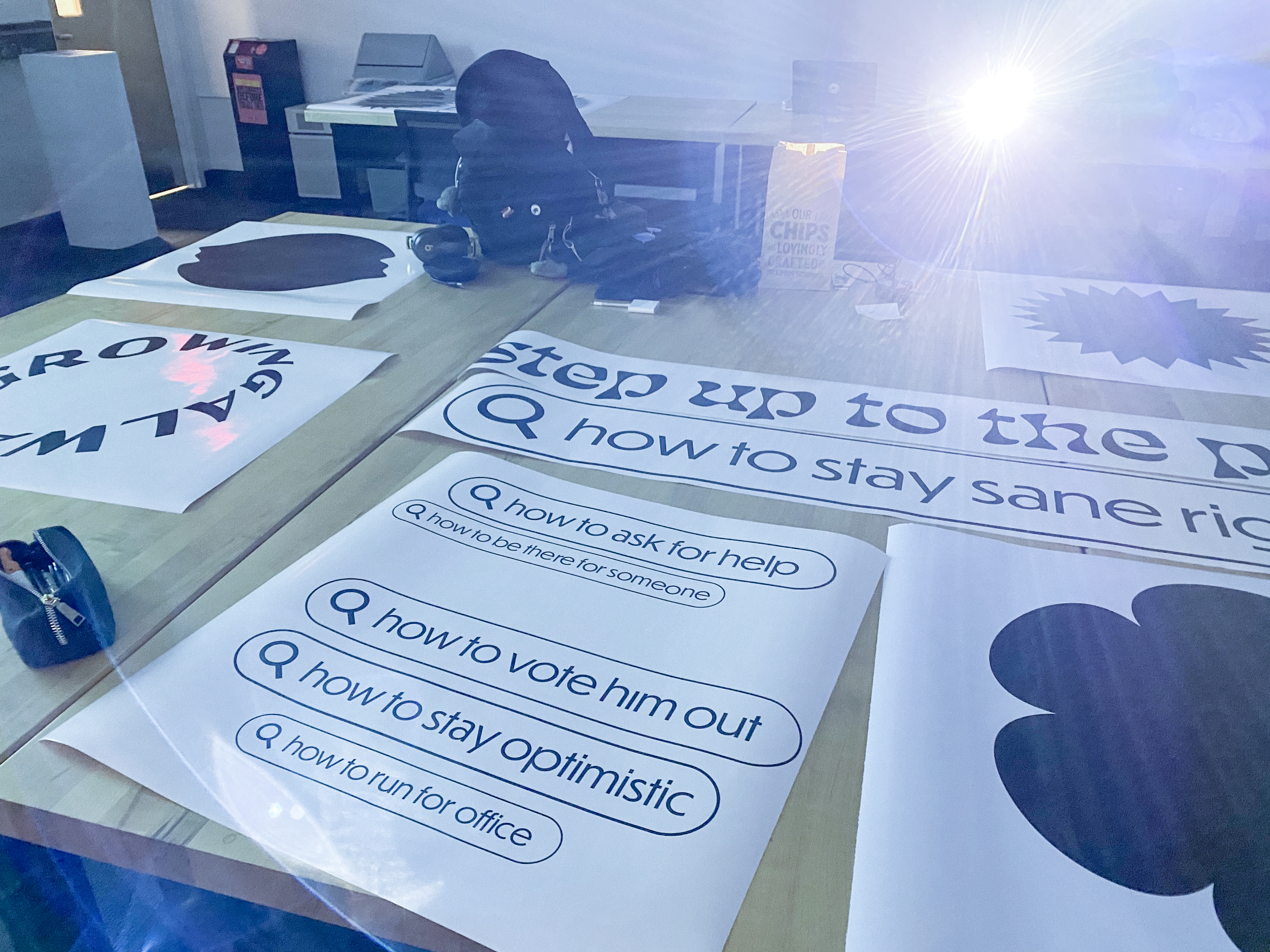
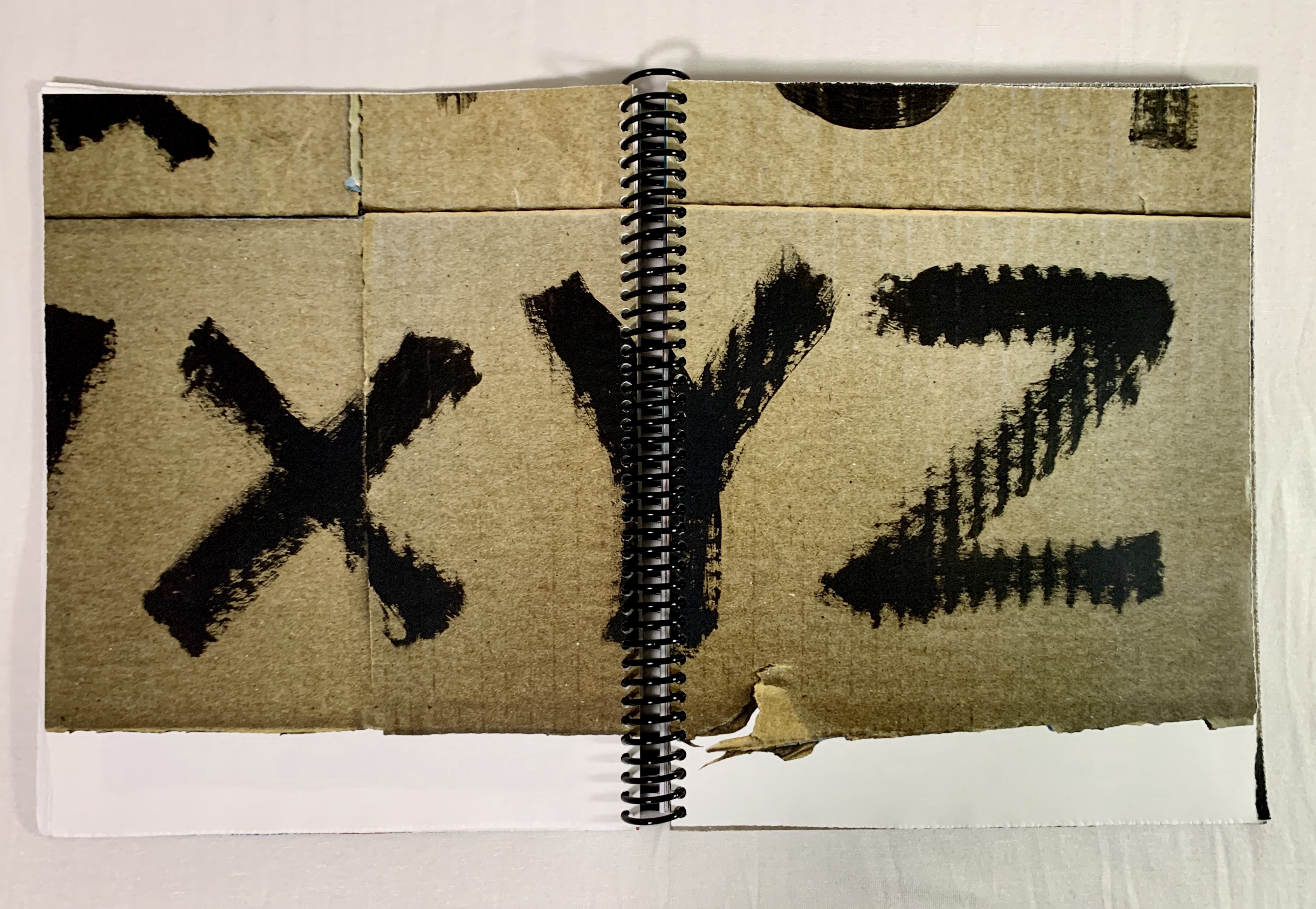 Abby Fenn, Creating Resistance
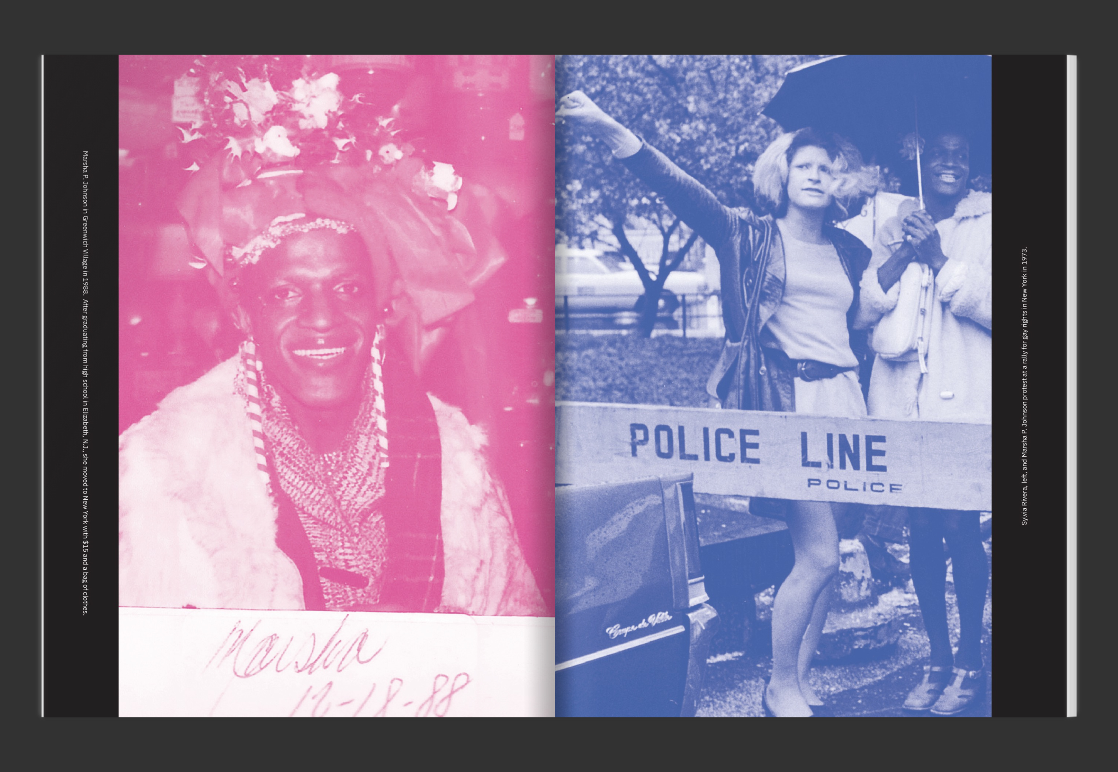 Morgan Recker, Love
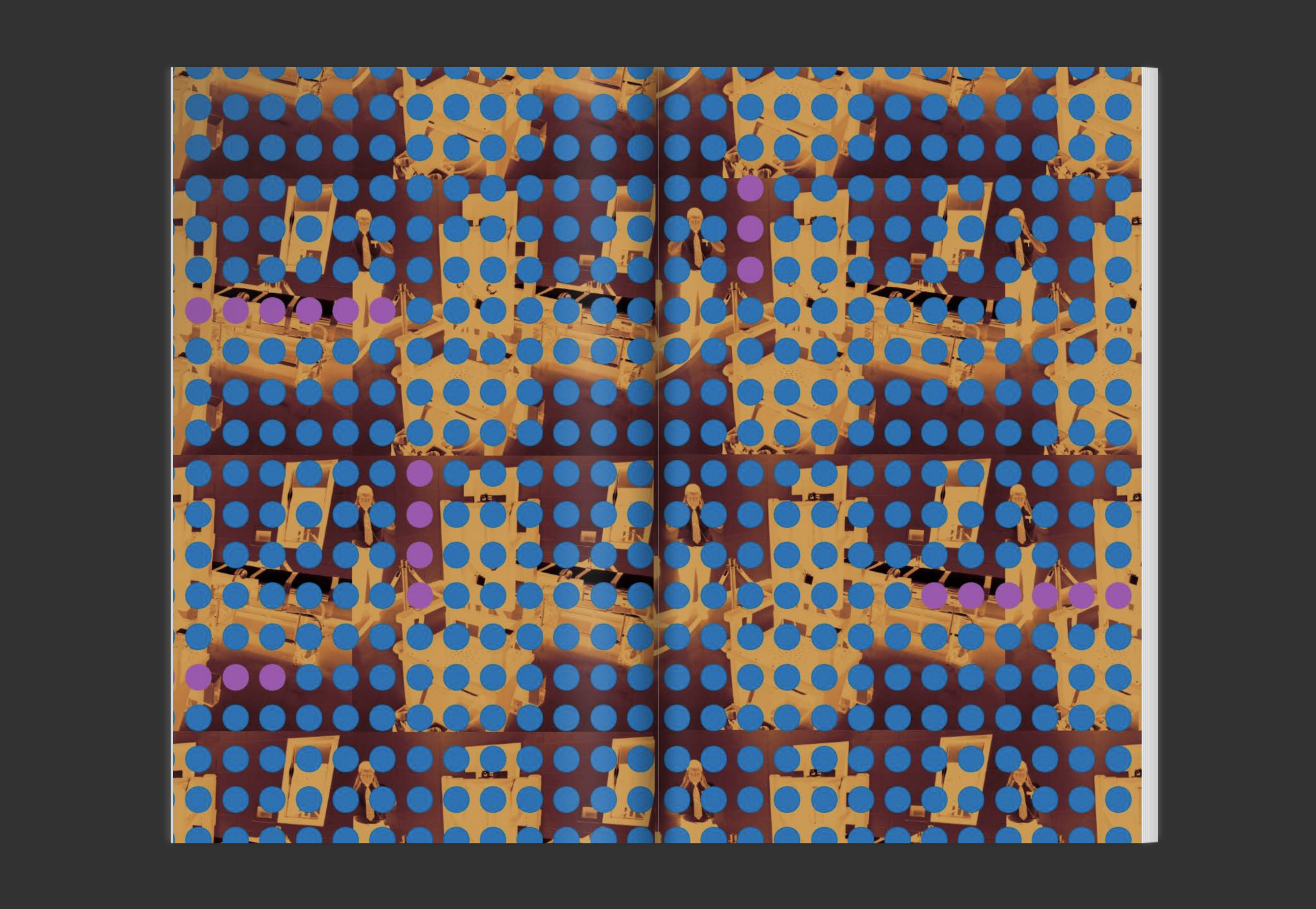 Mariana Velasquez, Broken System
  Ivan Reyes,
 Student Name: Morgan Recker, Abby Fenn, Mariana Velasquez, Ivan Reyes
Project Title: Protest: Impact & Empathy
Project Title: Protest: Impact & Empathy
Project Description:
As a group, we struggled with discussing, questioning, and critiquing design, design critique, and design education. It felt pointless, especially at a time like this when the world feels so unstable. What was the point of trying to describe why design is meaningful and impactful through design that felt meaningless? In order to get past this overbearing feeling of pointlessness, we decided to turn the project into an exercise in experimentation and play. We took the pressure off design and just created things for the sake of creating them; each print became a response to the barriers of design we experience and wrestle with as design students.
READ FULL BLOG POST
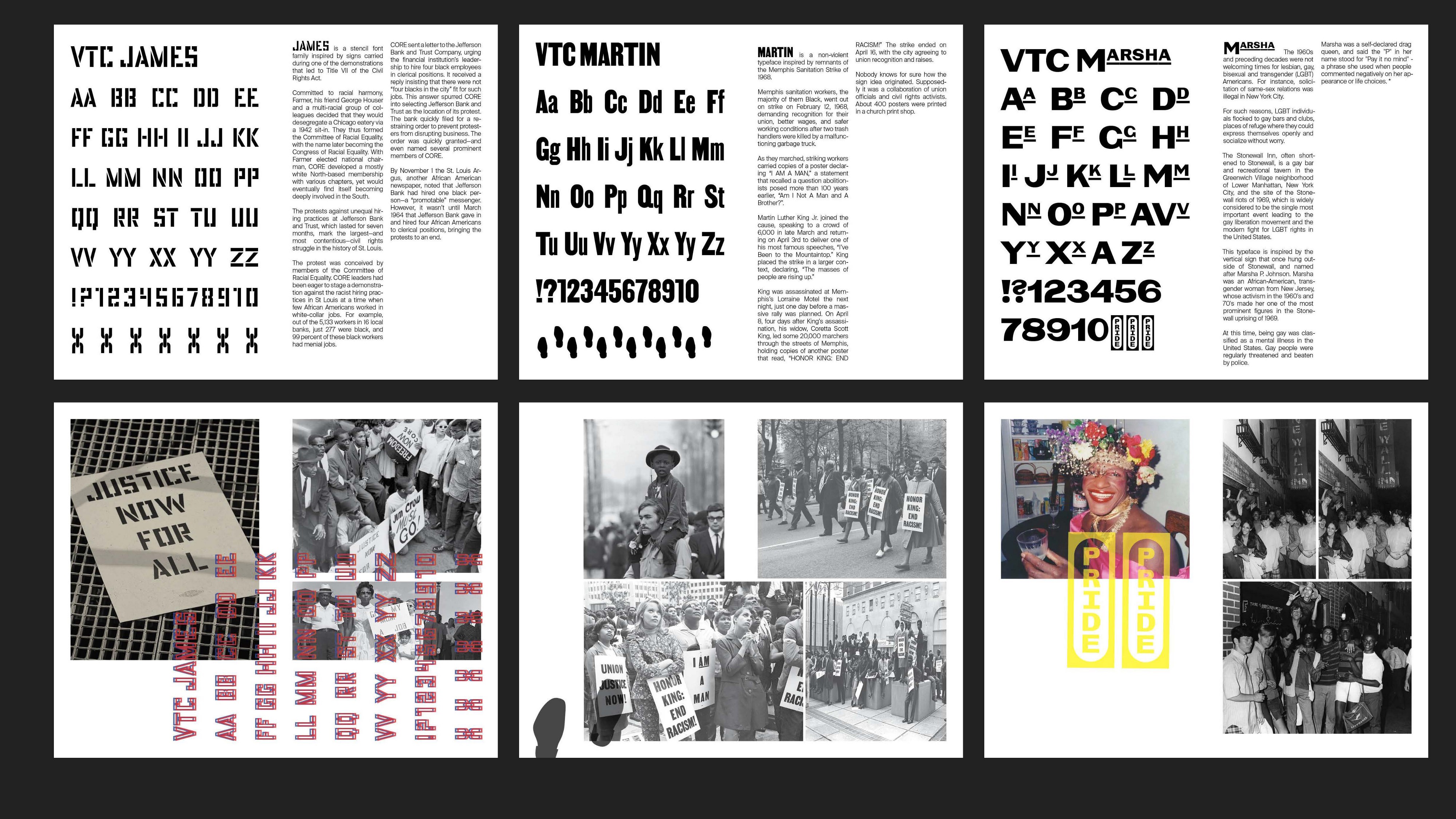
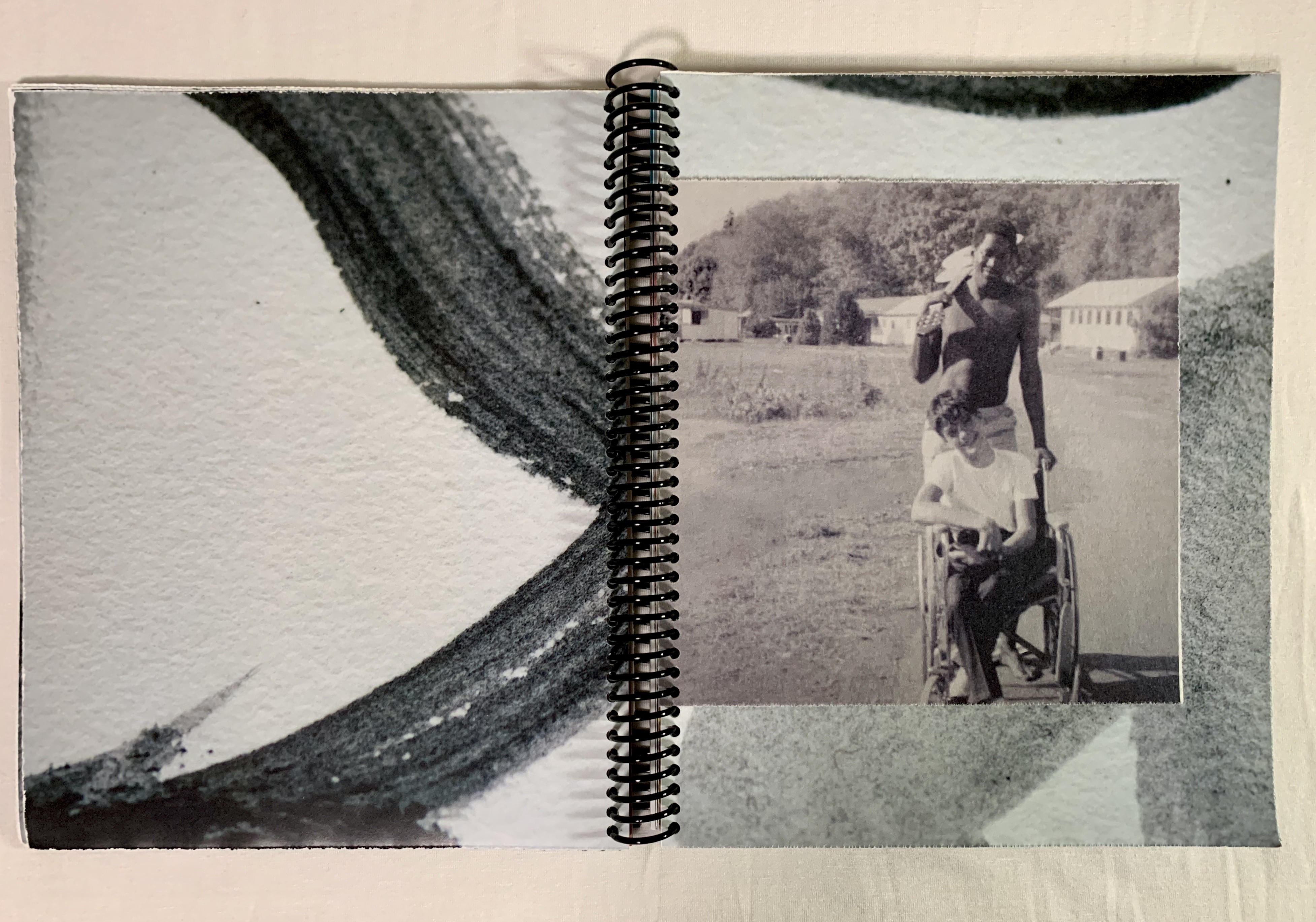
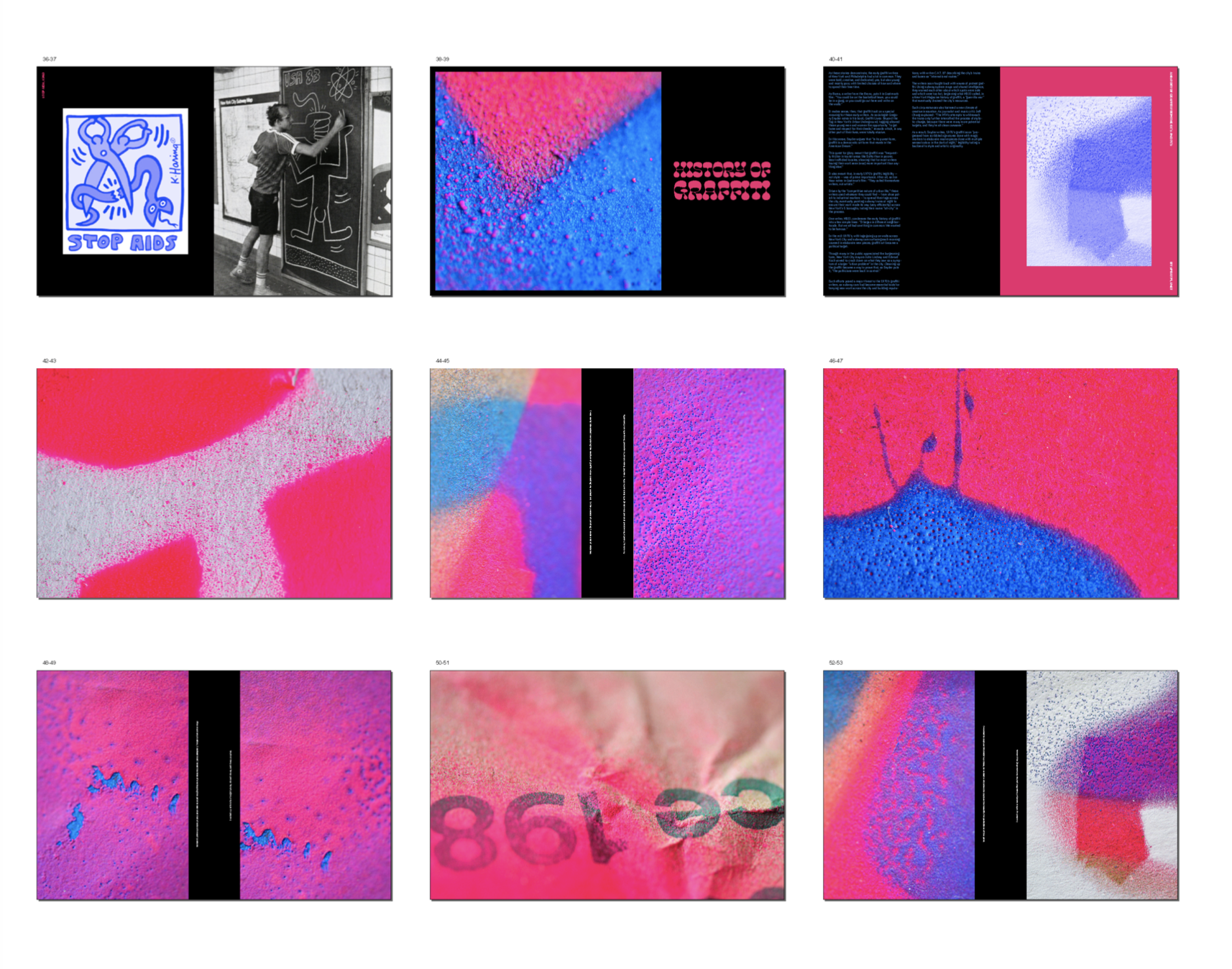
Student Name: Seong Jin (Steve) Kim, Fei Zhao, Angela Dong, Rachel Wui
Project Title: A Typographical Metaphor
Project Title: A Typographical Metaphor
Project Description:
In our first Senior Studio design project, Steve Kim, Rachel Wui, Fei Zhao, and I worked together to metaphorically express race and diversity through the use and study of typography.
Initially inspired by Hyperakt’s case study of its re-design of The Leonardo Museum. A museum dedicated to exploring the intersections of science, art, and technology. And by the current racial violence in the US and more specifically, the uprising of anti-Asian sentiment due to COVID-19. We wanted to find a way to combine all of our interests within the sciences and design into a unified project to speak on the issue of race that was directly affecting our community.
READ FULL BLOG POST

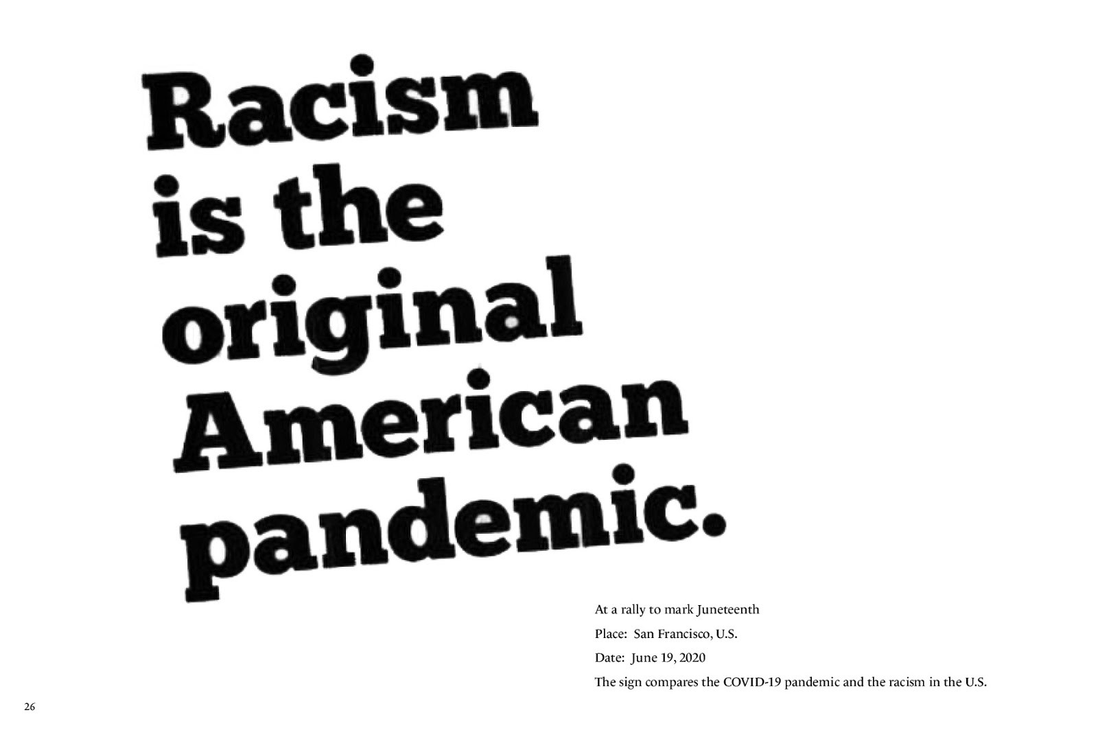
Student Name: Kari Everson
Project Title: Dystopia
Project Title: Dystopia
Project Description:
“An imagined state or society in which there is great suffering or injustice, typically one that is totalitarian or post-apocalyptic.”
For this last motion project I chose to make 3 videos each a minute long based on the them of Dystopian worlds. To achieve this I selected 3 movies/books that I have seen, that depicted epic dystopian worlds and I felt that I could really have fun making. From here I created each video using type, shape animations, old screen effects, and ominous/haunting soundtracks to portray these movies/books. My final outcome are 3 videos representing:
Besides telling stories and messages I also just really wanted this project to be another learning experience for me personally. After Effects is still somewhat new to me and I wanted to try achieving more creations strictly being created in After Effects.
READ FULL BLOG POST
“An imagined state or society in which there is great suffering or injustice, typically one that is totalitarian or post-apocalyptic.”
For this last motion project I chose to make 3 videos each a minute long based on the them of Dystopian worlds. To achieve this I selected 3 movies/books that I have seen, that depicted epic dystopian worlds and I felt that I could really have fun making. From here I created each video using type, shape animations, old screen effects, and ominous/haunting soundtracks to portray these movies/books. My final outcome are 3 videos representing:
- Dystopian Nation — The Purge
- Dystopian District — The Hunger Games
- Dystopian Society — 1984
Besides telling stories and messages I also just really wanted this project to be another learning experience for me personally. After Effects is still somewhat new to me and I wanted to try achieving more creations strictly being created in After Effects.
READ FULL BLOG POST
Student Name: Kateri Gemperlein-Schirm
Project Title: Home
Project Title: Home
Project Description:
Prompt: Develop a vignette or vignettes that feature a non-linear narrative and whose message is based on a vision of community. How you choose to interpret ‘community’ is up to you.
When I was first storyboarding for this project, the first things I thought of in regards to community was an aspect of self. I tried to think of what made me, me. Originally, I planned to create three separate videos, each with their own storyline and style. The first would be footage based, focusing on an aspect of my personality through clothing. The second was going to be animation, based on the idea of home, and the third would be stop motion based on online communities.
READ FULL BLOG POST
Student Name: Byori Hwang
Project Title: A Piano
Project Title: A Piano
Project Description:
A PIANO from Tender Buttons by Gertrude Stein
“If the speed is open, if the color is careless, if the selection of a strong scent is not awkward, if the button holder is held by all the waving color and there is no color, not any color.”
For tender buttons project, I had to choose 30– 40 word length from Tender Buttons written by Gertrude Stein. Gertrude Stein is an American Author and poet. As you can see, her use of language is very abstract thus it allows readers to interpret it from different and wider perspectives.
READ FULL BLOG POST
Student Name: Chrissy Casavant
Project Title: Tender Buttons
Project Title: Tender Buttons
Project Description:
My main goal for this project was to explore the Procreate animation capability. I love the look of stop motion text, but don’t have the focus or dedication to doing that in an analog format. As an illustrator, I’m still getting to know how Procreate works as a drawing app, but I had heard lots of good things about the animation assist feature, and wanted to see if I could make it work for me.
The passage I chose was: “Light blue and the same red with purple makes a change. It shows that there is no mistake. Any pink shows that and very likely it is reasonable. Very likely there should not be a finer fancy present.” When I chose the passage I did, I felt that it could be communicated through colors and words, which translates well to Procreate.
READ FULL BLOG POST
Student Name: Faith Huishi Li
Project Title: A Red Hat
Project Title: A Red Hat
Project Description:
Tender Buttons by Gertrude Stein is considered one of the most innovative pieces of Modernist writing. Select a short passage from Gertrude Stein’s Tender Buttons from either Objects or Food. Develop a vignette that visually interprets the chosen passage. The works of Gertrude Stein is valued more of sounds and rhythms than the meanings themselves. So her works provide a good start point and enough flexibility for us to improvise.
The first thing we did is to read through her works and find a piece containing 30–40 words we might be interested in. I found a piece call A Red Hat really intriguing. READ FULL BLOG POST
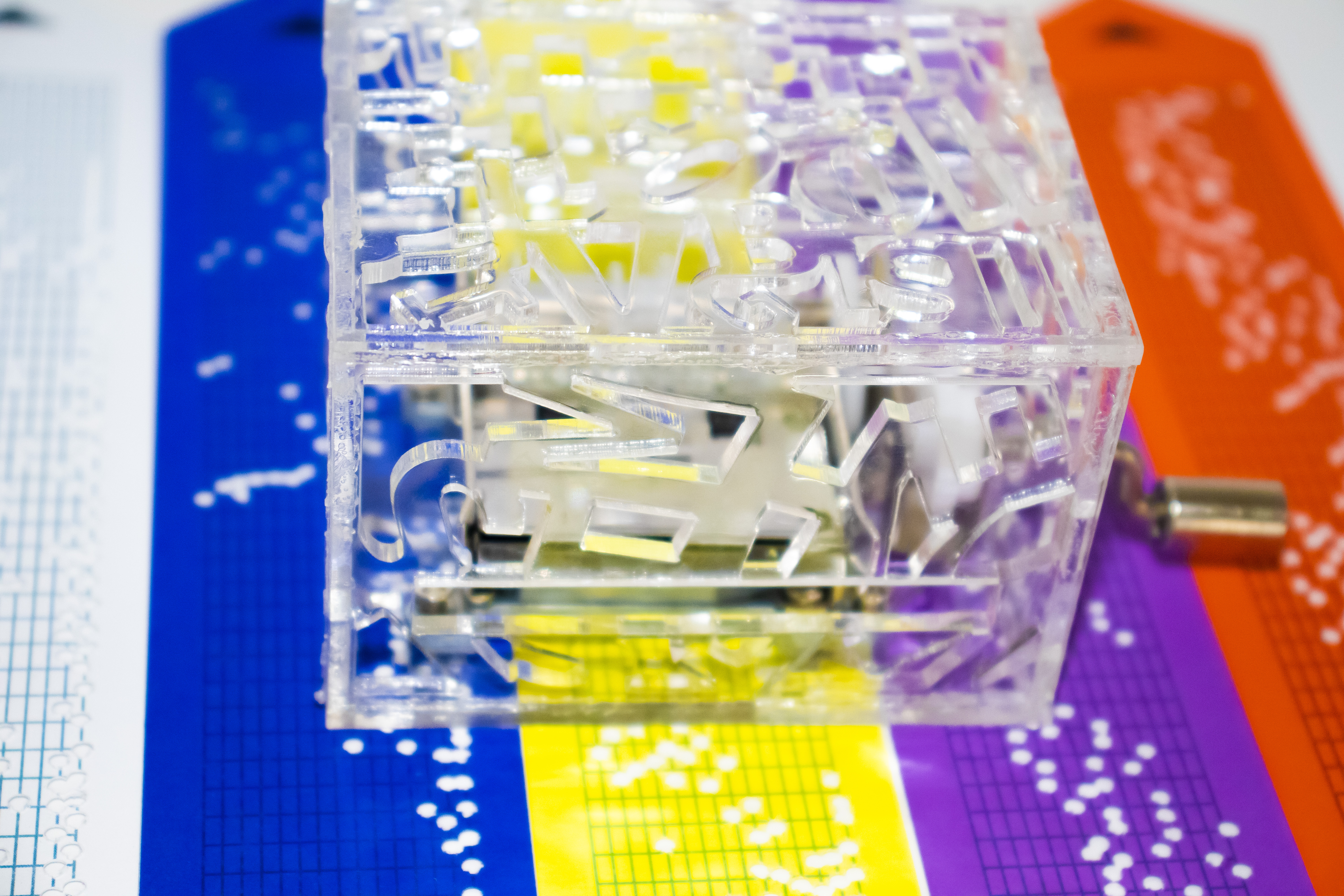
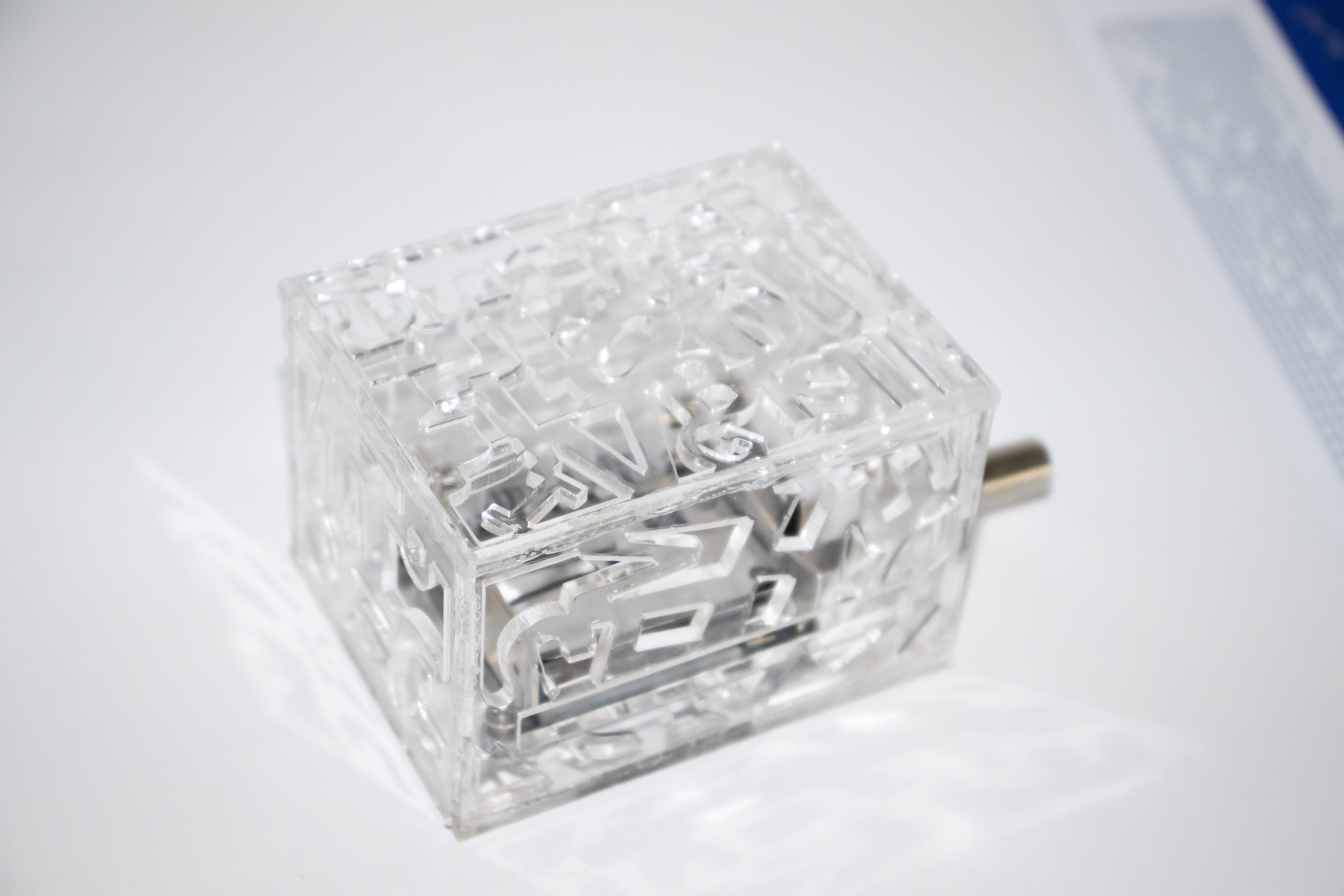
Student Name: Reem Alsanea, Byori Hwang
Project Title: Sound of Color
Project Title: Sound of Color
Project Description:
Over the blackened moon...
Tears of joy...
What kind of emotions do these lyrics leave you feeling? Our collection project is about music and emotion. Byori and I paired up for this project. We love music. But the genres and styles were totally different. We were figuring out how to incorporate music into this project, and then we suddenly thought, how about we listen to the same songs and record our emotions throughout the duration of each song? To be able to record our emotions precisely, we first had to come up with a system. Our system was basically choosing 8 different emotions, and giving each of these emotions a color.
READ FULL BLOG POST
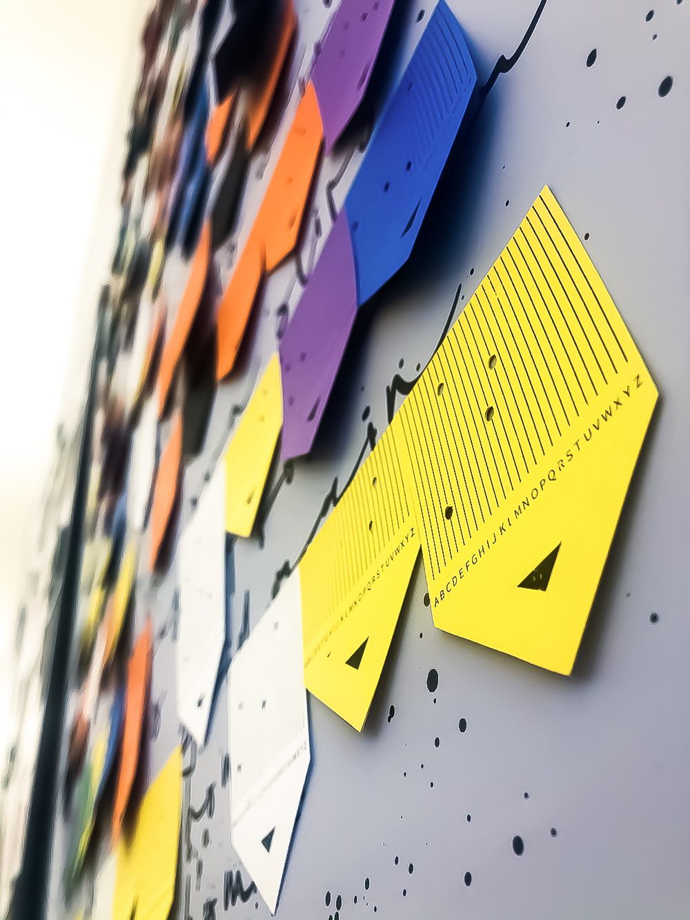
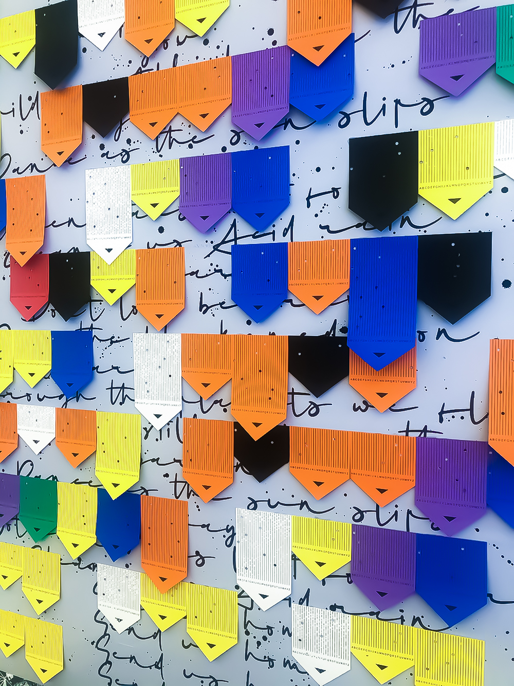
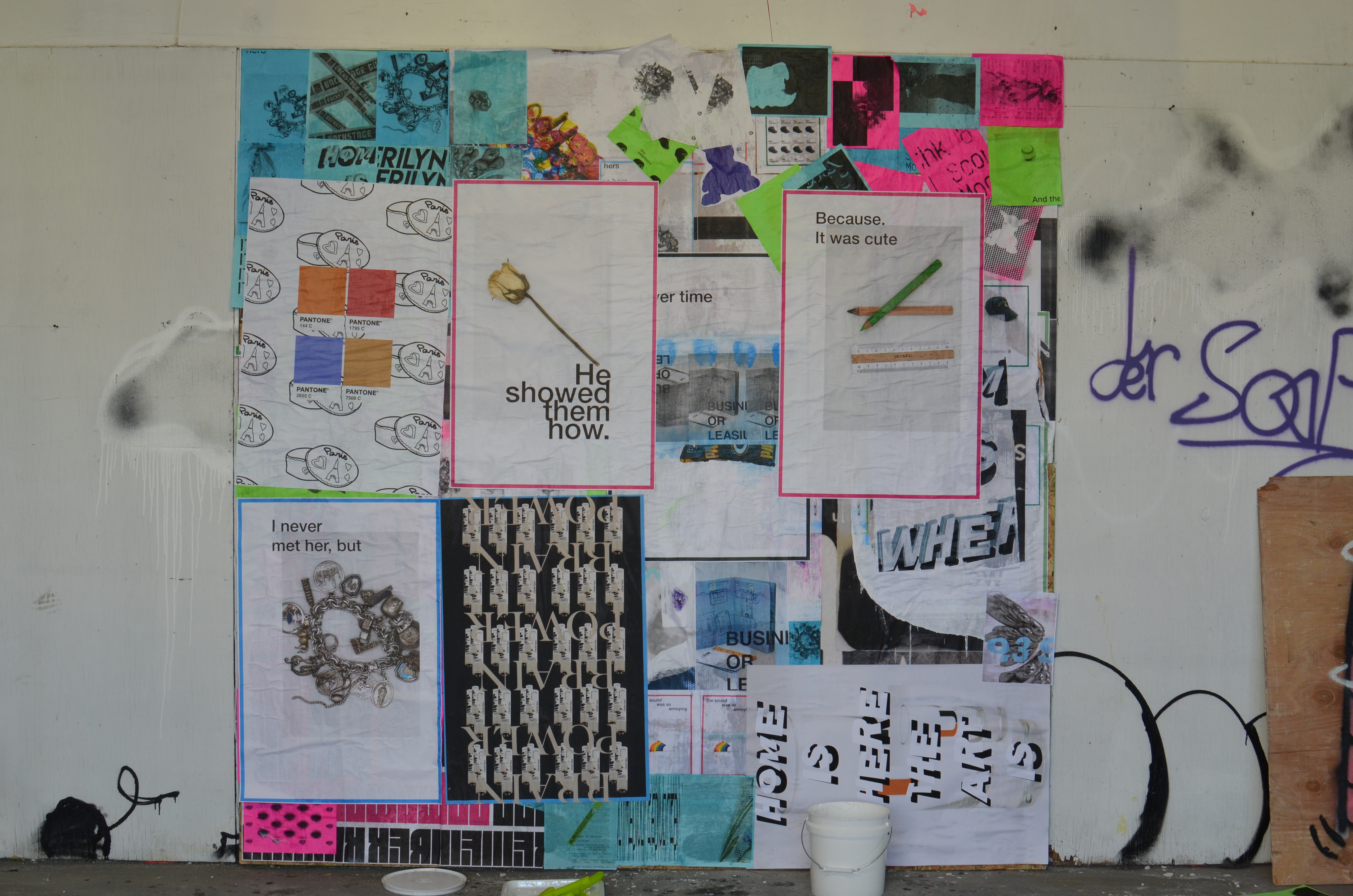
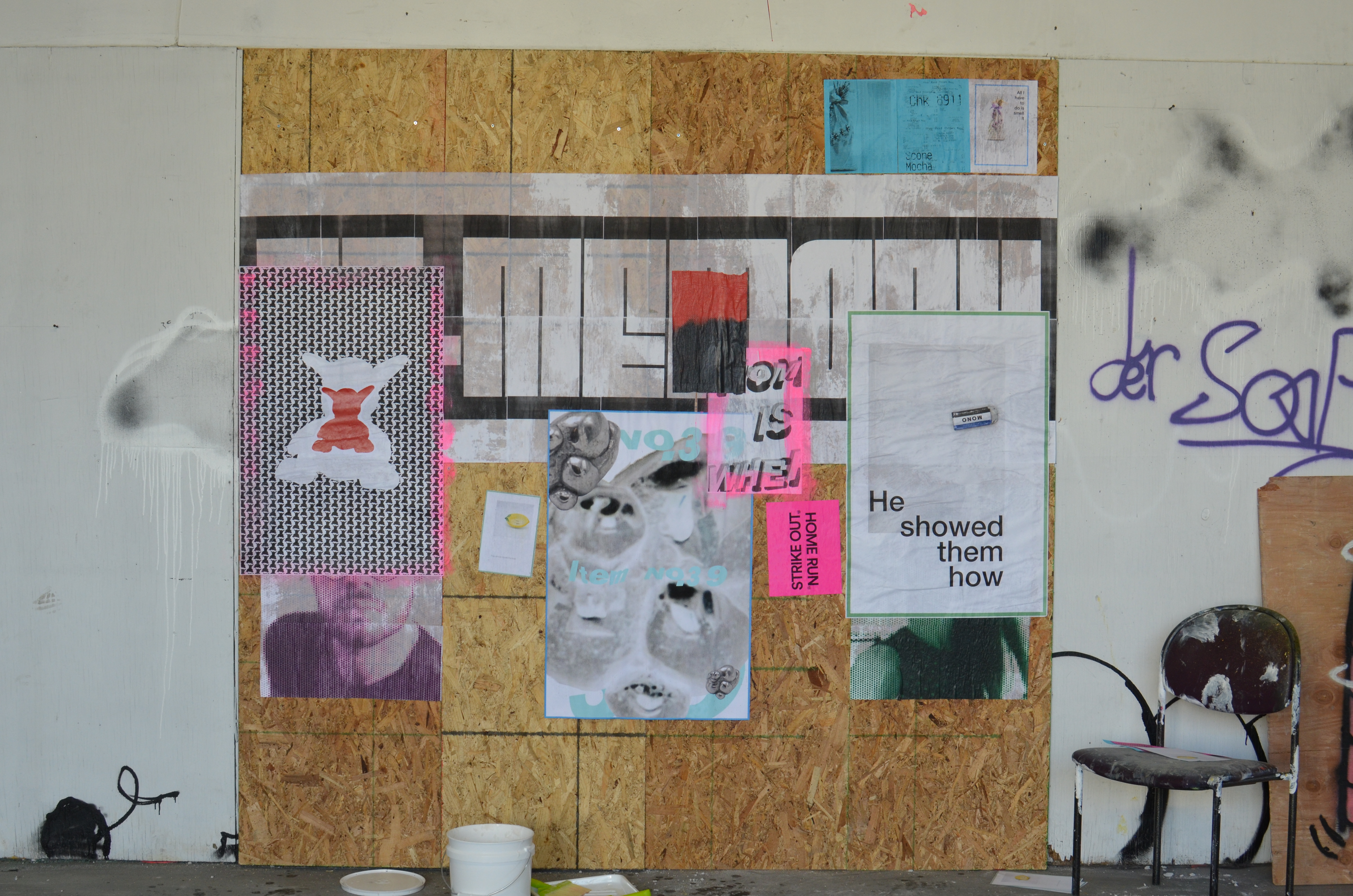
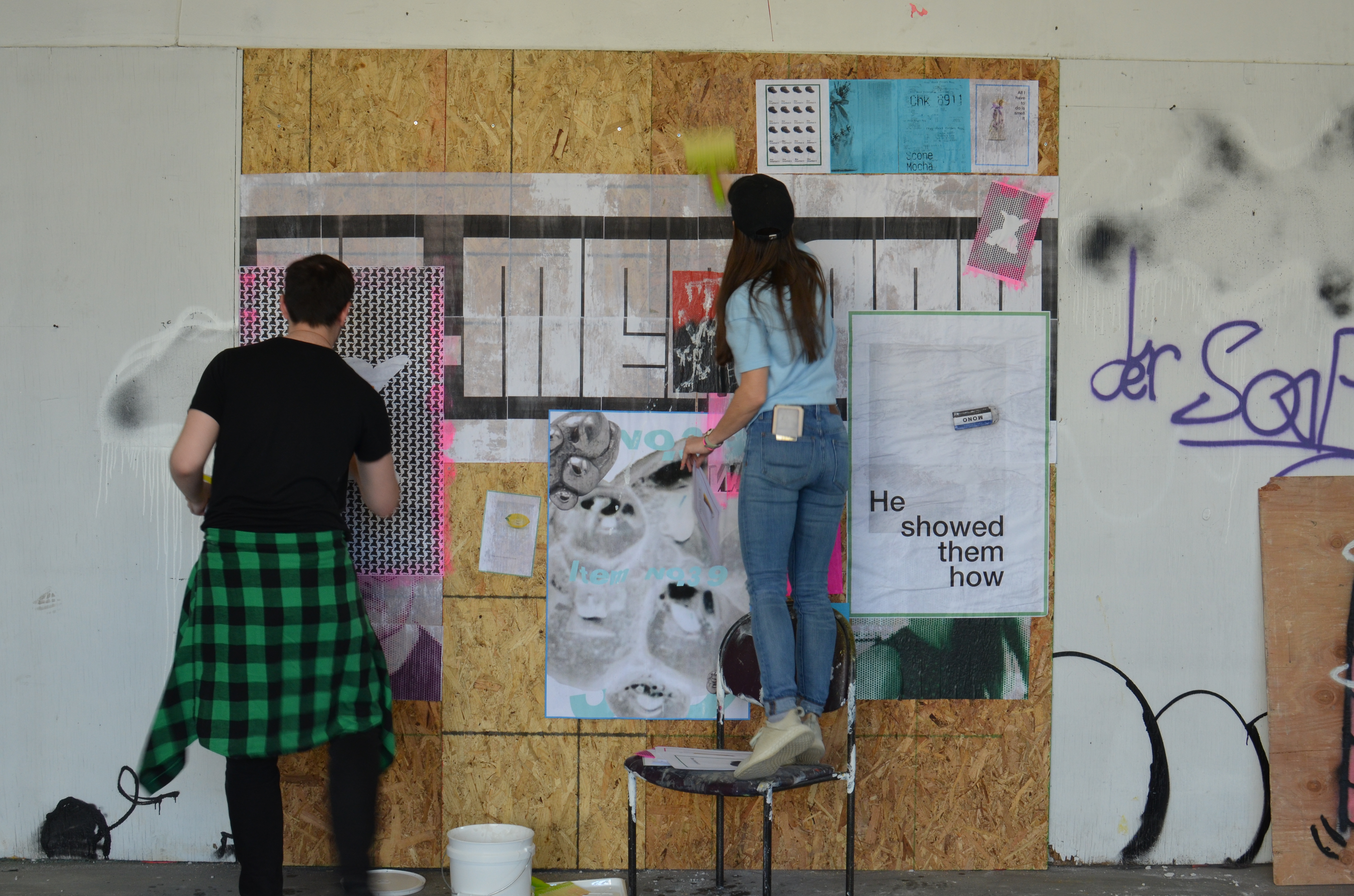
Student Name: Claire Bula, Michael Rosenberg,
and Jenna Benoit
Project Title: Re-Memory
and Jenna Benoit
Project Title: Re-Memory
Project Description:
After reviewing examples provided by our professor, James Grady, our group (Michael Rosenberg, Jenna Benoit, and Claire Bula) decided that we would cast our net for collection broadly. Prof. Grady provided three potential categories of collections we could explore — raw collection and a translation of that, documentation of an experience or event, or personal data collection. Our group had interests in all three, so we left it open for each of us to explore, over the course of a week, what caught our attention. In conversation, I mentioned that I don’t collect things anymore and I try to own as little as possible, whereas Jenna said she collected lots of mementos and trinkets. One idea that resulted from that conversation was to try and look around our homes and see what kinds of collections existed there, as opposed to gathering collections in the outside world. The resulting collections were of mostly everyday items, but tended to gravitate to objects that held a deeper meaning to us or a memory that was special. We also collected a little bit of data and drew some charts.
READ FULL BLOG POST
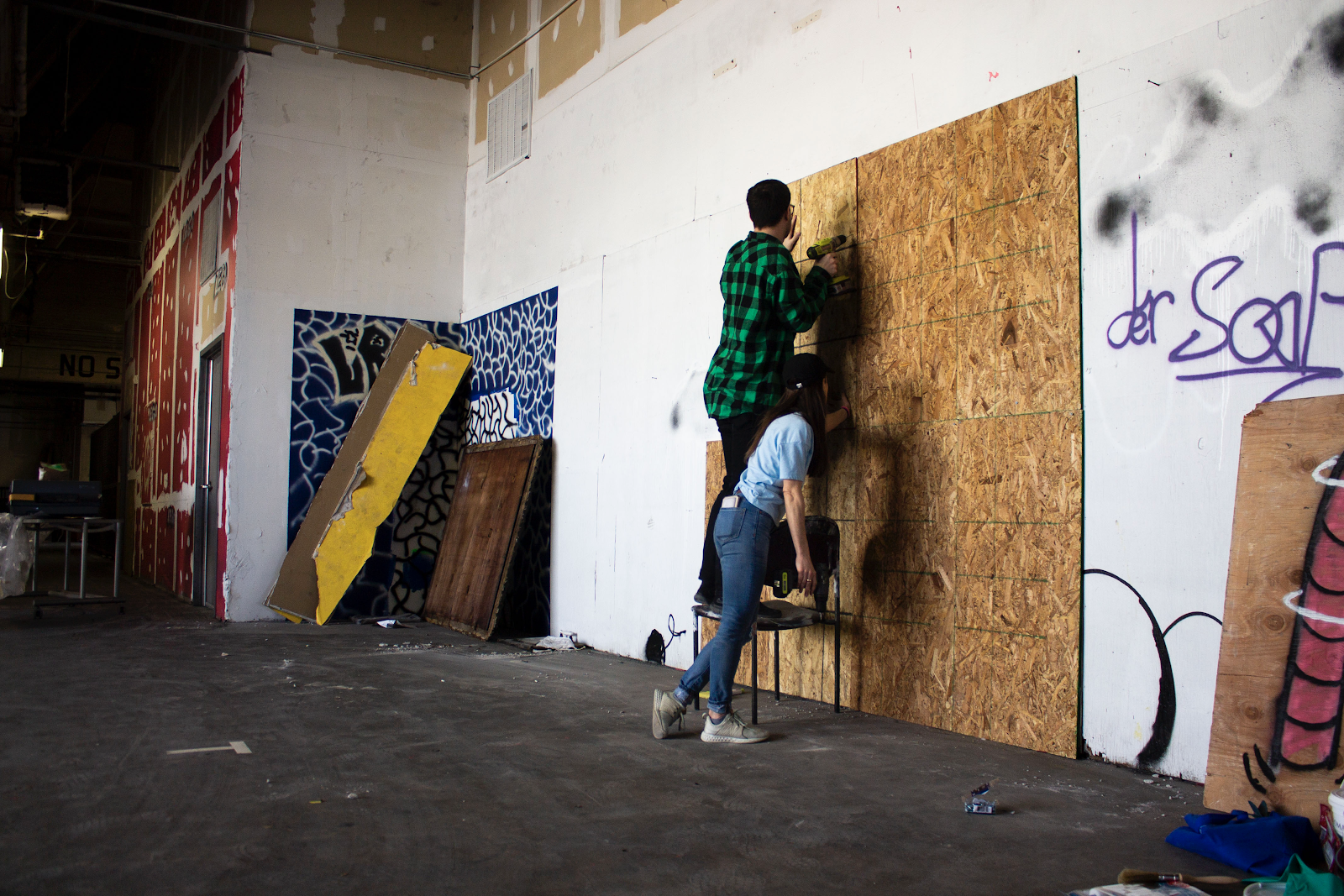
Student Name: Kari Everson, Taiyo Hasegawa
Project Title: Fenway Typography
Project Title: Fenway Typography
Project Description:
Our project is all about typography found in the Fenway Neighborhood area. Both of us live in the Fenway neighborhood and so it seemed only fitting to find a collection in a place that we both have a connection with and share in common. In a brief overview our project is an exploration of different typography found in Fenway signage. The letters found came from all different types of signage; from mostly restaurants, to stores, to recreational centers, etc. Using the type we found and collected we created type specimens, a Frankenstein “like” typeface (i.e. letters pulled from signage), a Fenway reviews poster, and a video using our made typeface. From this project we learned what can be found and made from collections.
READ FULL BLOG POST
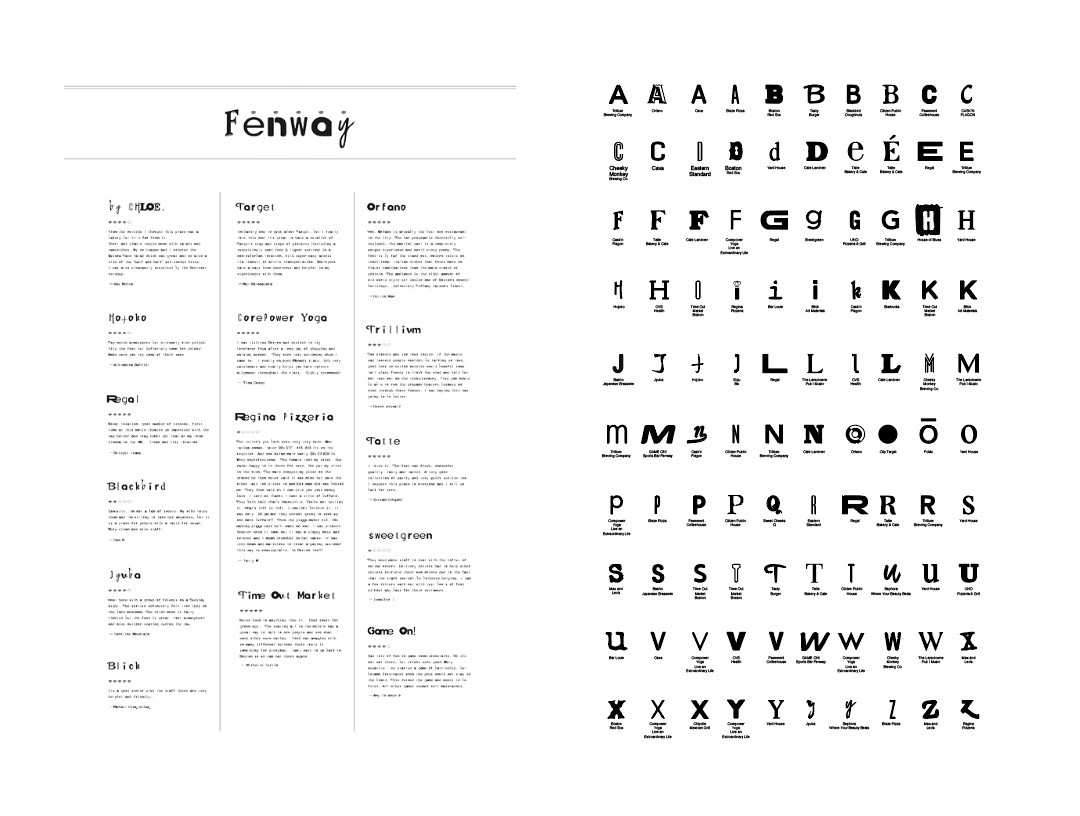
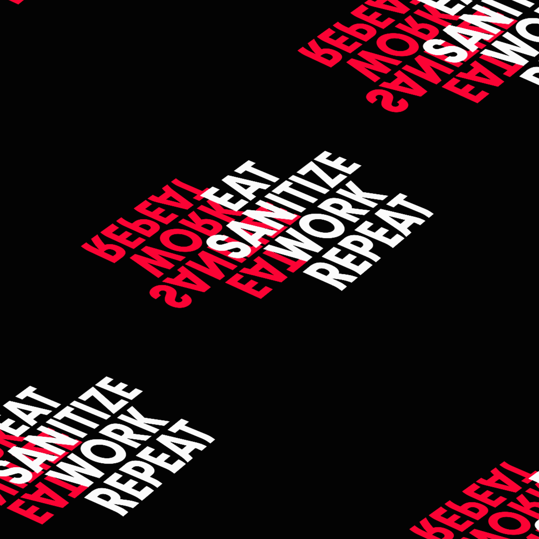
Student Name: Arjun Kumar
Project Title: COVID 19 Crisis
Project Title: COVID 19 Crisis
Project Description:
Our semester got disrupted and so did most of our projects. As for this project we had to have a print and digital component both, our project also had to change. Now, we had to make three digital posters with an AR component built into them with the help of Artivive. Before these changes were made, I had already begun working on a personal project about this COVID-19 crisis. I hated this situation of online classes we all had to adjust to. I loved working in our studio and just seeing everyone working passionately on their projects, I missed it so much. Hence, I started making kinetic typography videos on this situation we were in. That’s when I realized that we are in a liminal state.
READ FULL BLOG POST
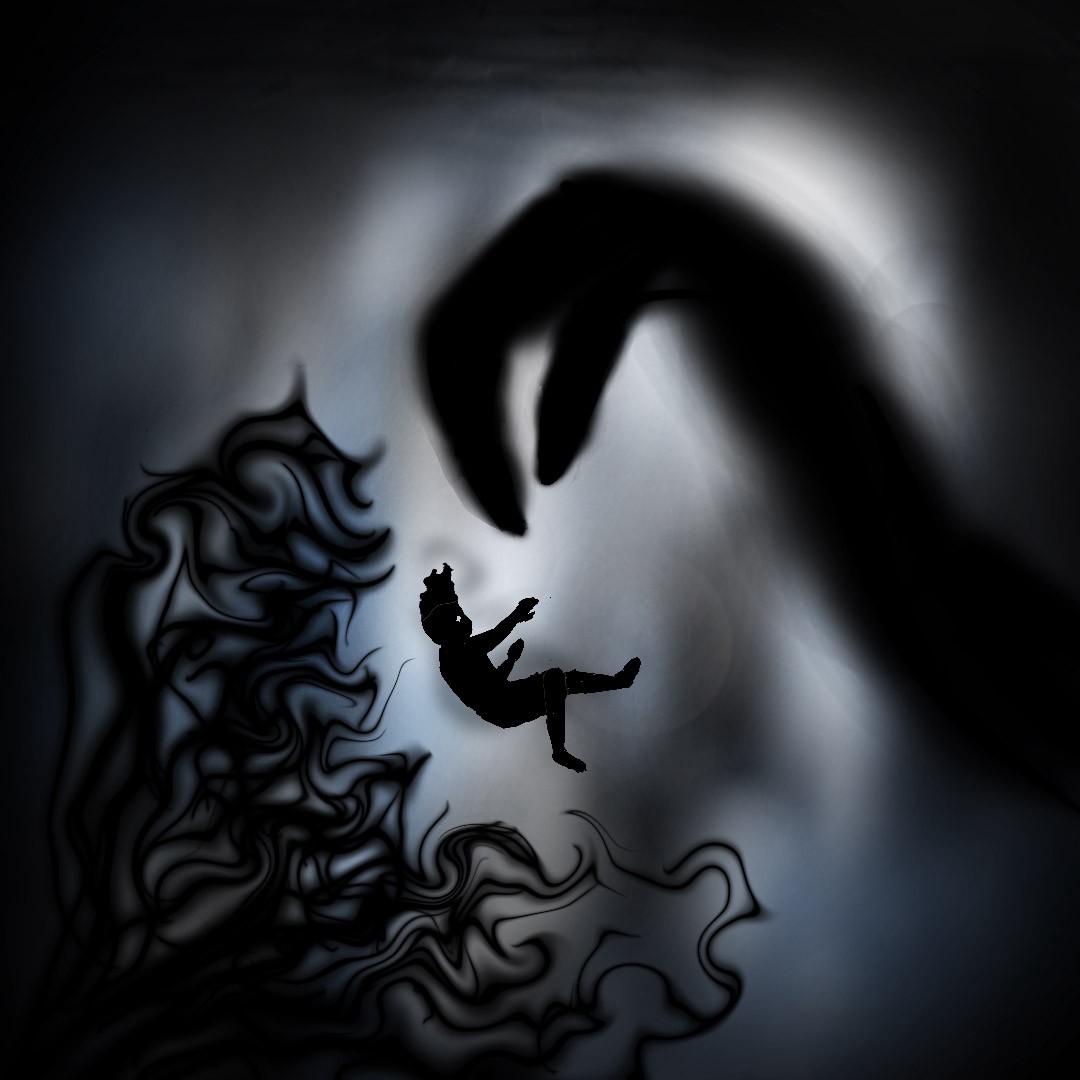

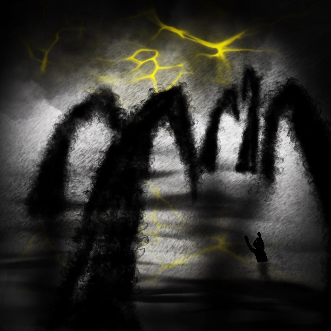
Student Name: Yiwei Bo
Project Title: Limbo
Project Title: Limbo
Project Description:
The word “inspiration” as in my opinion is not appropriate in this project. I am not inspired by the current situation of Covid-19 especially I am in a turning point with absolute uncertainty of my life. Nearly everything is doomed. All the plannings I have for 2020 or even 2021 are just gone. For the concept of this project — liminality, I mainly explored the term “limbo”. Definition of in limbo. 1 : in a forgotten or ignored place, state, or situation orphaned children left in limbo in foster homes and institutions. 2 : in an uncertain or undecided state or condition After graduating from college, he was in limbo for a while, trying to decide what to do next.
READ FULL BLOG POST

Student Name: Yike Chen
Project Title: Zoom
Project Title: Zoom
Project Description:
The word I chose for this project is zoom, and zoom has the meaning of zooming, rapid growth, and so on. So before I started filming, I set a theme for the video, about the current serious infectious disease coronavirus in China, because the current number of infected people is rising, and it also reflects the word zoom from a relatively metaphorical point of view.
READ FULL BLOG POST

Student Name: Angela Lian
Project Title: Breakslow
Project Title: Breakslow
Project Description:
Upon first reading Gertrude Stein’s “Tender Buttons”, I was caught off guard by the interesting cadence and association of words with certain subjects. Therefore, I wanted to first choose two subjects that I was familiar with visually before diving into the complexity of the poetry. I chose Eggs and Milk because these are two subjects I’ve worked with visually in the past and have enjoyed photographing.
READ FULL BLOG POST

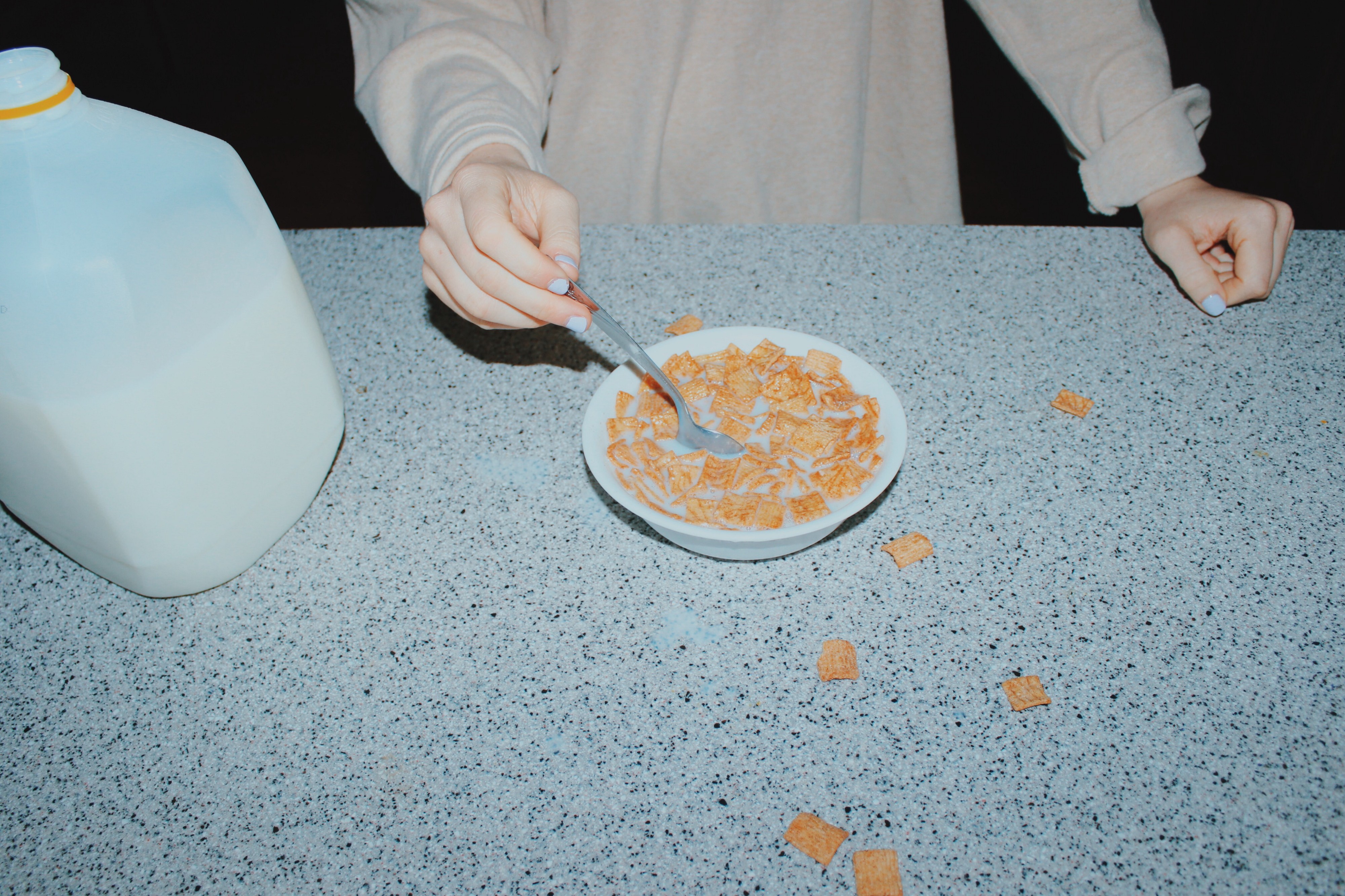
Student Name: Gregory Bond
Project Title: Layers: Tender Buttons
Project Title: Layers: Tender Buttons
Project Description:
Like most of my projects, I started Tender Buttons with a classic brainstorming session. First, I read through Gertrude Stein’s poem, and picked the passages that spoke to me most. I thought a lot about what I wanted to convey—emphasizing the fun, nonsensical language in Stein’s poetry. I also wrote down my initial goals for the project: getting better at Procreate on the iPad, and working on my animation skills. With these goals in mind, I storyboarded what I thought my Tender Buttons project would be, attempting to animate the subjects of Stein’s poem transforming into each other, or animating the key words from Stein’s poem in an expressive way.
READ FULL BLOG POST
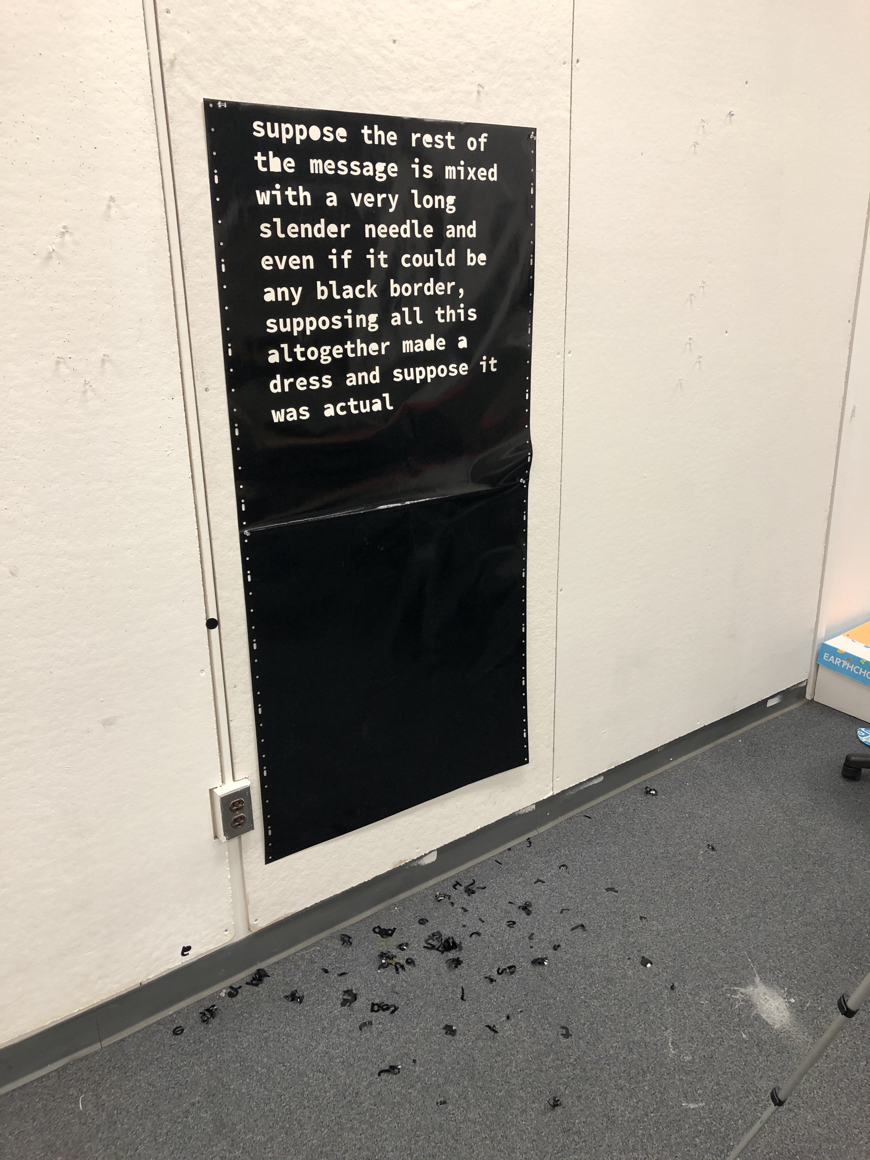
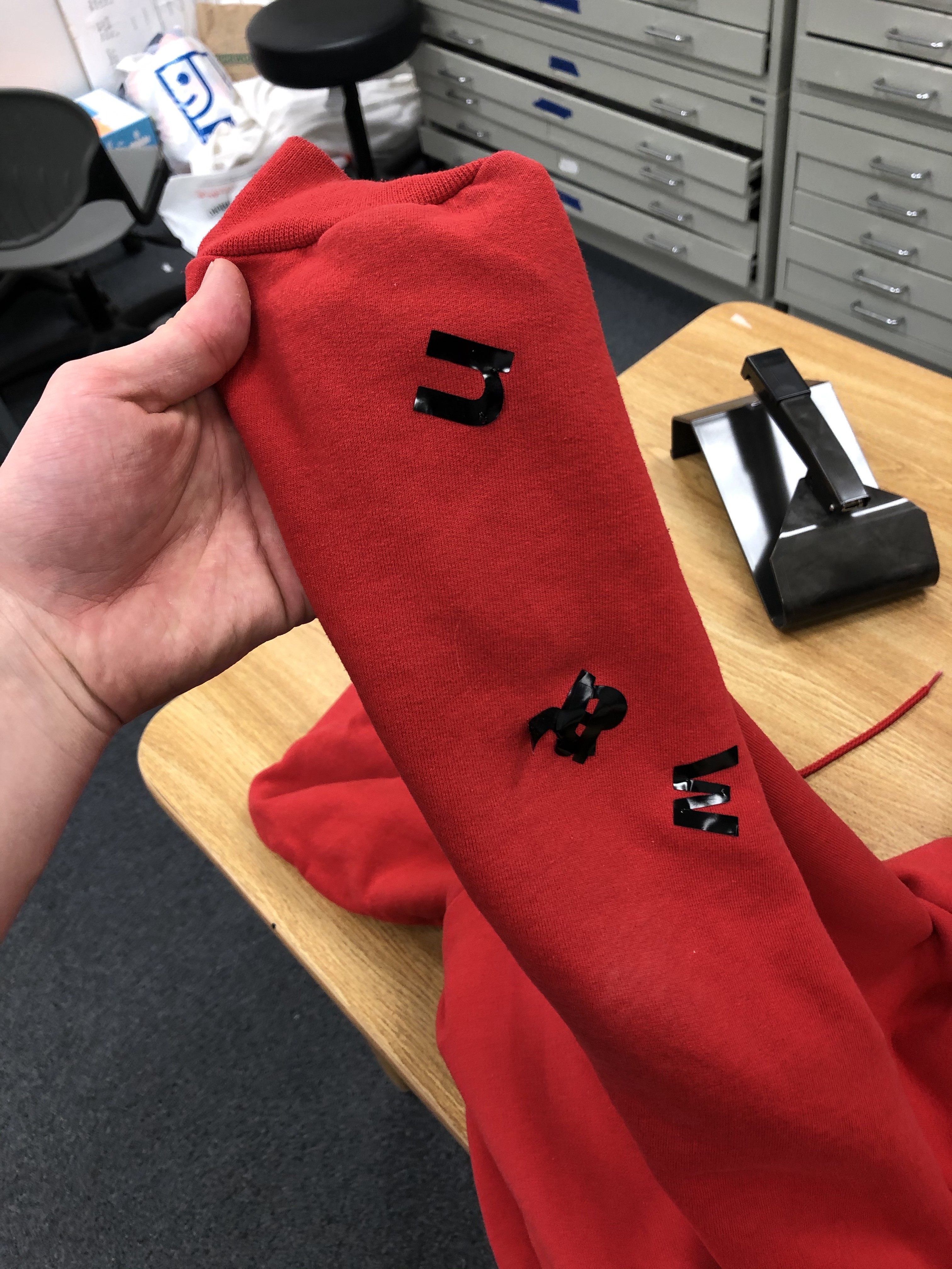
Student Name: Yilin Zhang
Project Title: Neolithic Age
Project Title: Neolithic Age
Project Description:
I remember when I was a child, there was an occasional power cut at home. Parents light candles, and whole families gather around to tell stories, play hand shadow by candlelight, or share their lives. The time away from social life is not so hard.
I want to tell a story about a neolithic family who had far less information about their day than modern people. In this video, I would imagine what the man as the father might do in a day, what the mother’s day would be like, and how the neolithic children would learn and play every day.
READ FULL BLOG POST
Student Name: Natalie Bolton
Project Title: Poetry in LA
Project Title: Poetry in LA
Project Description:
Originally I was planning on following my friend around the North End of Boston for the day, and adding the text as a moving element behind her and following her through the senic parts Boston, resulting in her meeting up with a friend as a resolution. I still love this idea, but I need to get a team of people and a larger budget involved before I make any short films.
I ended up using the vinyl cutter to create black stickers in different shapes. The stickers spelled out the poem “a box” by Gertrude Stein. The process was pretty tedious, but satisfying at the same time.
READ FULL BLOG POST
Student Name: Angela W, Angie Wijaya, Jiayi Ma, Sarah Perkins
Project Title: Brand Matrix
Project Title: Brand Matrix
Project Description:
We were stuck together again. Angela and I (Angie). UGH. Just Kidding. We love working together. But now we were smushed with another duo, Sarah and Jiayi. Together with the power of four, we decided to tackle the essay, Brand Matrix by Armin Vit and Bryony Gomez-Palacio.
And so we embarked on a journey to explain this essay to our peers and what we wanted to do for our upcoming exhibition. Our main source of inspiration was Christopher Doyle’s Identity Guidelines. We were drawn to the absurdity of treating a person like a logo and creating a strict set of guidelines and wanted to apply this to ourselves in our own distinct way.
READ FULL BLOG POST
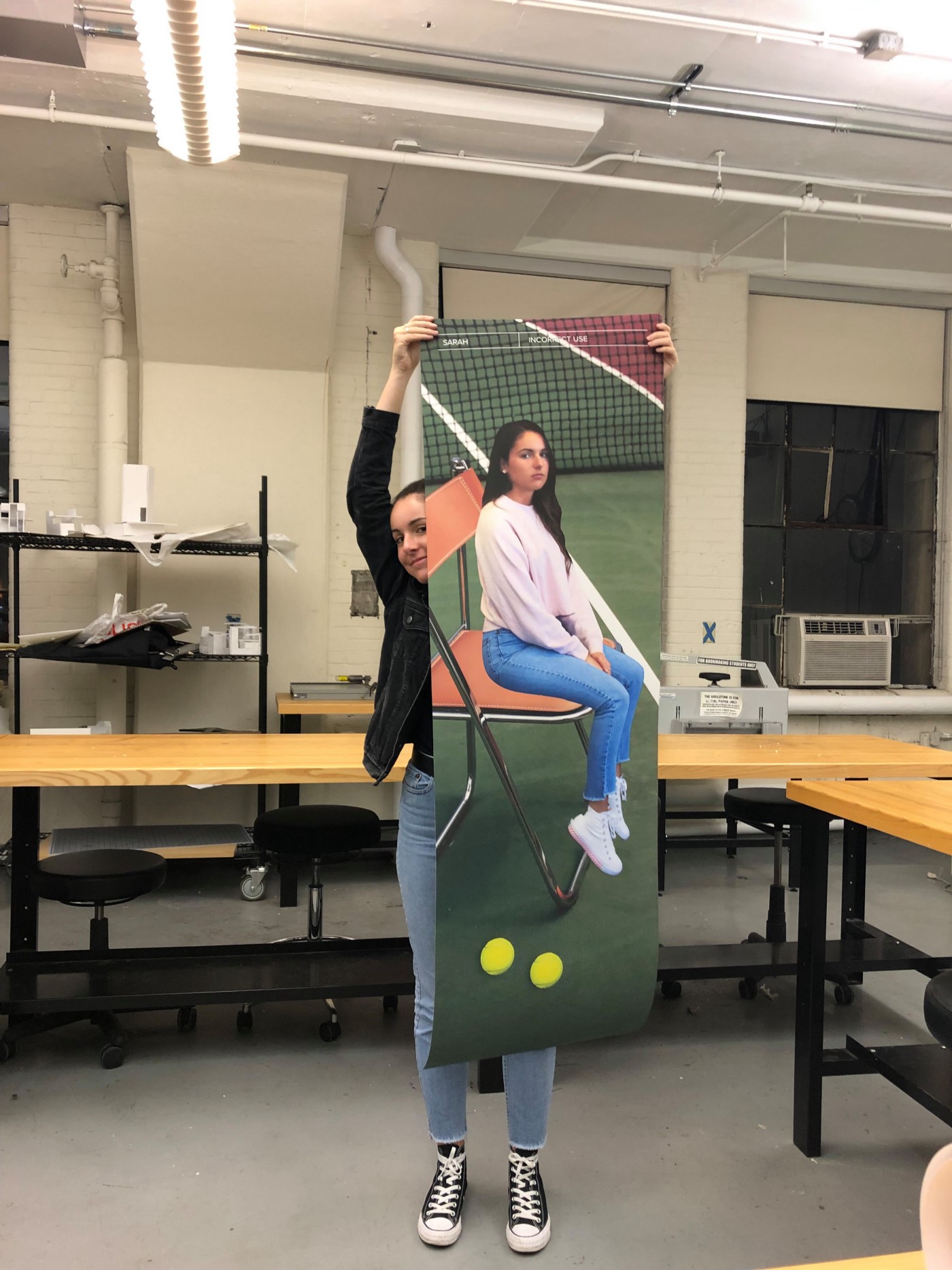
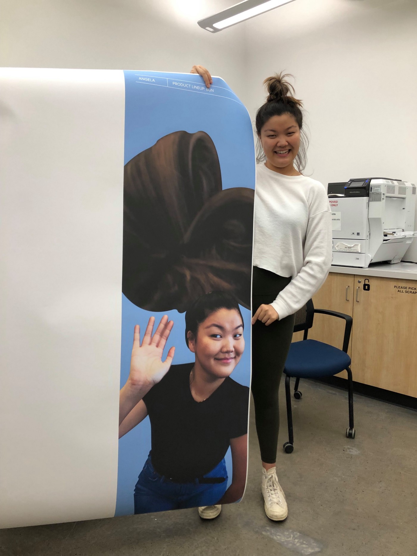
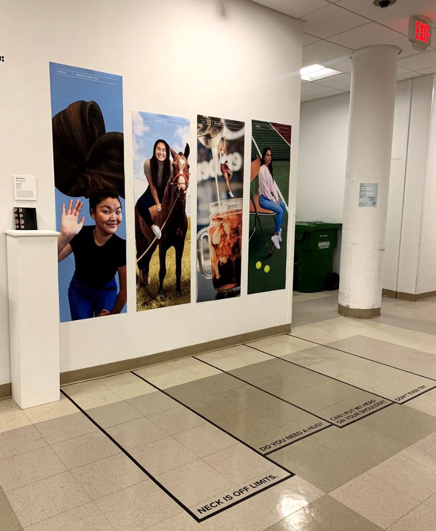
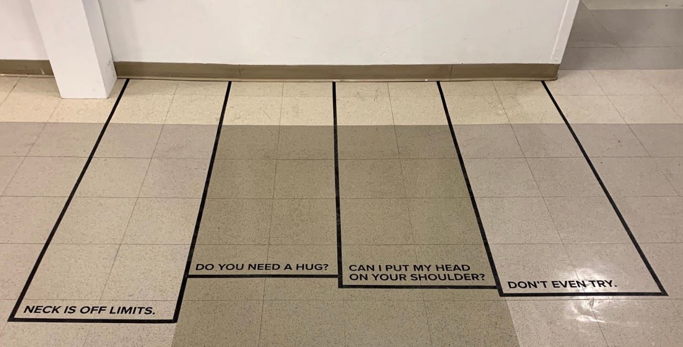
Student Name: Alicja Wisniowska, Skye Tse, Andrew Kim, Raven
Project Title: Brand New Worlds
Project Title: Brand New Worlds
Project Description:
In this assignment, the book Graphic Design: Now in Production was used as a reference for which to base the design of an exhibition. Our group, consisting of Andrew, Raven, Skye, and I, got together to first decide on an article, and then to toss around ideas of how we were going to go about execute a number of deliverables in response to our reading. These deliverables include a printed A0 poster, wall plaque, video, and book.
Brand New Worlds by Andrew Blauvelt is a meaty article that talks about a lot of different concepts. It gave us the history of logos and corporate identity, offered a series of logo redesigns, and discussed heraldry among other topics. What excited us were logos. There are thousands of them out there, and yet they are constantly being redesigned or updated to fit in with different societal views or to align with changed company missions. We first looked at logo redesigns and tried to find a way to pull an interested concept out of changed designs over time. In the end we found that direction would have lead to a project that was more research based than we would have liked. We tried something else, and compiled a collection of local and global logos to match with the letters of the alphabet.
READ FULL BLOG POST
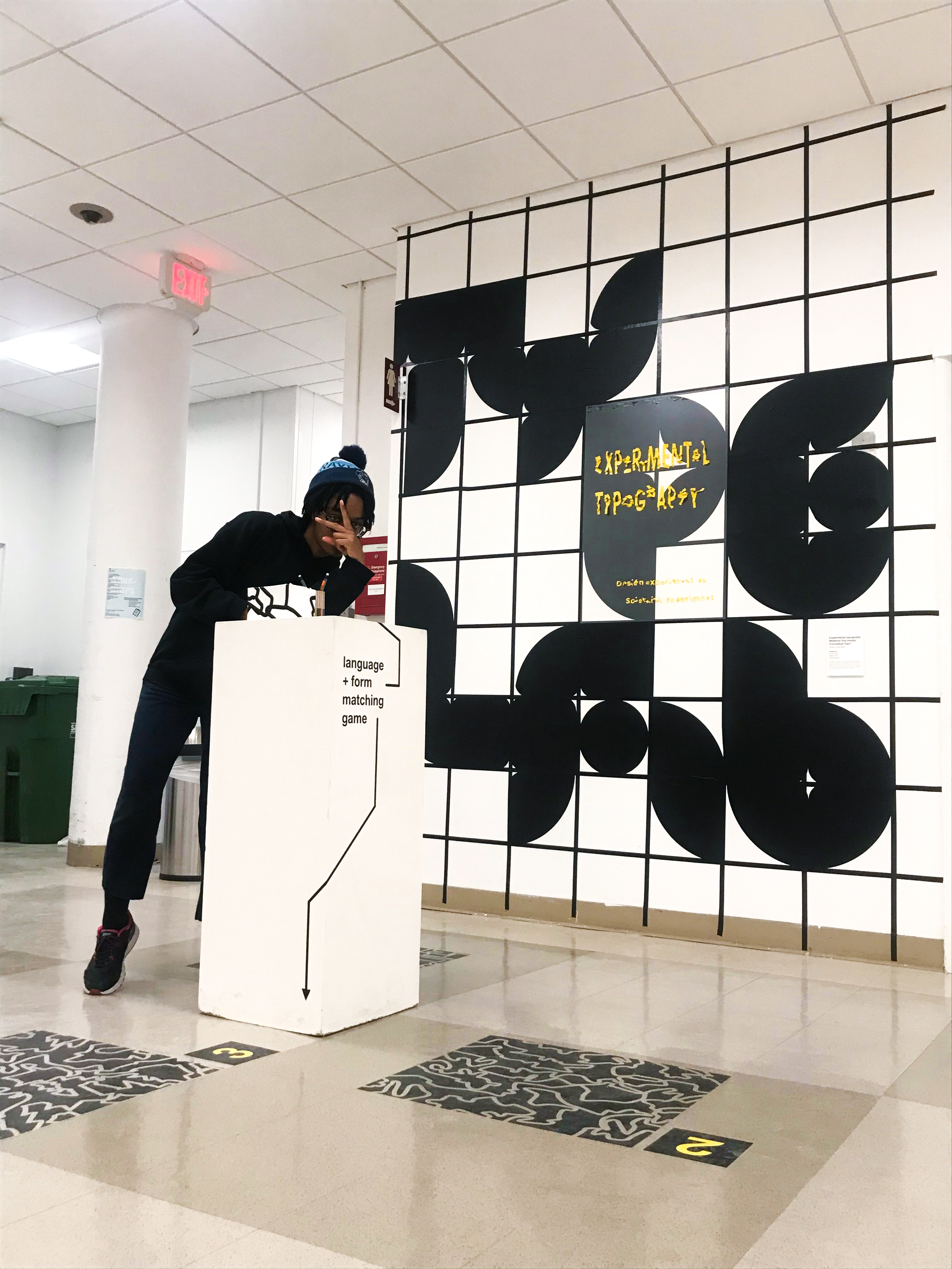
Student Name: Ciaran Brandin, Hannah Kim, Kaylah Haye
Project Title: Experimental Typography, Whatever that Means: Conceptual Type
Project Title: Experimental Typography, Whatever that Means: Conceptual Type
Project Description:
Hannah, Ciaran and I (Kaylah) were put in a group to come up with an exhibition in response to a design article of our choosing from the catalog Graphic Design: Now in Process. We chose the article “Experimental Typography, Whatever that Means” by Peter Bil’ak. The article argued for and against experiments in design and posed the question “are experiments in design even possible?” Bil’ak also touched on the difference between the scientific experiment and the artistic experiment; the artistic experiment is not seen as anything to be taken seriously, while the scientific experiment is something that is taken very seriously. There were many sides to this article to respond to, so we decided to create a sort of typography “lab” with experiments and have the viewer respond for themselves. The catch was, we only had three weeks to design, install, and de-install everything. Instead of trying to design every element of the exhibition together, we divided the tasks to fit our strengths and came together for and quick and efficient installation.
READ FULL BLOG POST
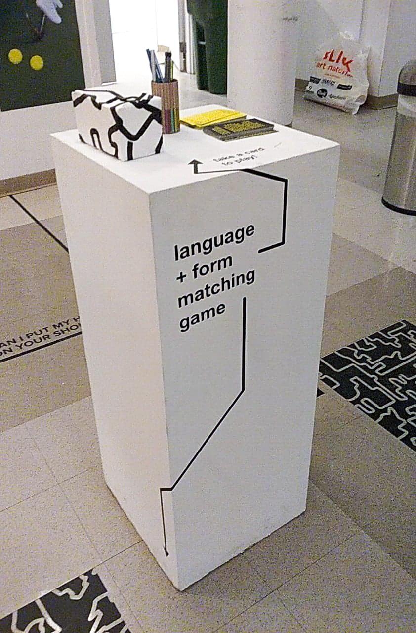
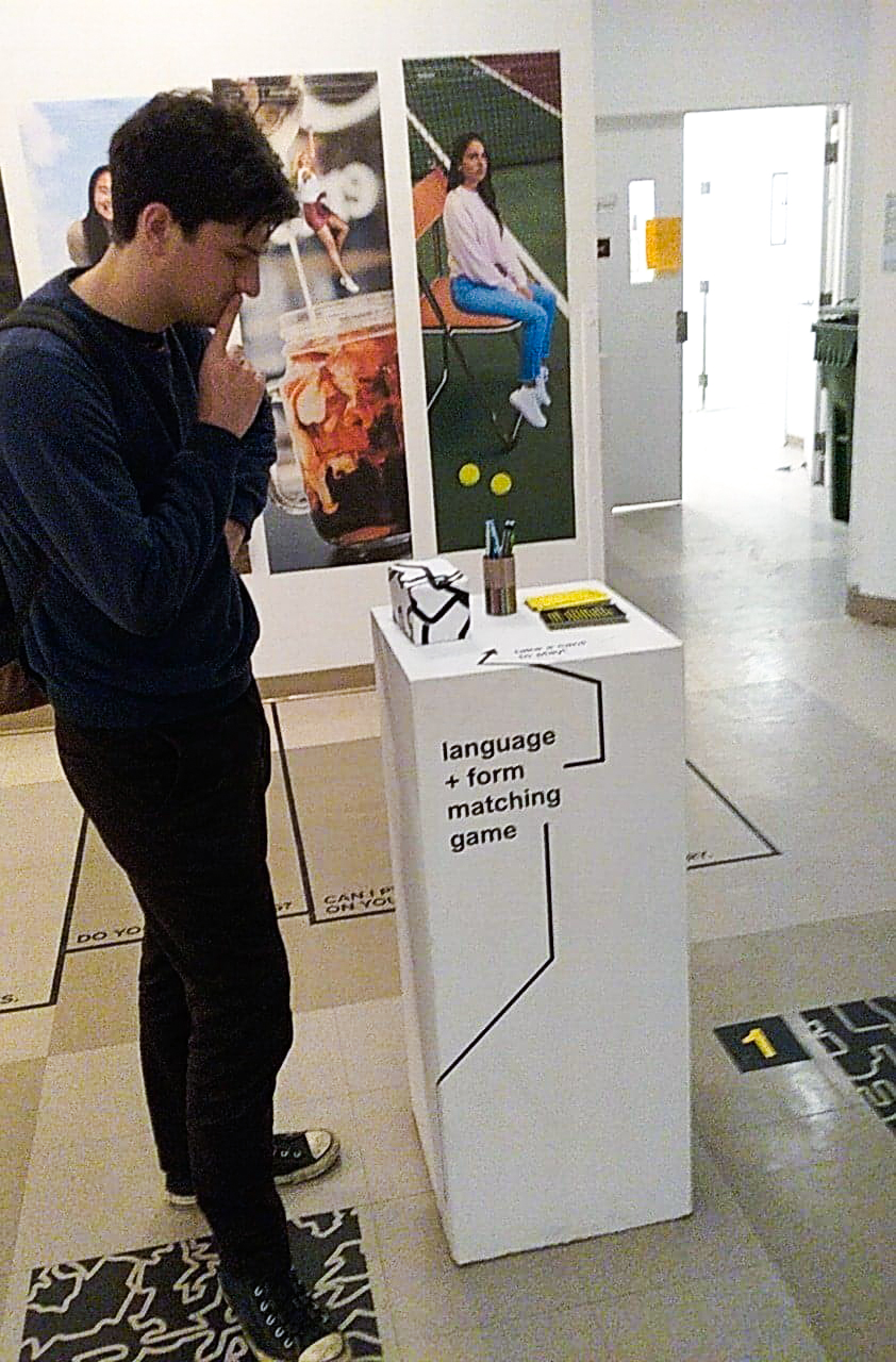
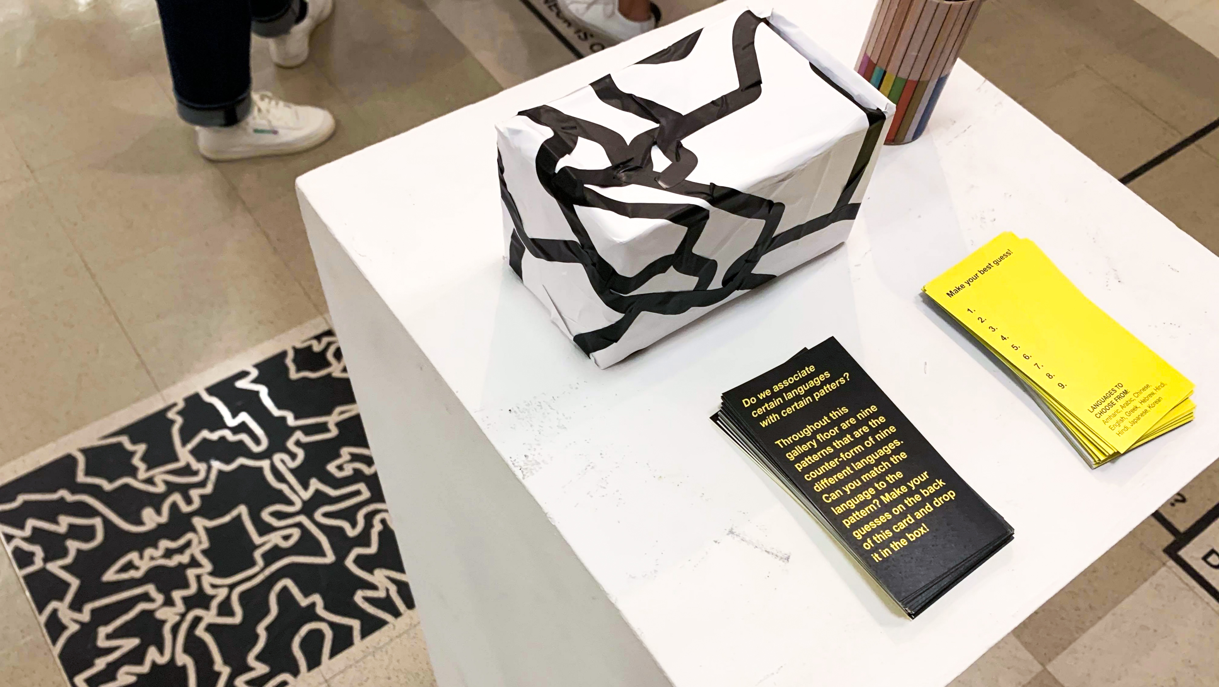
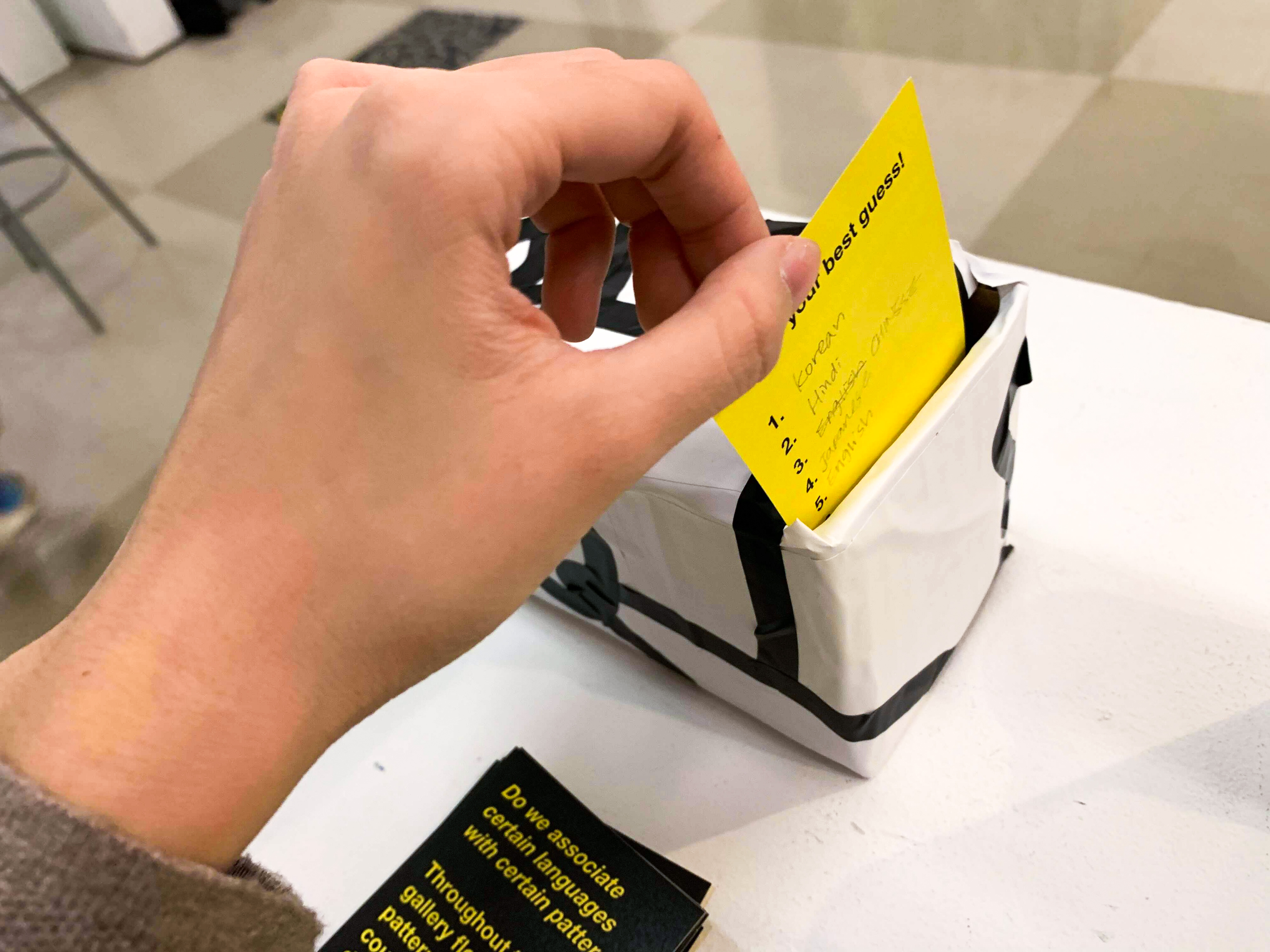
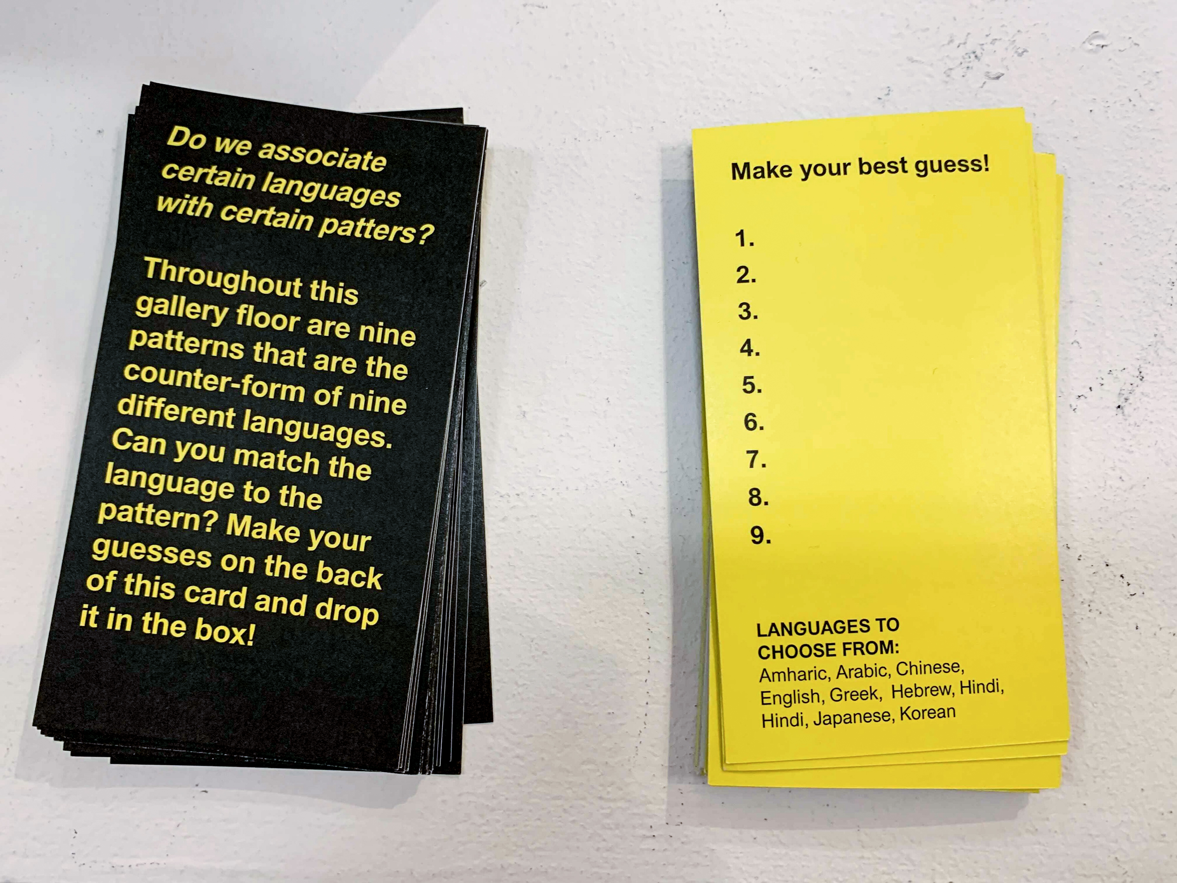
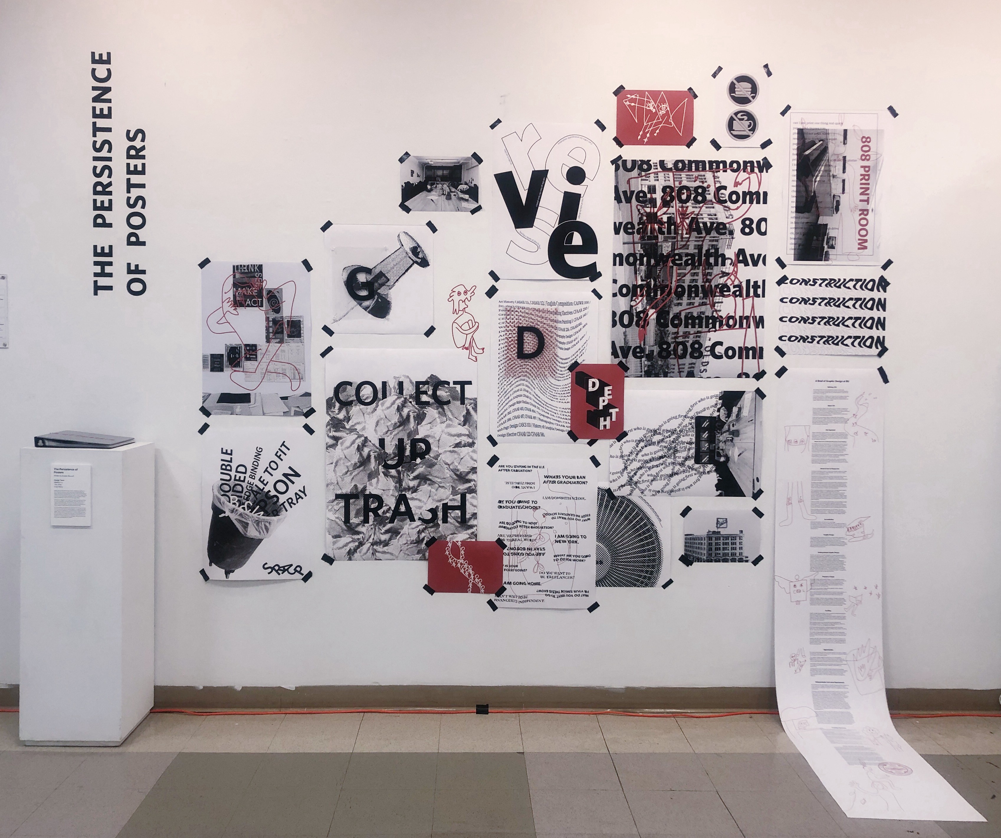
Student Name: Wenjing Liu, Nicole, Congcong Wang
Project Title: The Persistence of Posters
Project Title: The Persistence of Posters
Project Description:
In his article “The Persistence of Posters,” Andrew Blauvelt touched on the past and present of posters, and the irreplaceable cultural significance of them. Posters in the ancient time were used mainly by government as a tool of public announcement, later discovered by merchants for the use of advertising. Posters were used so much back in the days that they were once tightly constrained by legal decree. That time has passed but the culture of posting remains.
With the development of the modern printing technology and the revival of traditional printing technique, poster persists and thrives unto its own entity that holds aesthetic and symbolic value, instead of its traditional useful value of advertising.
READ FULL BLOG POST
In his article “The Persistence of Posters,” Andrew Blauvelt touched on the past and present of posters, and the irreplaceable cultural significance of them. Posters in the ancient time were used mainly by government as a tool of public announcement, later discovered by merchants for the use of advertising. Posters were used so much back in the days that they were once tightly constrained by legal decree. That time has passed but the culture of posting remains.
“The poster offers a convenient format the proverbial blank slate. It is graphic design’s equivalent to painting-a blank canvas.”— Andrew Blauvelt
With the development of the modern printing technology and the revival of traditional printing technique, poster persists and thrives unto its own entity that holds aesthetic and symbolic value, instead of its traditional useful value of advertising.
READ FULL BLOG POST
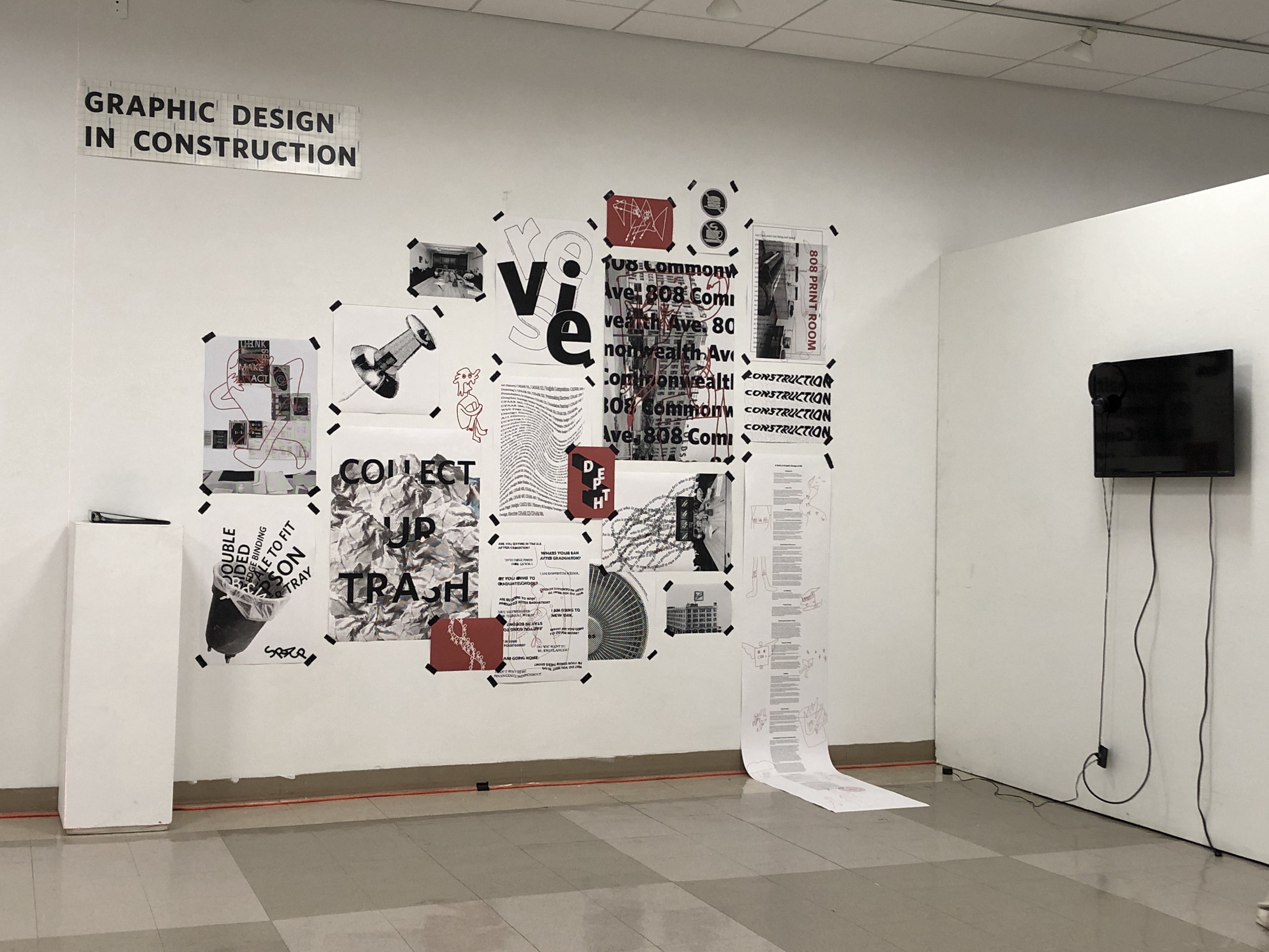
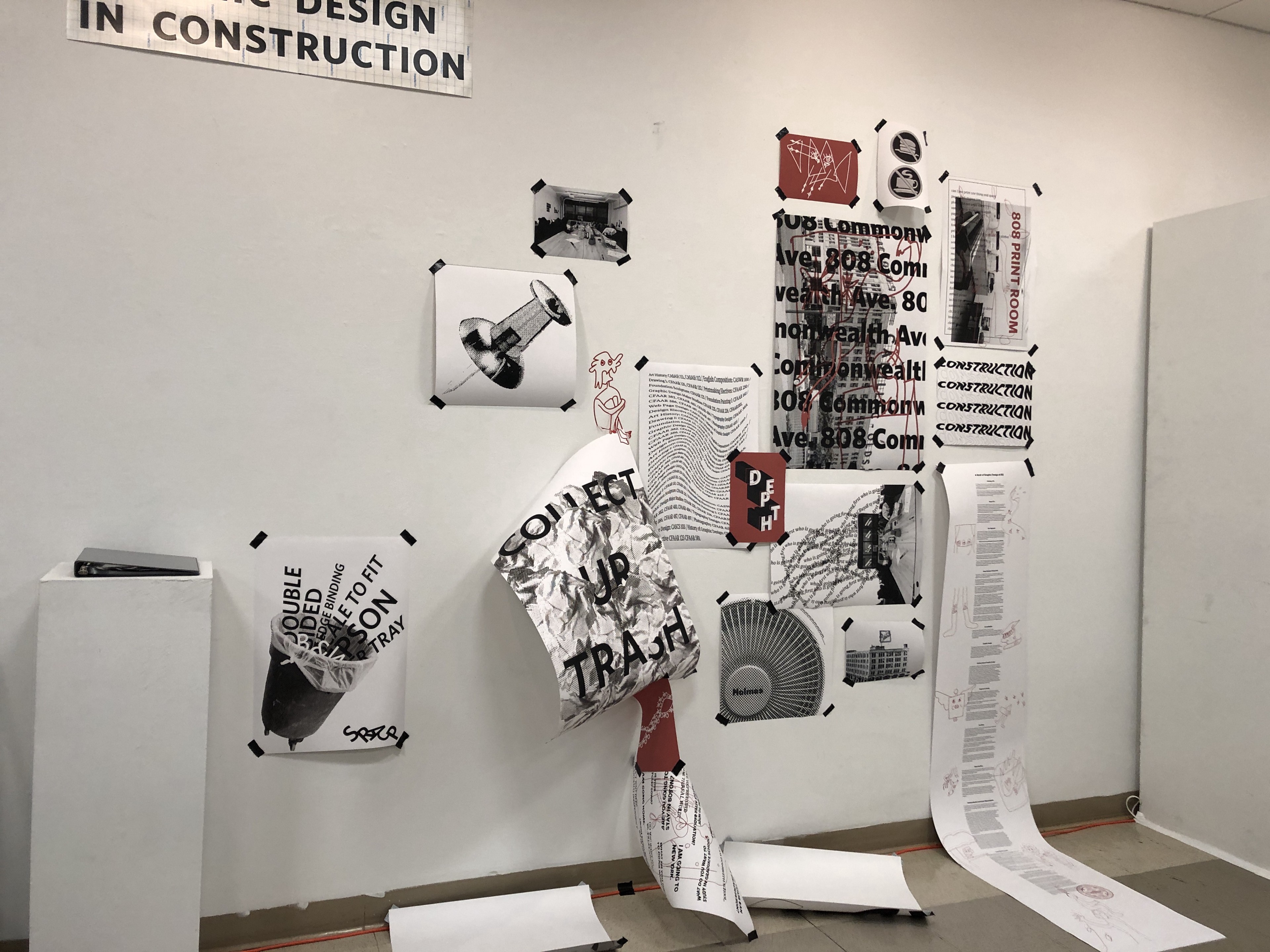
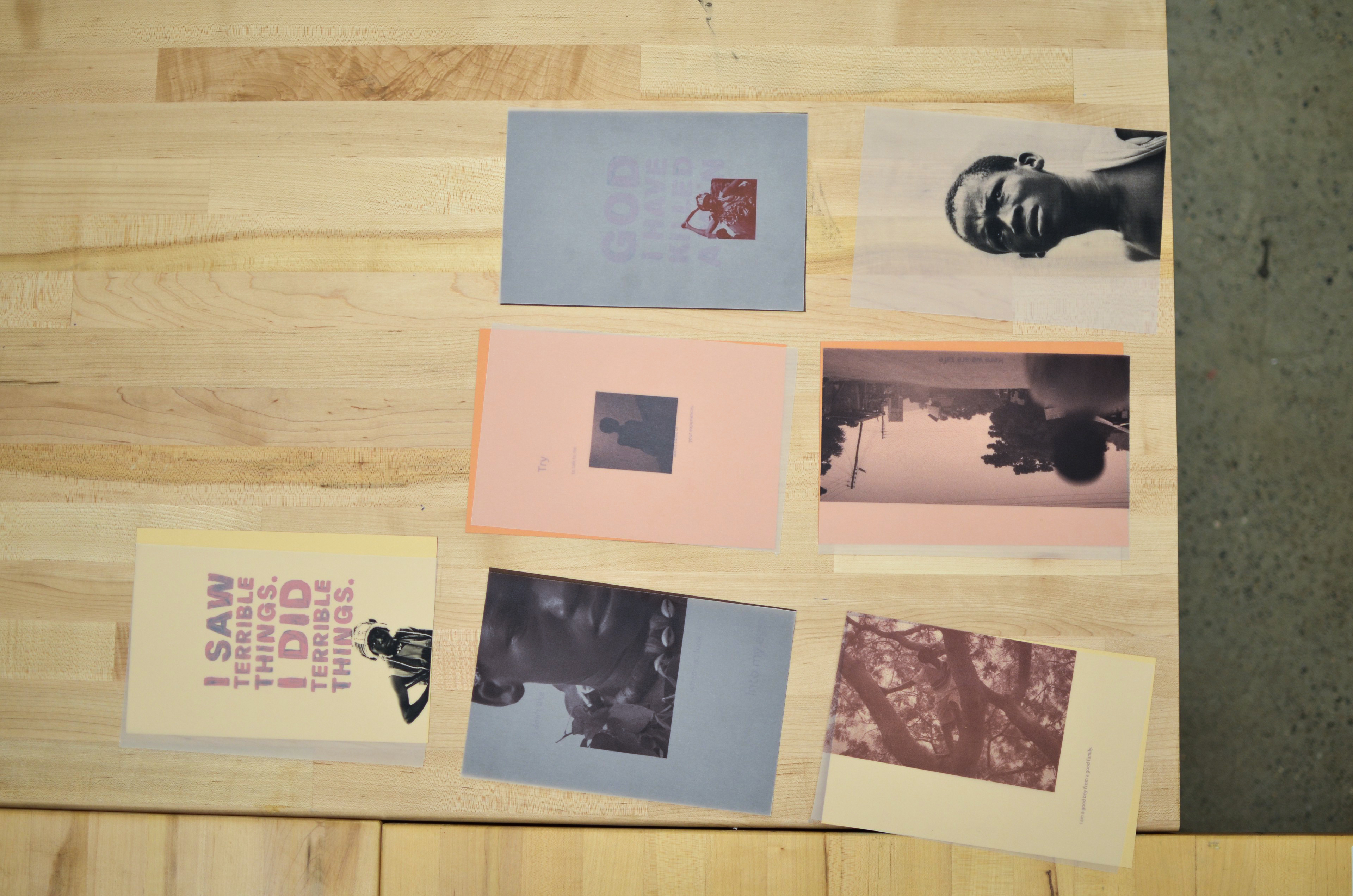
Student Name: Olivia Williams, Kabita Das
Project Title: Beasts of No Nation
Project Title: Beasts of No Nation
Project Description:
We chose a film which neither of us had seen before, hoping that fresh eyes and lack of biases would help us interpret the film in a unique way. A war drama, Beasts of No Nation (2015) presents a perspective and experience far removed from our own. Set in an unspecified African country, the story follows Agu: a child whose life is ruined by civil war. The beginning scenes show the normalcy of Agu’s daily life in his village: bargaining with a local soldier, teasing his macho older brother, climbing trees, singing and dancing in church services, enjoying a meal with his family. Suddenly, the war devastates Agu’s life: his mother and younger sister are forced to flee the village and he witnesses the murder of his father, brother, and grandfather. Over the course of the film, Agu’s experience as a child soldier and his loss of innocence dominate the rest of the narrative.
READ FULL BLOG POST
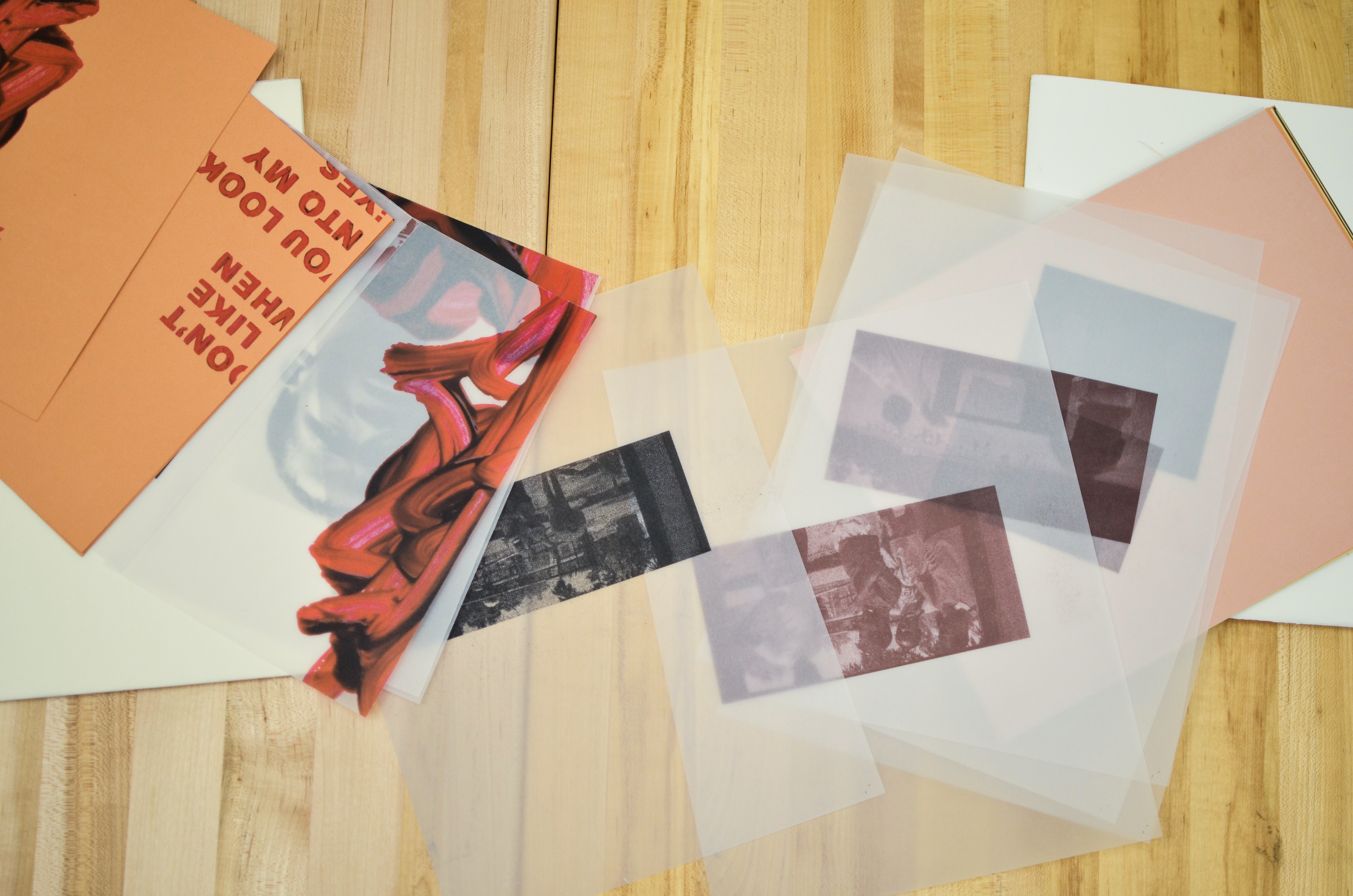
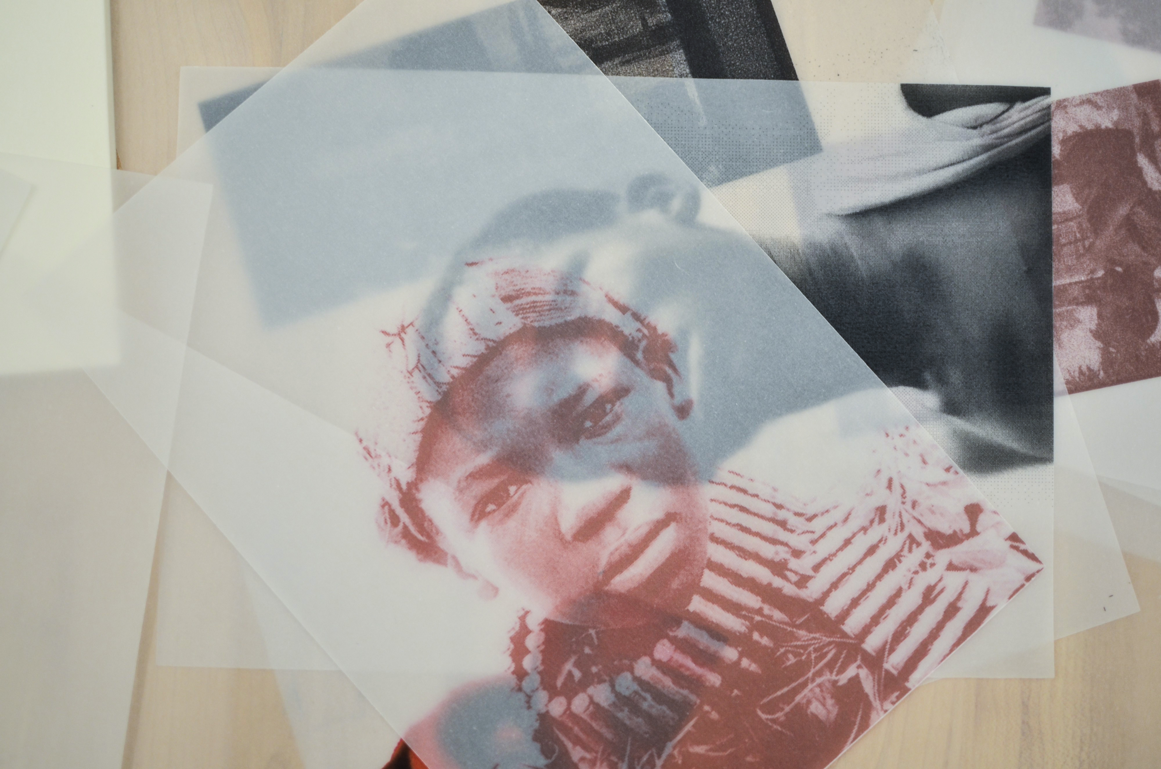
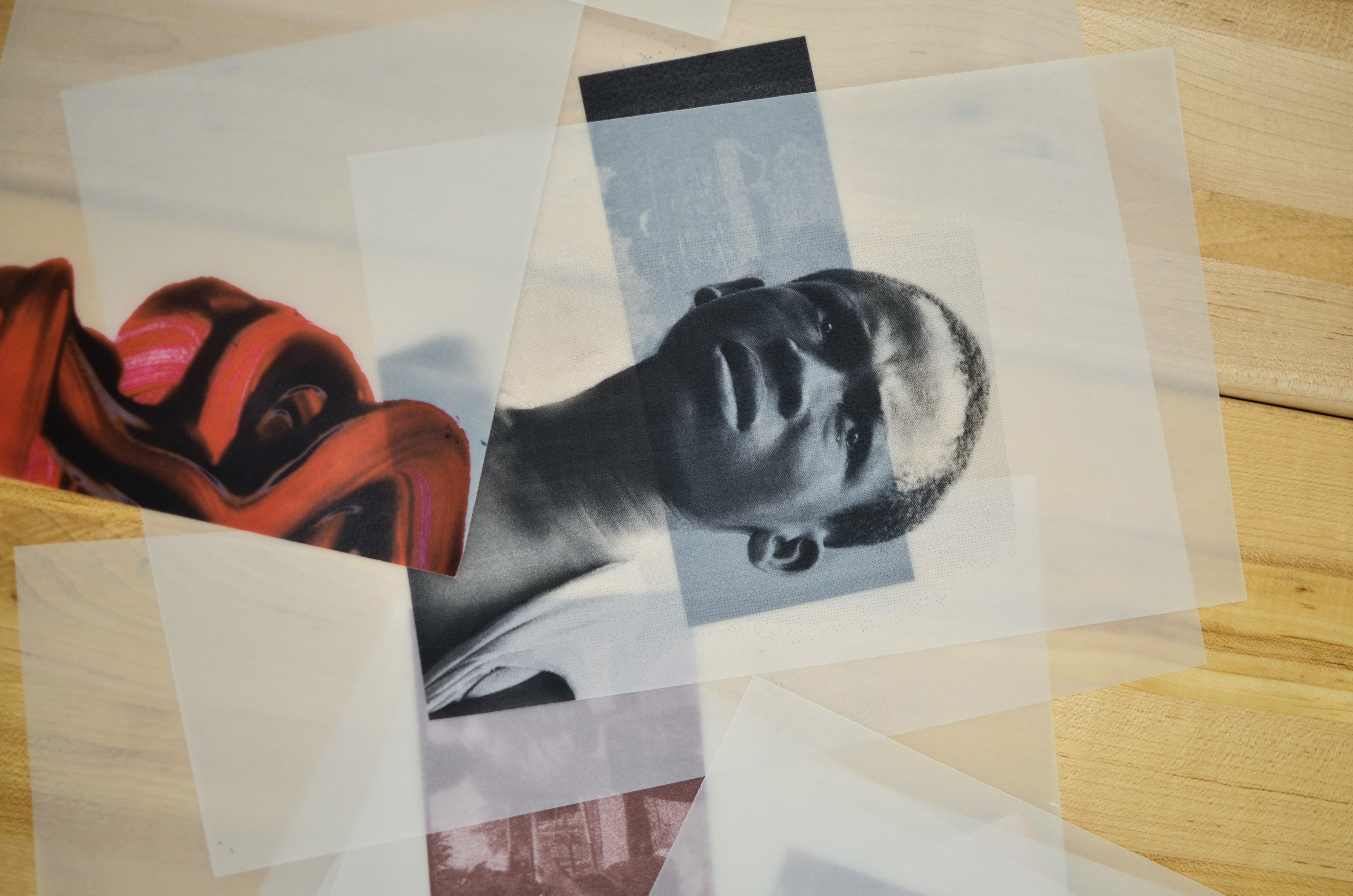

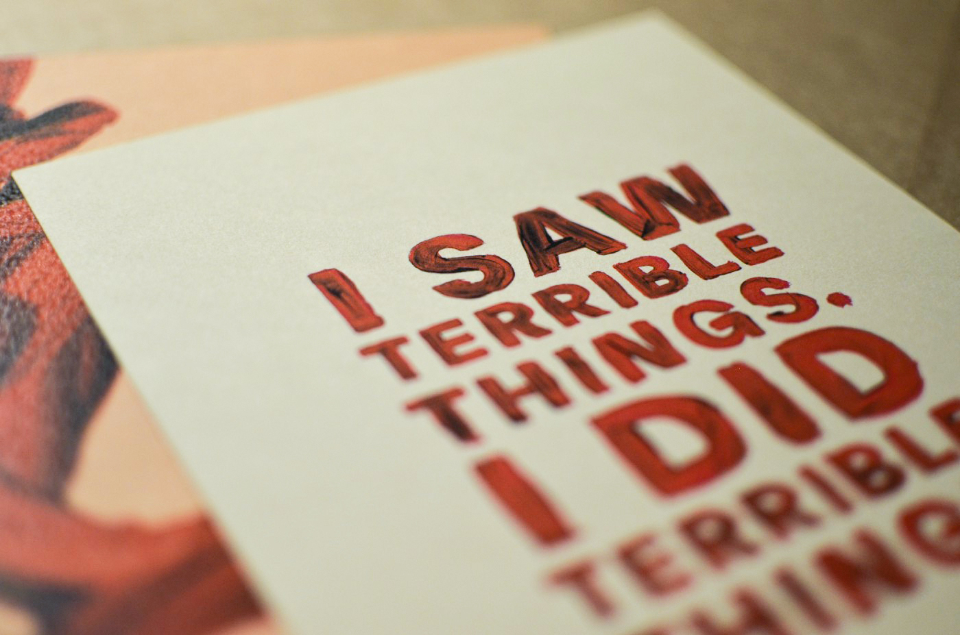
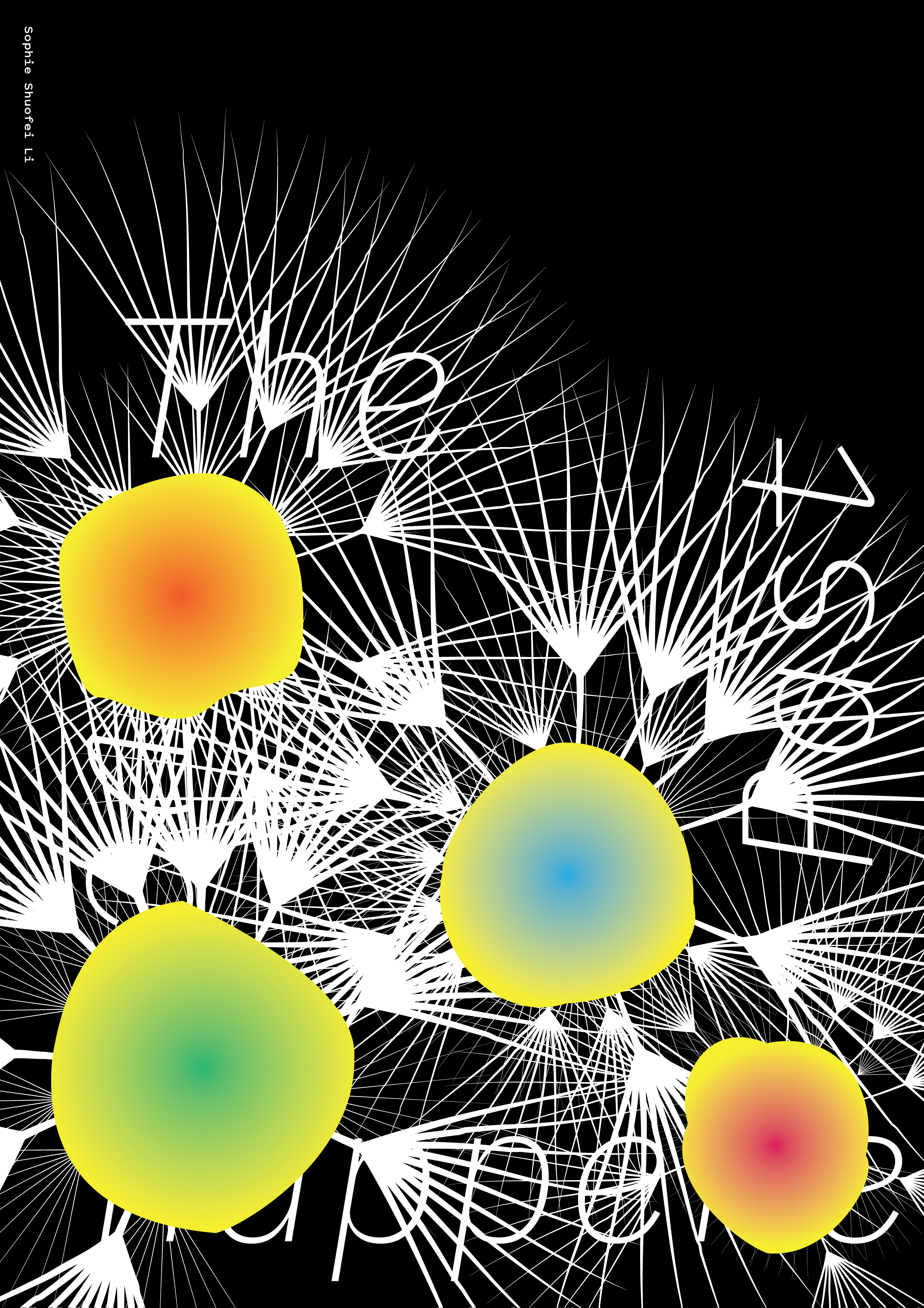
Student Name: Sophie Li
Project Title: Time Will Heal
Project Title: Time Will Heal
Project Description:
‘Einstein’s Dreams’ has many chapters, each of which is sorted by time. The story of a miner attracted me. When he was a child, he urinated his pants in class, so this memory has always been in his mind, making him feel inferior. Slowly, as he grew up, with his mine, and with countless trousers, these memories gradually became blurred. The busy life made him forget the pain he had. Not only himself but the people around him never remembered what he did. Even if they remember, they don’t care. People are busy with their affairs, and miners also realized the remembrance is not only these troubles but also a lot of happy things. So don’t be afraid, time will make you heal.
READ FULL BLOG POST
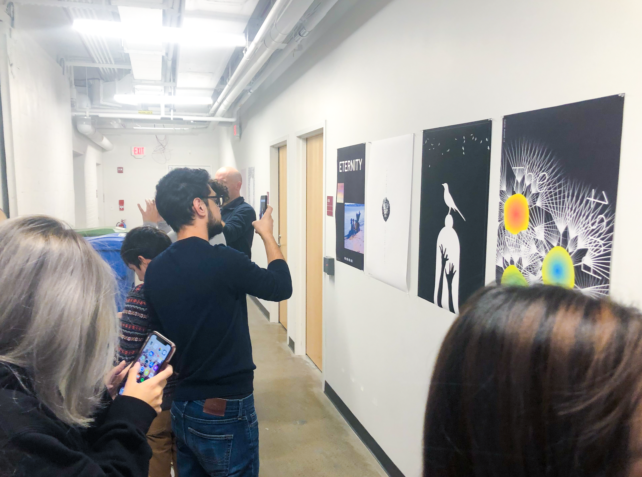
Student Name: Anissa Martínez, Kelly Nolan, Krystyn Wypasek
Project Title: The Sounds and Sights of Sunday
Project Title: The Sounds and Sights of Sunday
Project Description:
Immerse yourself with our interactive installation by relaxing and exploring what a Sunday feels like. This project required a lot of physical effort but also patience, since experimenting with an Arduino board was pretty new to us, it also involved testing and seeing which conductive material worked best but also how to show it in the clearest way possible so the audience could get the opportunity of fully embracing the experience.
The goal of this installation was for the audience to play some sounds using the conductive paint, as a projection of macro photos was being looped. We wanted to give these photos a peaceful and relaxed aspect to go with the feeling of a sunday but also a contrast and mystery and beauty of what the sound looked like.
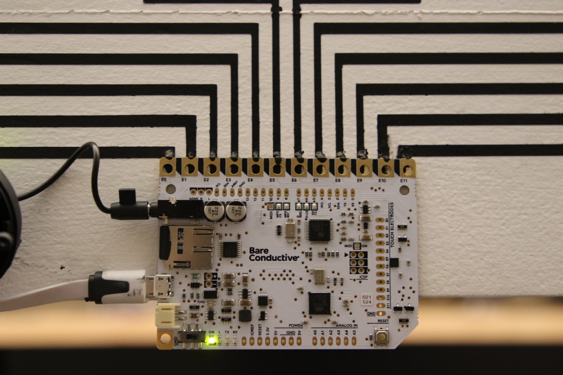
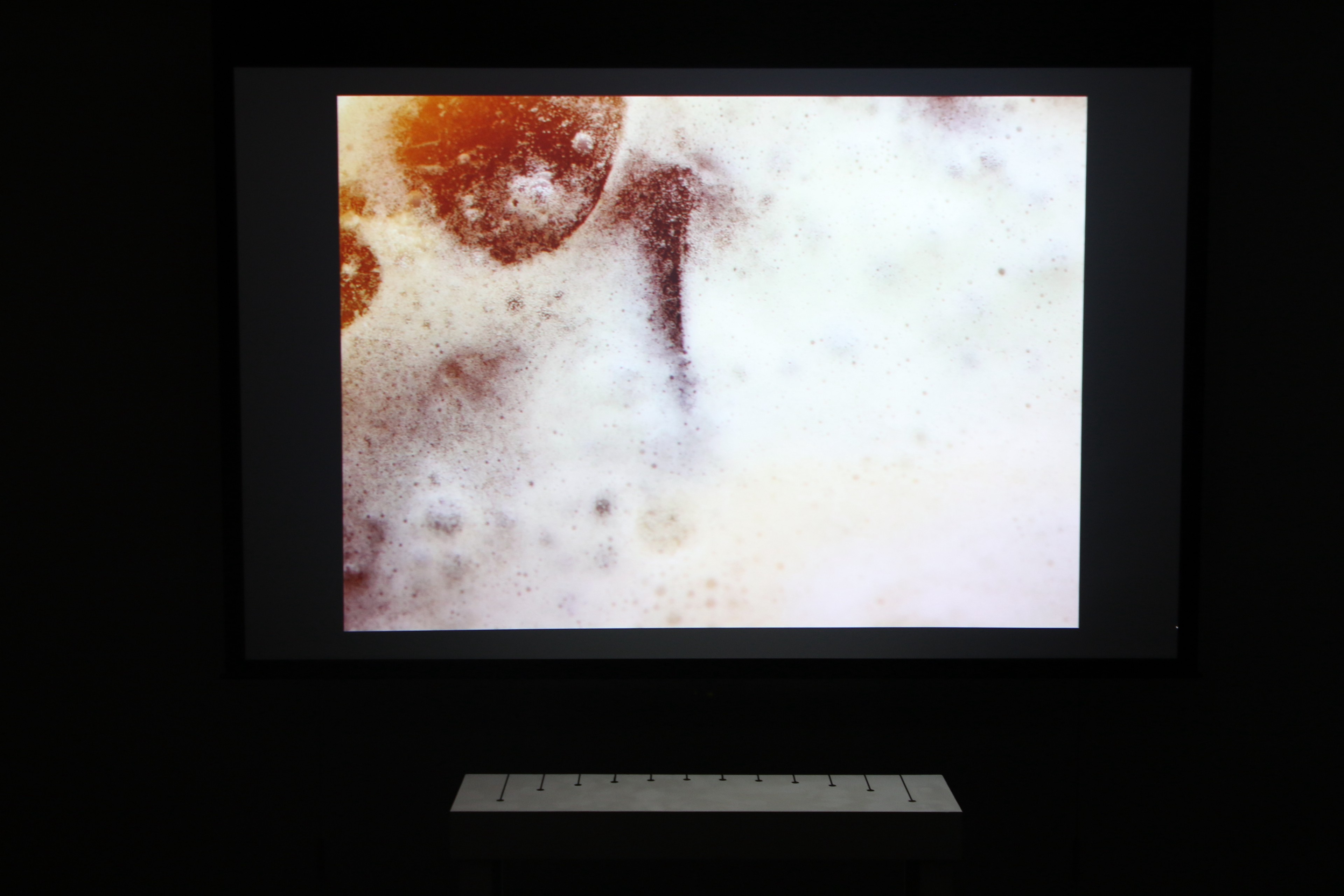
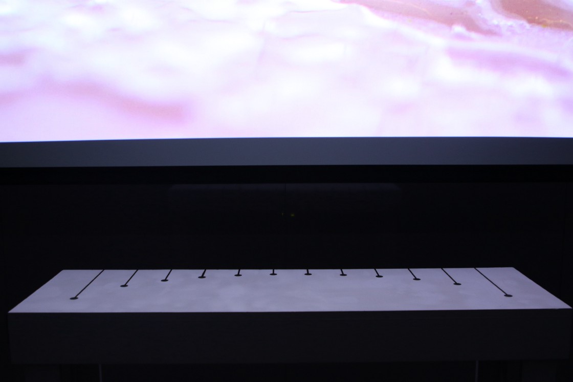
Student Name: Farinaz Valamanesh, Winnie Chen
Project Title: Water Waste
Project Title: Water Waste
Project Description:
We made this project in order to raise awareness about the amount of water that each person wastes in daily life. We used Arduino to add sound to our water installation and recorded the sound of 8 top categories of water waste: toilet, faucet, shower, clothes washer, dishwasher, and bath, to add to the board.
We made this project in order to raise awareness about the amount of water that each person wastes in daily life. We used Arduino to add sound to our water installation and recorded the sound of 8 top categories of water waste: toilet, faucet, shower, clothes washer, dishwasher, and bath, to add to the board.
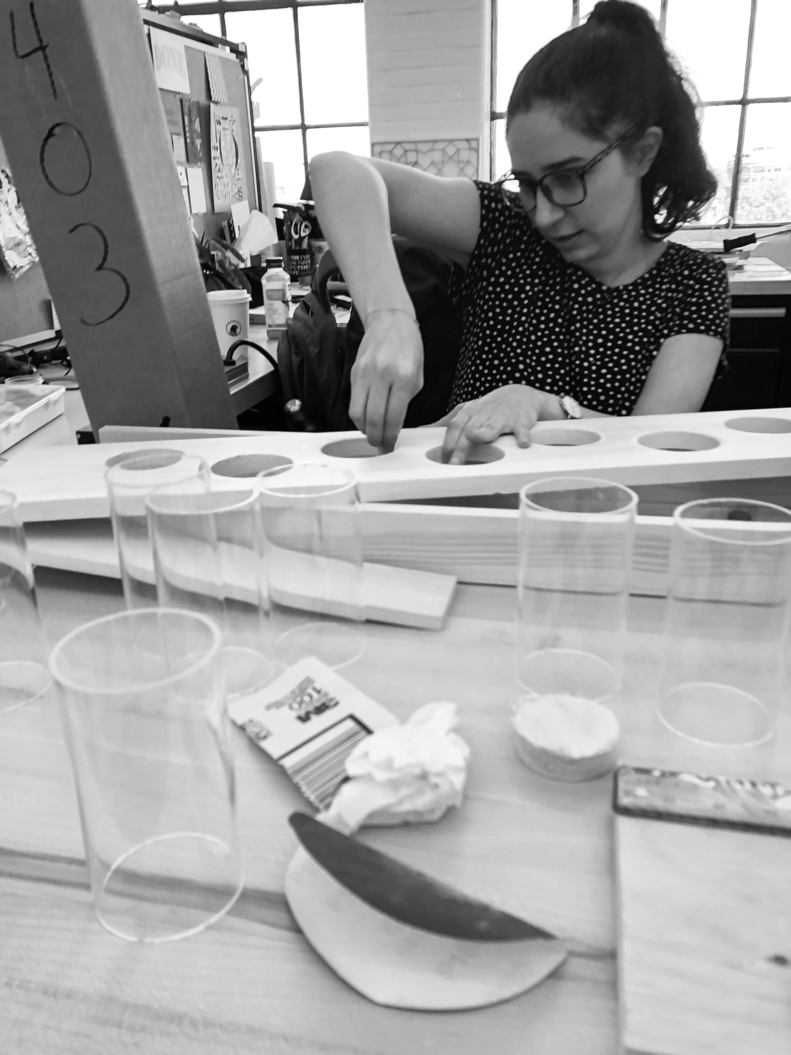
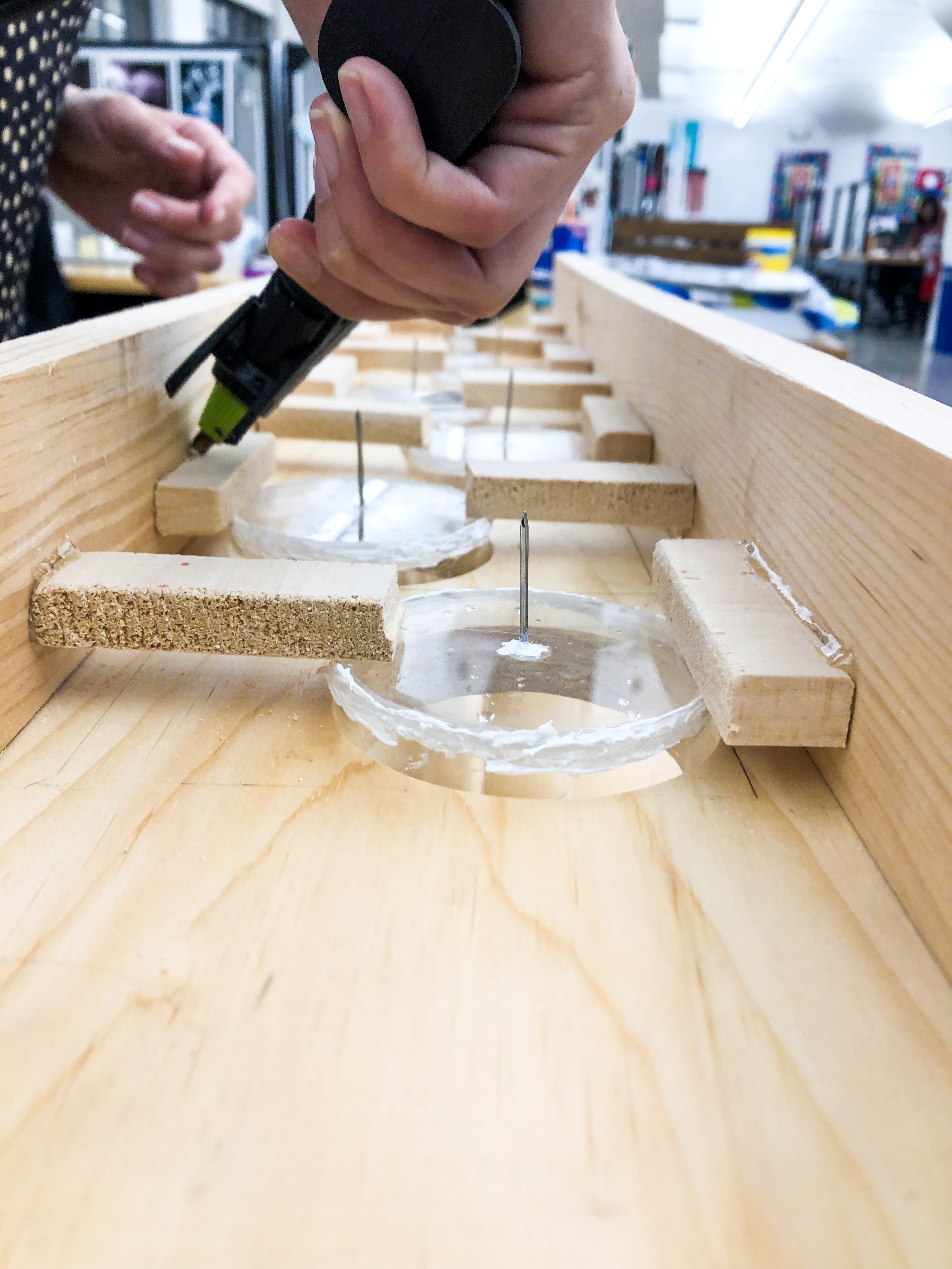

Student Name: Sophie Li, Anissa Martínez
Project Title: 10-eye
Project Title: 10-eye
Project Description:
We knew we wanted to do something involving projection and Arduino technology, but first we had to think about what we liked, what we were interested in, and so we started by making a list of things in common and found out that we loved projection, biology, light and magic. We then decided to narrow it down and relate it to science, recreating bacteria by using everyday objects. Personally we think that our skills and vision are perfectly complemented and while Sophie thinks one step ahead, I help her by refining that one step behind.
We knew we wanted to do something involving projection and Arduino technology, but first we had to think about what we liked, what we were interested in, and so we started by making a list of things in common and found out that we loved projection, biology, light and magic. We then decided to narrow it down and relate it to science, recreating bacteria by using everyday objects. Personally we think that our skills and vision are perfectly complemented and while Sophie thinks one step ahead, I help her by refining that one step behind.
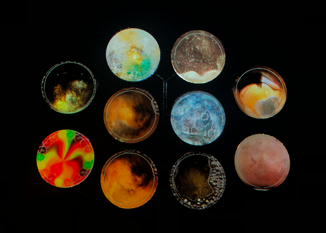
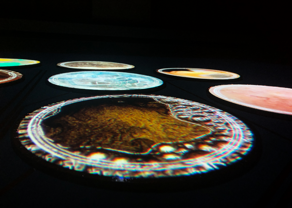
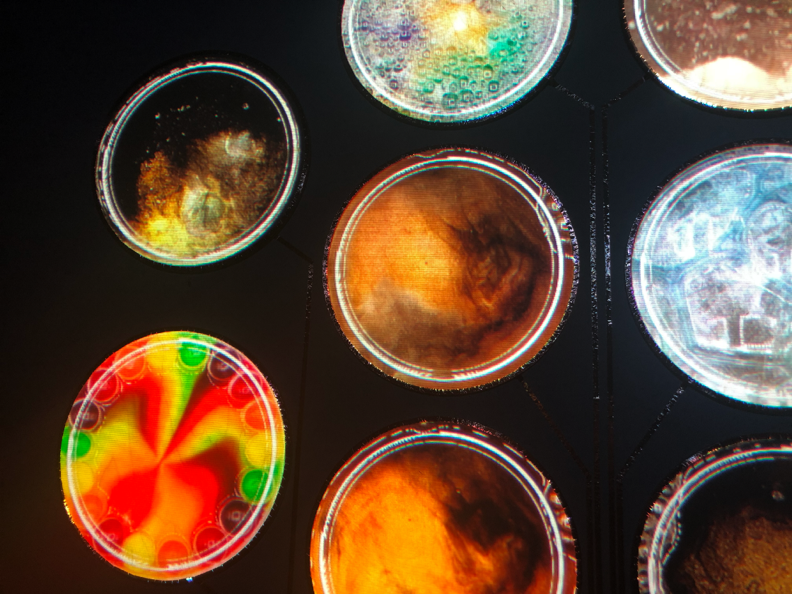
Student Name: Ibrahim Alazza
Project Title: See it All
Project Title: See it All
Project Description:
A lot of times we pass by places, things in our lives and they are the same! And by time, we look at these things as part of our lives or part the space they were in. Sometimes, we forgot to step back and look at things in a bigger vision or different view.
READ FULL BLOG POST
A lot of times we pass by places, things in our lives and they are the same! And by time, we look at these things as part of our lives or part the space they were in. Sometimes, we forgot to step back and look at things in a bigger vision or different view.
READ FULL BLOG POST
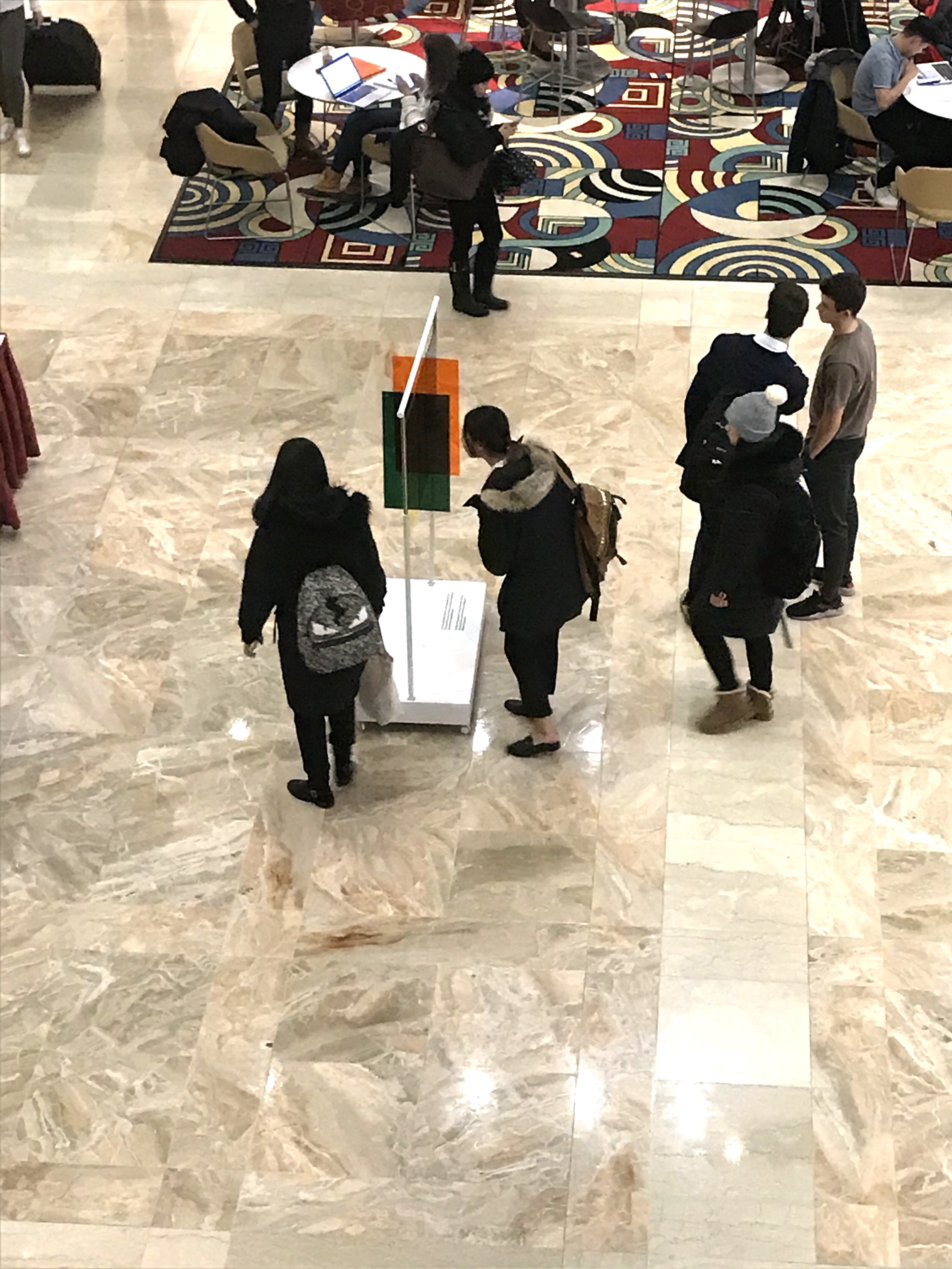
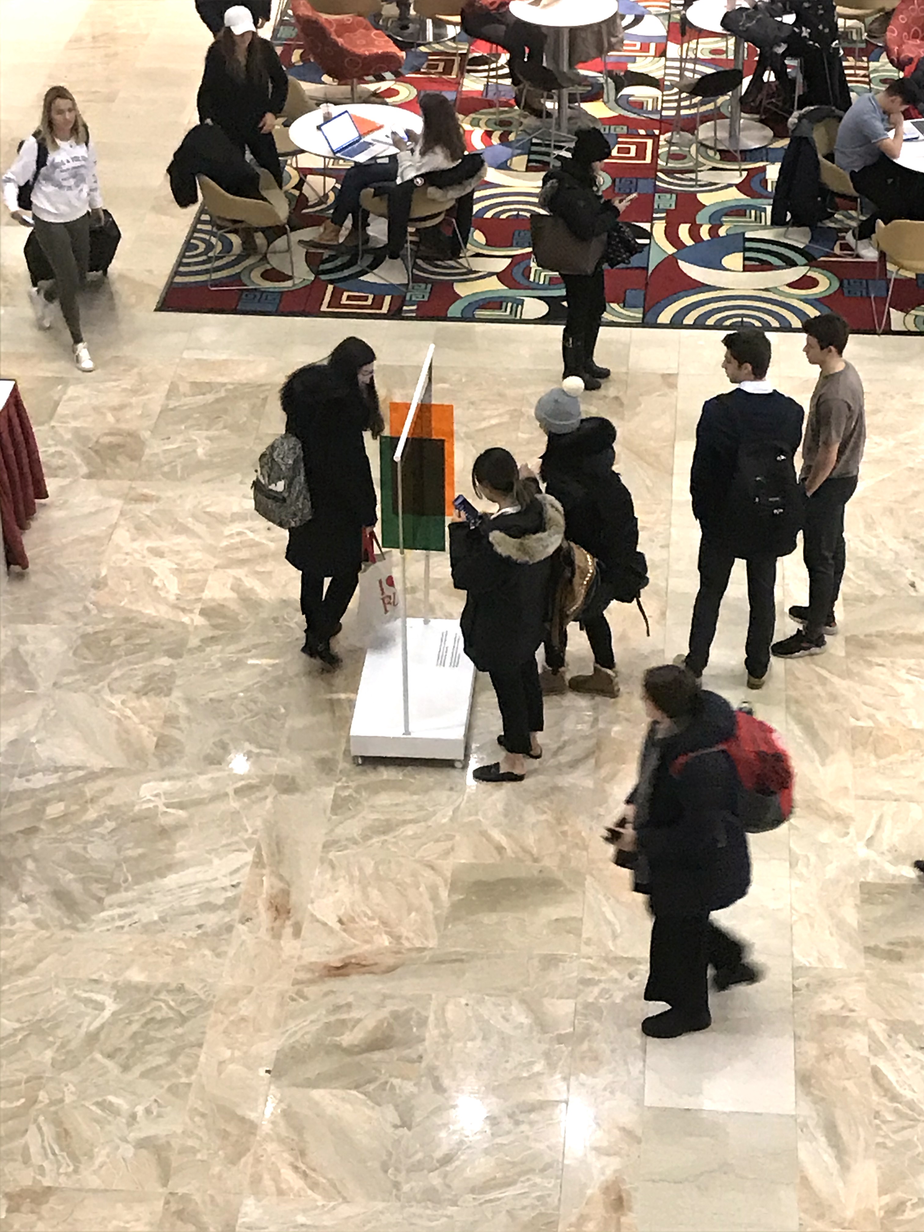
Student Name: Taryn Rostovsky
Project Title: Languages and the Evolution of Words
Project Title: Languages and the Evolution of Words
Project Description:
Languages and the Evolution of Words explores the idea of linguistics and focuses on the origin of the English language. Graphic design is the art of presenting ideas, opinions, and experiences with visual content. Like graphic design, words are a form of communication and a way to express a concept from one thing to another. This thesis is a study of how new words become part of our daily dialect.
My body of work emphasizes the research behind these questions:What is the derivation of the dictionary and how is it decided what words are worthy enough of an addition? What were some of the first-known words? How did people learn to speak the same words and understand each other? Whatmakes a word complete? If writing began after language did, how do people know when language was first used?
READ FULL BLOG POST
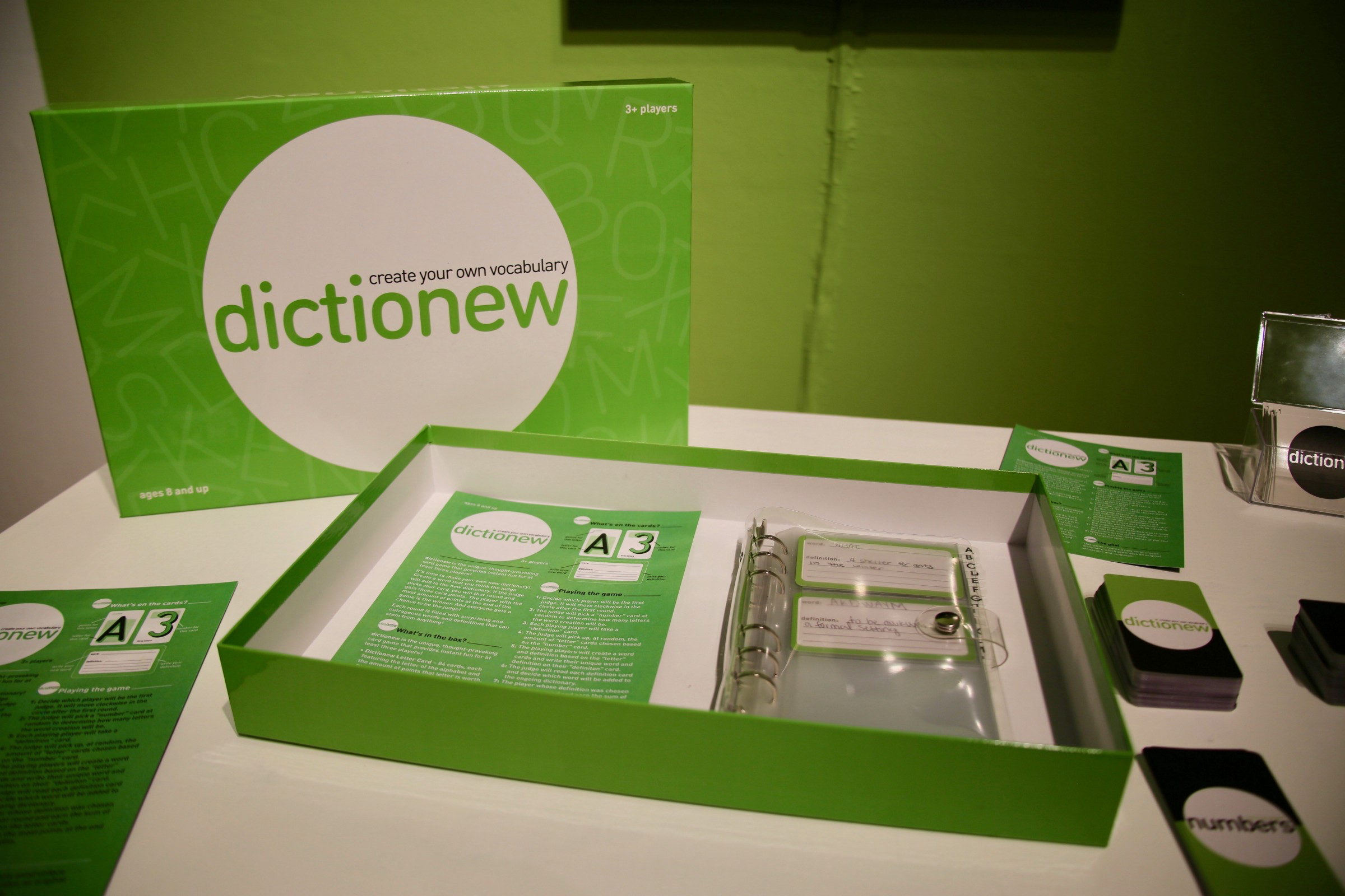
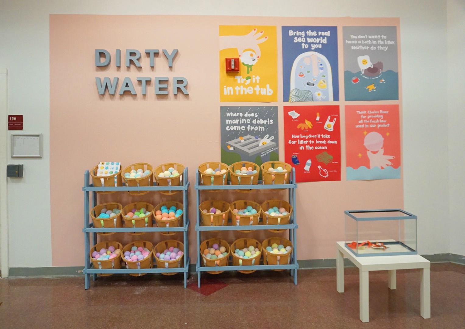
Student Name: Yue Wu
Project Title: Dirty Water
Project Title: Dirty Water
Project Description:
When looking down from a parasail at a crystal-clear sea, it’s difficult to imagine that “marine debris is one of the most serious ecological threats we face today”. The slogan “save the ocean” has been omnipresent in media and culture for as long as I can remember. However, it’s easy for most of us to feel detached from the problem of water pollution because our daily lives are lived far away from whales with plastic inside and mounds of plastic bottles littering shorelines. Perhaps as a result of that detachment, our acknowledgment of marine debris is limited. We’ve all seen pictures of sea turtle stuck in plastic, and fish with bellies full of plastic. But do people really know where the marine debris comes from? Therefore, for my senior thesis, my goal is to make people relate more to marine debris and to learn more about this topic through a common object: the bath bomb.
READ FULL BLOG POST
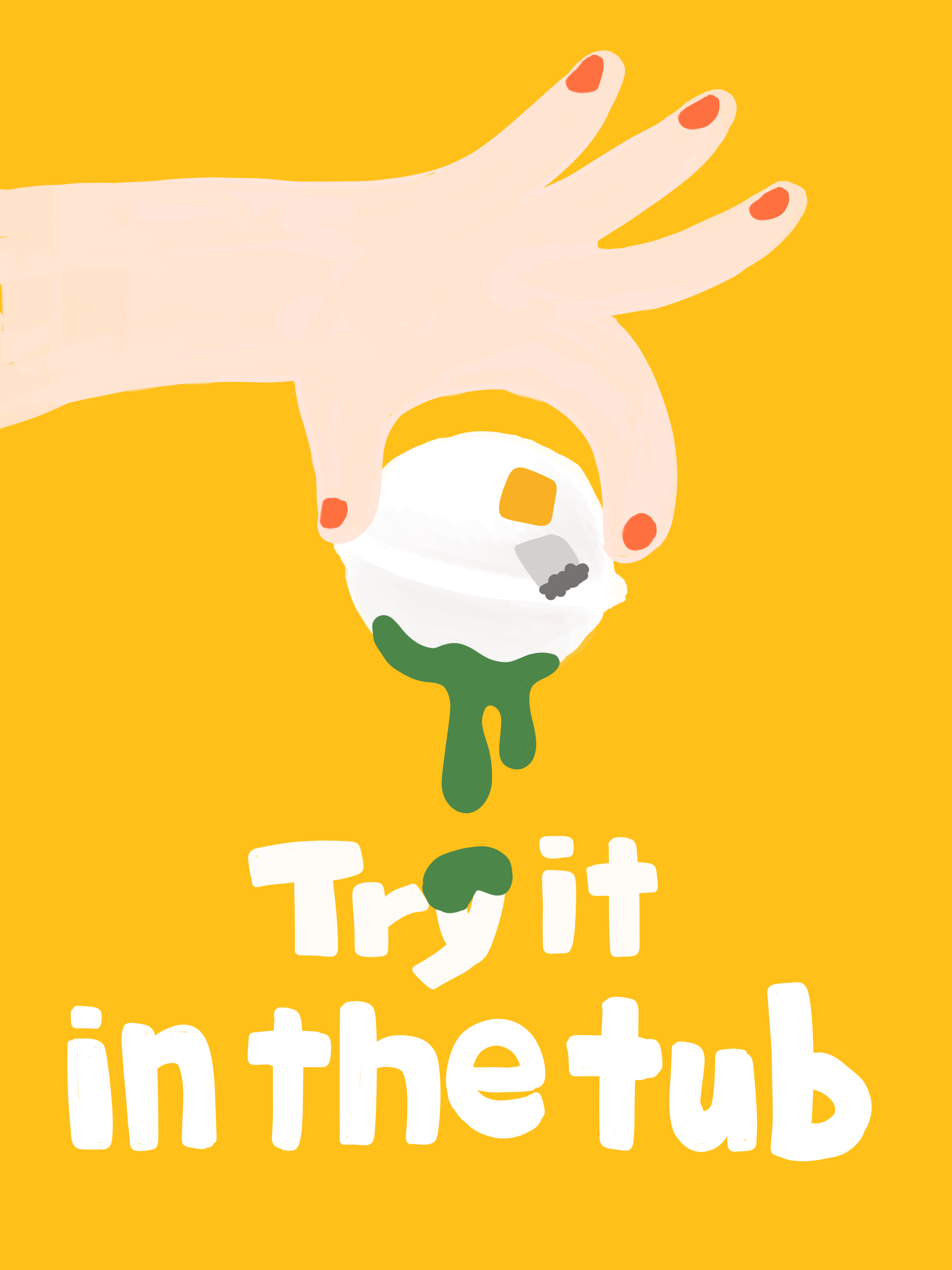
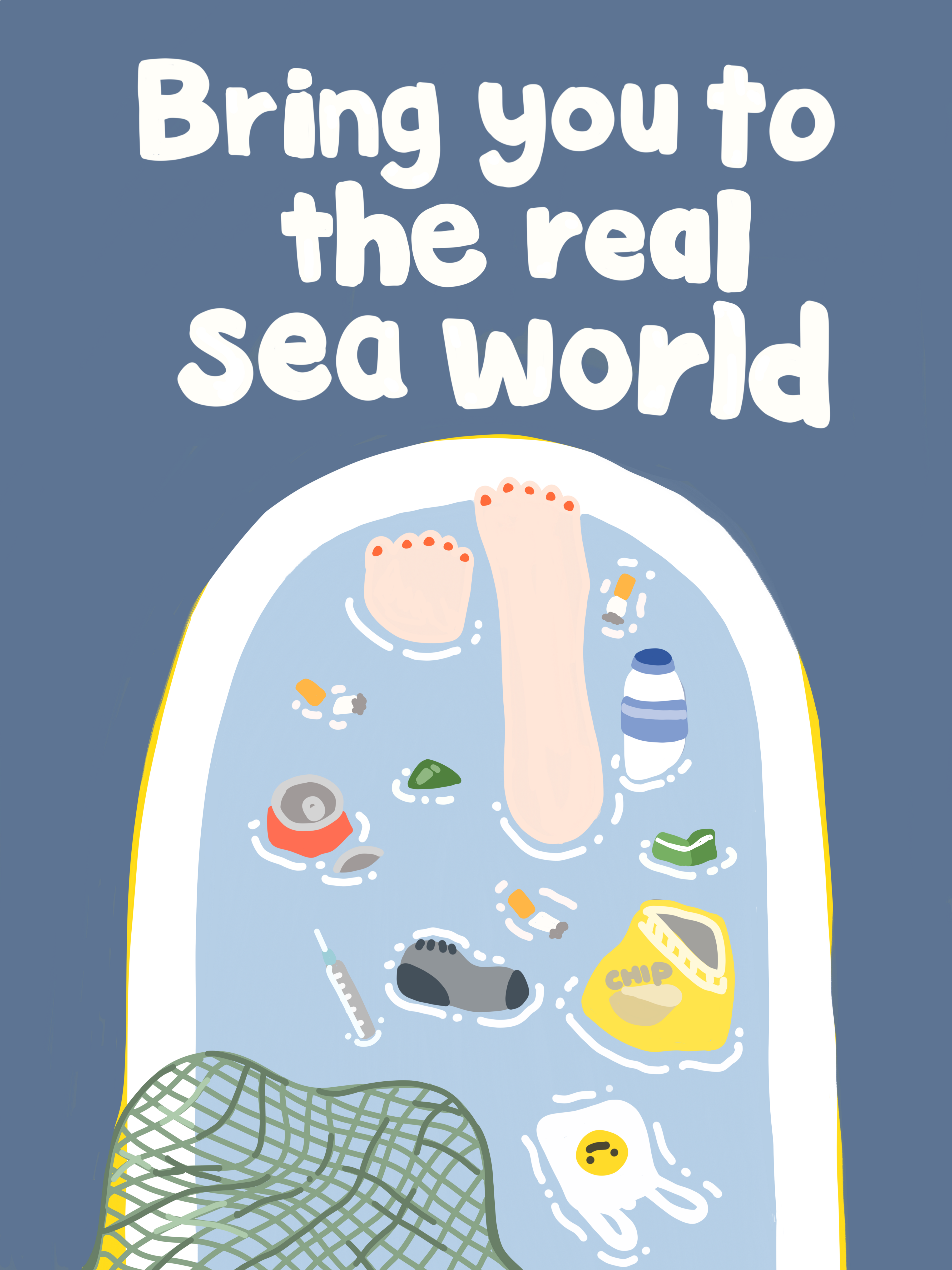
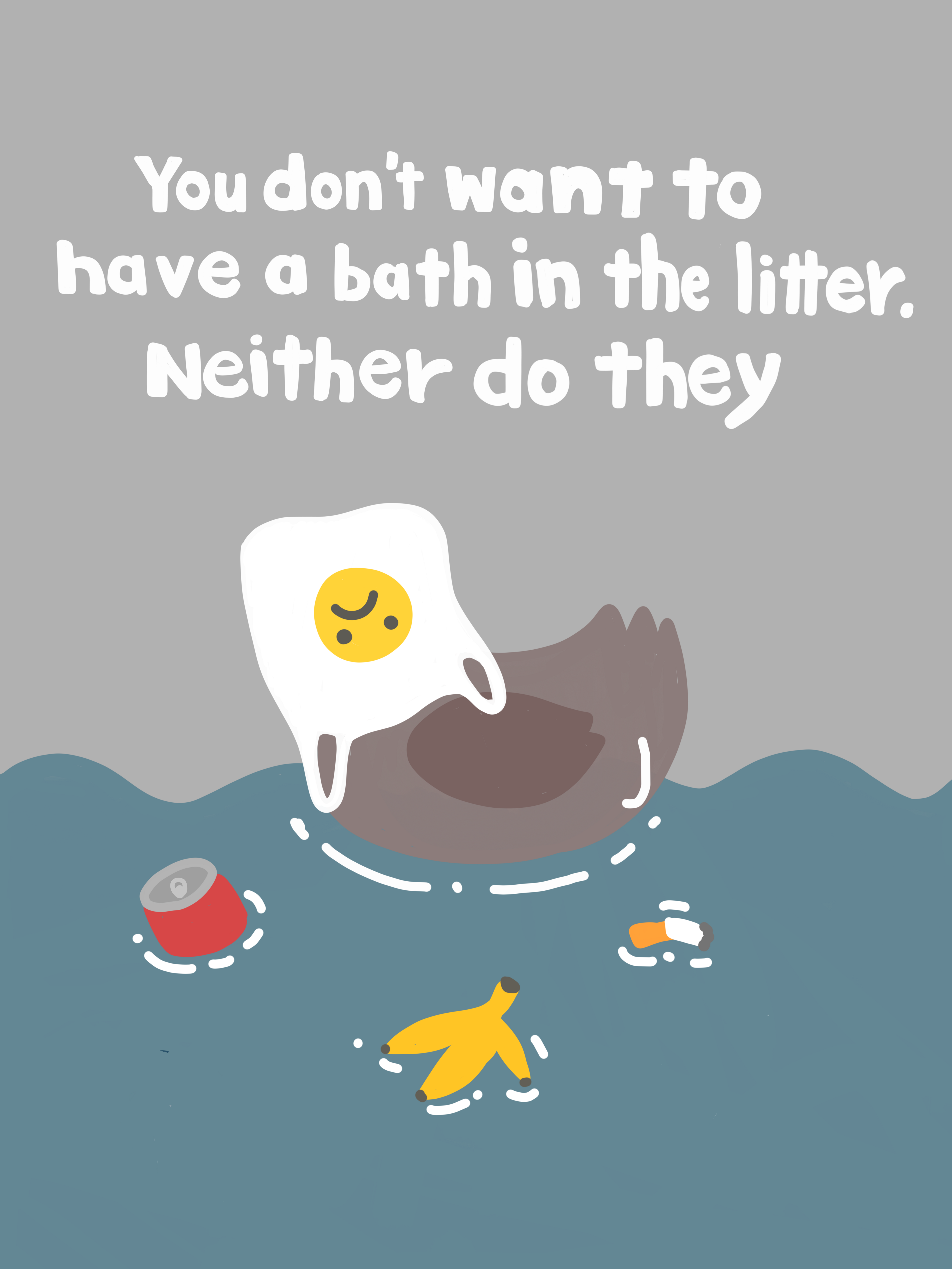
Student Name: Grace Colbert
Project Title: The Body is The Bind: How patriarchy interrupts the pursuit of the authentic self
Project Title: The Body is The Bind: How patriarchy interrupts the pursuit of the authentic self
Project Description:
The feminine construct is a set of ubiquitous and compulsory cultural ideals for performing womanhood in society. Though too numerous to be compiled here, the ideals set forth by the feminine construct demand of women bodily perfection in health, image, and comportment; sexual desirability; emotional tranquility; consumerist extravagance; and hyper-domesticity.
The feminine construct thus manifests itself as hyper-vigilant monitoring of the body and self (self-surveillance) in response to the pressure on women to regard femininity as a project in which one must constantly work towards unattainable perfection in every category. Self-surveillance behavior requires that women watch the self as an outside observer in an attempt to monitor the progress of the body and self and to manage impressions of the body and self.
READ FULL BLOG POST
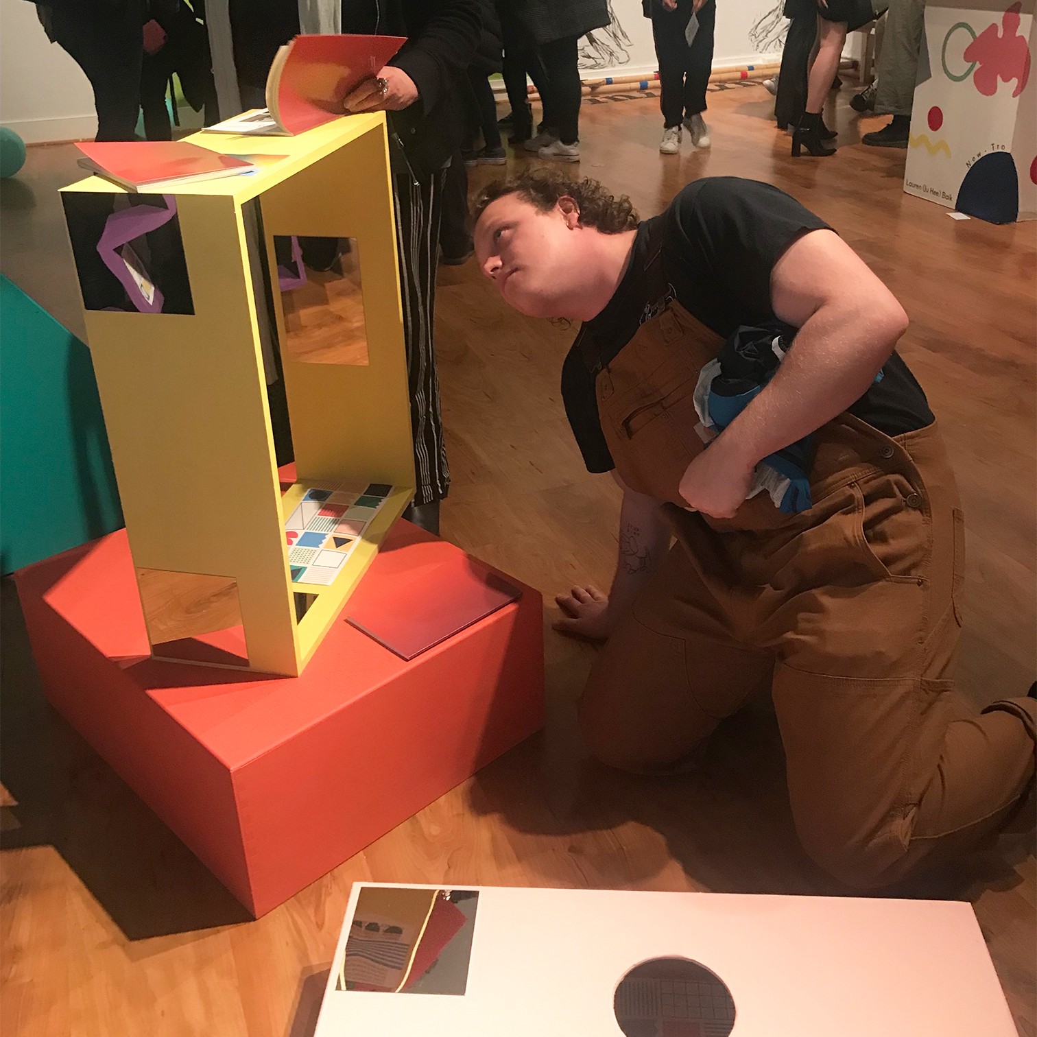
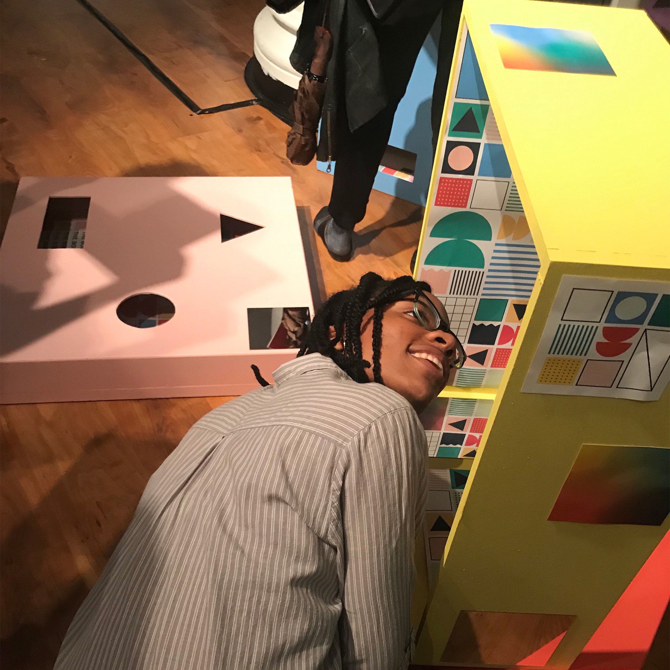
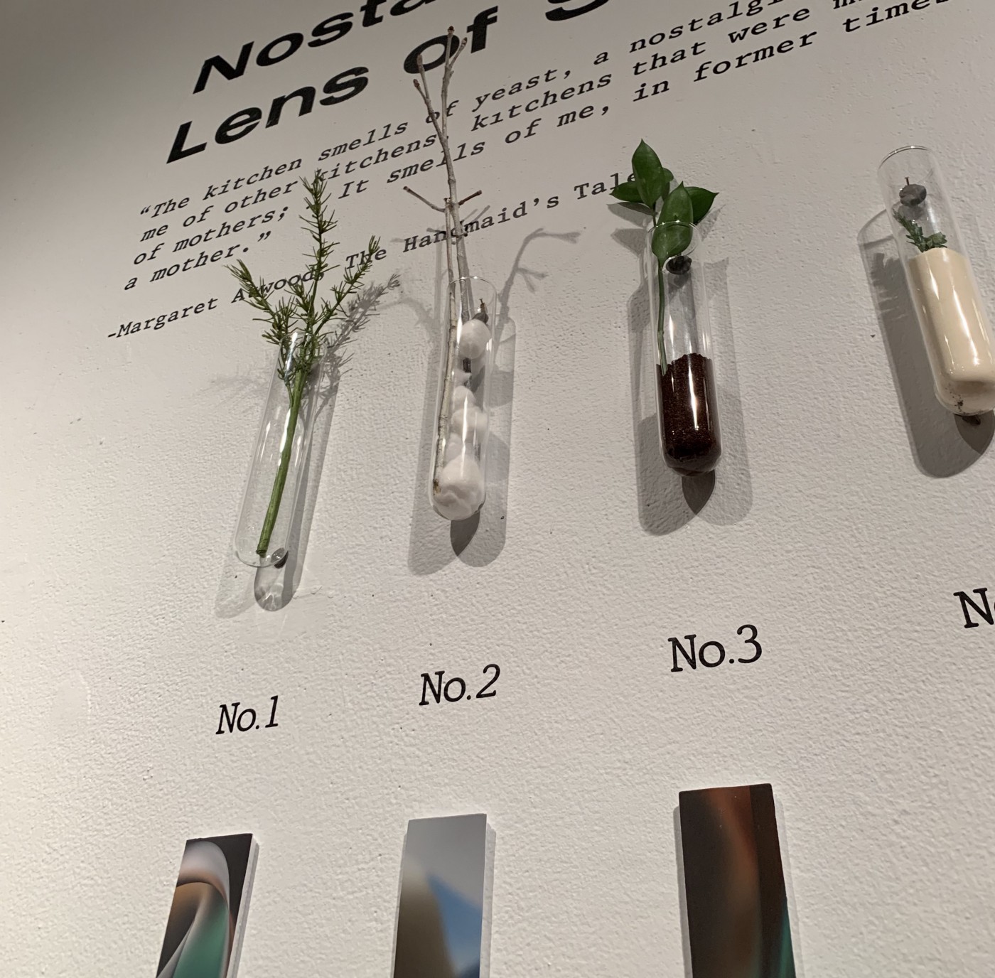
Student Name: Yuri Hong
Project Title: Nostalgia through the Lens of Scents
Project Title: Nostalgia through the Lens of Scents
Project Description:
They say that the sense of smell is closely linked with memory, probably more so than any of our other senses. The smell of cigarettes on a jacket or the smell of your mother’s Chanel perfume could bring strong emotions as a response to those memories or anything we associate with those scents. Because scent perception is a learned association, responses to odors are learned by the emotional context in which they are perceived directly. This also means that sometimes when we smell a familiar scent, we become reconnected to memories from our past, creating an experience known as nostalgia. Nostalgia is described as being ‘a sentimentality for the past’ consisting of the greek words ‘nóstos’, meaning “homecoming” and álgos, meaning “pain” or “ache”. True to its root words, nostalgia often brings upon the bittersweet feelings of being close to a memory but very far from its origination. However, research has shown that practicing nostalgia is a great way to connect our past to our present and feel optimistic about the future. Nostalgia can also encourage empathy, social connectedness, and is an integral part of how we form the human narrative. READ FULL BLOG POST
They say that the sense of smell is closely linked with memory, probably more so than any of our other senses. The smell of cigarettes on a jacket or the smell of your mother’s Chanel perfume could bring strong emotions as a response to those memories or anything we associate with those scents. Because scent perception is a learned association, responses to odors are learned by the emotional context in which they are perceived directly. This also means that sometimes when we smell a familiar scent, we become reconnected to memories from our past, creating an experience known as nostalgia. Nostalgia is described as being ‘a sentimentality for the past’ consisting of the greek words ‘nóstos’, meaning “homecoming” and álgos, meaning “pain” or “ache”. True to its root words, nostalgia often brings upon the bittersweet feelings of being close to a memory but very far from its origination. However, research has shown that practicing nostalgia is a great way to connect our past to our present and feel optimistic about the future. Nostalgia can also encourage empathy, social connectedness, and is an integral part of how we form the human narrative. READ FULL BLOG POST
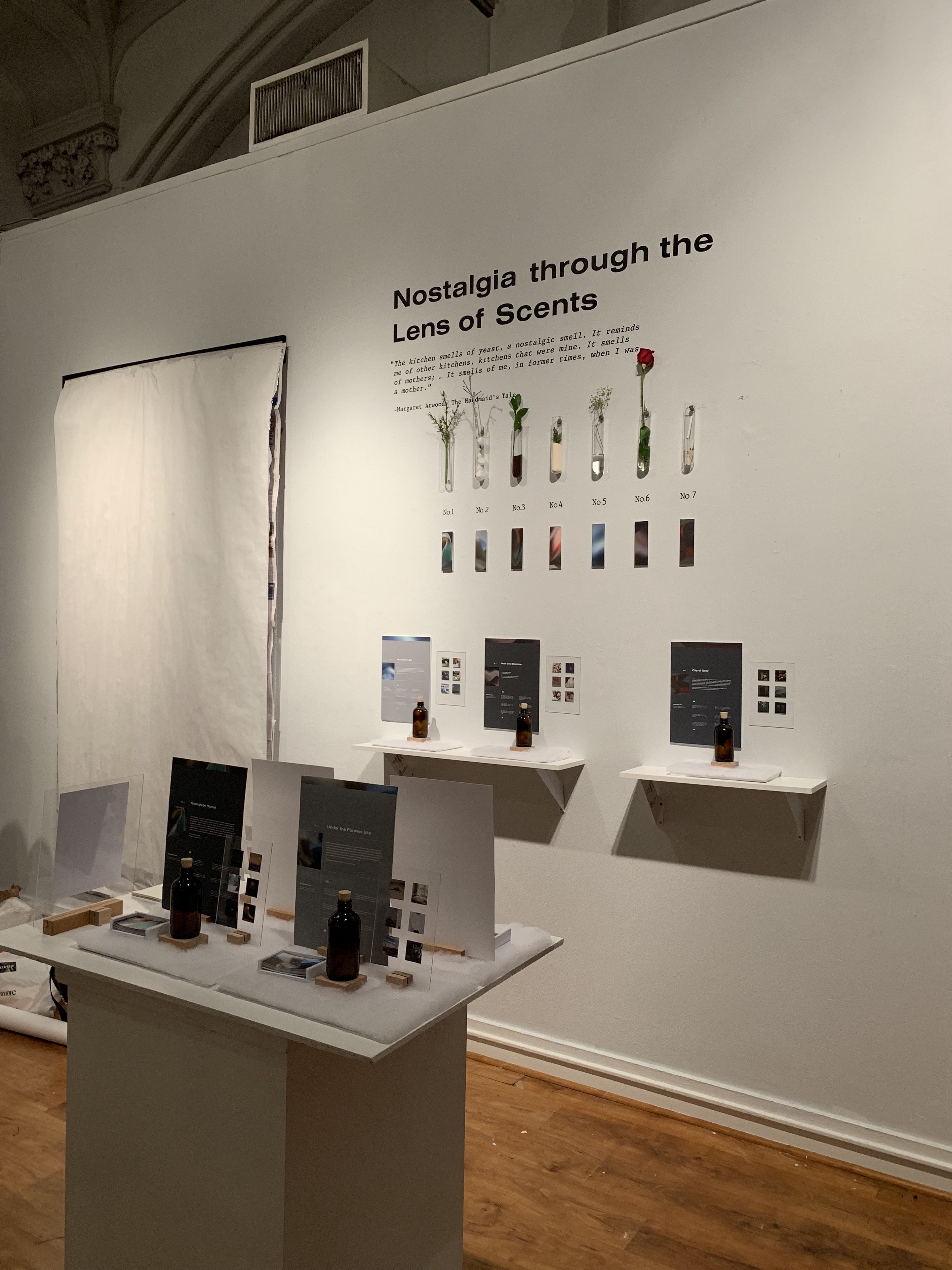
Student Name: Tammy Qiu
Project Title: Primordial Soup
Project Title: Primordial Soup
Project Description:
Primordial Soup is a project in two-fold: first an interactive game that asks users a series of questions about home, and second a physical data visualization in the form of an LED board. I wanted to probe people on their conception of home and then create a physical record of their answers.
READ FULL BLOG POST
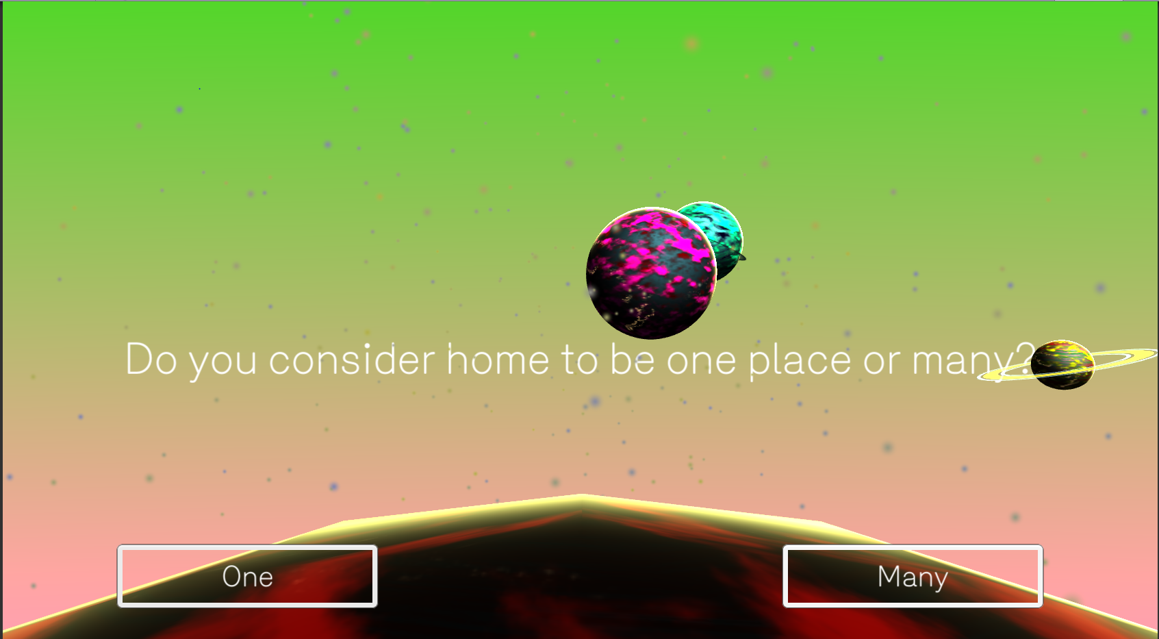
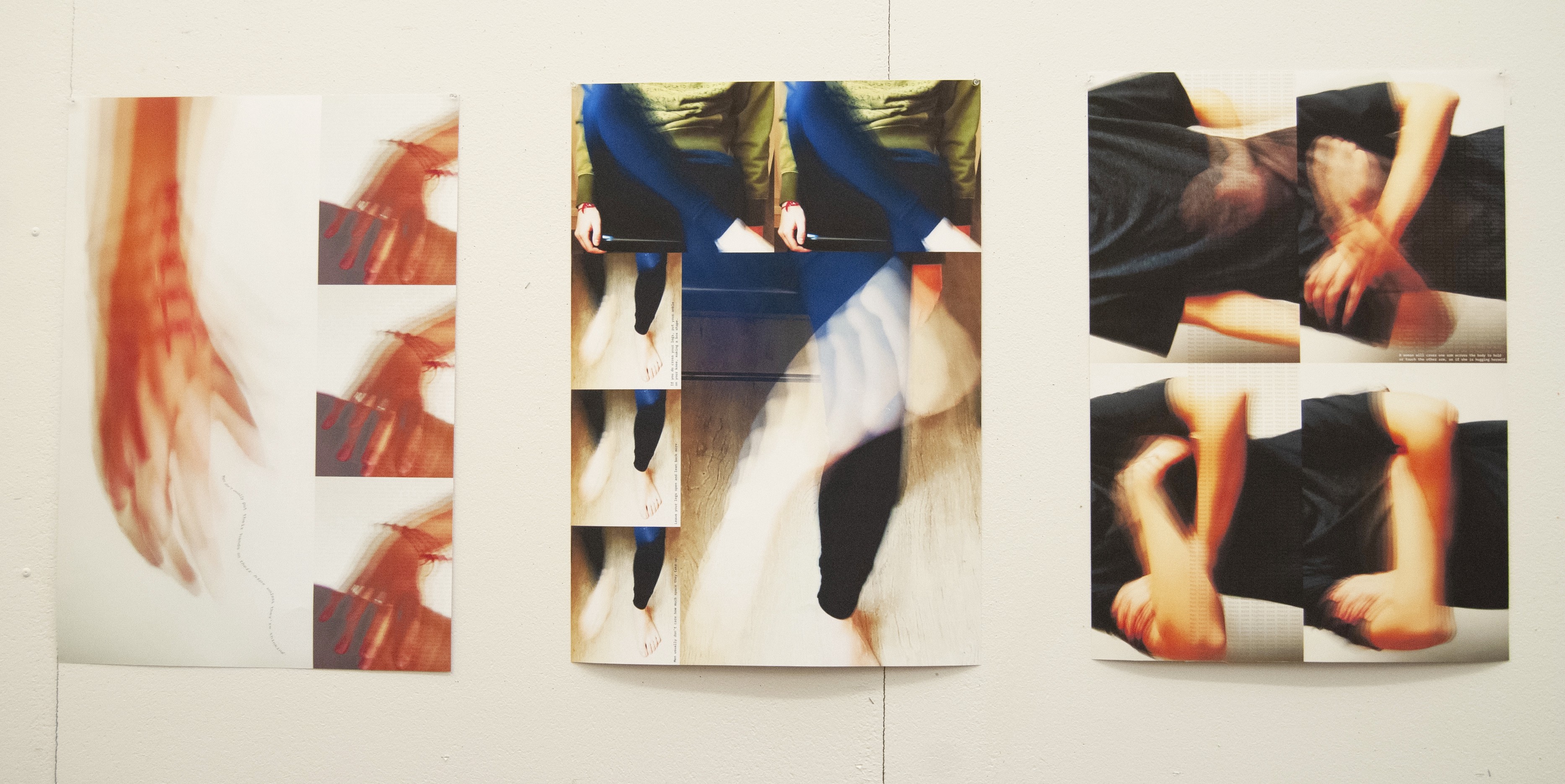
Student Name: Julian Parikh
Project Title: Motion
Project Title: Motion
Project Description:
For our third and final studio assignment of the year, we were asked to interpret Aristotle’s philosophy on motion and represent the concept in both digital and print format.
While reading Aristotle, I began to think about motion in terms of the body. I was interested in how the often unconscious movements of our body can imply certain things to those around us. I realized that a lot can be implied by movement. People are constantly interpreting body language and it affects how we interact with others in the world. But I began to ask myself some questions about this type of motion — how many of our assumptions about body language are biased? How many of them are rooted in gendered stereotypes or generally held presumptions? And finally, are these thoughts holding us back from expressing ourselves freely
and keeping an open mind to others?
READ FULL BLOG POST

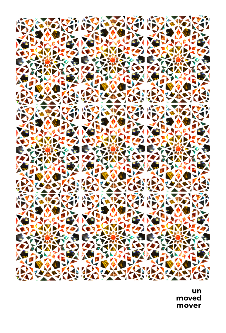
Student Name: Kelly Nolan
Project Title: The Unmoved Mover
Project Title: The Unmoved Mover
Project Description:
Two things were running through my mind after reading the assigned article on Aristotle’s philosophy on motion — 1) his concept of the unmoved mover and 2) the form of kaleidoscopes — reflected geometric patterns.
According to Aristotle, everything has a cause and effect, except for the unmoved mover, which is the first thing to set the universe in motion and is never moved. To Aristotle, that was god. Meanwhile, to explore my idea of a kaleidoscope, I experimented with a prism — a solid geometric object that refracts light. I shone different colored lights through the prism and photographed the refracted light through the prism. The results were photographs which I personally thought were incredibly interesting and something not from this earth— other-worldly. The scenes went well with my idea of god and the unmoved mover.
READ FULL BLOG POST
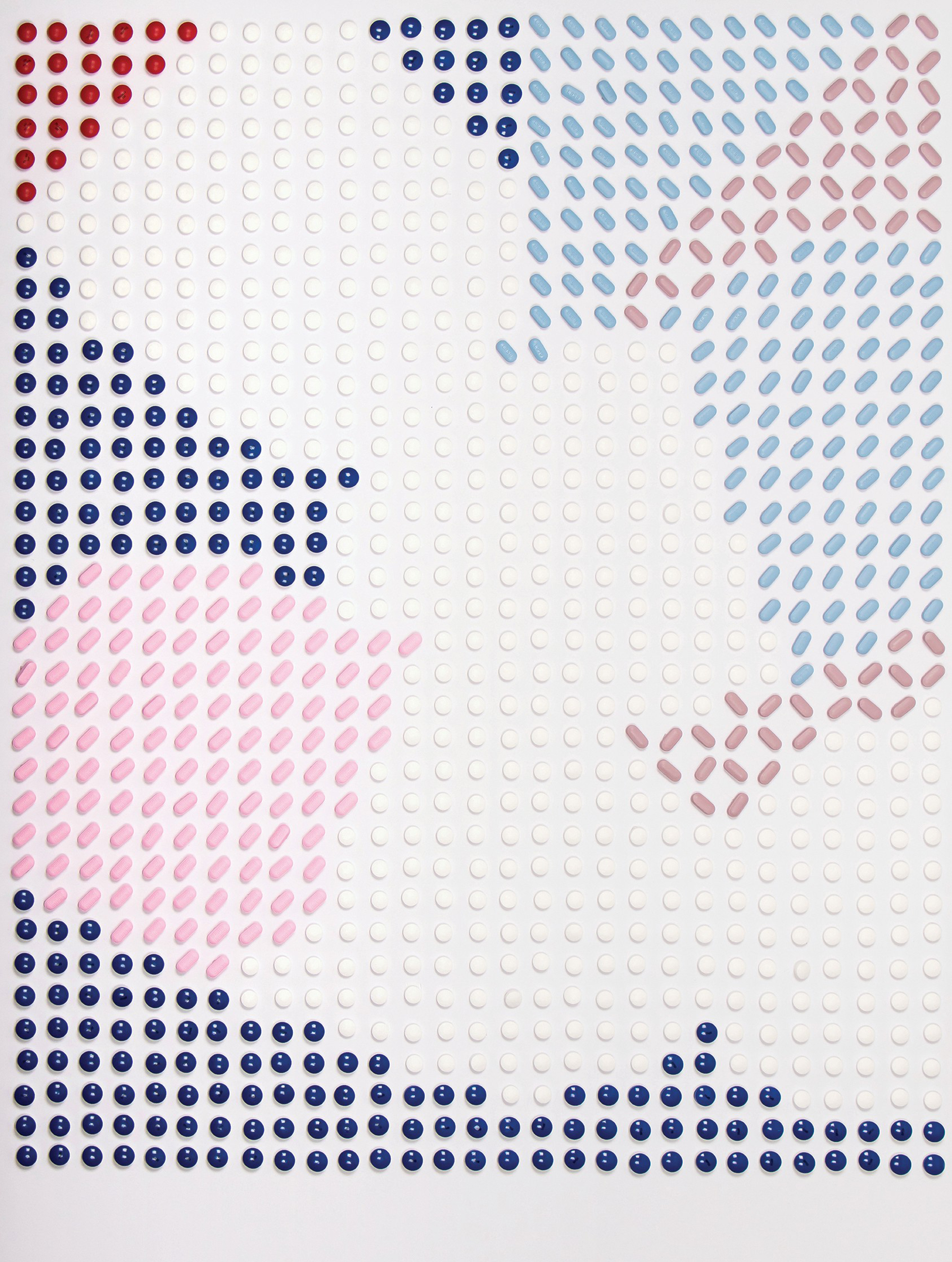
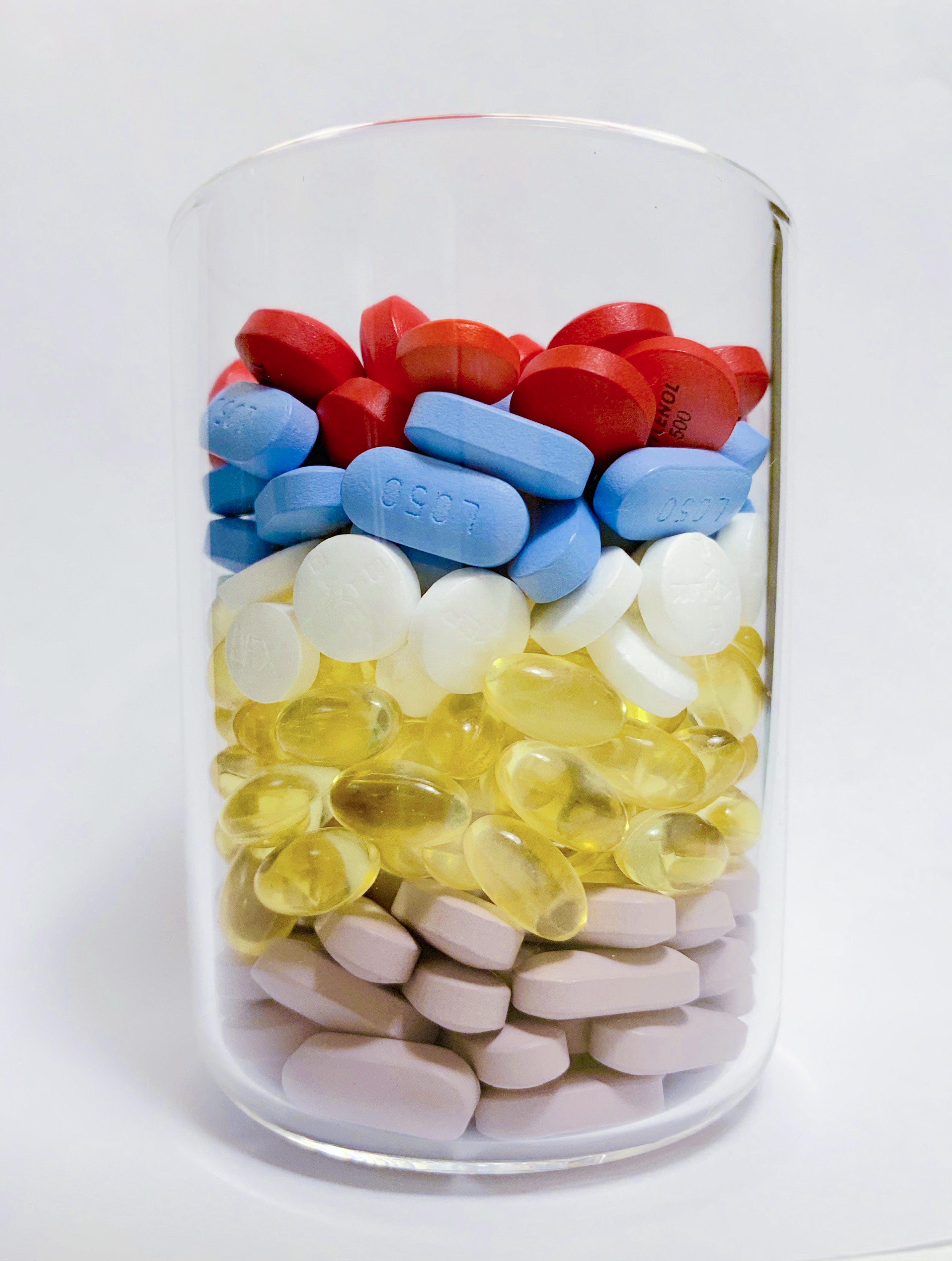
Student Name: Lily Chen
Project Title: Rx Bag
Project Title: Rx Bag
Project Description:
This project includes four parts, a raw collection, an experience collection, a personal data collection and a project comes from former three projects. It is a challenging project since I have no experience on each of them, but also attractive that we can’t imagine what they would look like finally.
READ FULL BLOG POST
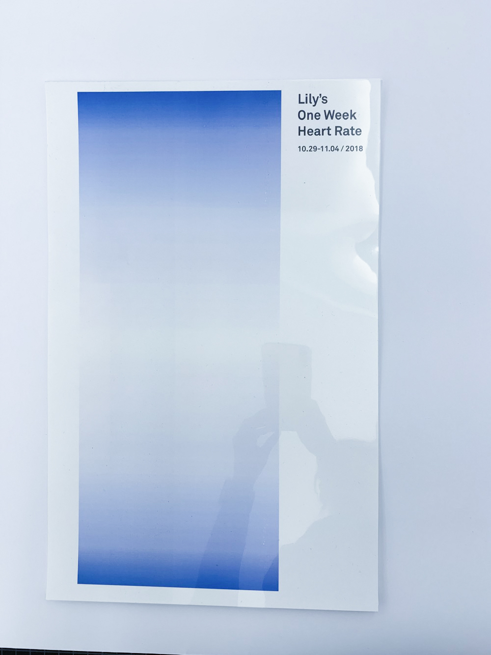
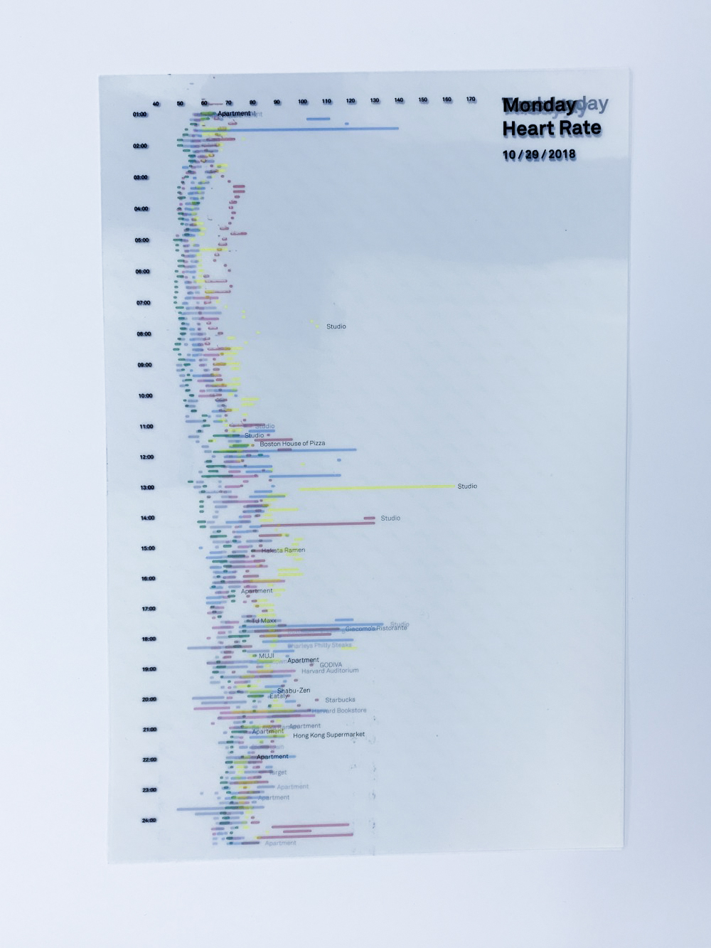
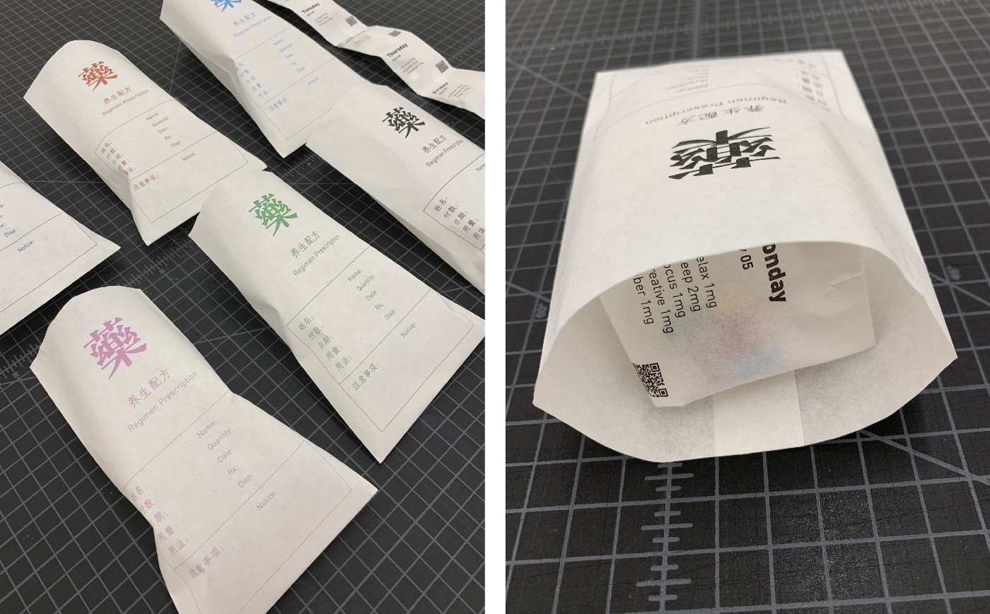
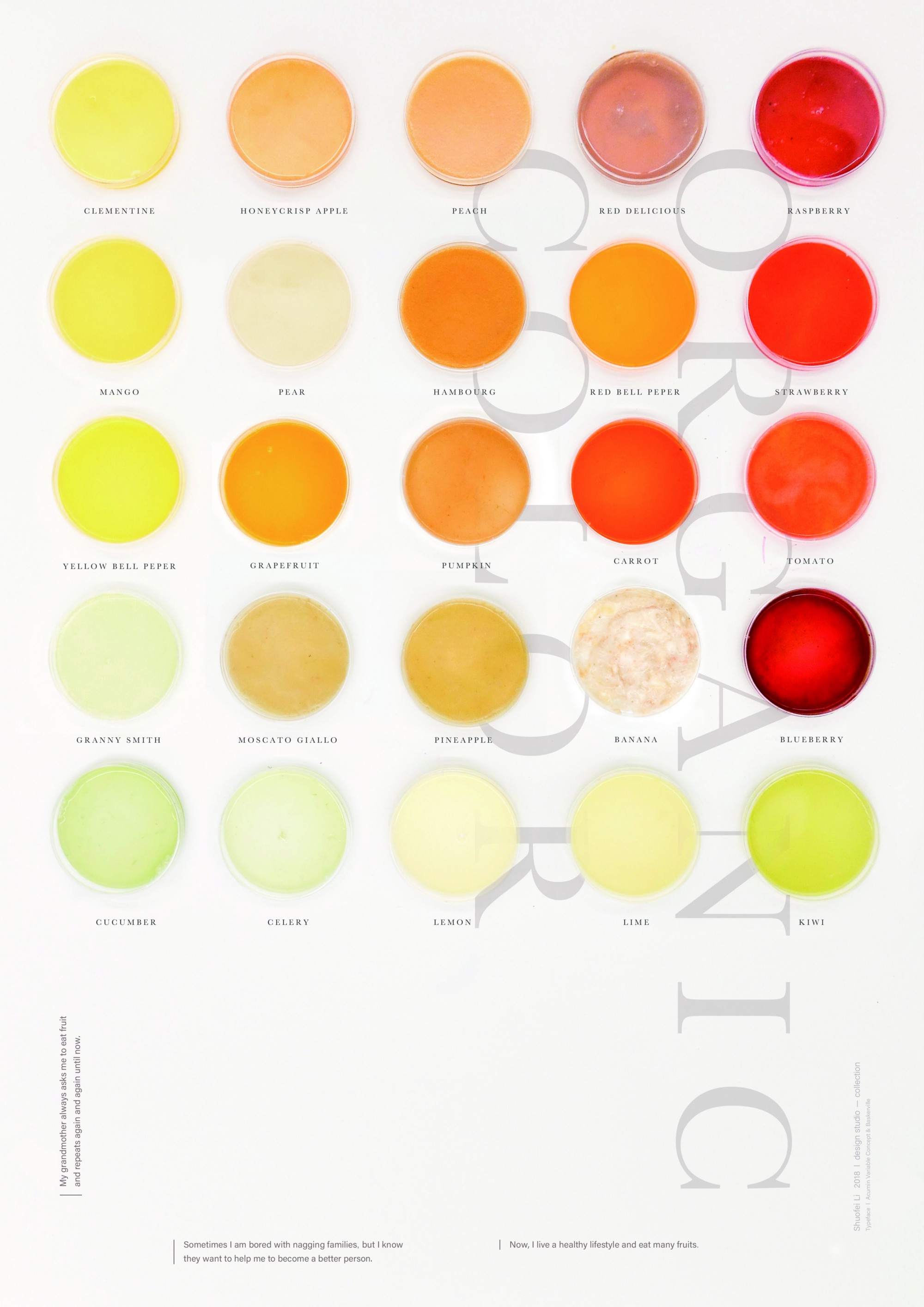
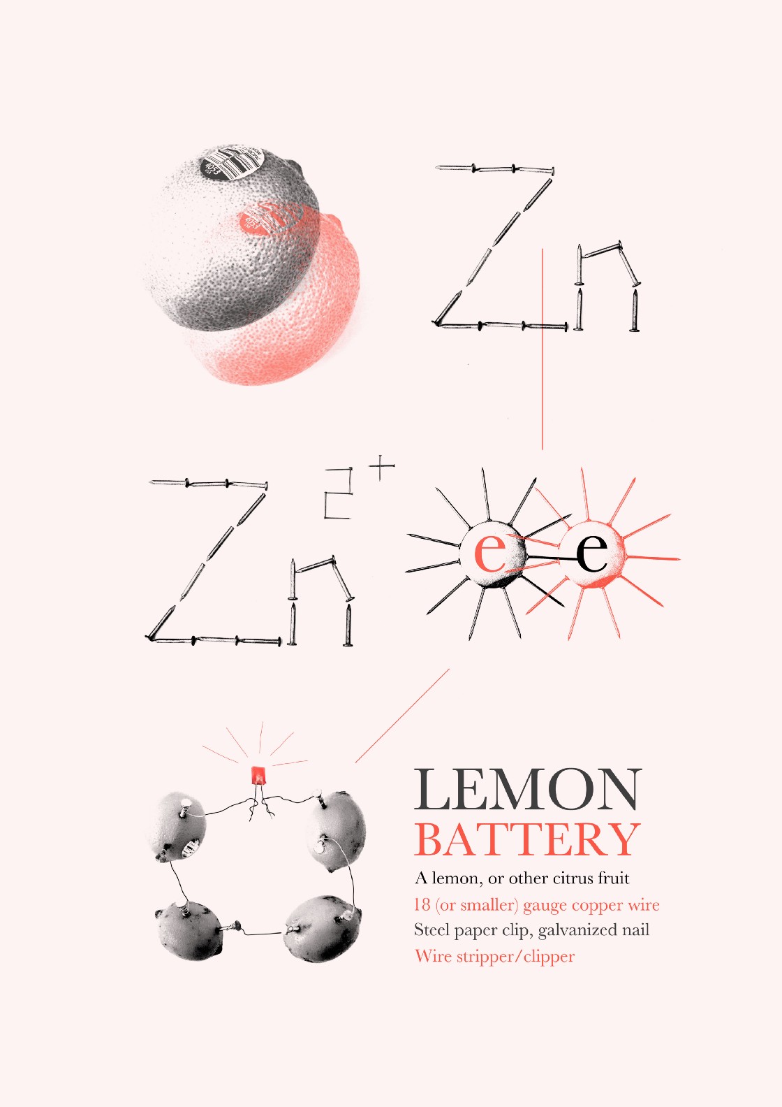
Student Name: Sophie Li
Project Title: Collection: Organic Color
Project Title: Collection: Organic Color
Project Description:
When I was young, my grandmother constantly asked me to eat fruit in the morning, which led me to be a person who gets used to eating fruit every day. One day, when I was making my second project, Collection, I thought maybe I should do something with fruit.
Then, I realized even though we eat fruits every day, most of us just eat them without making fresh juice. What if I collect those colors, and try to find something interesting? So I went to the nearest market and bought over 25 kinds of fruit. I also ordered a juicer machine and Sterile Plastic Petri Dish (Thank you for your advice Mariana!) to save more juice.
READ FULL BLOG POST
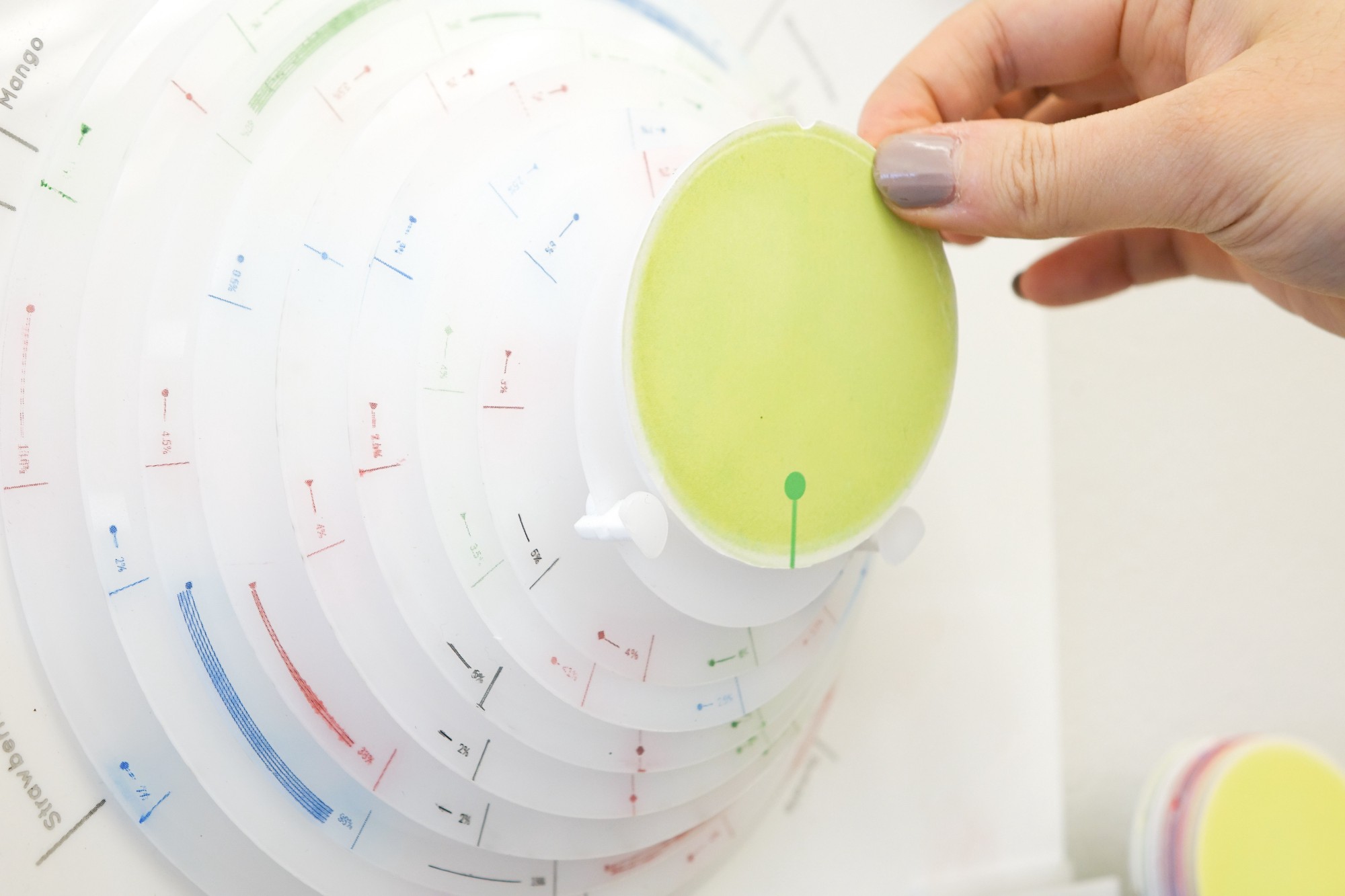
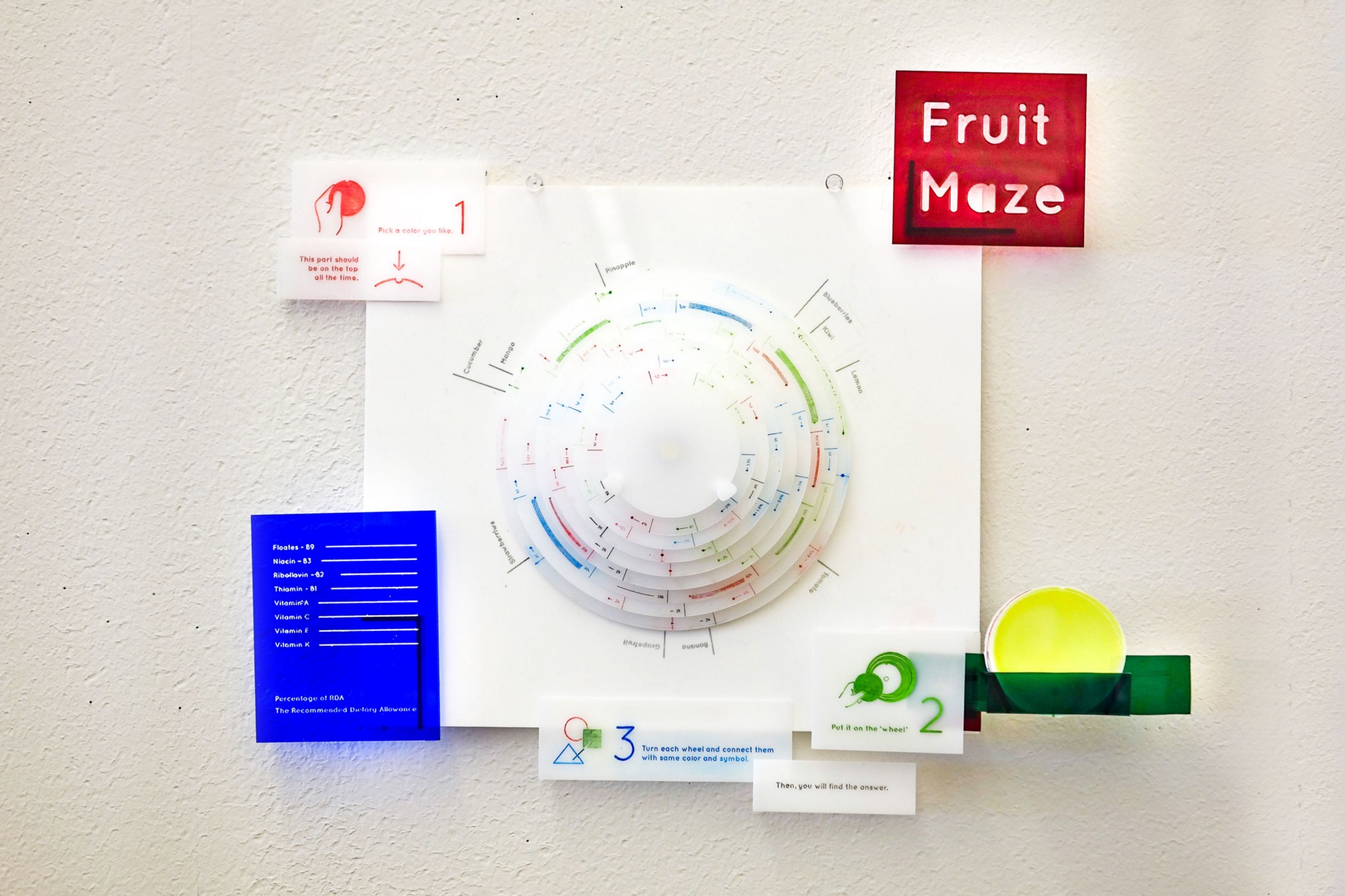
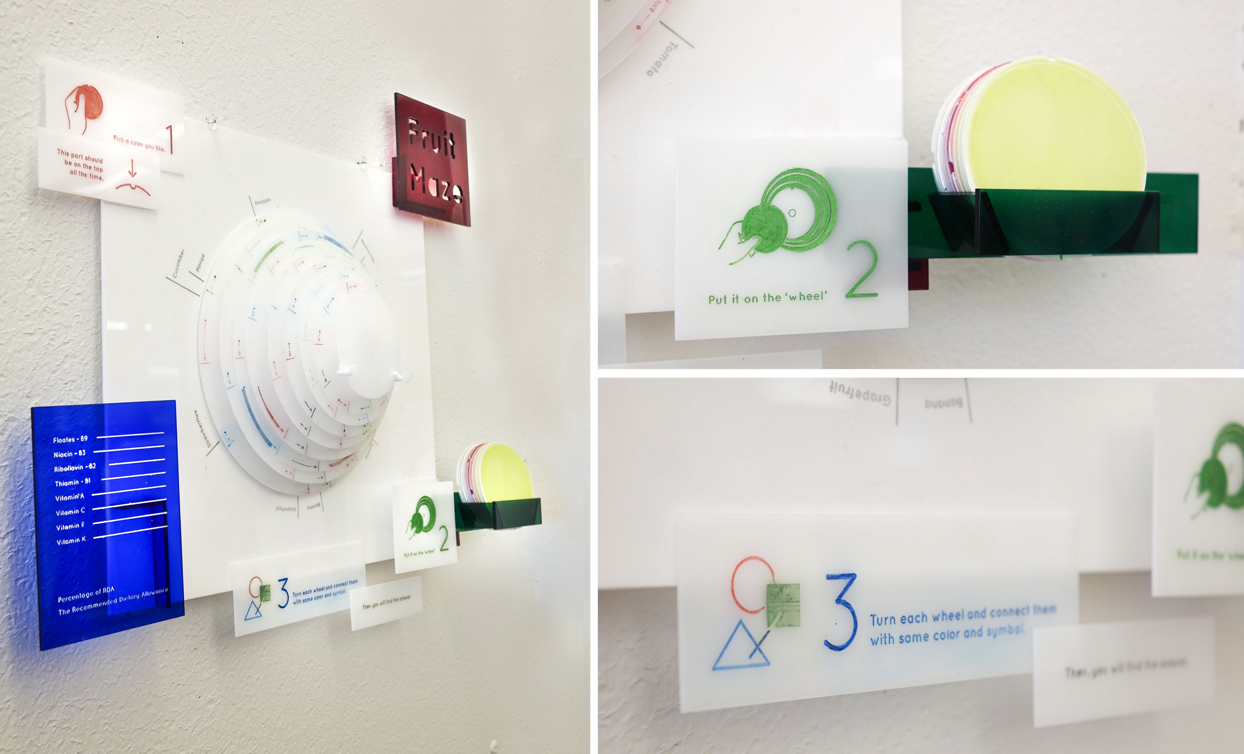
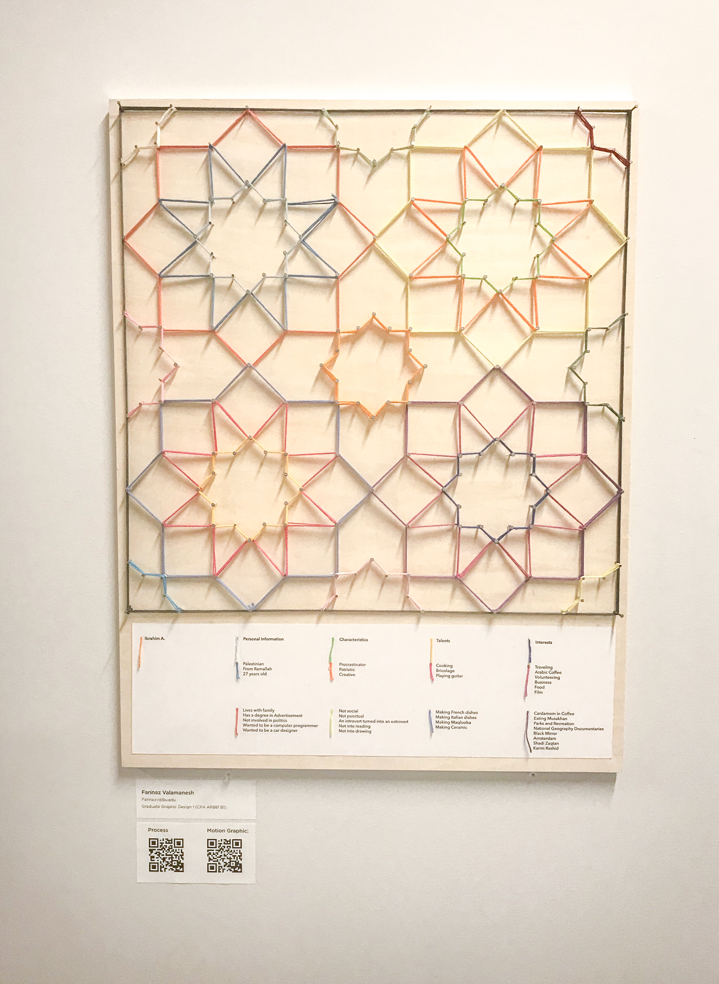
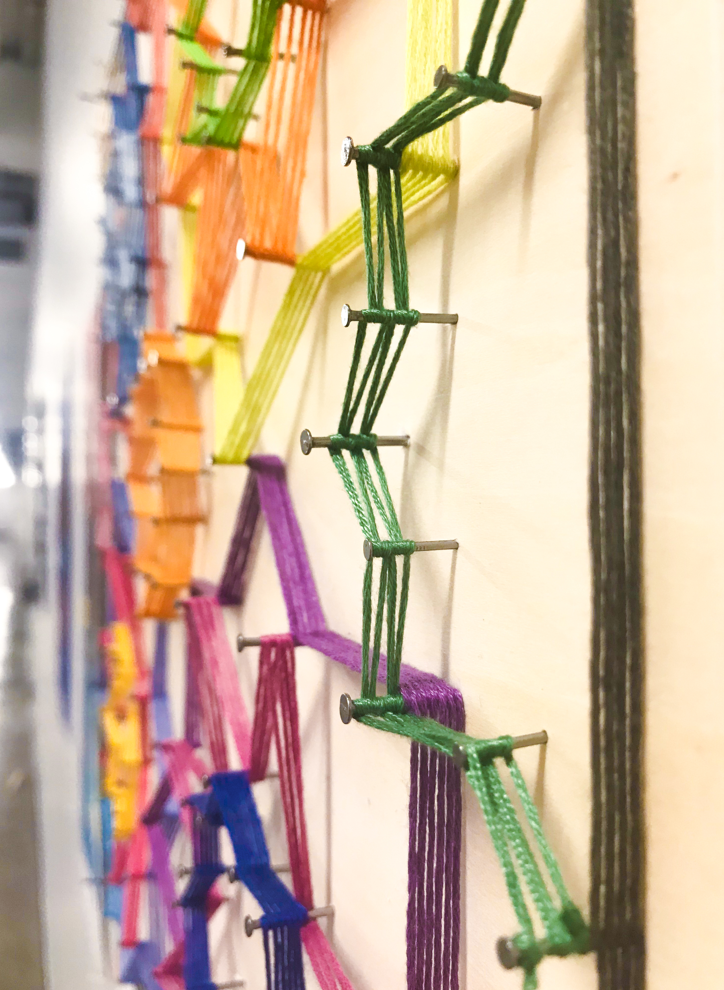
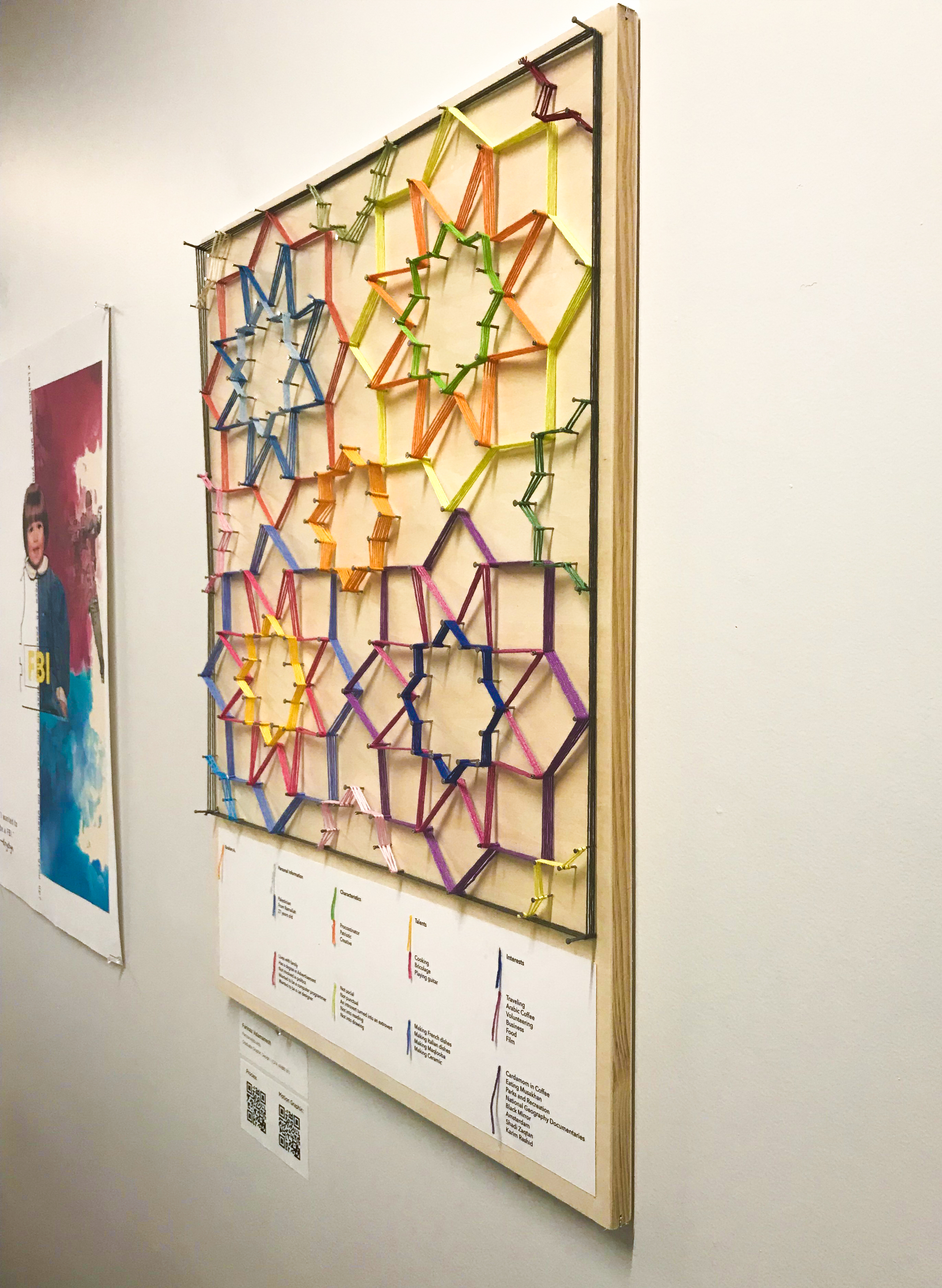
Student Name: Farinaz Valamanesh
Project Title: Peer Biography: Ibrahim Alazza
Project Title: Peer Biography: Ibrahim Alazza
Project Description:
This biography project was a great way to start my first semester as a graduate graphic design student at Boston University. The class was divided into groups of two and we were supposed to create a biography inspired work based on our groupmate. It was a bit of a challenge to create an artwork about a person I’d just met but my pair, Ibrahim Alazza made it much easier for me.
Through an interview that took a couple of hours, I gathered a lot of information about Ibrahim’s personality, life, and interests. In addition, during the week after our interview session, I did a lot of research on the raw data I gathered. READ FULL BLOG POST
Student Name: Ivanna Lin
Project Title: The Waiting Room
Project Title: The Waiting Room
Project Description:
We face numbers and data on a daily basis. Advertisement often uses them to tell consumers why they need a product. Non-profit organizations influence people to take action with statistics. Article headlines finish “did you know” with alarming facts to hook you into reading the rest of the article. It is no surprise that the media understands the power of data. But with the large quantity of statistical numbers exposed to the public, has it lost its impact?
For my thesis, I want to investigate new ways to display data points.
The goal of my thesis is to allow the audience to understand the data beyond solely numbers. We are used to seeing percentages, fractions, pie charts, and bar graphs as forms of data visualization. These visual formulas are identifiable but tedious to fully understand because of how universally applicable they are. I hope to curate an experience that can allow people to not only know information but also feel it.
READ FULL BLOG POST
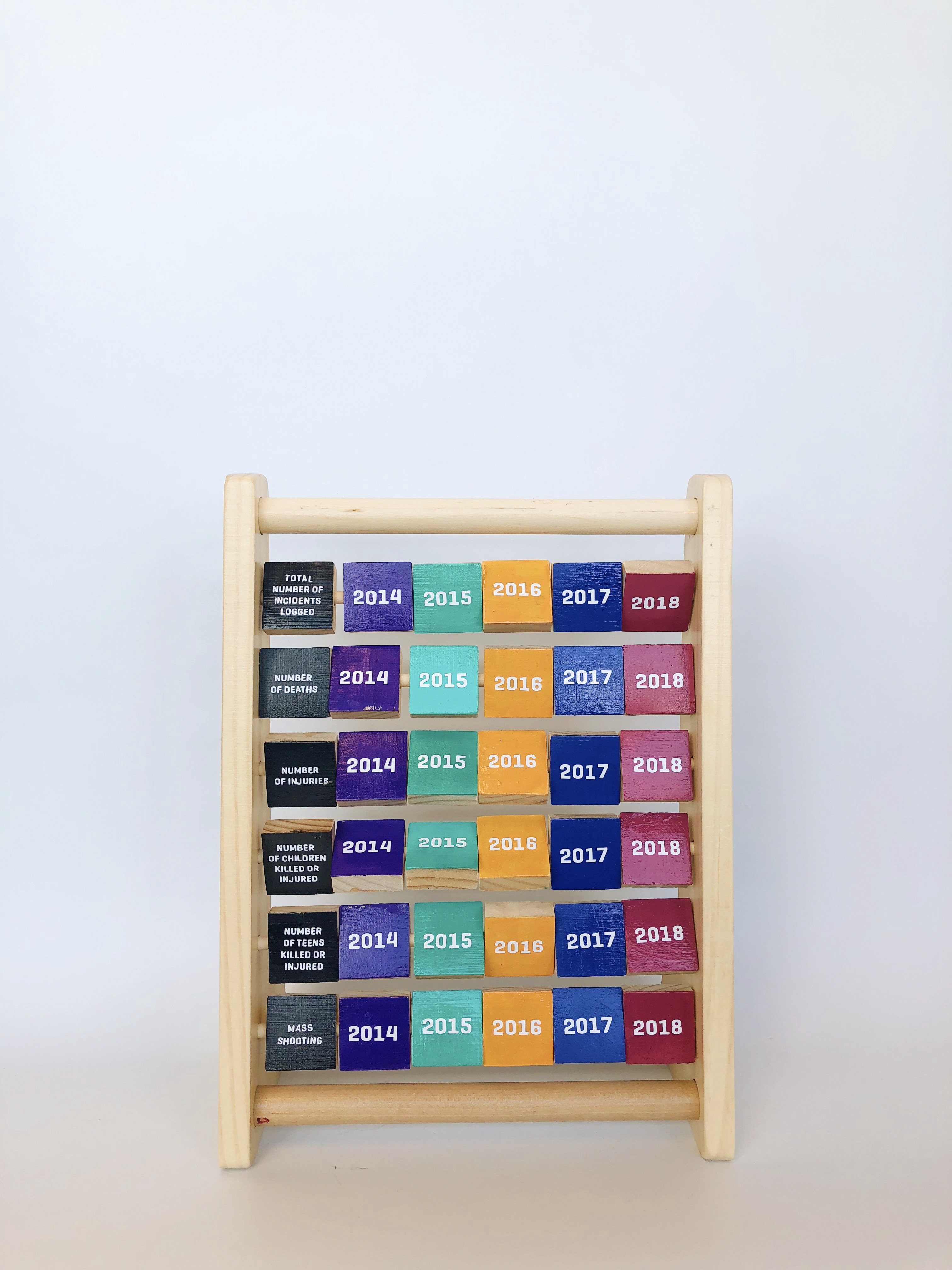
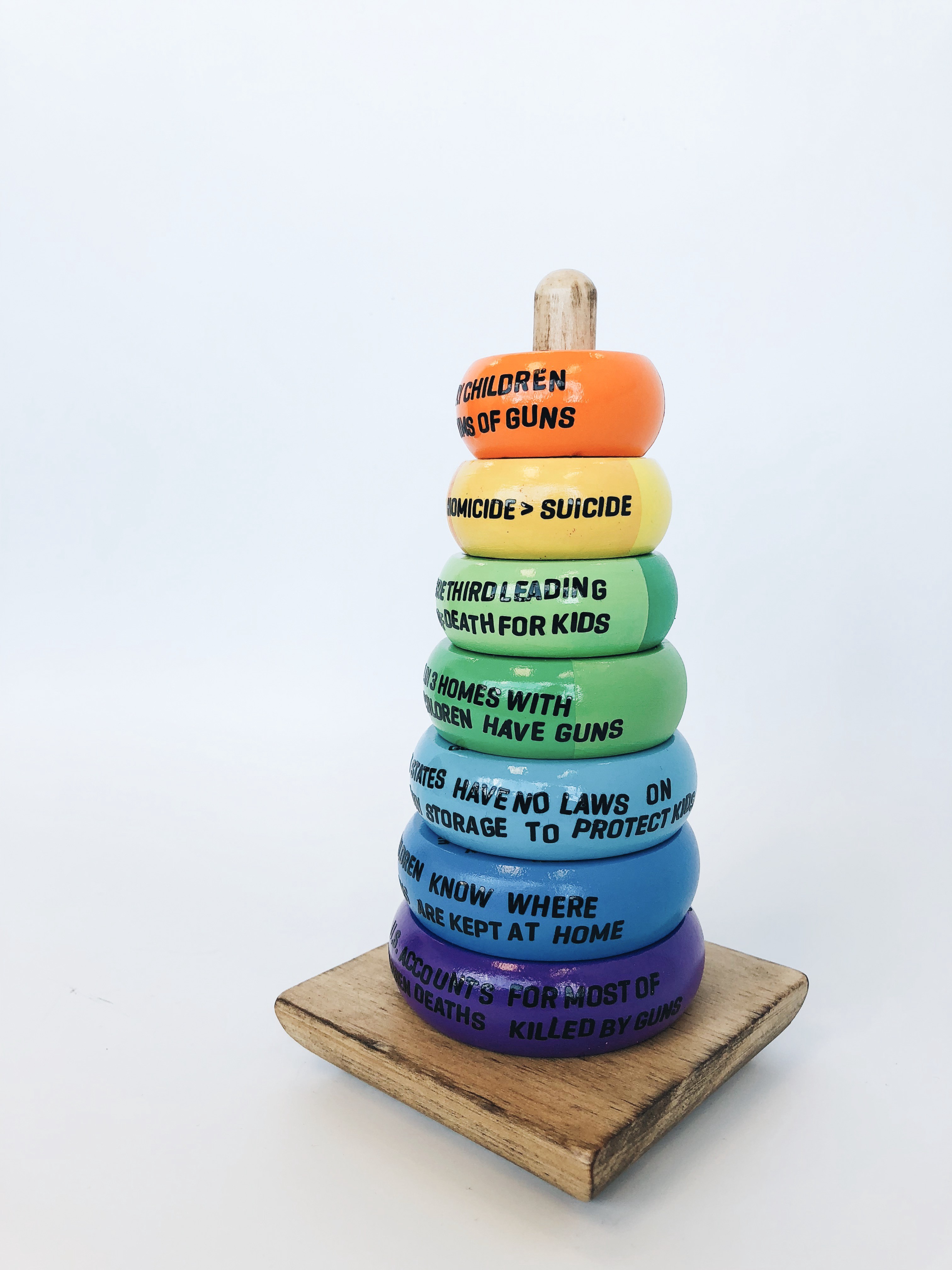
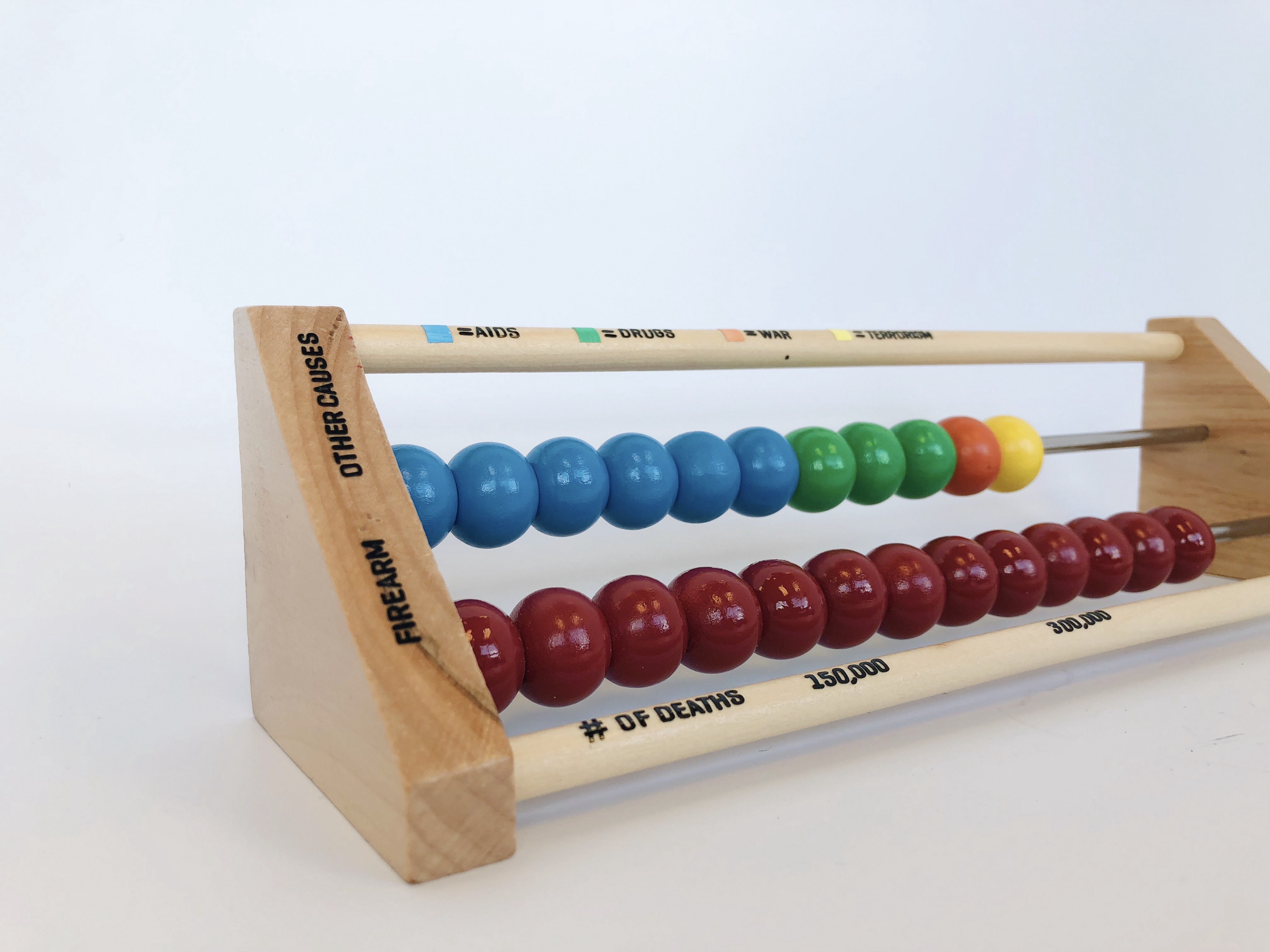
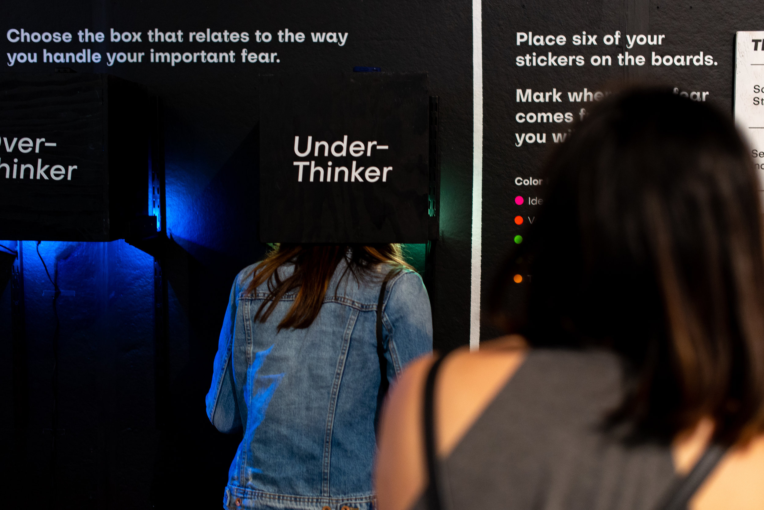
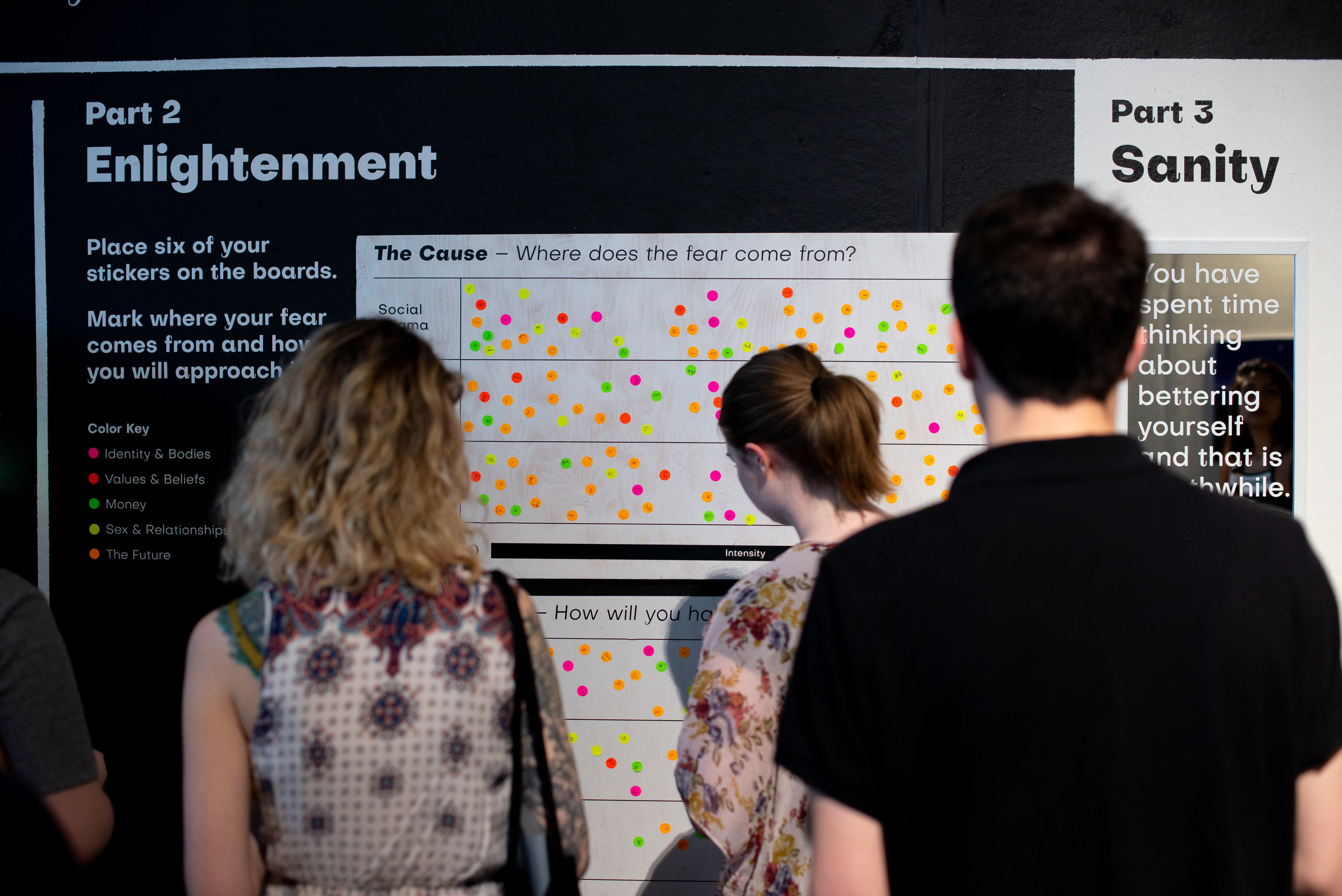
Student Name: Naomi Tenenini
Project Title: The Proprium Method
Project Title: The Proprium Method
Project Description:
A thesis born from important humble beginnings.
What is something that’s important to you that scares you to think and/or talk about?
I presented this question as the the main thesis statement that would drive the entire project forward. So now you may be asking, “what’s the point of all of this anyway?” and to that I say, “TO SAVE THE WORLD” of course.
Well, not quite, but in a certain sense, yes.
The goal is to provide a method for people to use to overcome their personal struggles that they deem to be meaningful to themselves. It’s all about each person being able to do something worthwhile for themselves. By doing so, I believe that people become more confident, stable, and sane. They then project that outward to the other people in their lives, which builds better communities and lives for everyone involved.
READ FULL BLOG POST
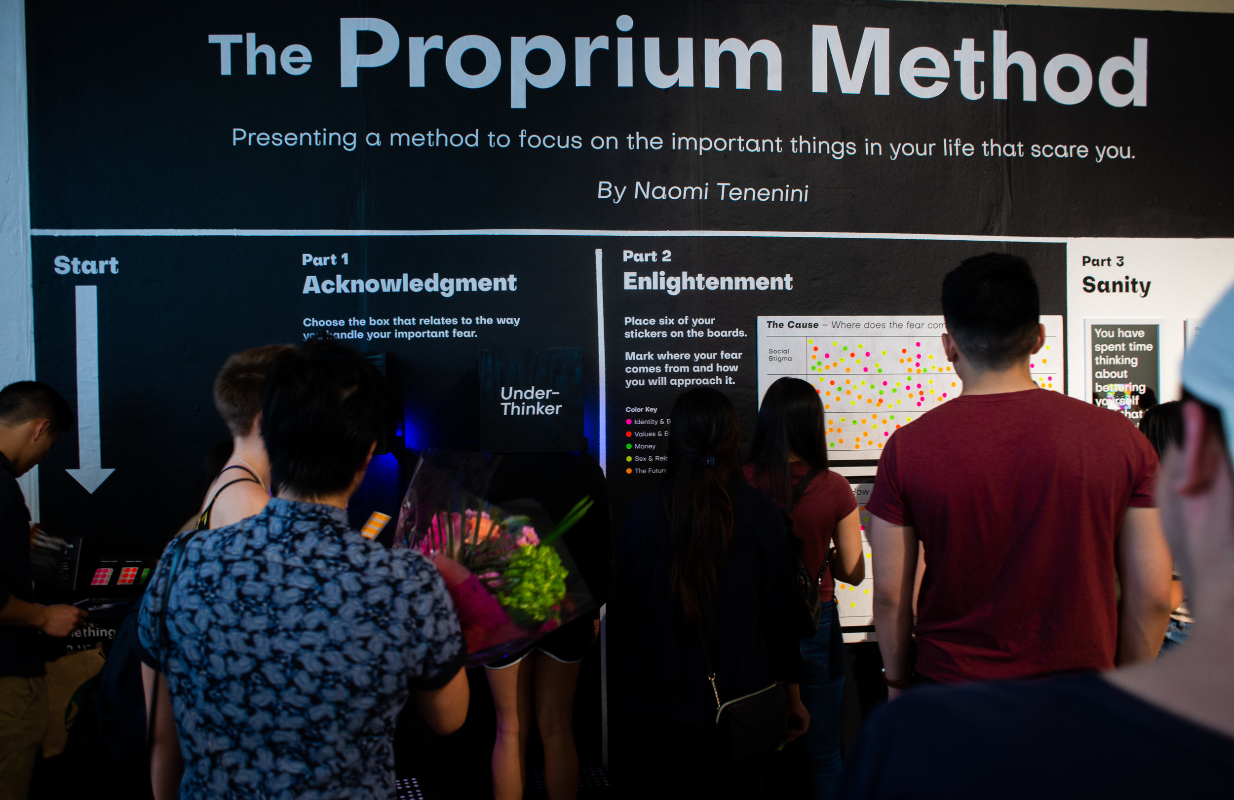
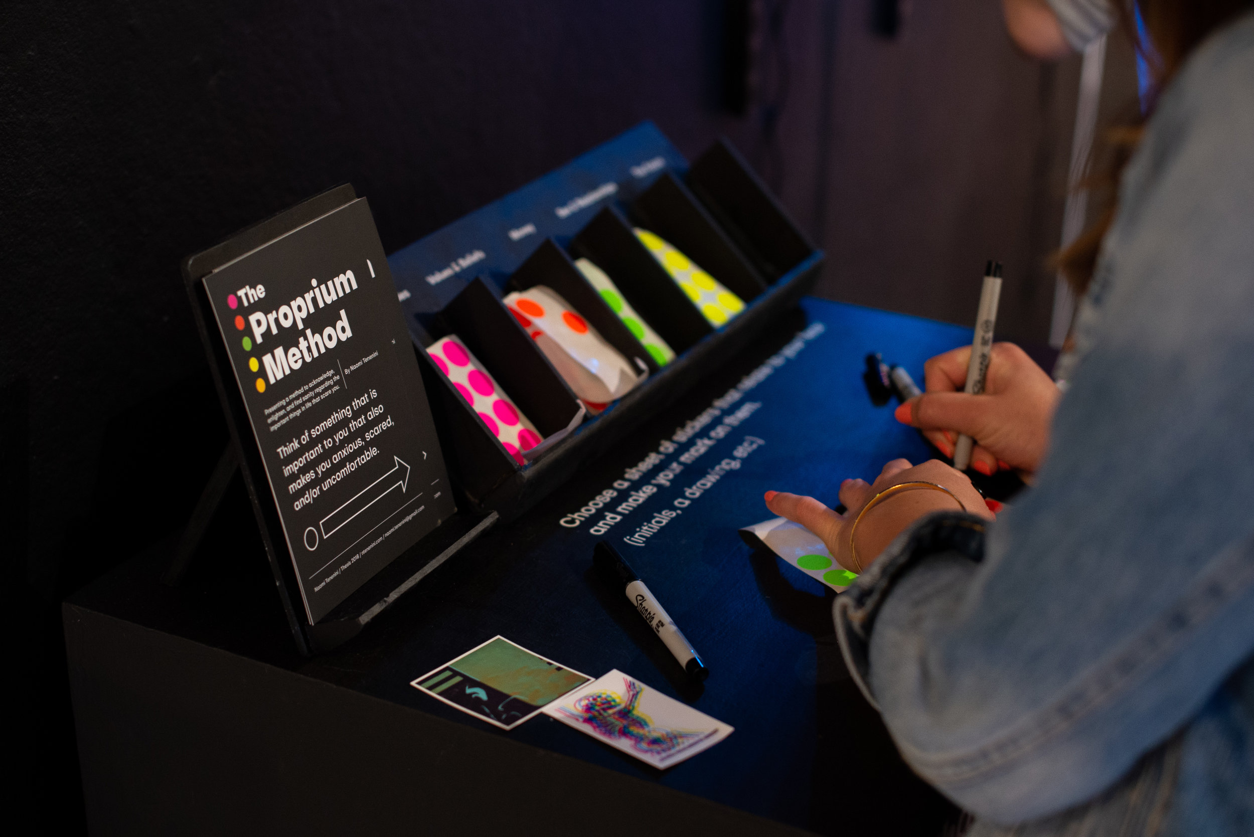
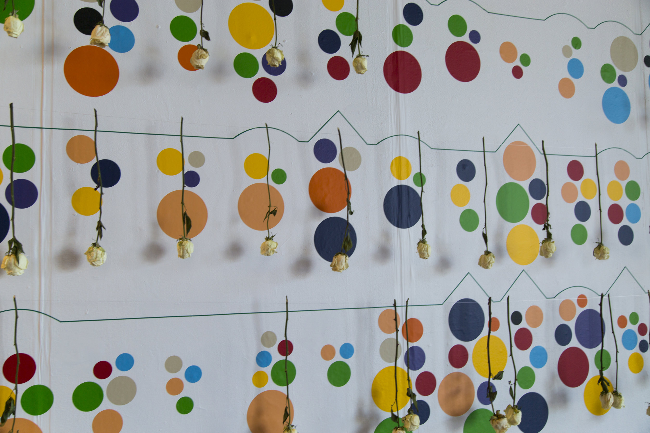
Student Name: Tabitha Michaelidis
Project Title: Tragedy and Growth
Project Title: Tragedy and Growth
Project Description:
It was the first week in February, I was sitting on my bed thinking of a topic I could potentially dive into for thesis. I turned to my left to check on my candle, and there it was. A yellow sticky note on my dresser that said "Tragedy can be a form of education that provides moral insight, which fosters emotional growth". This quote was found in Aristotle's Nicomachean Ethics translated by Robert C. Bartlett and Susan D. Collins. This was the beginning of my process.
READ FULL BLOG POST
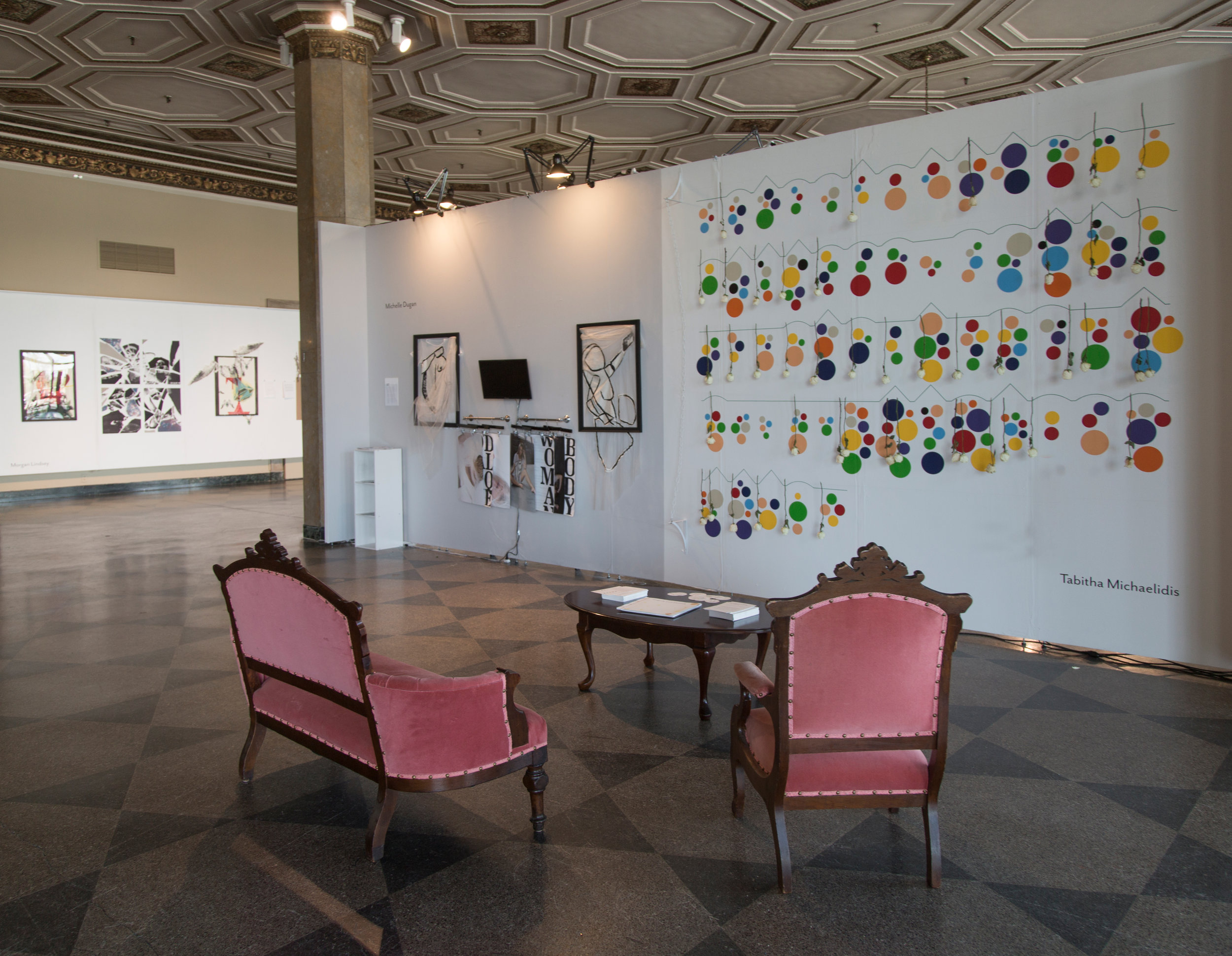
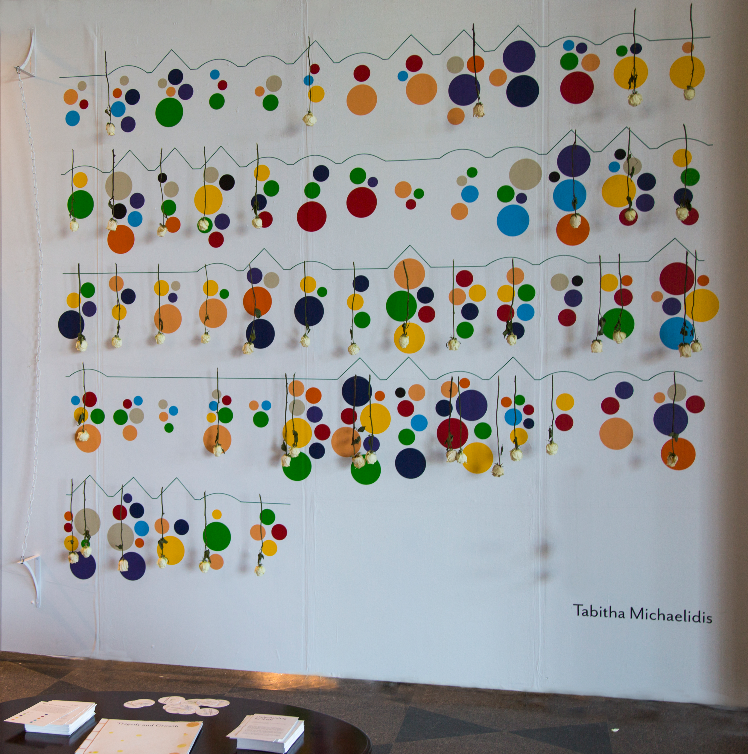
Student Name: Michelle Dugan
Project Title: Odalisque Now
Project Title: Odalisque Now
Project Description:
Odalisque Now looks at the historical depiction of women in fine art, and searches for relevance today. Historically in Classical and Neoclassical works, women are depicted in either full or partial nude, shown as victims or idealized objects, and almost exclusively created from a man’s perspective. Women have had their backs against a wall, facing preexisting notions of how they should be visually represented. Odalisque Now also explores the question of how wardrobe relates to character portrayal; often times the female body is only draped in scraps of fabric. Fashion may be the most intimate form of art. It is physically closest to us and can be used as a tool to show ourselves to the world without a single word.
READ FULL BLOG POST
Student Name: Abigail Wang
Project Title: Favors As Currency
Project Title: Favors As Currency
Project Description:
What is currency? If you think about it, currency comes in many different forms. And themost interesting forms of currency do not come in paper bills. In every society, we use our relationships as a form of currency. We often hear “you owe me a favor” or “you owe this much to me” amongst friends or people we know.
For example, in the Chinese culture, the word“favor” is called “ren qing”. Directly translated, it’s put together by two words that means “human feelings”. It’s almost like a mental account book in your head of how much other people owe you or you owe other people.
READ FULL BLOG POST
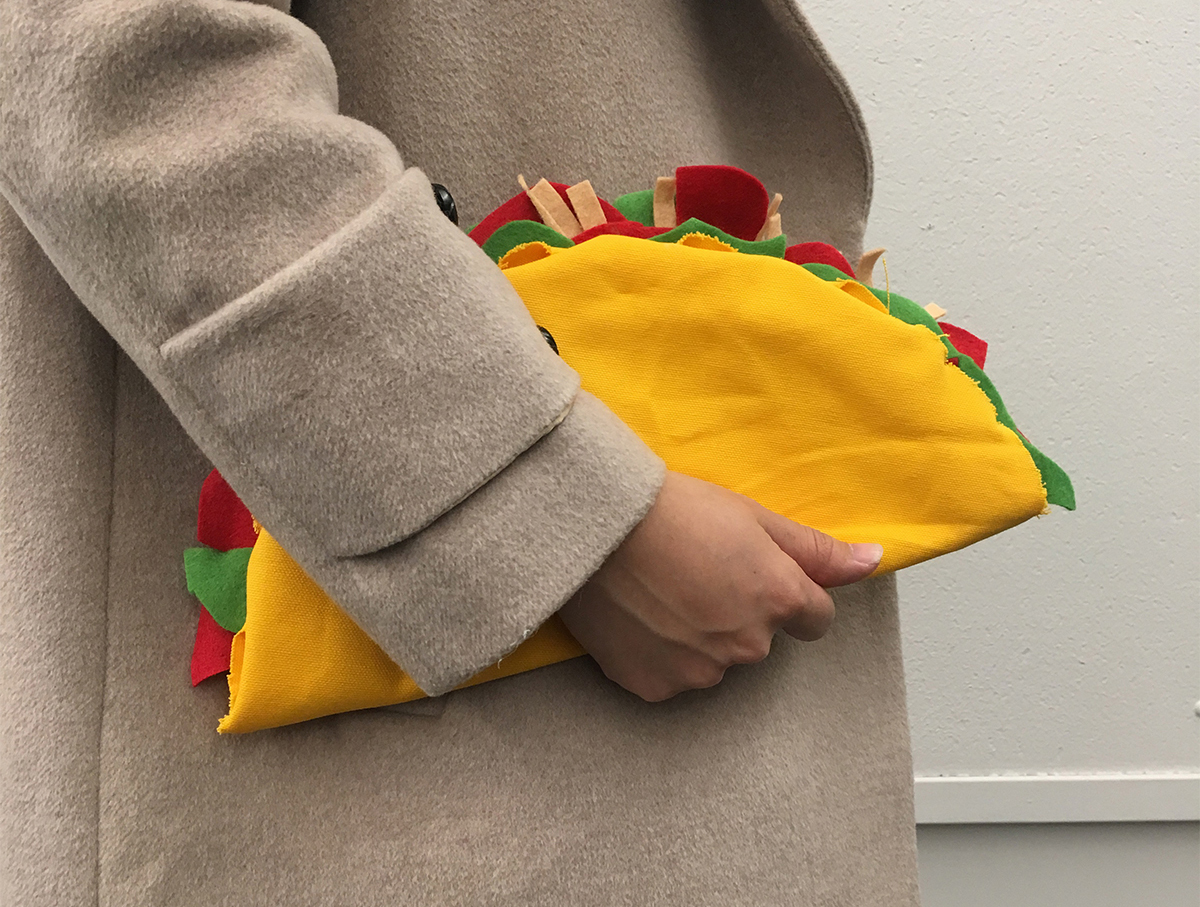
Student Name: Erdian Gao
Project Title: Humor
Project Title: Humor
Project Description:
Attractiveness means a genuine personality. And when it comes to design, there’s one thing that helps us convey a personality—humor.
Humor—a comic, absurd, or incongruous quality causing amusement.
How can an incongruous quality create delight? Using graphic design as a lens to understand the mechanics of humor, I demonstrate this phenomenon of universal amusement. My method involves creating unexpected mixes and matches and visual puns as a vehicle for play.
Design is not only functional but also fun. Synthesizing unexpected elements in surprising ways adds one more layer of legibility and suspends us cognitively. On one hand, you hear the word humor a lot, yet philosophers have little to say, and what they have said is largely critical.
READ FULL BLOG POST
Student Name: Harshetha Girish
Project Title: XB16 // Thesis
Project Title: XB16 // Thesis
Project Description:
A story is how we communicate the visual potential of what can only be imagined. I have always wanted to tell stories through various mediums of art and design by working with the story, atmosphere, composition, character, conflicts, and resolution.
Being part of a global family and has let me indulge and grow my fictional fantasies. I have always been known for packing one too many books and sacrificing a few hours of sleep to watch the latest in-flight movies. Baz Luhrmann, the Australian director, writer and a contemporary example of an auteur has been one of my main inspirations.
READ FULL BLOG POST
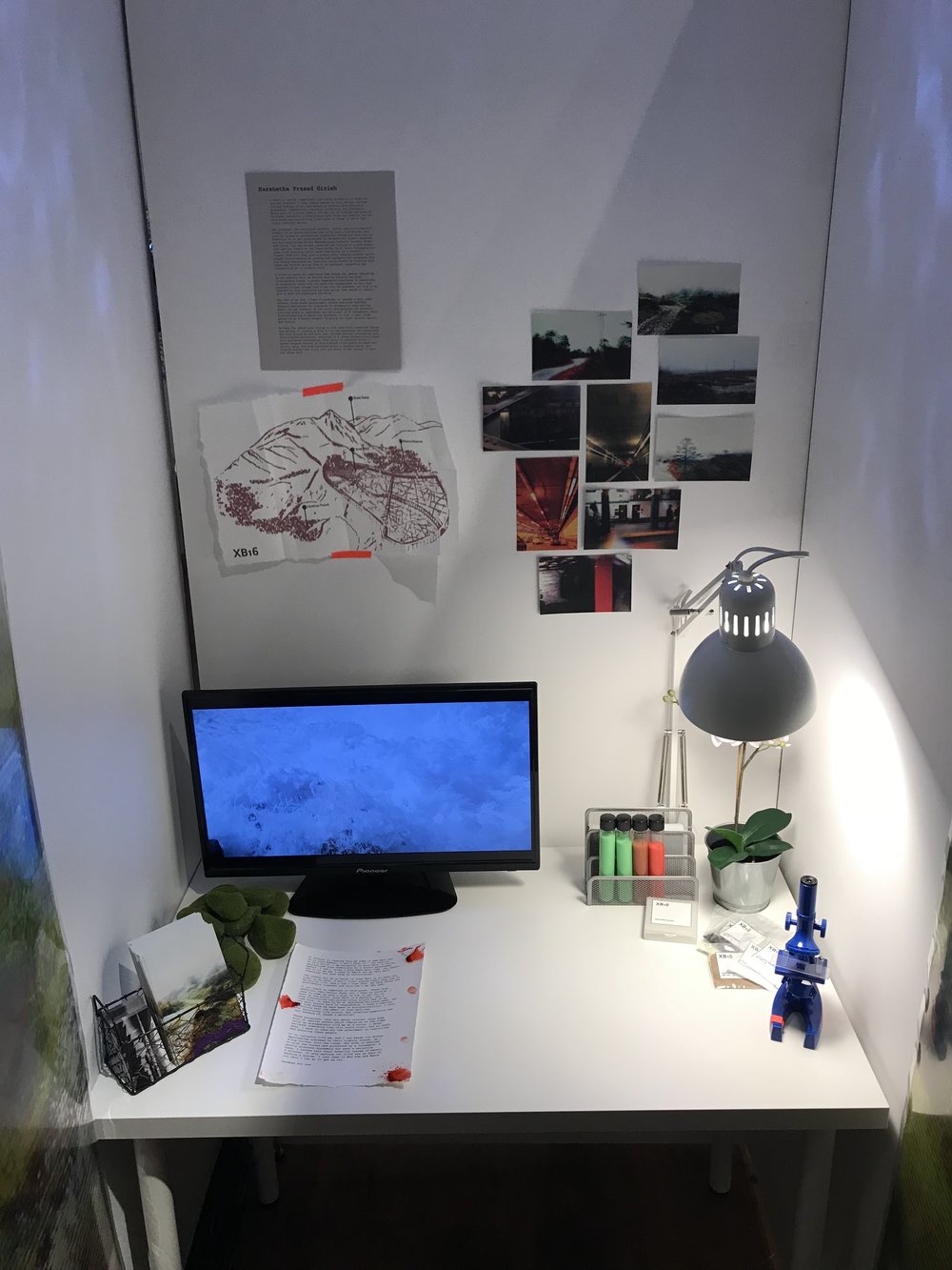
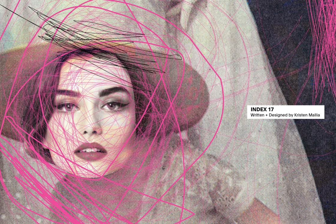
Student Name: Kristen Mallia
Project Title: Index 17
Project Title: Index 17
Project Description:
Using my collections of objects and ephemera as sources of inspiration, content and interpretation, I aim to generate graphic treatments that are layered, unique, engaging and visually rich. Though the objects are old, the designs should feel contemporary, graphic and fresh, while inspiring a deeper narrative that goes beyond the surface impact. The audience may view this work as something pretty, dynamic or intense, but they can see a more complex story within the compositions, as well, with which they can formulate their own meaning.
My audience is engaged, educated and design-conscious. They are looking
for functional, streamlined and usable design, but they also value originality and creativity of voice. It is important that things are well designed, but personality must also be present. Furthermore, while people embrace instruction, they also like to come to their own conclusions. Interpretation is important.
READ FULL BLOG POST
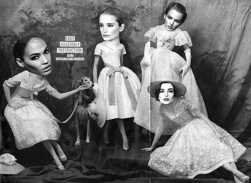
Student Name: Molly Haig
Project Title: Meanings
Project Title: Meanings
Project Description:
Meanings — can design itself have meaning, or does meaning emerge only through content? How could you make a design that meant something without its content? What gives design meaning anyways? Is it words? Visual cultural references? Gut reactions like excitement, repulsion, shock? What is the least information a meaningful design can have? Could design make the same material mean different things?
“You don’t quite say what your goal is,” noted my professor. Aesthetically, this was true. I had no idea how this project would look, or how exactly I meant to carry it out, and this was meant to be a “practice” thesis, easily doable in a busy semester — so I revised. Instead of wildly digging for sources of meaning, I zoomed in. I focused on exploring my interest in the boundary between type and image by alternating between digital and physical mediums.
READ FULL BLOG POST
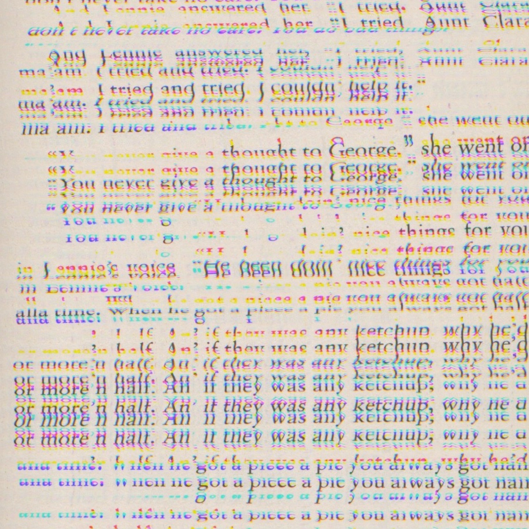
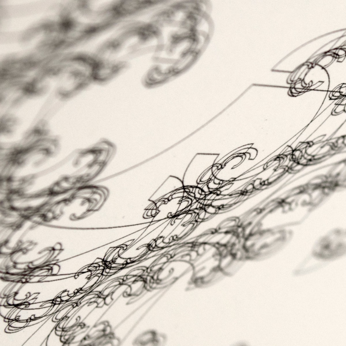
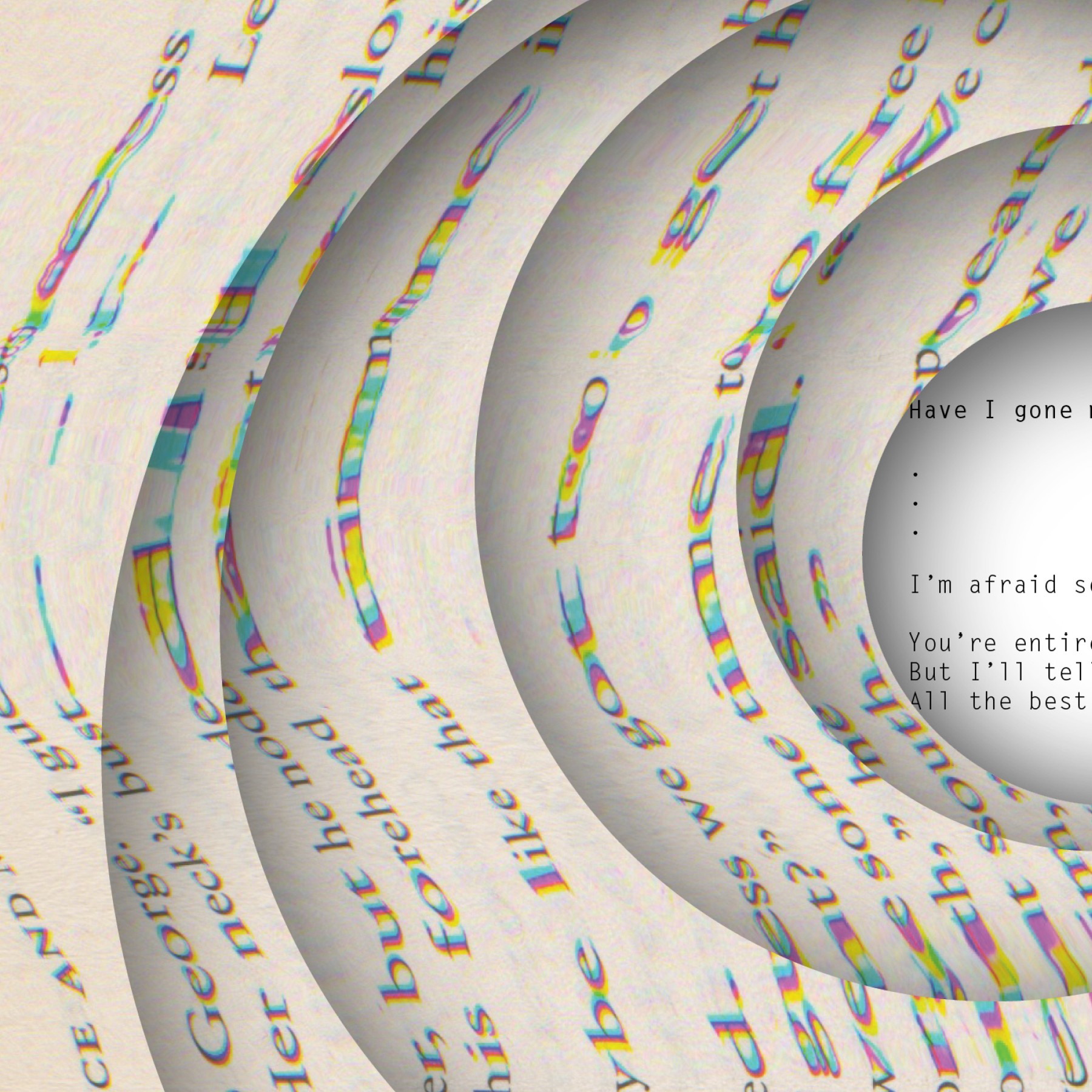
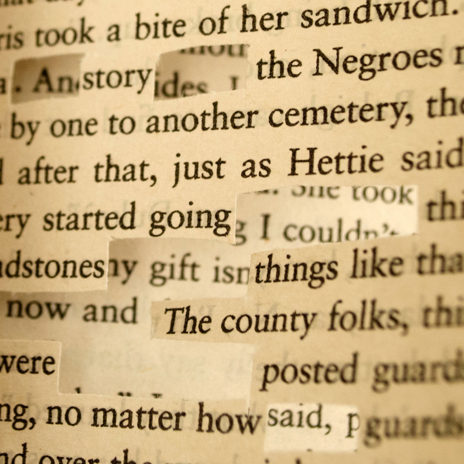
Student Name: Vaishnavi Kumar
Project Title: Layered Narratives + the Handcrafted Experience
Project Title: Layered Narratives + the Handcrafted Experience
Project Description:
In my studio practice, I find that creating pieces that explore deeply personal narratives to tell a story are most fulfilling to me. In terms of form-making, I’m strongly inclined towards incorporating hand-crafted elements (from cut-paper art to model-making). Inspired by the idea of participative art, I wish to create pieces that provide an interactive experience to the audience. My goal is to create a body of work that allows the audience to immerse themselves in and develop their own personal connections. Currently, I’m exploring socio-political themes and/or social advocacy, to see how I can translate them into a set of designed pieces.
Simultaneously, I’m working on a mini-thesis experiment to explore my interest in cut-paper art. I like to cut organic forms out of paper by hand. These forms tend to create large patterns which allow you to see through the paper, creating a dynamic piece. I’m trying to push the actual patterns in a more graphic direction. Further, I’d like to push the interactivity of these pieces in space. Through the addition of imagery, type, layering, light + shadow, how can I make my work more impactful? How can I make them a more engaging and interactive hand-crafted experience whether it’s a print or a motion project?
READ FULL BLOG POST