Student Names:
Vincent Liu
Sarah Nam
Project Title:
Anemoia
Vincent Liu
Sarah Nam
Project Title:
Anemoia
Project Description:
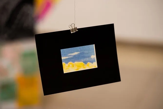
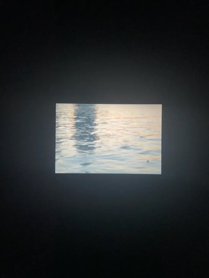
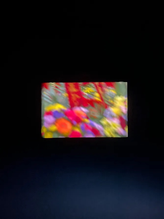
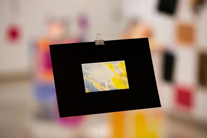
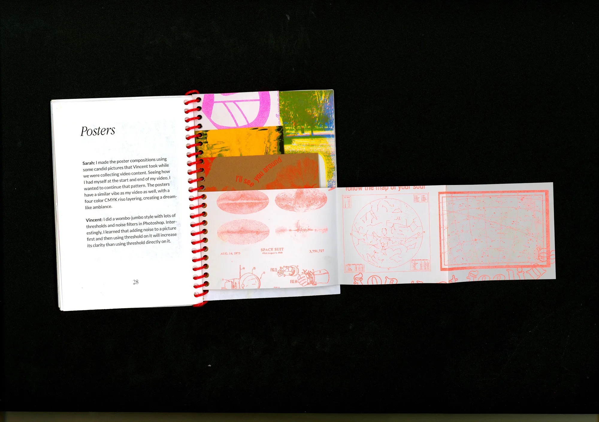
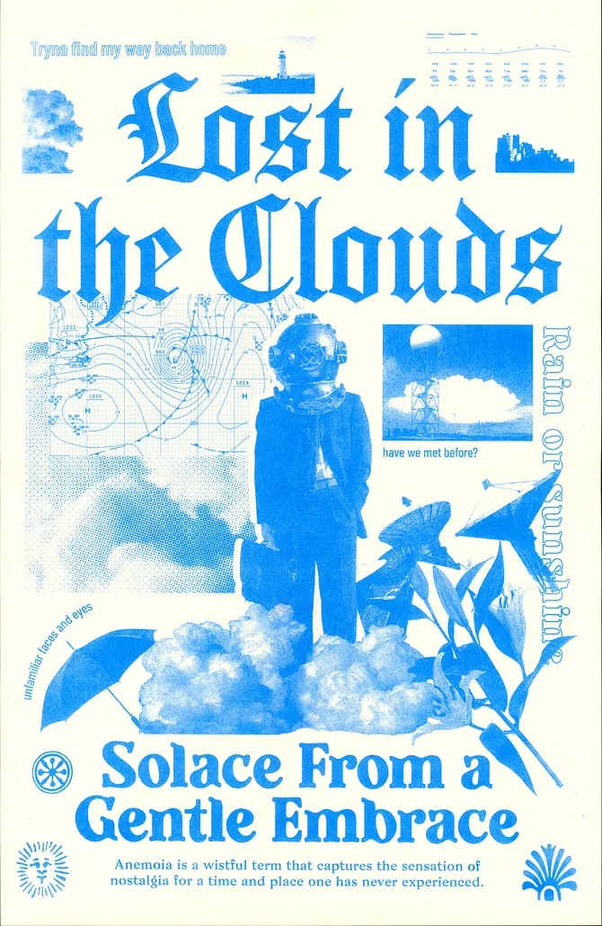
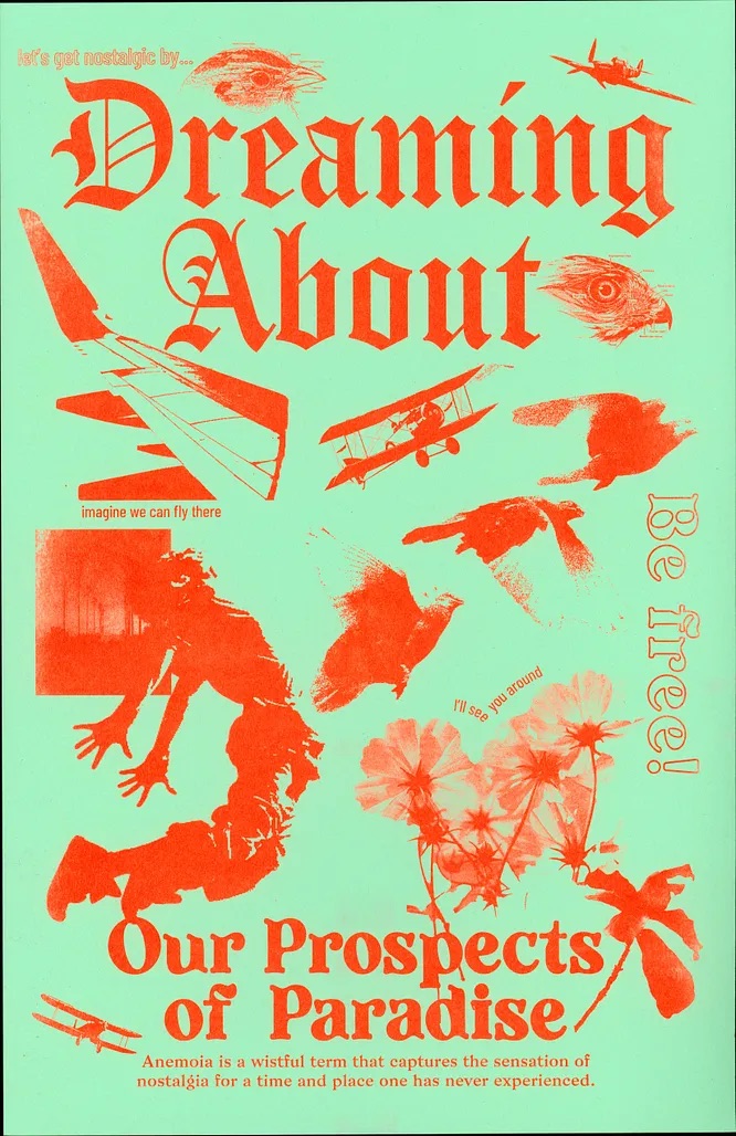
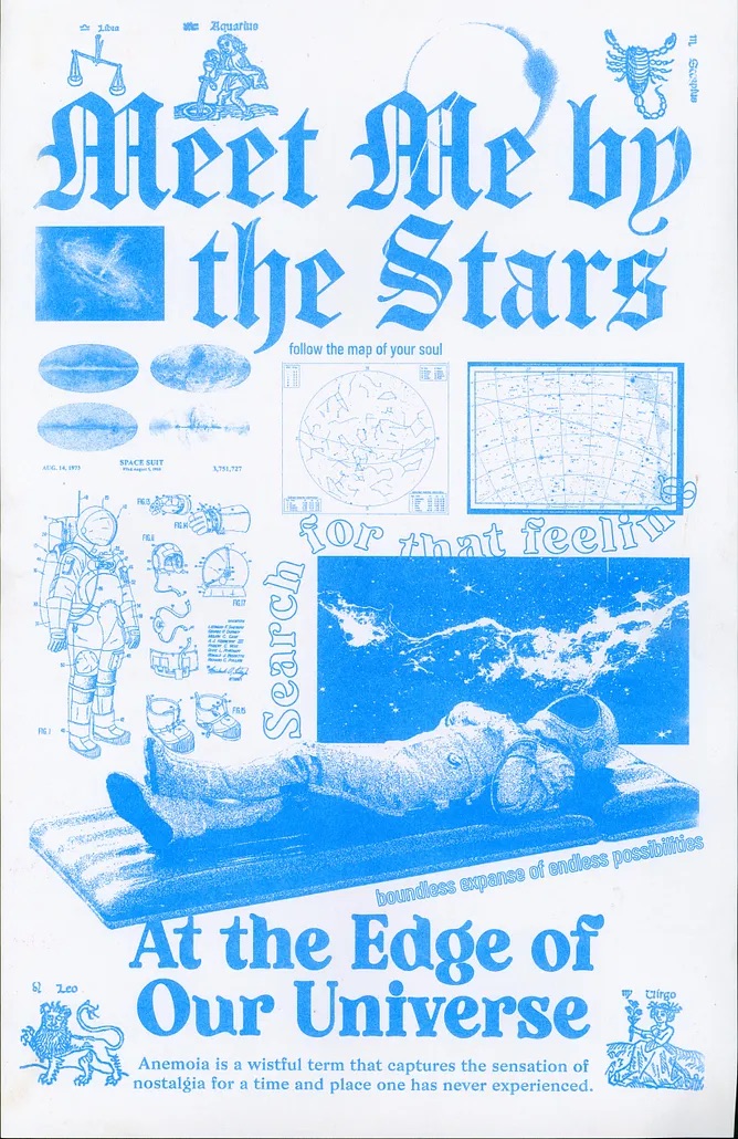
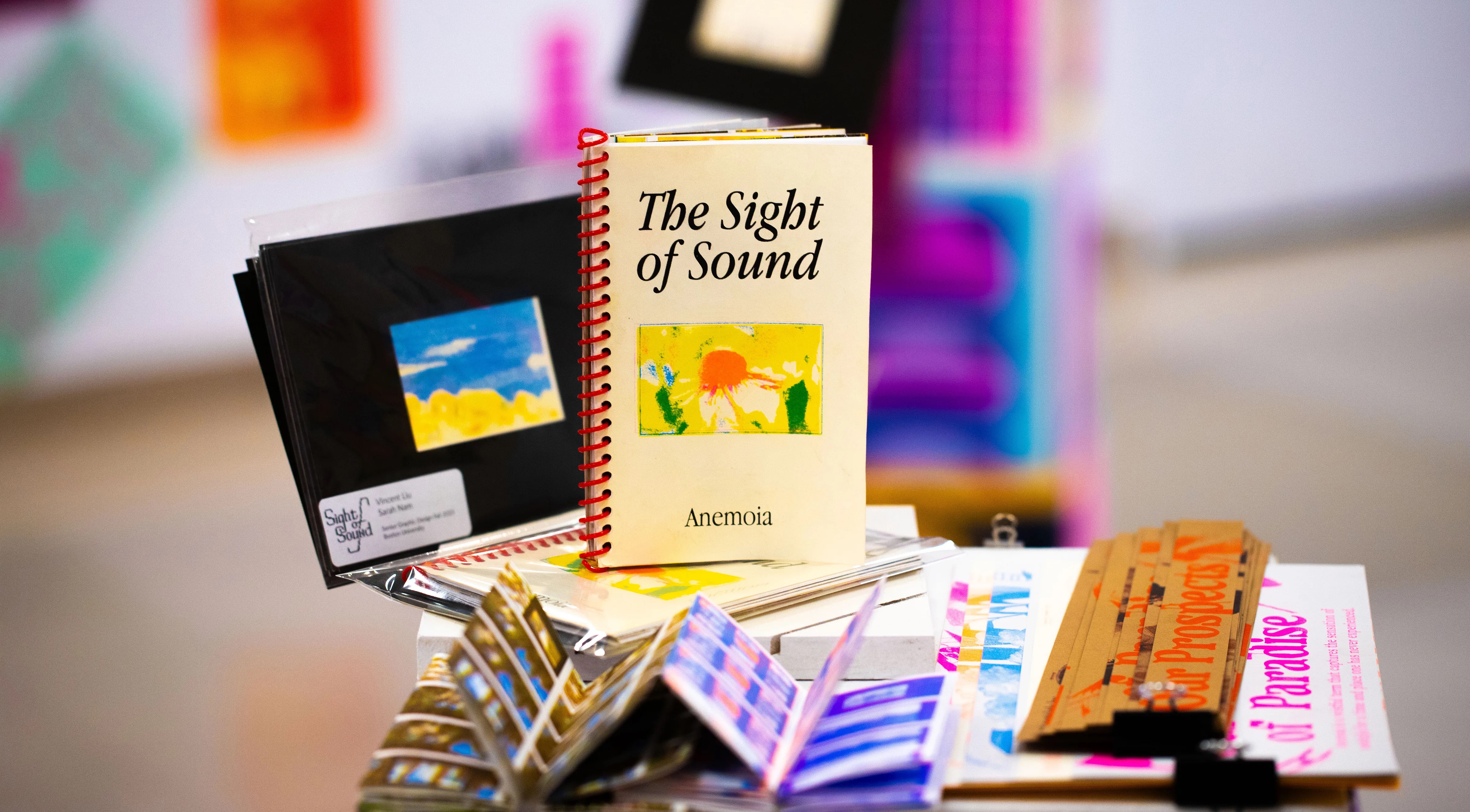
When thinking of a theme for Sight of Sound, we gathered topics of what we were most interested in at the time. Some of them include family, relationships, Studio Ghibli, and nostalgia. We were both drawn to the idea of the nostalgia of Studio Ghibli, and wondered why we felt that way about those movies even though our backgrounds are quite different. We zoned in on that feeling of caring about something that does not exist in the real world, almost like escapism. The term for that nostalgic feeling for a place you’ve never known or been to is called “anemoia,” and we decided that would be our theme.
We looked at various analog photography and image editing methods to see what was possible to create the feeling of nostalgia. Another aspect that was inspiring was Studio Ghibli’s movie palettes, which we thought resembled the vibrancy of the risograph. In terms of typography, we wanted a clean thin serif look and elevated the elegance of our photography and video footage, which we later settled on to be Apple Garamond. It was used a lot in the 80s and 90s as a display typeface for Apple’s advertising and conveyed the feeling of nostalgia.
READ FULL BLOG POST
